Nordik is a high-quality Webflow template for Portfolio & Agency, Professional Services, Business & Startup, Art & Design, Photography & Videography, Personal by Slate Dept.
Our Review of Nordik
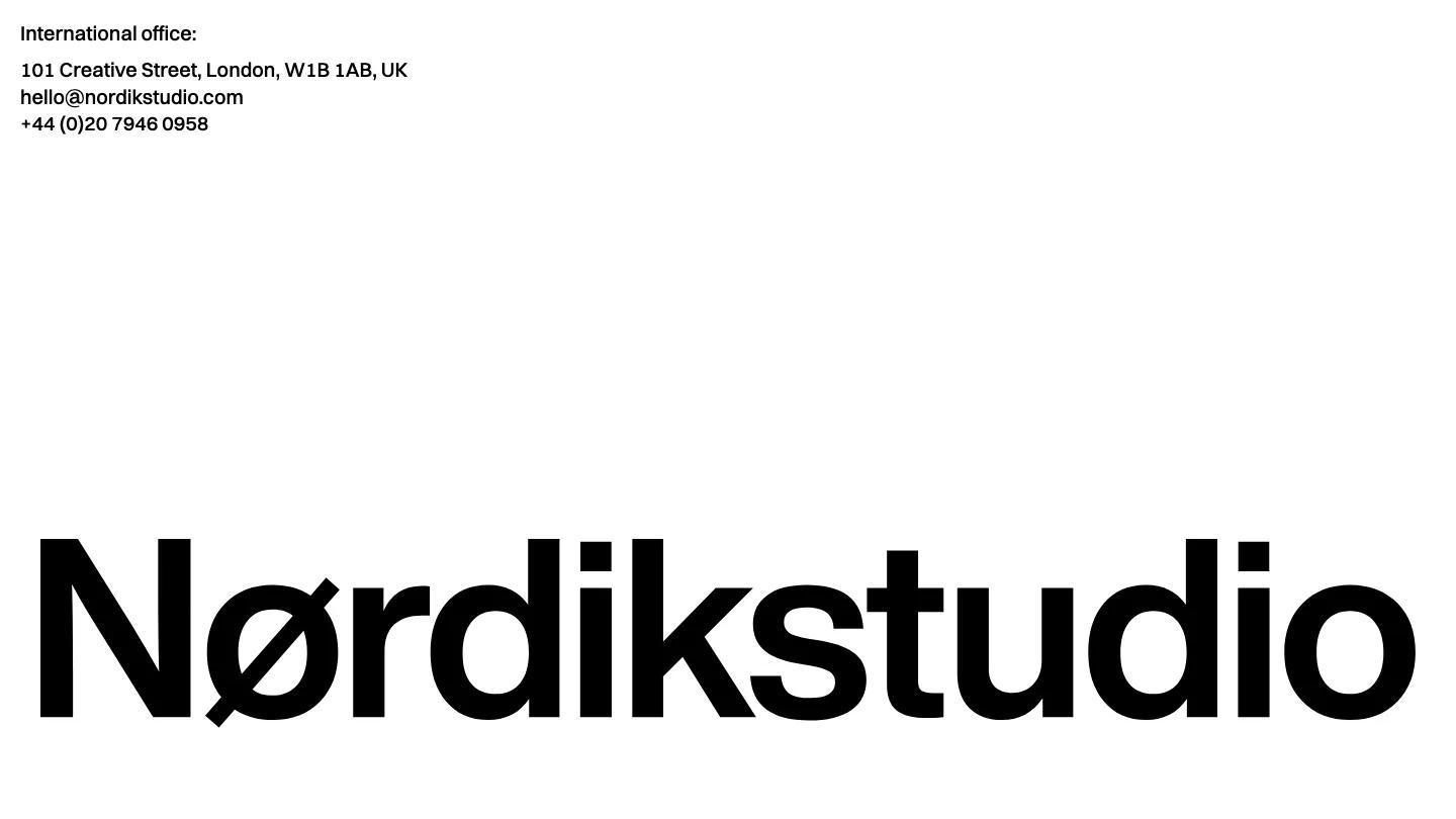
Nordik takes minimalism about as far as a studio site can go. The homepage is a single white screen: an office address, email and phone number in small black Switzer type in the top left, the studio wordmark stretched edge to edge across the bottom in heavy black letters with a slashed O, and a dark rounded pill holding Home, Works, About and Contact just beneath it. There's no hero photo, no scroll and no color at all. This Webflow template by Slate Dept is dressed as an architecture practice, and it reads like a printed letterhead.
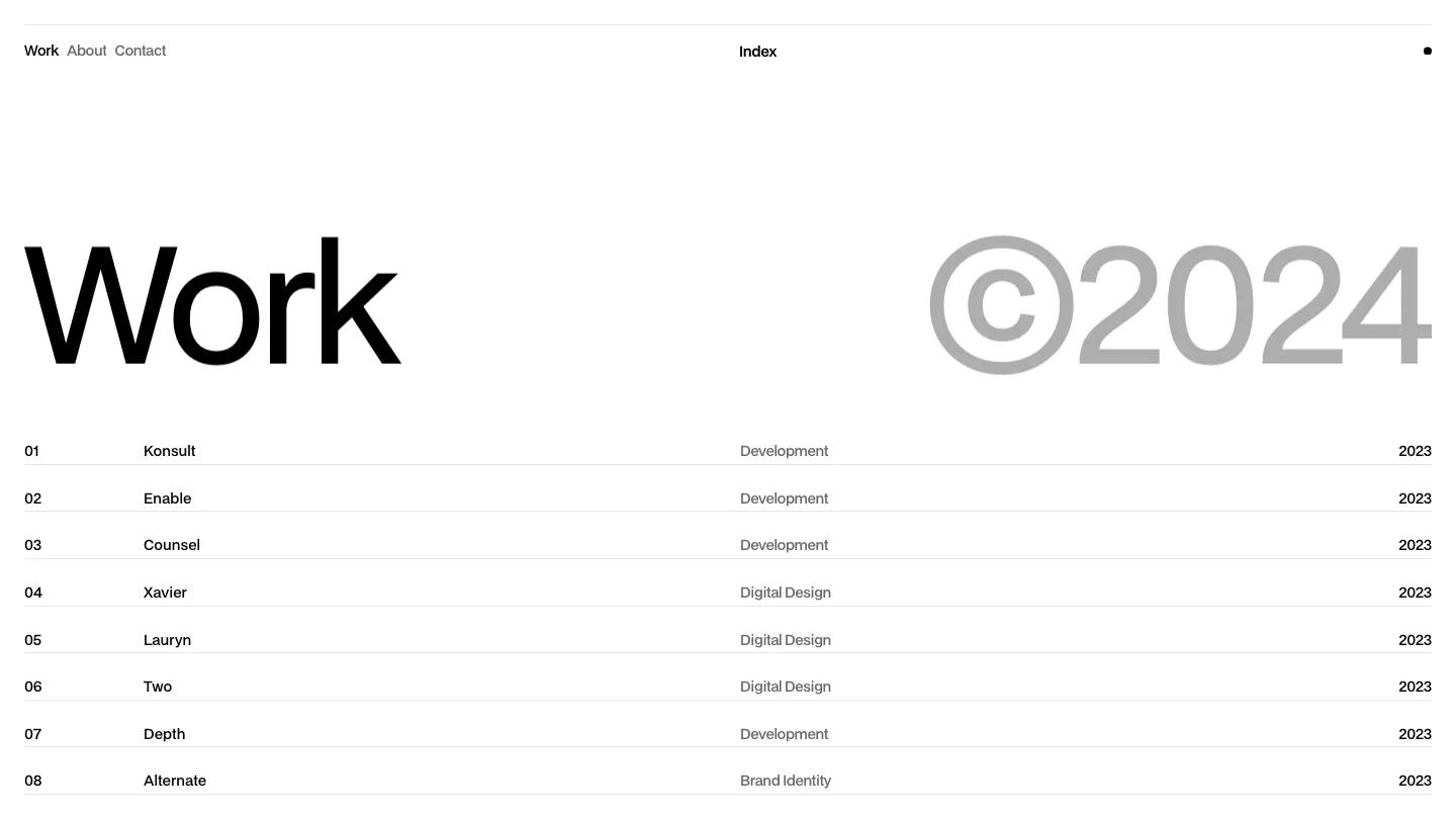
The inner pages keep the same frame, with the giant wordmark and floating pill staying at the bottom while the content changes above it. Works is just a plain list of project names in gray, each opening its own page from the CMS. Those project pages count up a percentage loader, then show a neat spec list covering type, area, period, materials and location, followed by an overview, concept and process write-up with images. About gives the practice's mission, approach and values in short labeled blocks next to a photo, and Contact pairs the office details with a team list of names, roles, emails and phone numbers. We like the project spec lists: area, period and materials are exactly what an architecture client scans for first.
On a 390px phone the wordmark shrinks to fit one line, the address stays at the top, and the navigation pill sits centered under the name.
We'd pick Nordik for a small architecture, interiors or engineering office whose work speaks through case studies rather than a splashy homepage. Be aware that the homepage itself shows no projects at all, so visitors have to click into Works before they see a single building.
Based on the live demo, viewed on desktop and on a phone. The Design and Dev scores come from separate independent reviews. See how we score templates.
Independently evaluated by our team of 6 designers and 5 developers.











Designers score design, developers score development, and each score is the average of their independent ratings. Read about our review team and how we score templates.