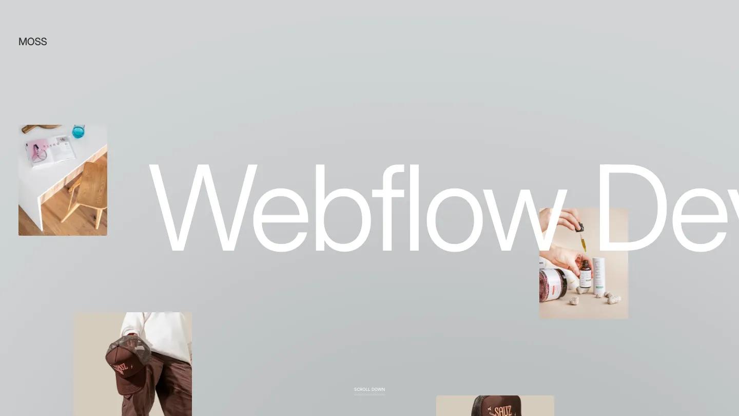
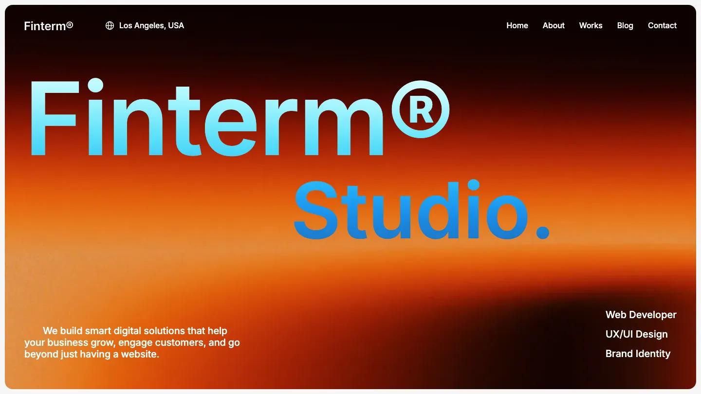
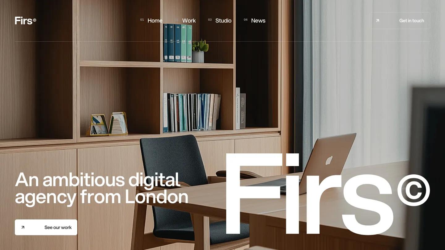
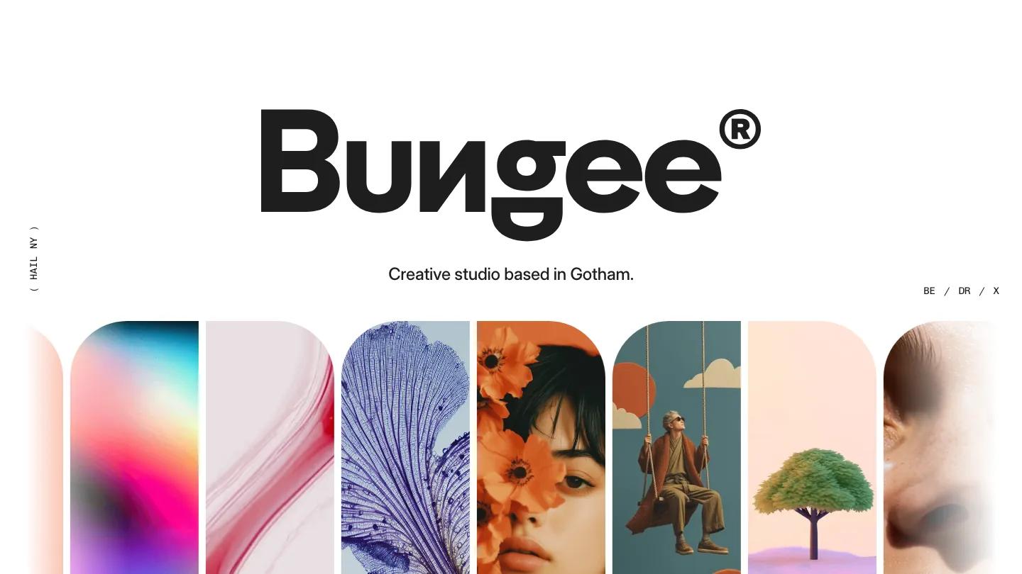
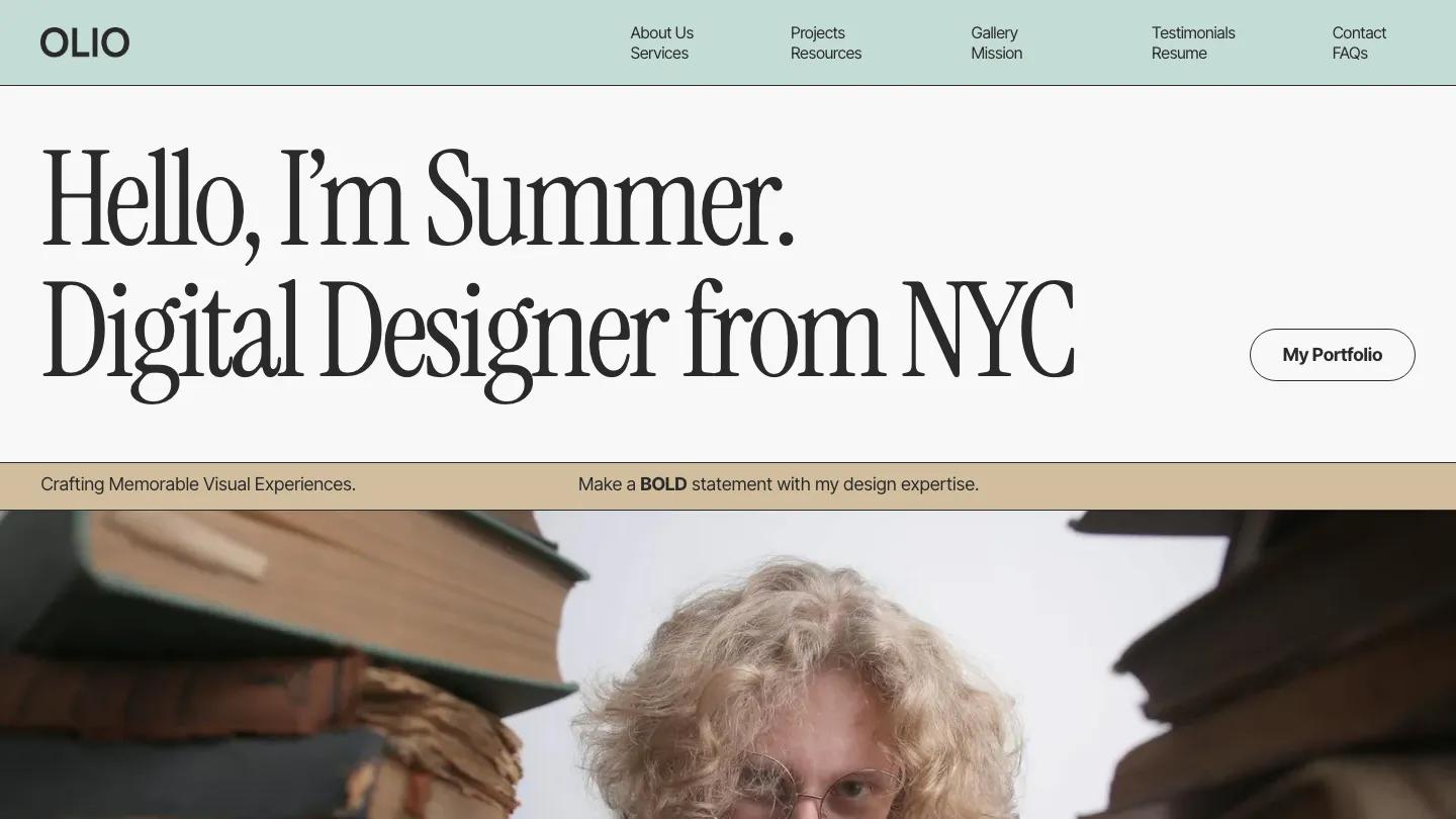
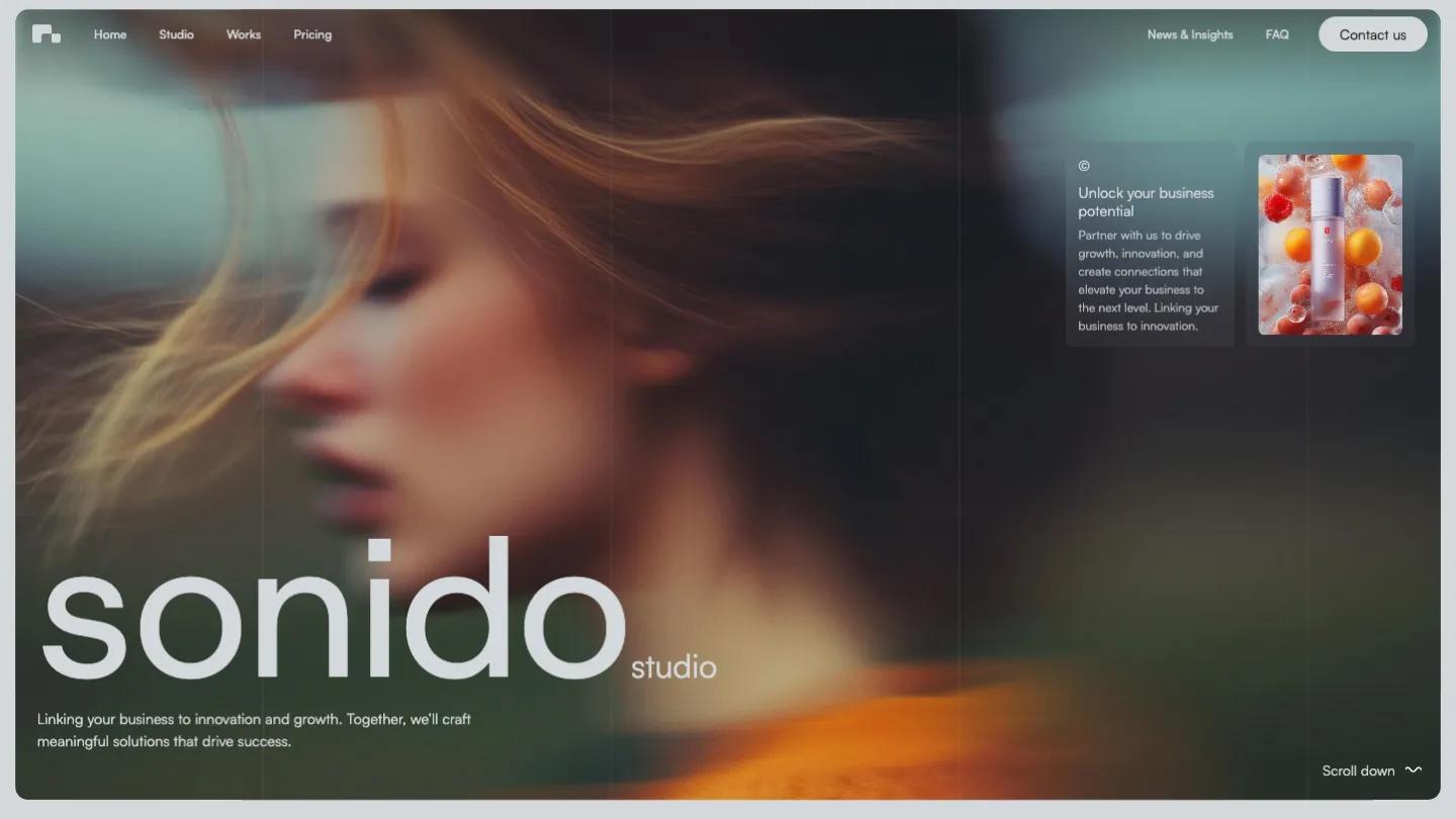
Everett Studio is a high-quality Webflow template for Portfolio & Agency, Art & Design, Professional Services, Business & Startup, Personal by Slate Dept.

Our Review of Everett Studio
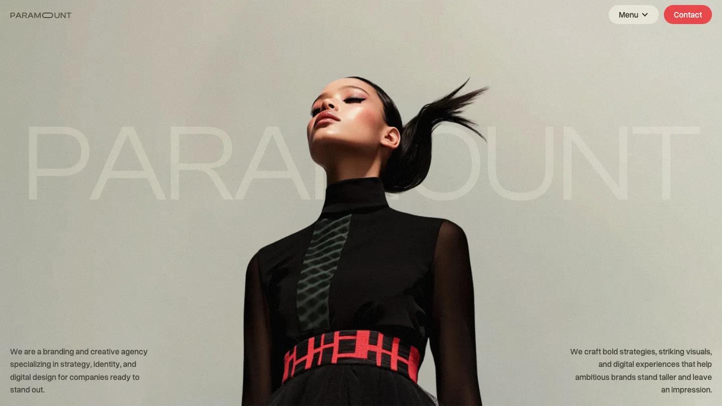
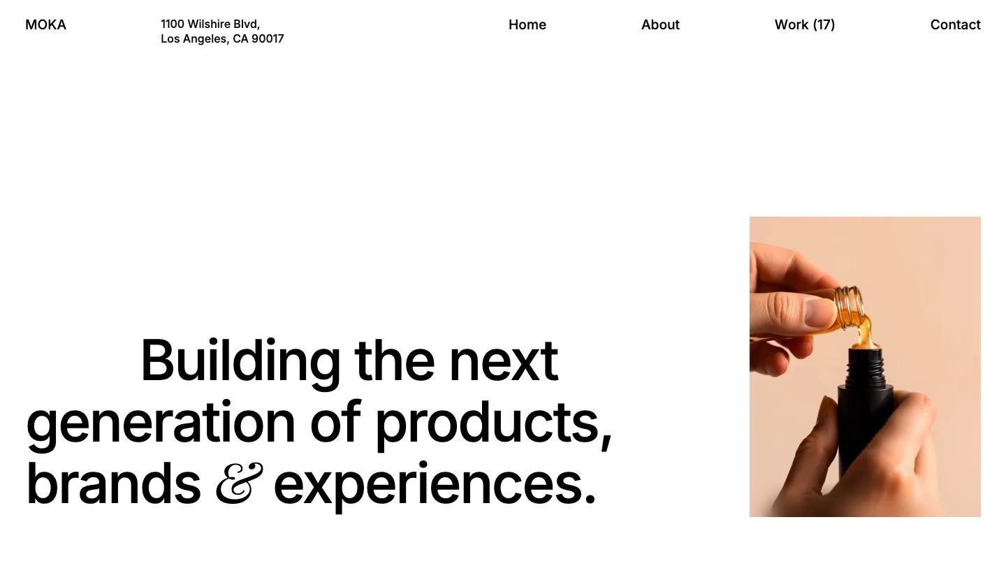
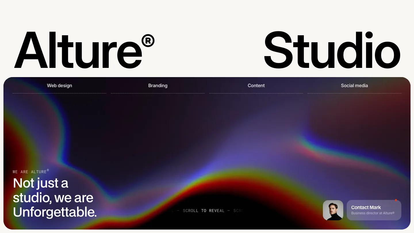
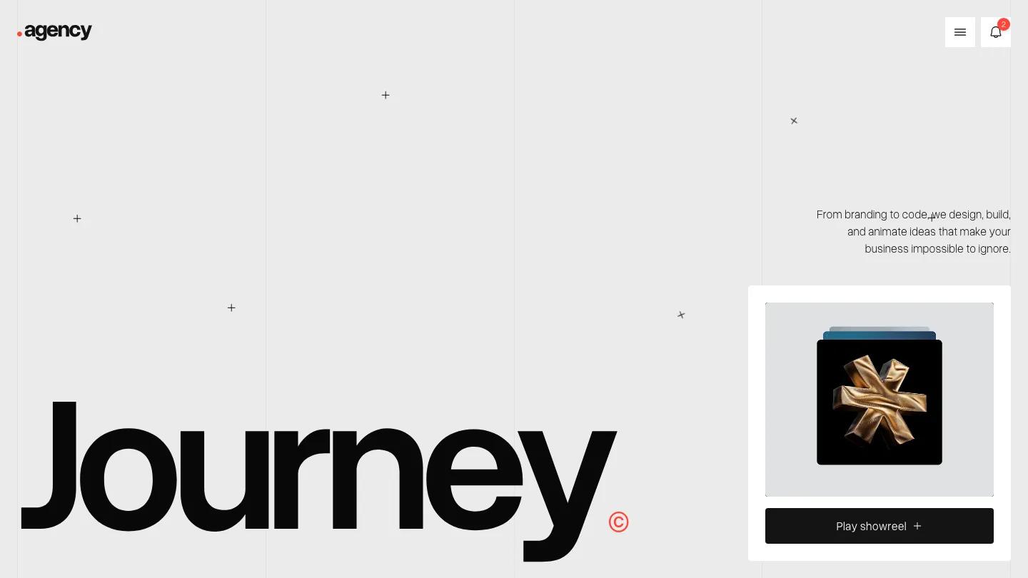
Everett Studio is a portfolio for a small design studio or an independent creative who wants the page to feel like a printed monograph. The hero is mostly white space: the name Miles Everett in large black BDO Grotesk at the top left and a one-line studio intro sitting low on the right. Then a full-width portrait crops in from below, a face and a raised arm against a pale wall. The header is just as spare, with Work, Studio, News written as a comma-separated phrase and an underlined Get in touch link.
Slate Dept. keeps the structure short. Our Story opens with one long statement in big grotesk type across the full width, then two quiet grey paragraphs and a Learn more about us link. Featured work follows as a two-column grid of large project photos, each with a bold title and a one-line tagline, all shot in muted greys, steel, and black. A row of news cards with category and date labels comes next, before a closing "Let's create something unique" call to action and a simple link footer. The Work page brings back the oversized heading as Case studies, adds a small Grid / List toggle, and moves the projects into a three-column grid.
On a phone, the name still fills the width, the menu collapses to a single Menu label, and the Our Story statement stays large, which makes for a long scroll.
We'd pick Everett Studio for branding studios, art directors, and freelance designers with a consistent set of project photos. The look depends on that: the demo imagery is all cool, desaturated mockups, and colorful work will change the mood a lot. We'd also trim the Our Story paragraph, since at that size every extra sentence adds real height.
Based on the live demo, viewed on desktop and on a phone. The Design and Dev scores come from separate independent reviews. See how we score templates.
Independently evaluated by our team of 6 designers and 5 developers.











Designers score design, developers score development, and each score is the average of their independent ratings. Read about our review team and how we score templates.