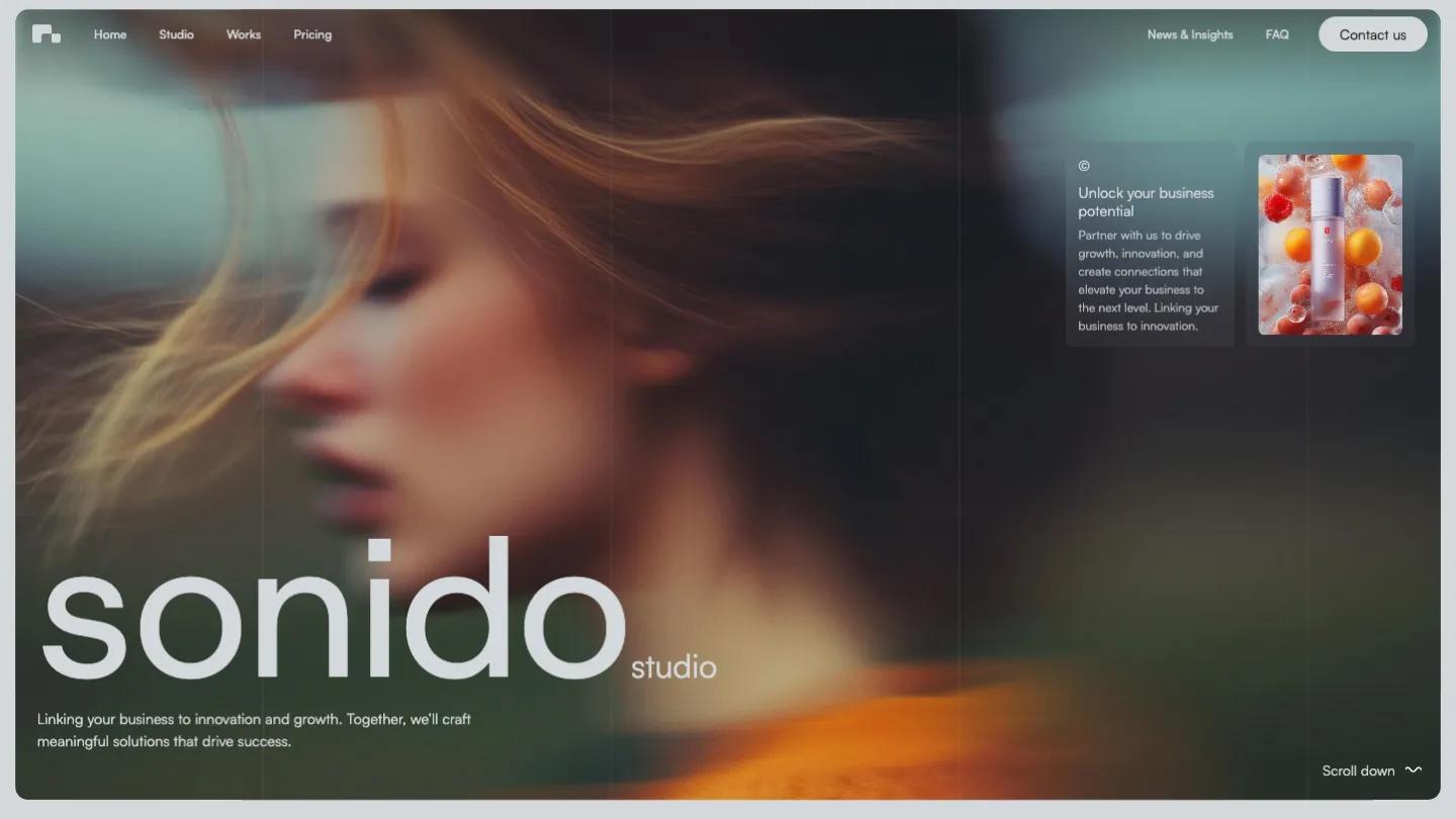
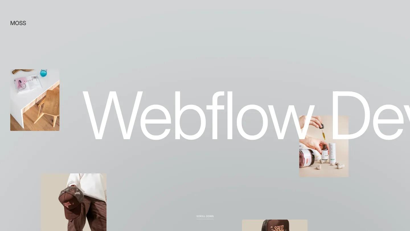
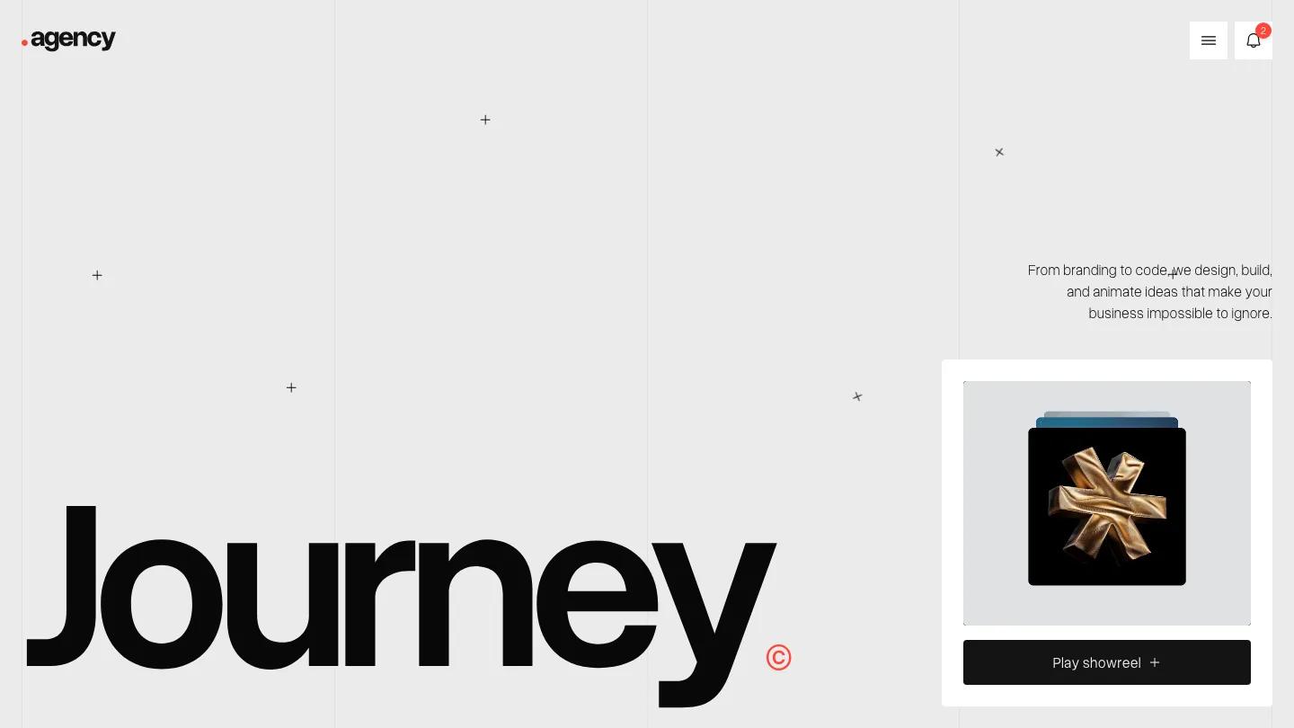
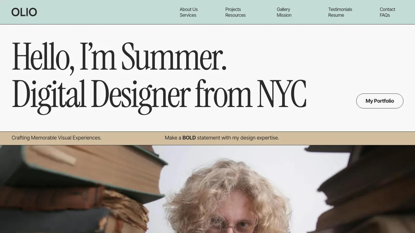
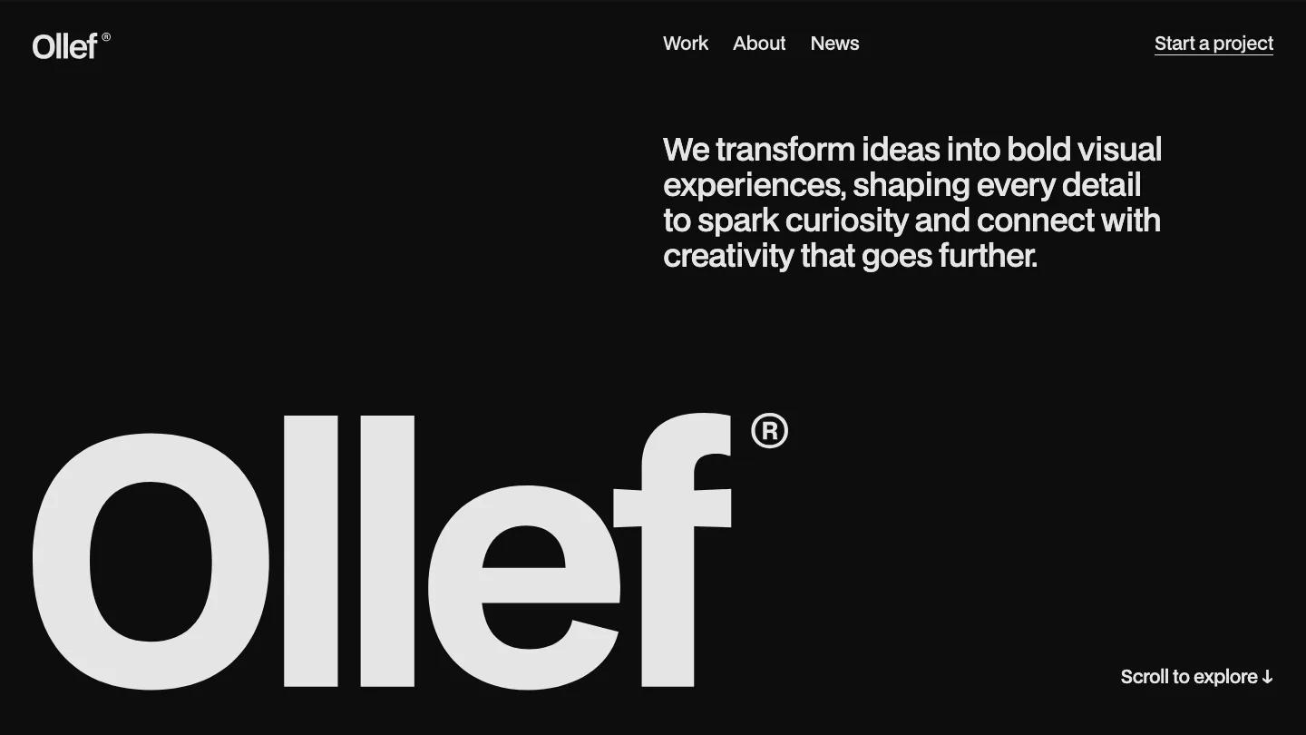
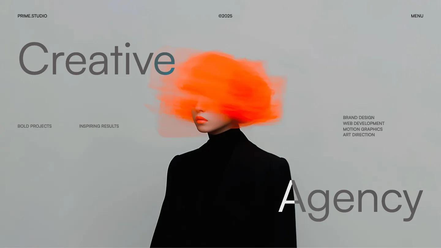
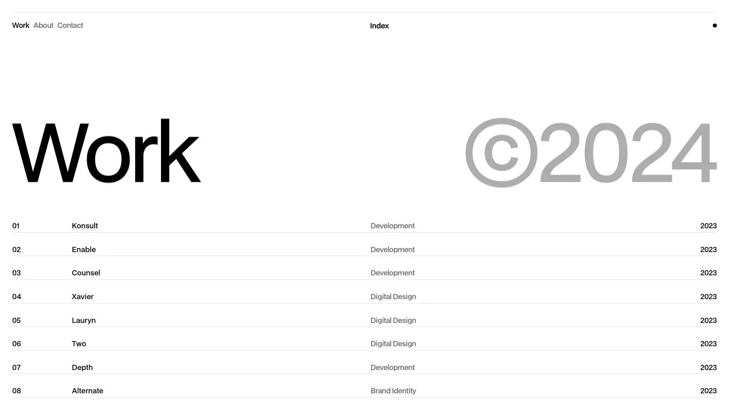
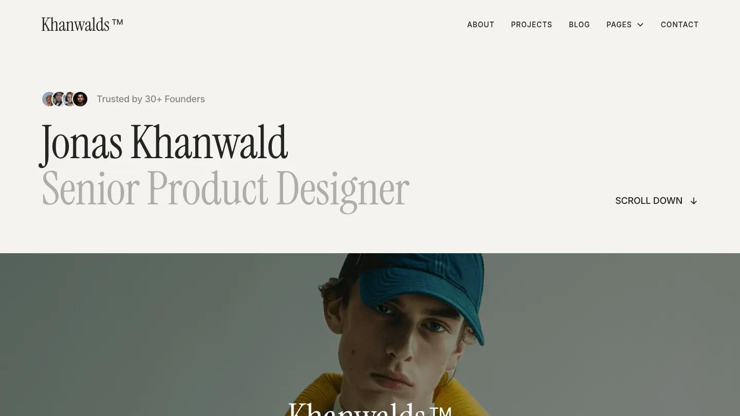
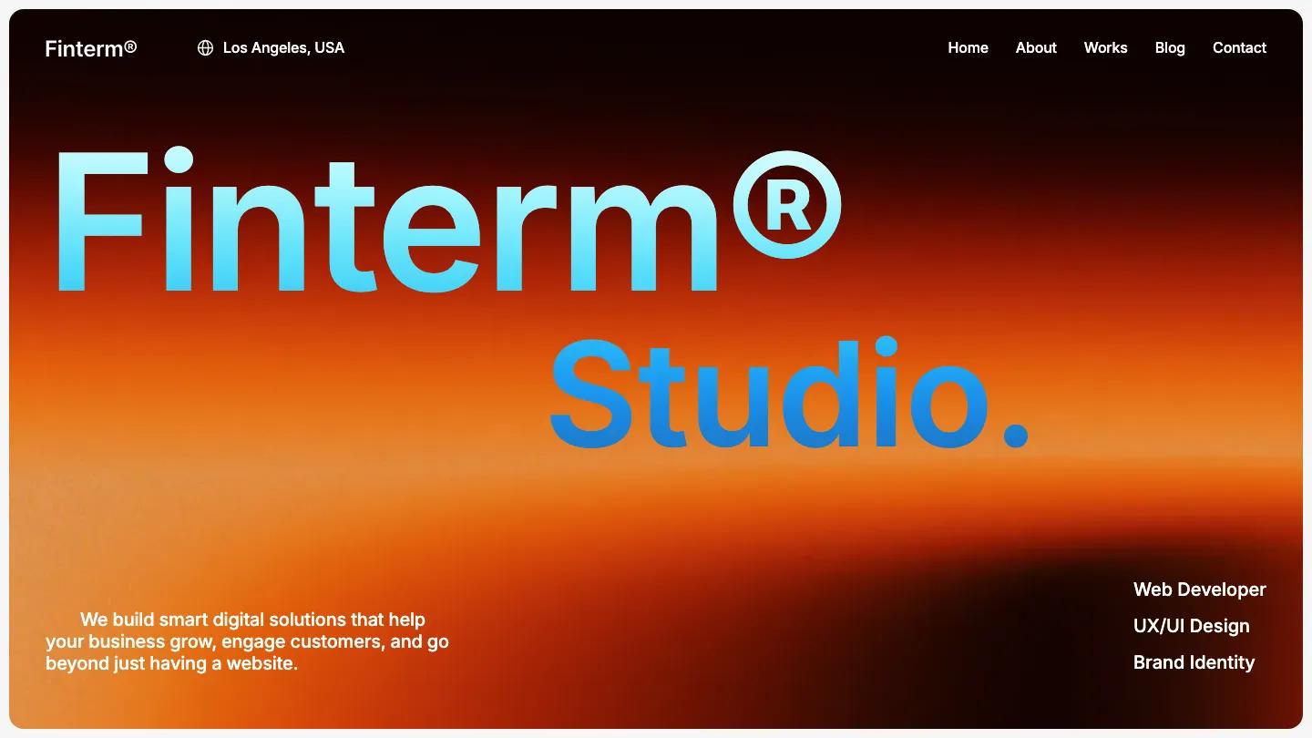
Firs Studio is a high-quality Webflow template for Portfolio & Agency, Professional Services, Business & Startup, Personal, Art & Design, Photography & Videography by Jacob Nielsen.
Our Review of Firs Studio
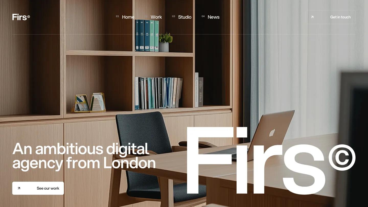
Firs Studio is a site for a small digital agency, and it opens with the kind of confidence agencies like to project. A full-screen photo of a pale oak office, fills the hero. "An ambitious digital agency from London" sits bottom left in white Aspekta with a See Our Work button, while the wordmark and a copyright symbol take up the whole bottom right at enormous size. The header numbers each link in tiny superscript, 01 Home through 04 News, and ends in an outlined Get in Touch button with a small arrow.
Below the fold, Jacob Nielsen switches to a crisp white page with charcoal type and almost no color. A Welcome block sets a long mission statement in heavy, tightly spaced sans serif, followed by short columns of studio values, a row of office photos, and a Read More About Us link. Featured Work opens with a huge heading, then shows each project as a site mockup floating on a soft blurred gradient, with a See All Work link and arrow beside it. A Clients grid lays out numbered logo cells separated by hairlines, and the footer pairs a newsletter signup with a large "Let's work together" and an email address. The Work page repeats the pattern, with a grey and black intro line and the numbered heading.
On a phone, the hero headline moves above the photo, the giant wordmark still spans the full width, and the menu becomes a two-line icon.
We'd pick Firs Studio for web, branding, and product agencies that want a calm, typographic site with plenty of white space. Before launch, replace the placeholder "Category goes here" labels and client logos, and proofread the demo copy, which has a couple of typos in its section labels.
Based on the live demo, viewed on desktop and on a phone. The Design and Dev scores come from separate independent reviews. See how we score templates.
Independently evaluated by our team of 6 designers and 5 developers.











Designers score design, developers score development, and each score is the average of their independent ratings. Read about our review team and how we score templates.