Very Basic is a high-quality Webflow template for Portfolio & Agency, Professional Services, Art & Design, Personal, Business & Startup, Photography & Videography by Jacob Nielsen.
Our Review of Very Basic
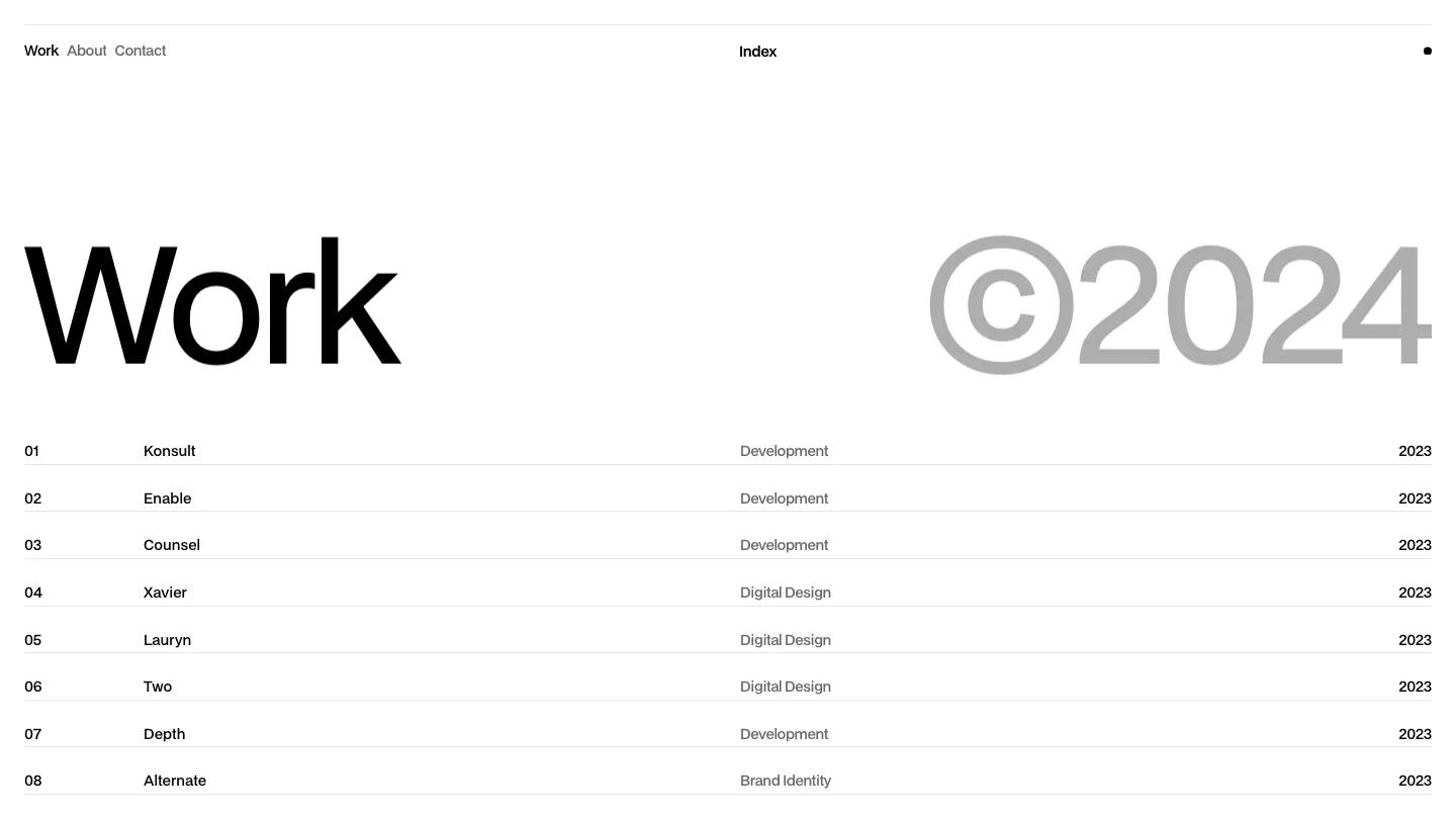
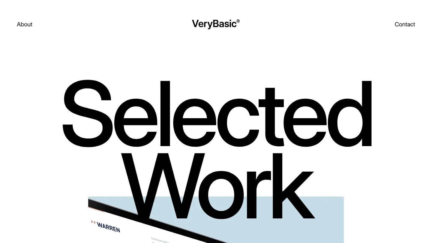
Very Basic is honest about what it is: a black and white studio site built almost entirely out of type, for a small design or strategy studio that prefers restraint to effects. The header puts About on the left, a VeryBasic wordmark with a registered mark in the center, and Contact on the right. Below it, "Selected Work" fills the first screen in giant Inter Display, and the bottom of the word overlaps a pale grey panel holding a laptop mockup of a project with a large serif title.
Jacob Nielsen keeps the homepage moving with scale alone. A huge bold statement introduces the studio and its city, then a Welcome label sits on the left while a large paragraph about simplicity reads on the right. Recent projects comes as a stacked list rather than a grid: each project name is set as big as a headline, with a small discipline like Strategy, Design, or Development aligned to the right and a thin rule underneath. A full-bleed office photo breaks up the white, then an About us block with an underlined Read more link and a Clients list in thin ruled rows. The About page opens with an oversized About heading and a small 01 beside it, then pairs a small photo with the same calm, large paragraph text.
On a phone, the header changes to the wordmark and an Open Menu text link, and the hero heading and mockup scale down well.
We'd pick Very Basic for studios and consultants with short project names and a confident tone. Long names would break the big list. Plan on writing your own copy, since the template has almost no imagery to lean on.
Based on the live demo, viewed on desktop and on a phone. The Design and Dev scores come from separate independent reviews. See how we score templates.
Independently evaluated by our team of 6 designers and 5 developers.











Designers score design, developers score development, and each score is the average of their independent ratings. Read about our review team and how we score templates.