Index is a high-quality Webflow template for Portfolio & Agency, Personal, Art & Design, Professional Services by Jacob Nielsen.
Our Review of Index
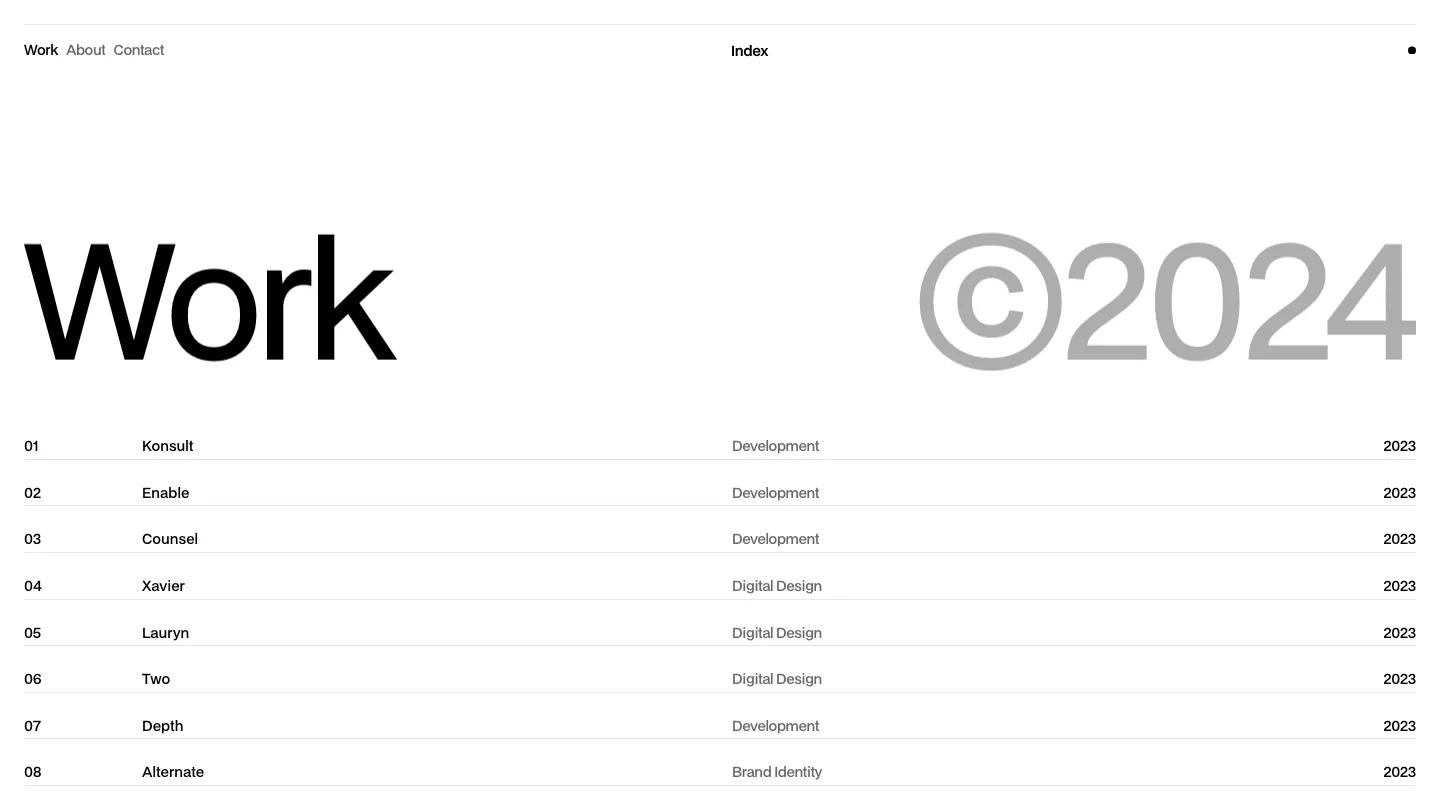
Index is about as stripped back as a portfolio gets, and that is exactly its appeal. There is no hero image and no tagline. The homepage opens on the word "Work" in giant black Bdogrotesk on the left, balanced by a copyright mark and year in the same size but in mid grey on the right. A thin rule runs across the top, with Work, About, and Contact in small text on the left, the wordmark centered, and a single black dot on the far right. It reads like a type specimen or a well-set catalog page.
Below the heading, Jacob Nielsen lays the projects out as a plain list, one row per project separated by hairlines, with a two-digit number, the project name, a discipline such as Development, Digital Design, or Brand Identity in grey, and the year aligned to the right edge. That list is essentially the whole homepage, and it fits in a single screen. The footer repeats the wordmark beside small links to a style guide, licenses, and a changelog. The About page keeps the system: an oversized About heading pushed to the right half, a short "We are Index" label, and a large photo running beside it.
On a phone, the list turns into stacked project cards, each with a grey-backed device mockup image above the number, name, discipline, and year, which actually makes the work easier to see than on desktop.
We'd pick Index for developers, freelance designers, and small studios who would rather let a tidy list do the talking. On desktop, visitors see names and categories rather than images, so the project titles need to be meaningful. The demo's About photo shows a letter board with a cheeky slogan, so swap it out unless that matches your tone.
Based on the live demo, viewed on desktop and on a phone. The Design and Dev scores come from separate independent reviews. See how we score templates.
Independently evaluated by our team of 6 designers and 5 developers.











Designers score design, developers score development, and each score is the average of their independent ratings. Read about our review team and how we score templates.