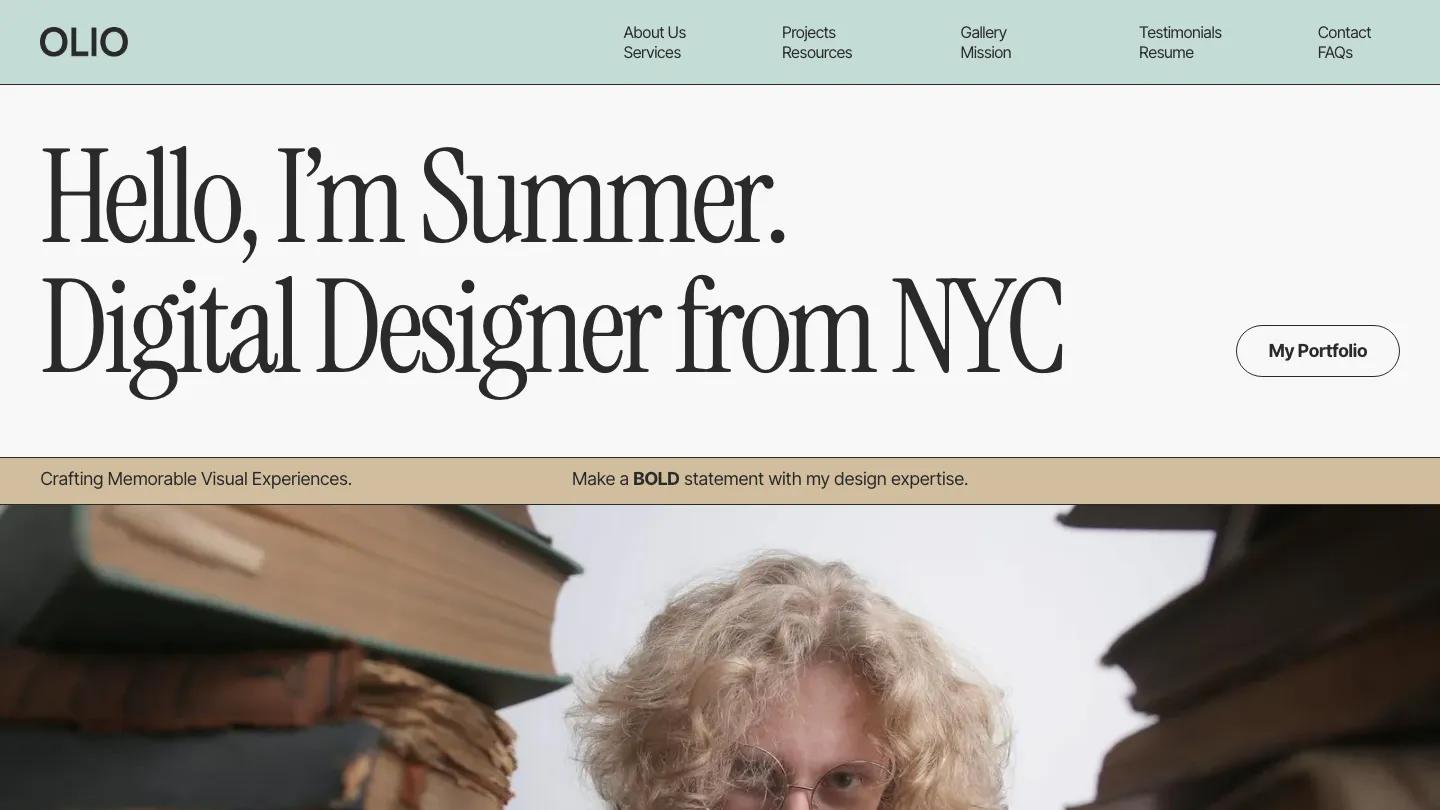
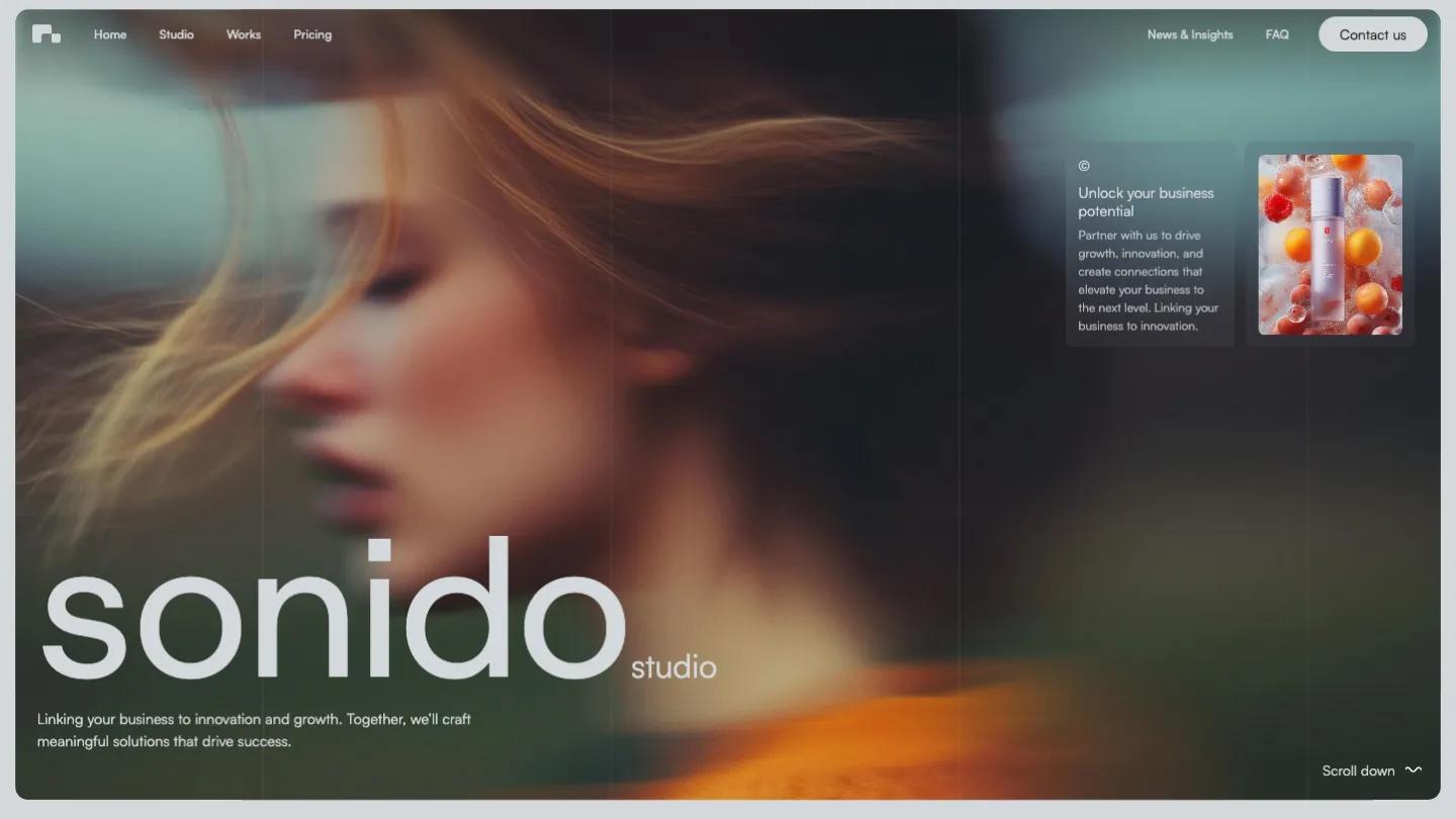
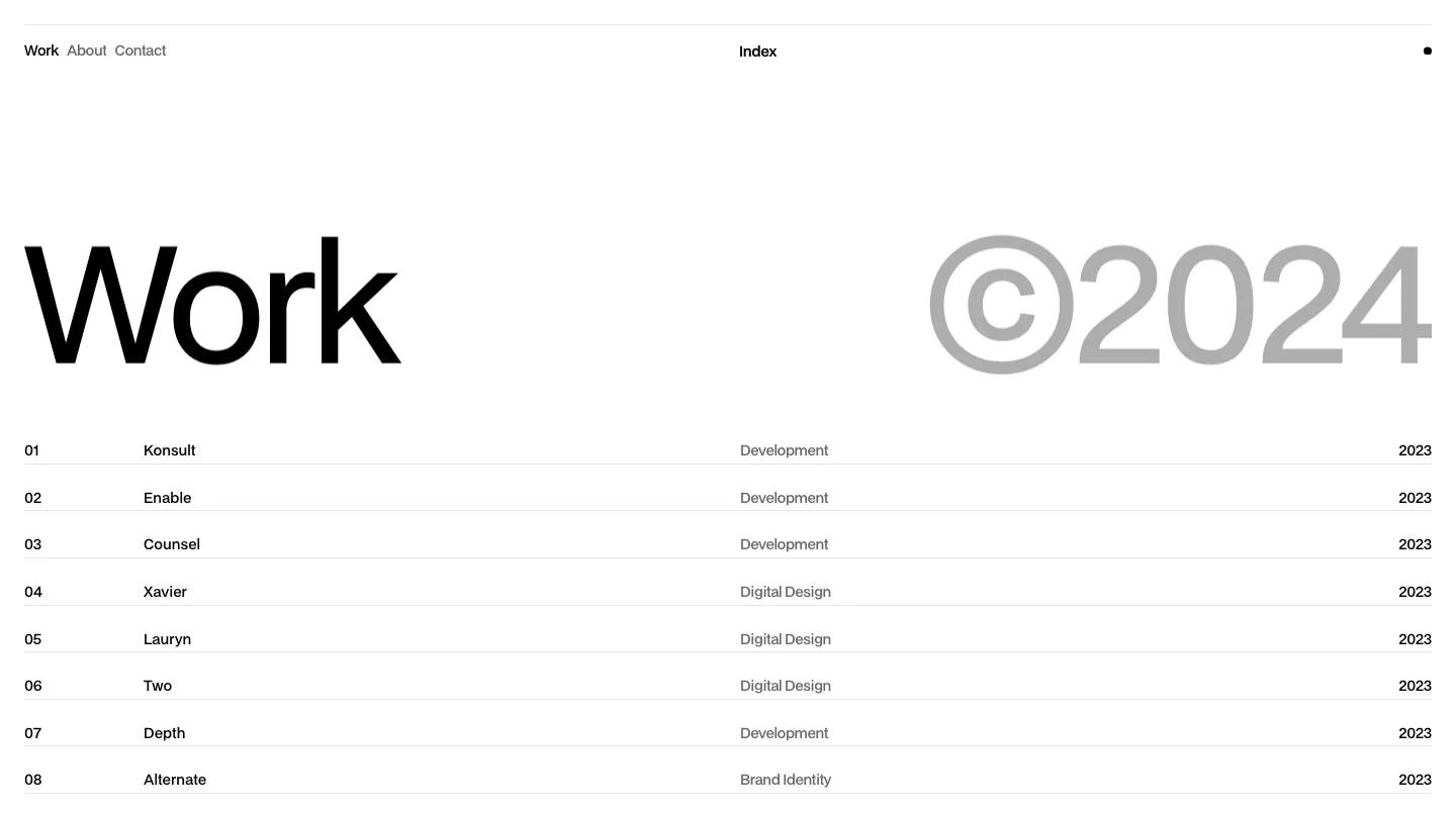
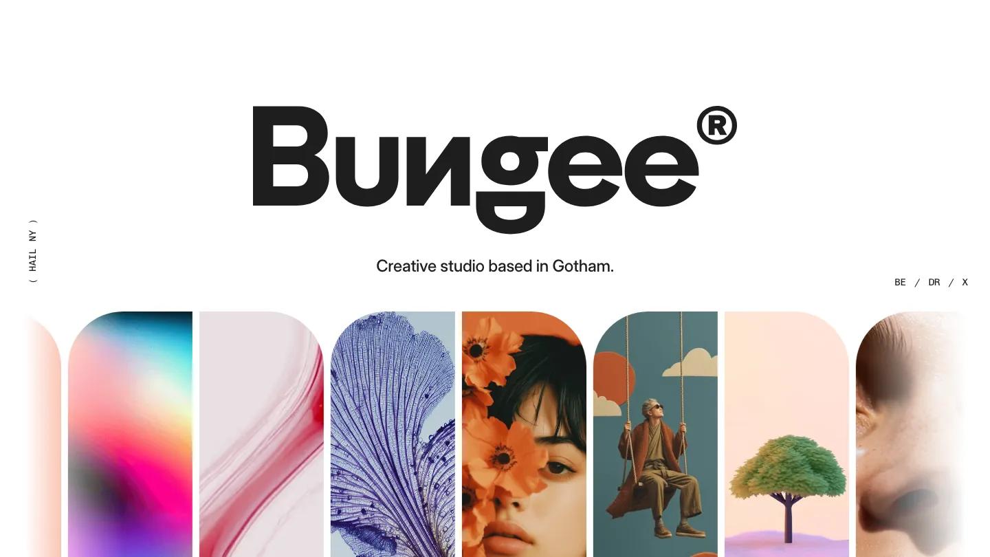
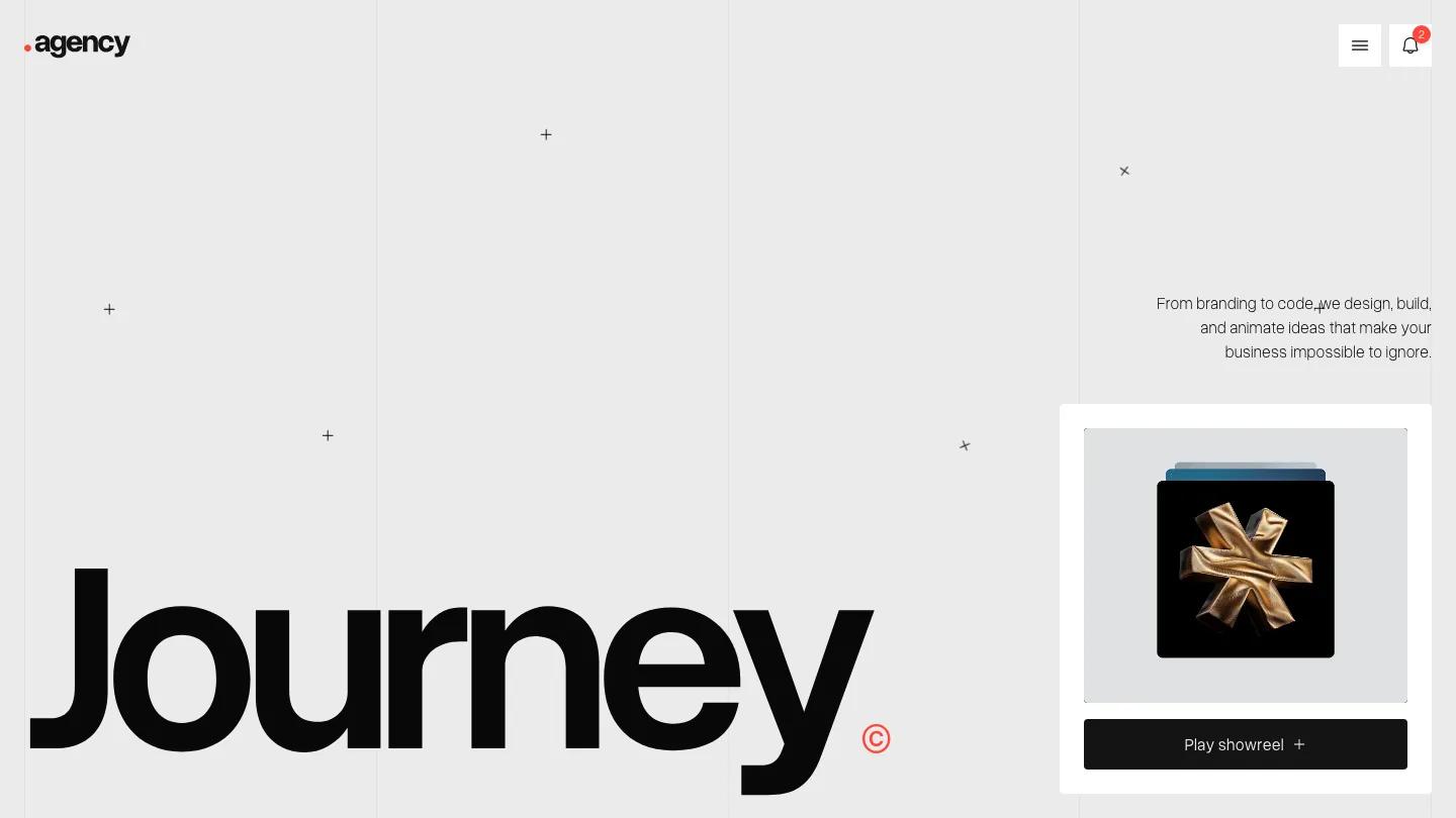
Portfolix is a high-quality Webflow template for Portfolio & Agency, Personal, Art & Design, Photography & Videography, Professional Services by Deveb.
Our Review of Portfolix
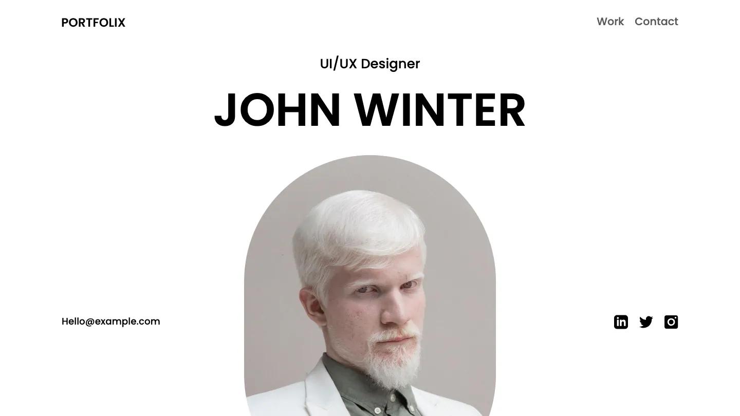
Portfolix is a bright, white-page portfolio built for one person who wants their name, face, and career on a single scroll. The first screen is almost formal. A short role line cycles between titles like UI/UX Designer and Photographer, the name below it is set in heavy black uppercase Poppins, and an arched portrait rises from the bottom of the screen. An email link and three social icons flank the photo. The header is equally spare: a Portfolix wordmark on the left, Work and Contact on the right.
Deveb lays the homepage out like a résumé with pictures. Project cards come first in a two-column grid, with generous rounded corners and colorful editorial portraits, each labeled with a number and title underneath. Work Experience and Education follow as long outlined rows, where a soft lilac gradient panel slides over the row to show the dates, company, and role. We like the Expertise section most: skills such as Product Design, Logo Design, and Mentoring sit in pale pill bars tinted lavender, sky blue, and peach, one tint per column. Below, a carousel of outlined testimonial cards ends in a View All button, and pastel Interests and Languages panels close the page. The Works page opens with a large scrolling Featured Works heading in alternating grey and black, then the same project grid.
On a phone, the arched portrait fills most of the screen, the name fits on one line, and email plus social icons collapse into one rounded bar beneath it.
We'd pick Portfolix for designers and photographers who want a clean, light résumé site with room for colorful work. Expect a rewrite: project names are placeholders, the experience rows hold dummy Latin, and testimonials credit famous brand names that should become your real clients.
Based on the live demo, viewed on desktop and on a phone. The Design and Dev scores come from separate independent reviews. See how we score templates.
Independently evaluated by our team of 6 designers and 5 developers.











Designers score design, developers score development, and each score is the average of their independent ratings. Read about our review team and how we score templates.