Symbol is a high-quality Webflow template for Portfolio & Agency, Personal, Professional Services, Art & Design, Photography & Videography by Versy Templates.
Our Review of Symbol
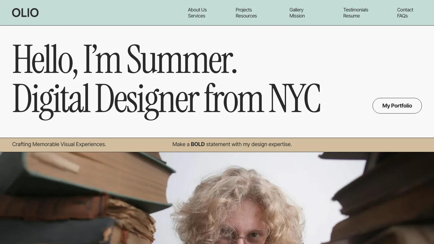
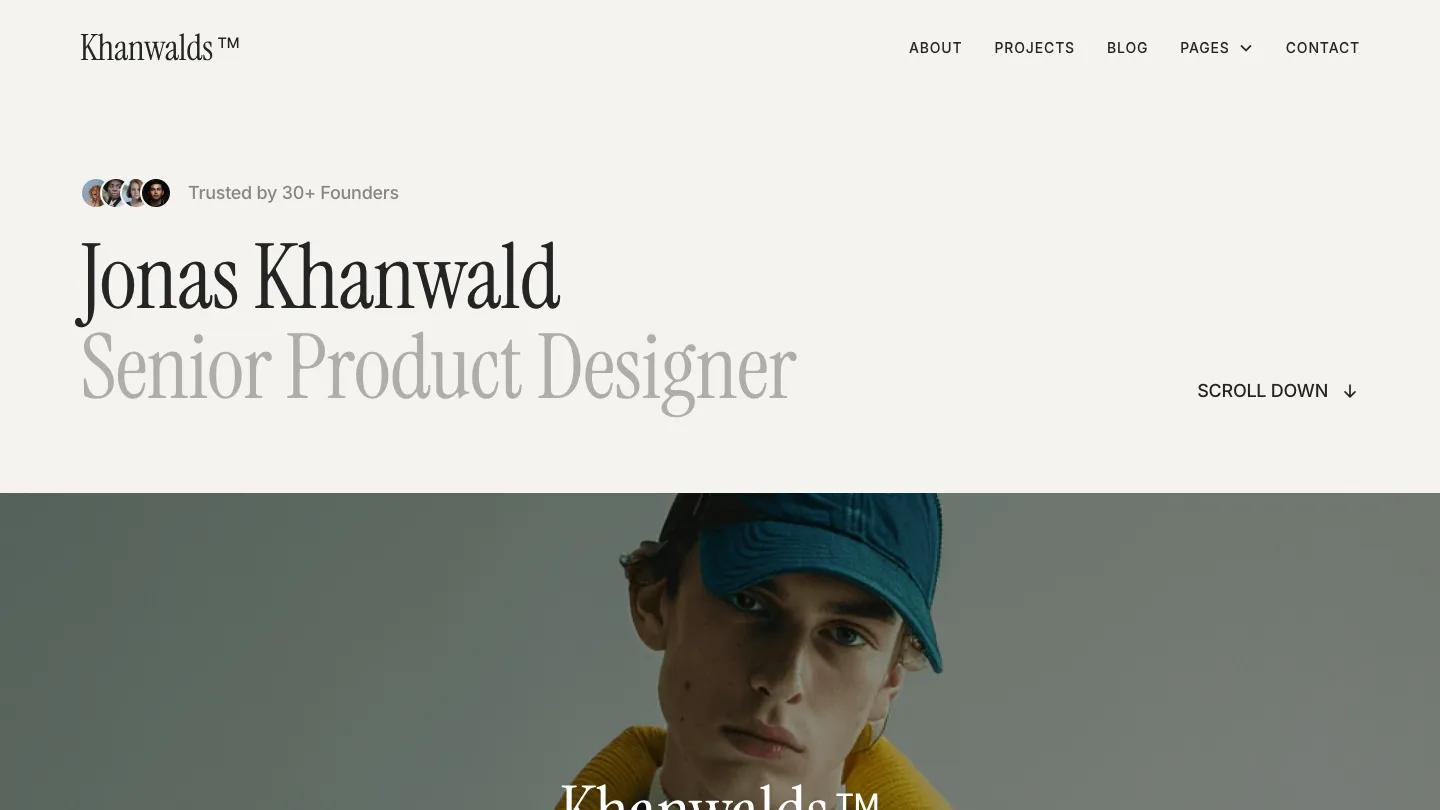
Symbol is a personal portfolio for a product or UX designer, and its charm comes from a single well-chosen typeface. The hero sets the designer's name in tall, condensed Instrument Serif in near black, with the job title directly beneath in the same face but soft grey, so the pair reads like a business card blown up to poster size. A row of small round client avatars with a short social proof line sits above, and a Scroll Down link with an arrow waits on the right. A full-width portrait with the wordmark laid over it follows. The palette is warm off-white, charcoal, and grey, and the header keeps About, Projects, Blog, a Pages dropdown, and Contact.
Versy Templates builds the homepage around Selected Works. Each project gets a wide photo with rounded corners, then a serif title, a one-line summary, and an underlined See Details link, with Year and Services listed in a narrow column on the right. A services section follows with UI/UX Design, Product Design, and Brand Identity heading short lists of skills, then testimonials in soft white cards with italic quotes, and a big centered Get in Touch with a Schedule a Call link. The About page pairs a tall rounded portrait with an [About] label, the name in large serif, and an introduction set in plain Inter.
On a phone, the name and title shrink but keep their black and grey contrast, the menu collapses to a hamburger, and the portrait banner stays full width with the wordmark centered.
We'd pick Symbol for a solo designer who wants a calm, editorial look without much setup. One demo project summary still trails off into placeholder filler, and the testimonials and client avatars are invented, so replace them with real ones before going live.
Based on the live demo, viewed on desktop and on a phone. The Design and Dev scores come from separate independent reviews. See how we score templates.
Independently evaluated by our team of 6 designers and 5 developers.











Designers score design, developers score development, and each score is the average of their independent ratings. Read about our review team and how we score templates.