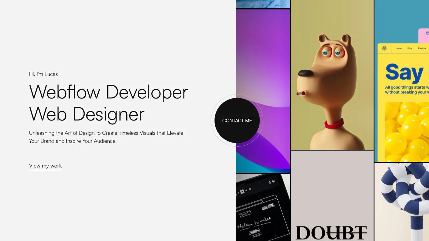
Kaito is a high-quality Webflow template for Portfolio & Agency, Personal, Art & Design, Photography & Videography, Professional Services, Business & Startup by Jacob Nielsen.
Our Review of Kaito
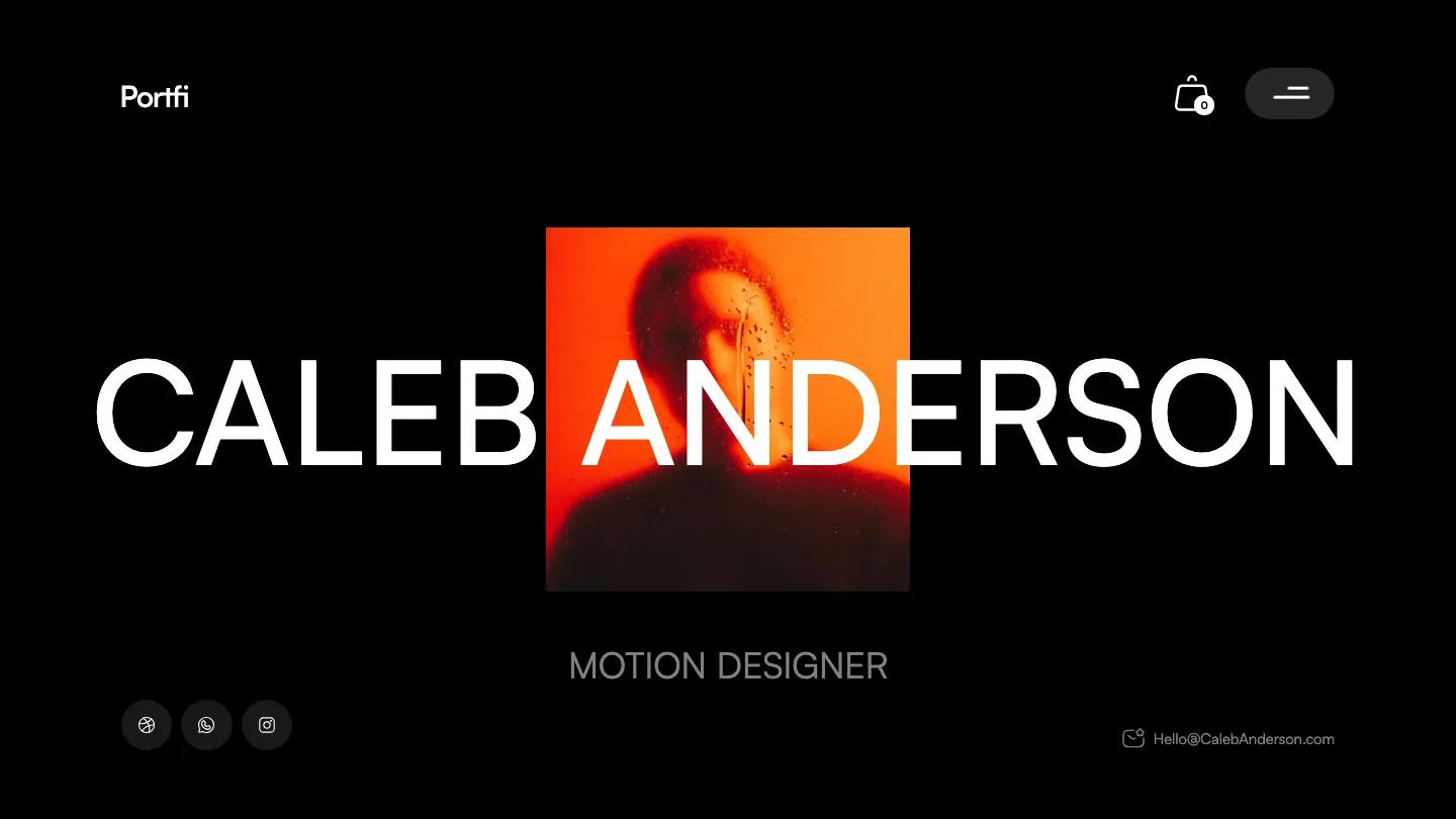
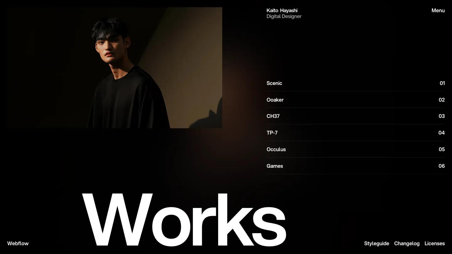
Kaito is a one-screen portfolio for a digital designer or art director, and it is about as stripped back as a Webflow site gets. Jacob Nielsen builds the whole homepage on black. A moody portrait sits in a framed rectangle at the top left, the designer's name and title stack in small white and grey Aspekta at the top right, and a single Menu link sits in the corner. Across the bottom, "Works" is set enormous in white, cropped by the edge of the screen, which gives the page its weight. A faint warm glow behind the type keeps the black from feeling flat.
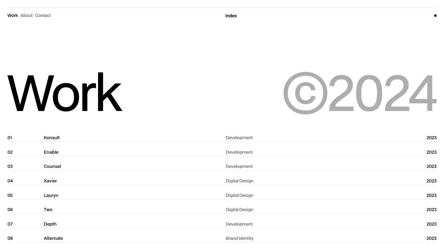
There are no sections to scroll through. The work lives in a numbered list on the right, project names like Scenic and Ooaker on the left of each row and 01, 02, and so on at the right, separated by hairline rules, so the homepage reads like a table of contents. Small footer links to the style guide, changelog, and licenses sit in the bottom corners. The About page keeps the same dark mood with a full-height portrait in the middle, a short bio beside an About label, and a large white statement about creating natural, thoughtful visuals set across the lower left, with a small Scroll cue in the corner.
On a phone, the portrait shrinks to a small thumbnail, Works becomes a normal heading, and the numbered list fills the screen with comfortable tap targets.
We'd pick Kaito for designers who want visitors to land straight on a project list without any pitch first. Everything hangs on one strong portrait and well-named projects, so short, memorable titles matter. We'd also check whether you need services or client sections, since the homepage has room for neither.
Based on the live demo, viewed on desktop and on a phone. The Design and Dev scores come from separate independent reviews. See how we score templates.
Independently evaluated by our team of 6 designers and 5 developers.











Designers score design, developers score development, and each score is the average of their independent ratings. Read about our review team and how we score templates.