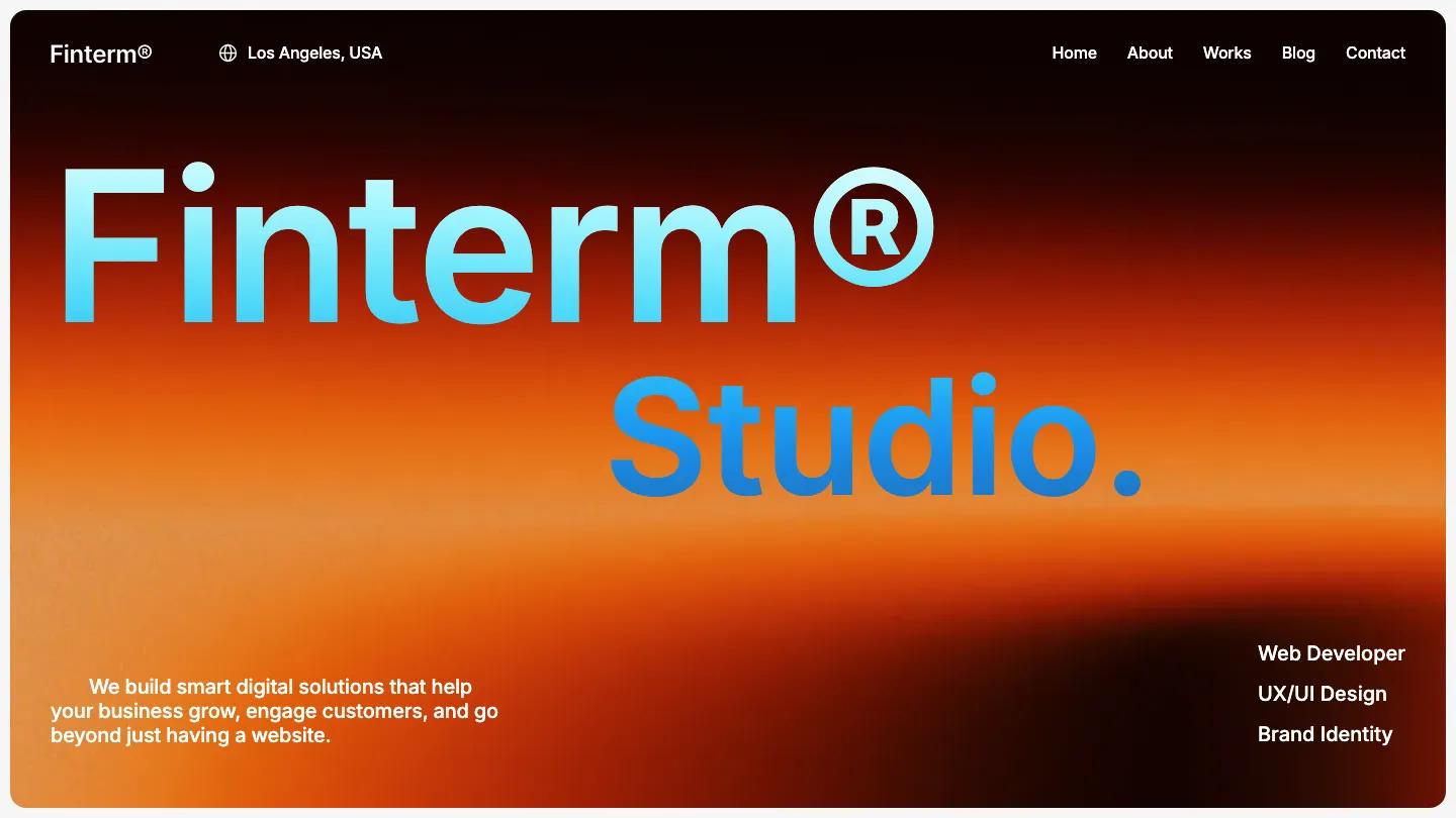
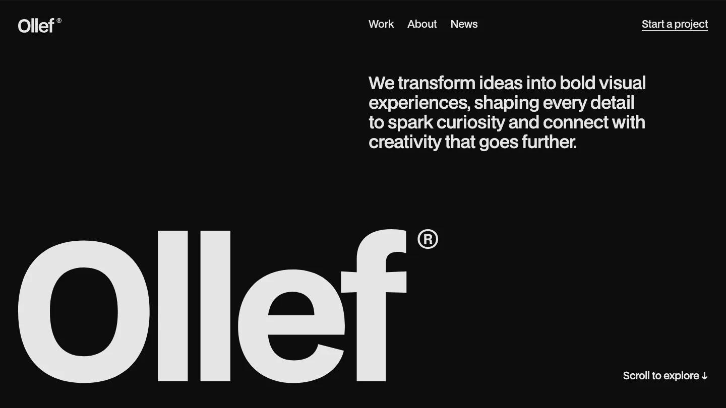
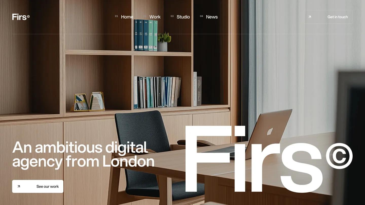
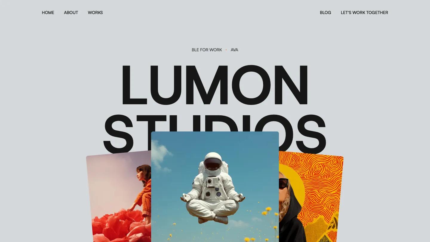
Sonido is a high-quality Webflow template for Portfolio & Agency, Professional Services, Business & Startup by Lucas Gusso.
Our Review of Sonido
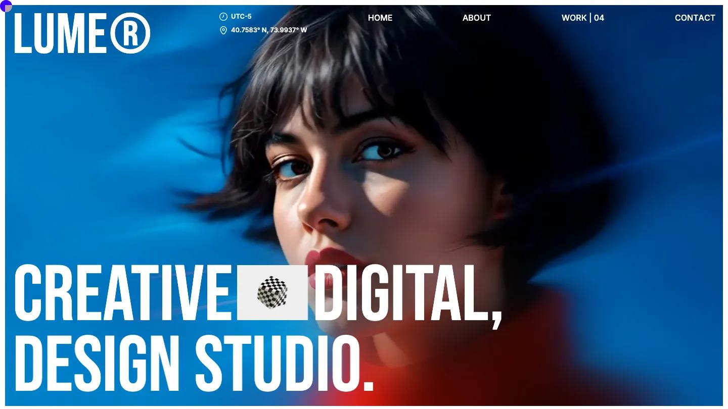
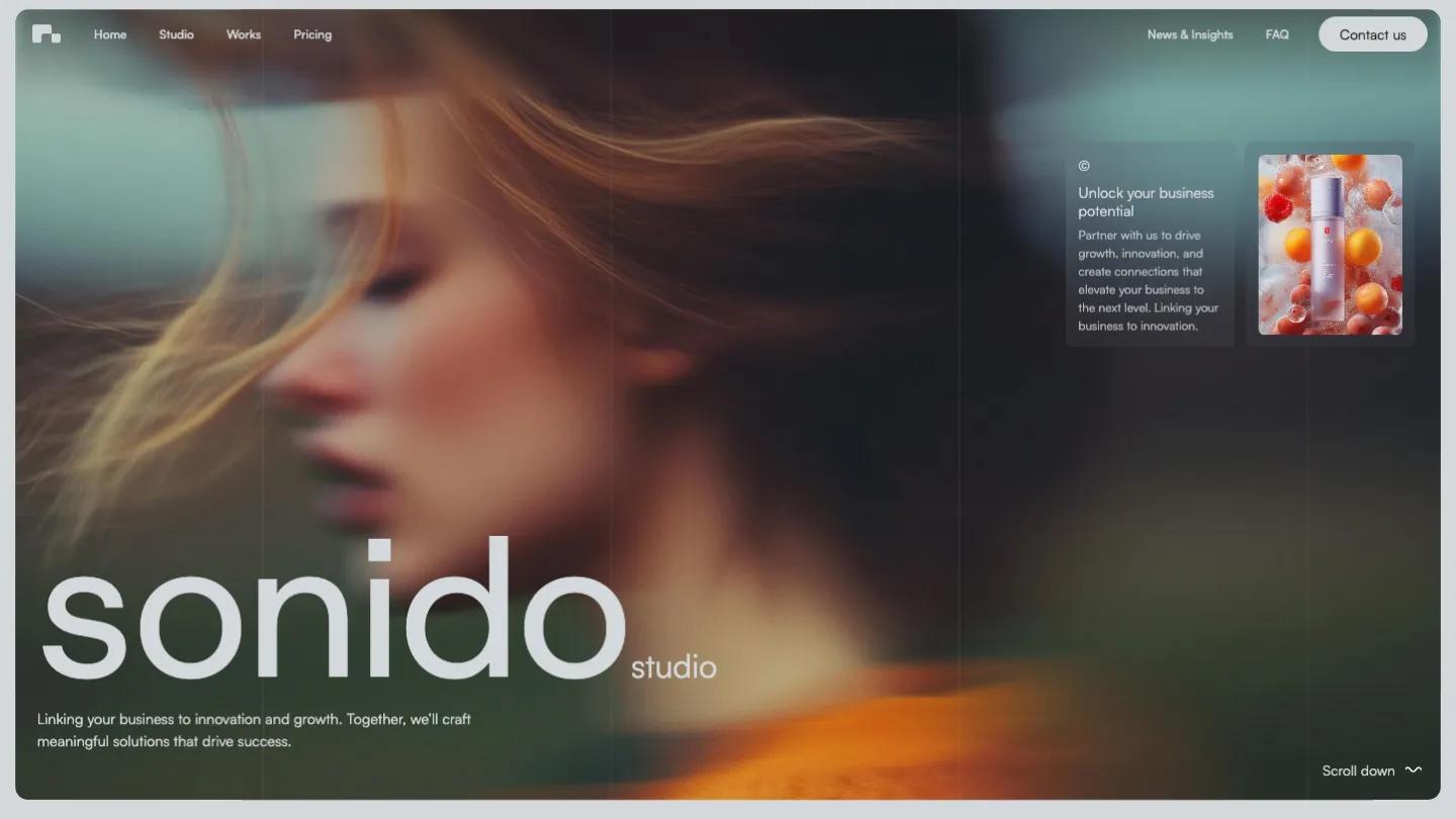
Sonido is built for design studios, creative agencies, and consultancies that want a typographic, motion-forward presence. The hero fills the screen with a blurred, cinematic photograph and oversized lowercase type spelling out "sonido studio", followed by a tagline. The palette is neutral, leaning on soft grays and whites with occasional pops of color in project cards. The homepage uses large type for section headings and the layout breathes with generous whitespace between blocks.
The demo includes home, studio (about), works, pricing, a blog section called news and insights, an FAQ, and a contact page. The works page is CMS-driven, showing project cards with logos and placeholder names like Botic, Space, Run, and Circle. The homepage scrolls through sections on process, a logo grid, a testimonial carousel with star ratings and attributed quotes, team member cards with photos and names, four stat blocks, a pricing card for a monthly design subscription with a feature list and a call booking button, and a blog preview with three posts. Scroll effects and 3D transforms animate elements as you move down the page, and the template includes a 404 page and a style guide.
The mobile view keeps the same cinematic hero image and stacks the large wordmark vertically. The hamburger menu sits in the top right, and the card-based layout adapts cleanly, though the heavy reliance on large images means you'll need to source or commission photography that matches the cinematic quality of the hero.
We like Sonido for studios that want a portfolio and service site in one package, with room for blog content and pricing tiers. The motion and type give it personality, but the demo's placeholder project names and generic testimonials mean you'll need to invest setup time replacing them with real case studies and client stories that carry the same weight the design expects.
Based on the live demo, viewed on desktop and on a phone. The Design and Dev scores come from separate independent reviews. See how we score templates.
Independently evaluated by our team of 6 designers and 5 developers.











Designers score design, developers score development, and each score is the average of their independent ratings. Read about our review team and how we score templates.