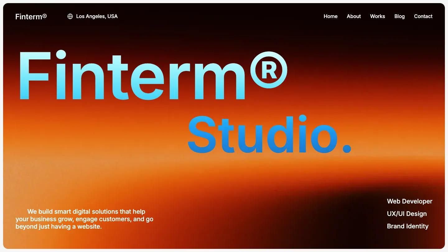
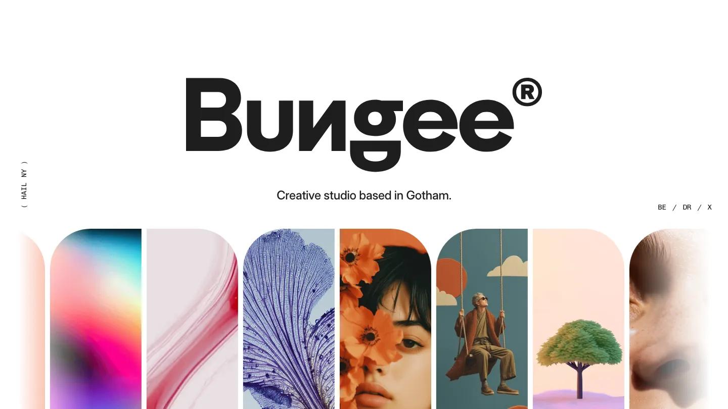
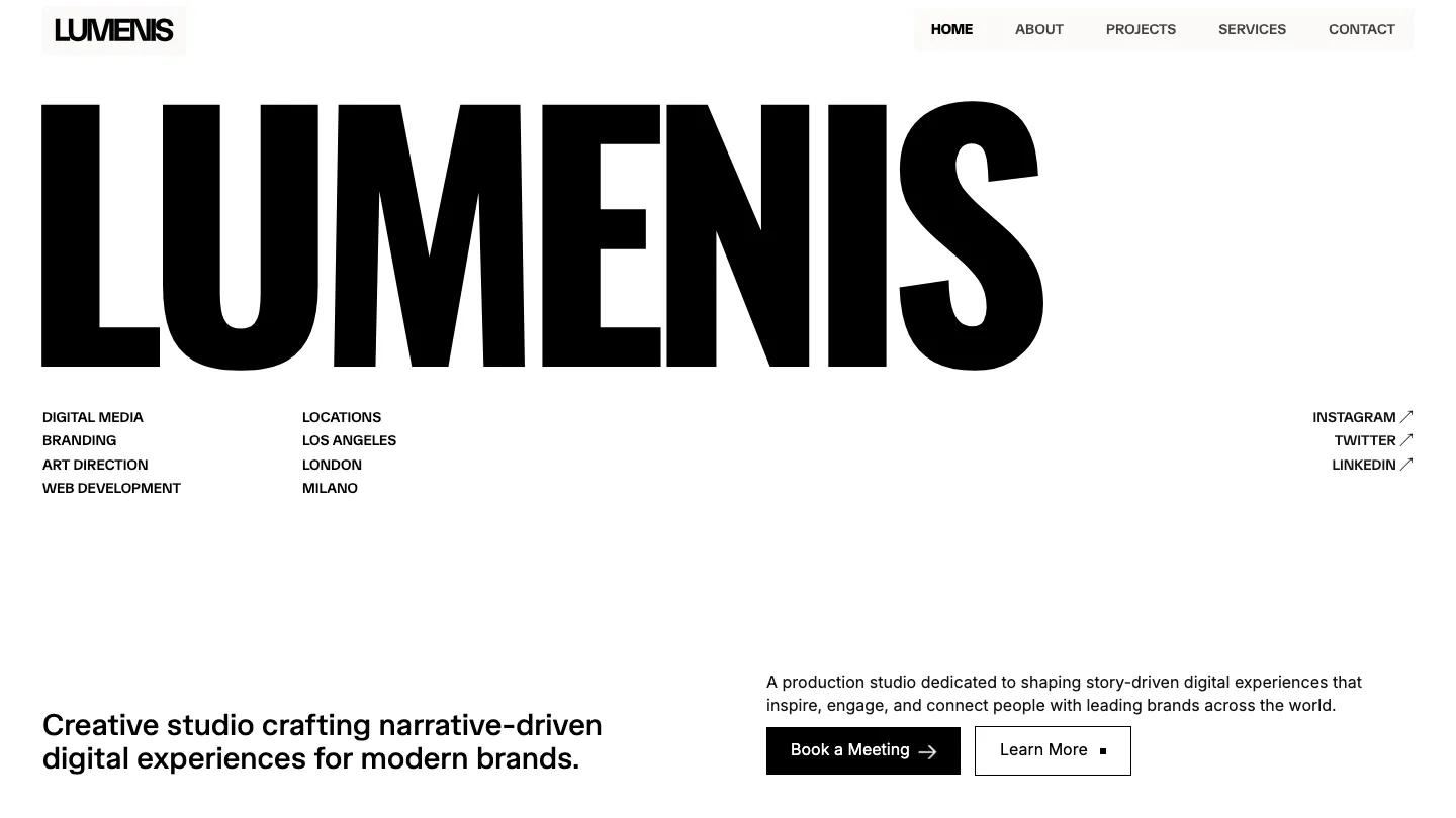
Studio Verno is a high-quality Webflow template for Portfolio & Agency, Professional Services, Art & Design, Business & Startup, Personal, Photography & Videography by Outer Studio.
Our Review of Studio Verno
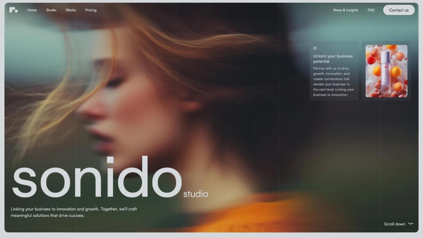
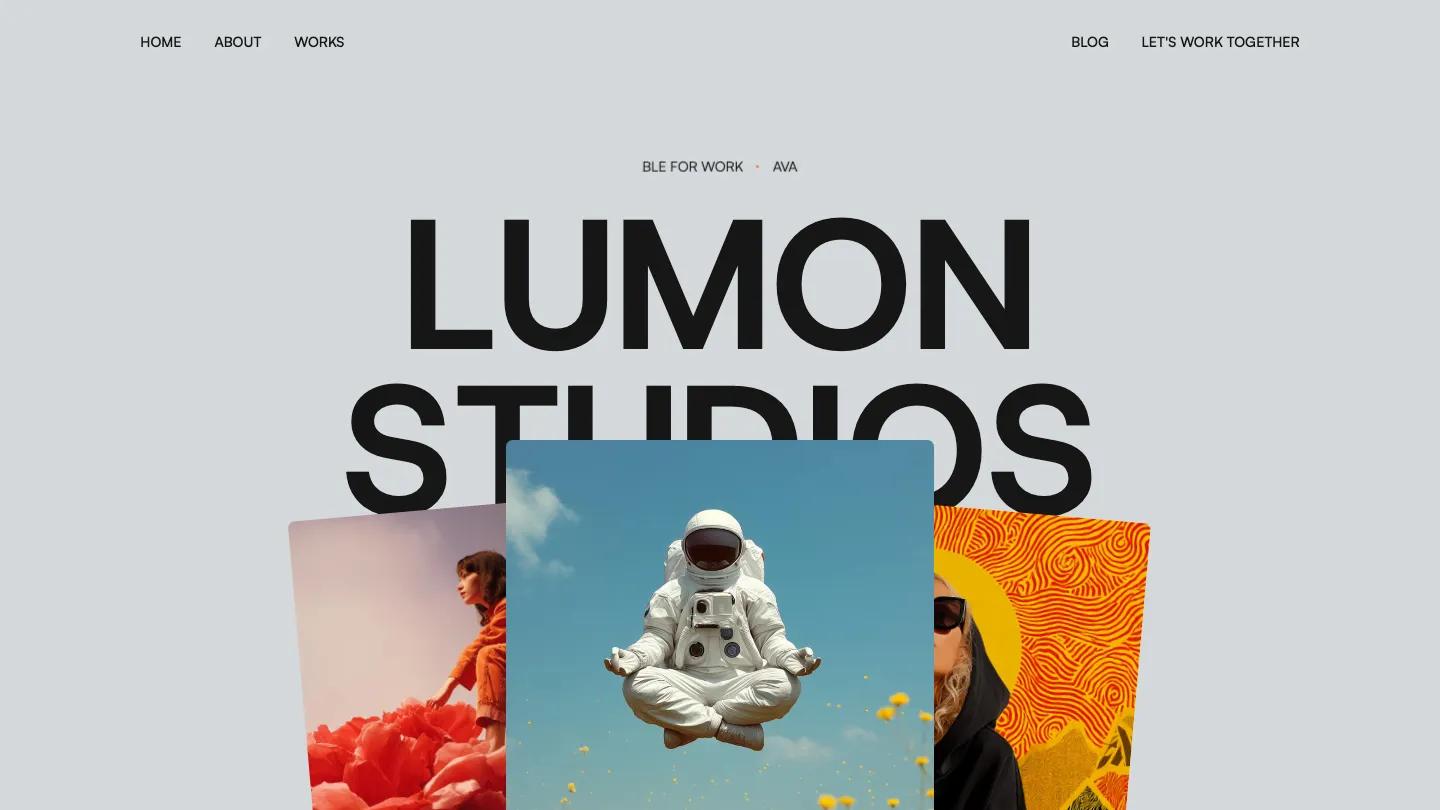
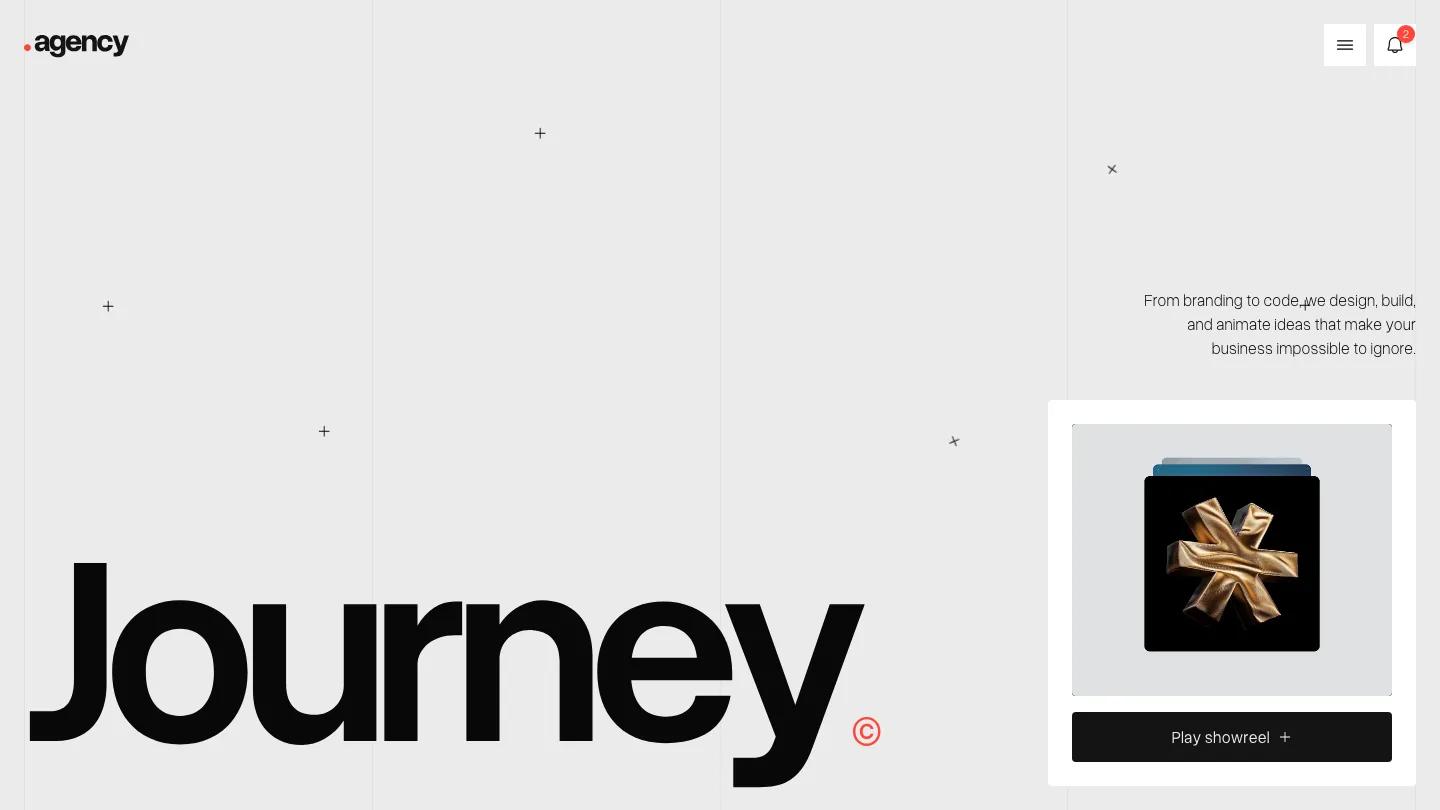
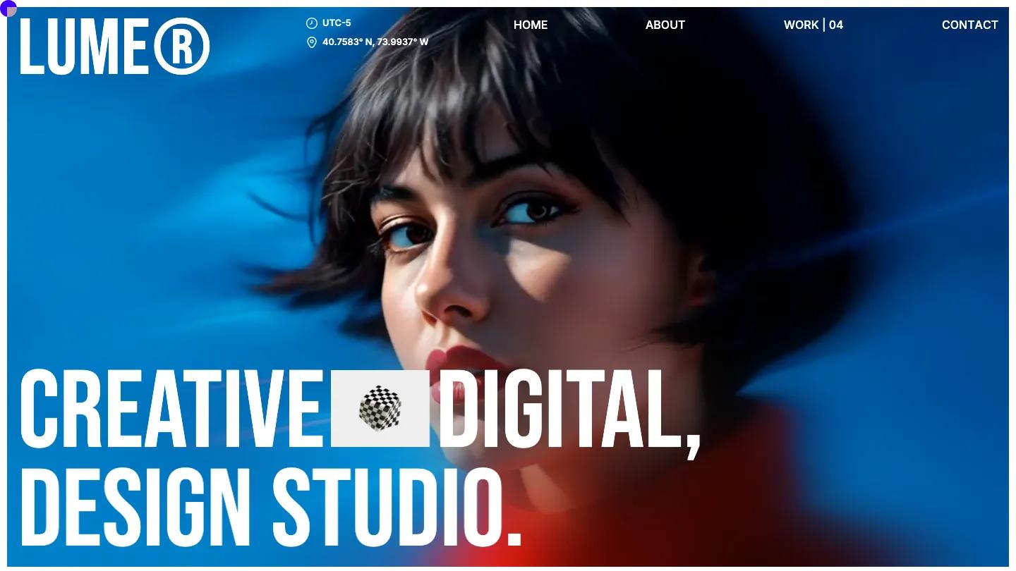
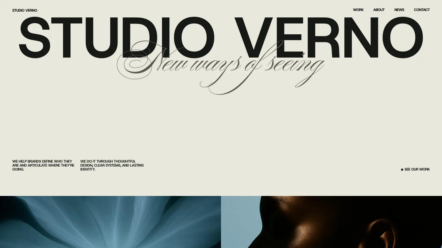
Studio Verno opens with a bold typographic statement: the studio name set in oversized black sans-serif against a warm beige background, with a delicate script tagline reading "new ways of seeing" layered underneath. The hero uses scale and restraint to set a confident, editorial tone. The palette is mostly neutral beige and off-white with black type, punctuated by rich photography that includes close-up florals, abstract motion blur, and textured portraits. The typeface is Host Grotesk throughout, and the layout relies on generous whitespace, large headings, and asymmetric text blocks that feel more like a design manifesto than a typical agency site.
The template includes work, about, news, and contact pages. The work page displays project thumbnails in a two-column grid with category labels and year tags, and each project opens to a detail view. The about page features a large statement heading and body copy paired with full-width imagery. The news section uses a CMS-driven blog layout with article cards showing featured images and titles. The demo also includes a 404 page, a license page, a style guide, and a changelog. We like the typographic confidence and the way the layout lets photography breathe, but the design leans heavily on strong imagery, so you'll need high-quality photos to match the demo's impact. The mobile view keeps the bold type hierarchy intact, stacking elements vertically and collapsing navigation to a hamburger menu.
Studio Verno works well for design studios, branding agencies, or creative consultants who want a portfolio site that feels more like a visual identity than a service brochure. The main trade-off: the template doesn't include service detail pages, team profiles, or case study templates with process sections, so you'll need to build those layouts yourself if your work requires that depth.
Based on the live demo, viewed on desktop and on a phone. The Design and Dev scores come from separate independent reviews. See how we score templates.
Independently evaluated by our team of 6 designers and 5 developers.











Designers score design, developers score development, and each score is the average of their independent ratings. Read about our review team and how we score templates.