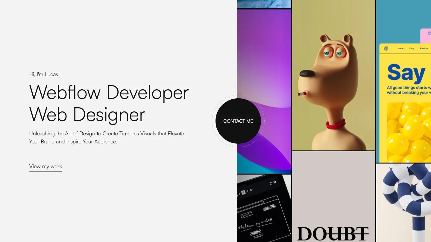
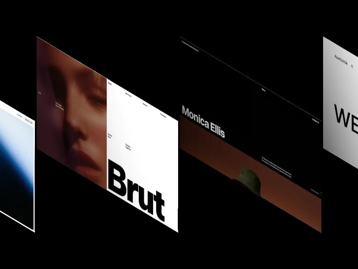
Okocha is a high-quality Webflow template for Portfolio & Agency, Personal, Art & Design, Photography & Videography, Professional Services by Chico.
Our Review of Okocha
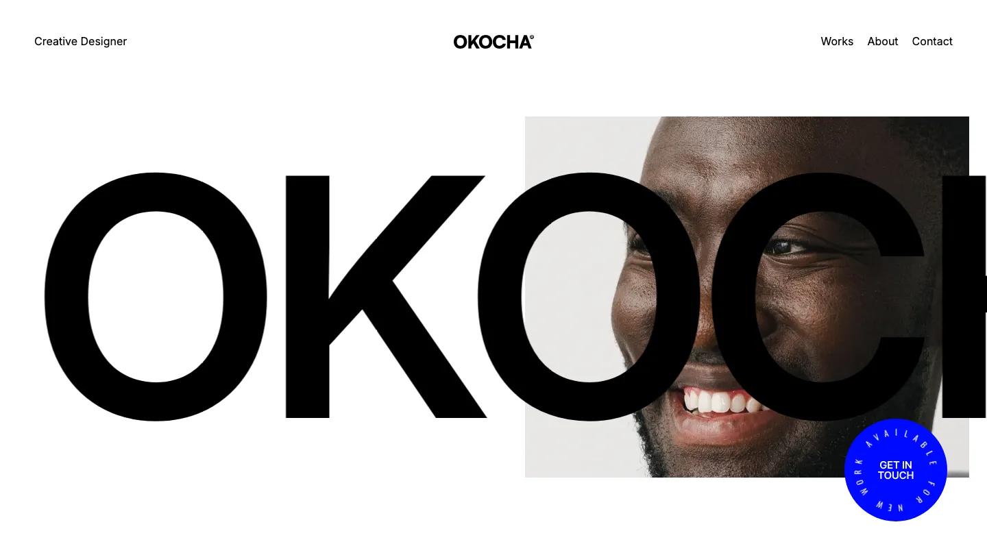
Okocha is a portfolio for a solo creative, and it introduces that person in the boldest way it can. The name runs across the hero in black Inter at billboard size, and the letters overlap a cropped portrait so the face shows through the second O. A round electric blue badge reading Get in Touch sits in the corner, with "available for new work" set in a ring around its edge. Everything else stays quiet: a white page, a short Works, About, Contact menu, and "Creative Designer" tucked into the top left.
Below the hero, Chico lets the work do the talking. Selected Works gives each project a full-width image with its title, year, and discipline underneath, so a case like Fruits & Colors reads as a clean caption rather than a boxed card. A row of square Experiments tiles runs edge to edge further down, a good home for side projects and quick studies. The Works page repeats the oversized heading, sets the cases in an offset two-column grid, and links each one to its own case study page.
On a phone, the portrait fills the screen, the wordmark crops to its first letters, and the blue badge stays in view. The intro paragraph is justified, though, and at that width it opens wide gaps between words. We'd switch it to left-aligned.
We'd pick Okocha for designers, art directors, and photographers with a short name and strong visuals. A long name won't sit in the hero the same way, and the layout only works with bold, high-quality images. There's no services or blog page either, so it suits a body of work more than a studio pitch.
Based on the live demo, viewed on desktop and on a phone. The Design and Dev scores come from separate independent reviews. See how we score templates.
Independently evaluated by our team of 6 designers and 5 developers.











Designers score design, developers score development, and each score is the average of their independent ratings. Read about our review team and how we score templates.