MorrisFolio is a high-quality Webflow template for Portfolio & Agency, Art & Design, Personal, Business & Startup, Professional Services by Slate Dept.
Our Review of MorrisFolio
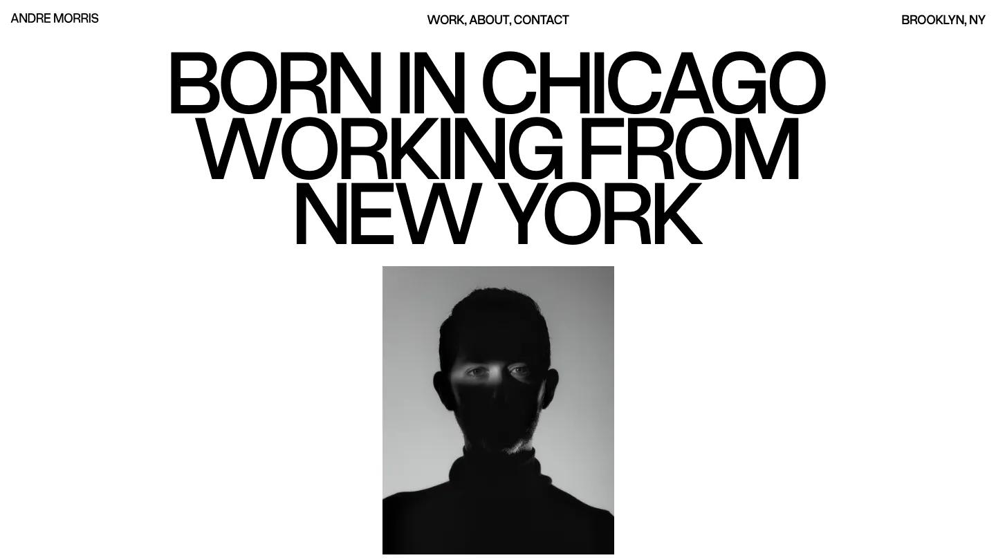
MorrisFolio is a stark, all-caps personal portfolio in black and white, set entirely in Overused Grotesk. The hero is pure typography: "Born in Chicago, working from New York" stacked in huge uppercase lines that reveal one after another, with a tiny header holding the designer's name on the left, Work, About, and Contact as one comma-separated line in the middle, and the neighborhood on the right. No image, no button, just the sentence.
Slate Dept lets the projects take over from there. A Recent Work heading splits its two words to opposite edges, then each project fills the whole screen as a moody monochrome image of packaging, print, or embossed stationery, with a small discipline label and the project name centered at the bottom and a round white View button that follows the cursor. The Work page is a neat archive: "Our Work" with a bracketed year range, then every project as a row with the name in large caps, the discipline, and the date, divided by thin rules. A Ready to Start a Project prompt closes the homepage.
On a phone, the full-screen project images and centered labels work well once you scroll. The opening is the weak spot, though: when we loaded it, the headline was still faint and the screen mostly blank several seconds in, while the reveal animation played.
We'd pick MorrisFolio for brand, packaging, and editorial designers with a strong, consistent visual style. The design is deliberately colorless, so it flatters black and white or muted work most. We'd shorten the intro animation on mobile so visitors don't land on an empty screen.
Based on the live demo, viewed on desktop and on a phone. The Design and Dev scores come from separate independent reviews. See how we score templates.
Independently evaluated by our team of 6 designers and 5 developers.











Designers score design, developers score development, and each score is the average of their independent ratings. Read about our review team and how we score templates.