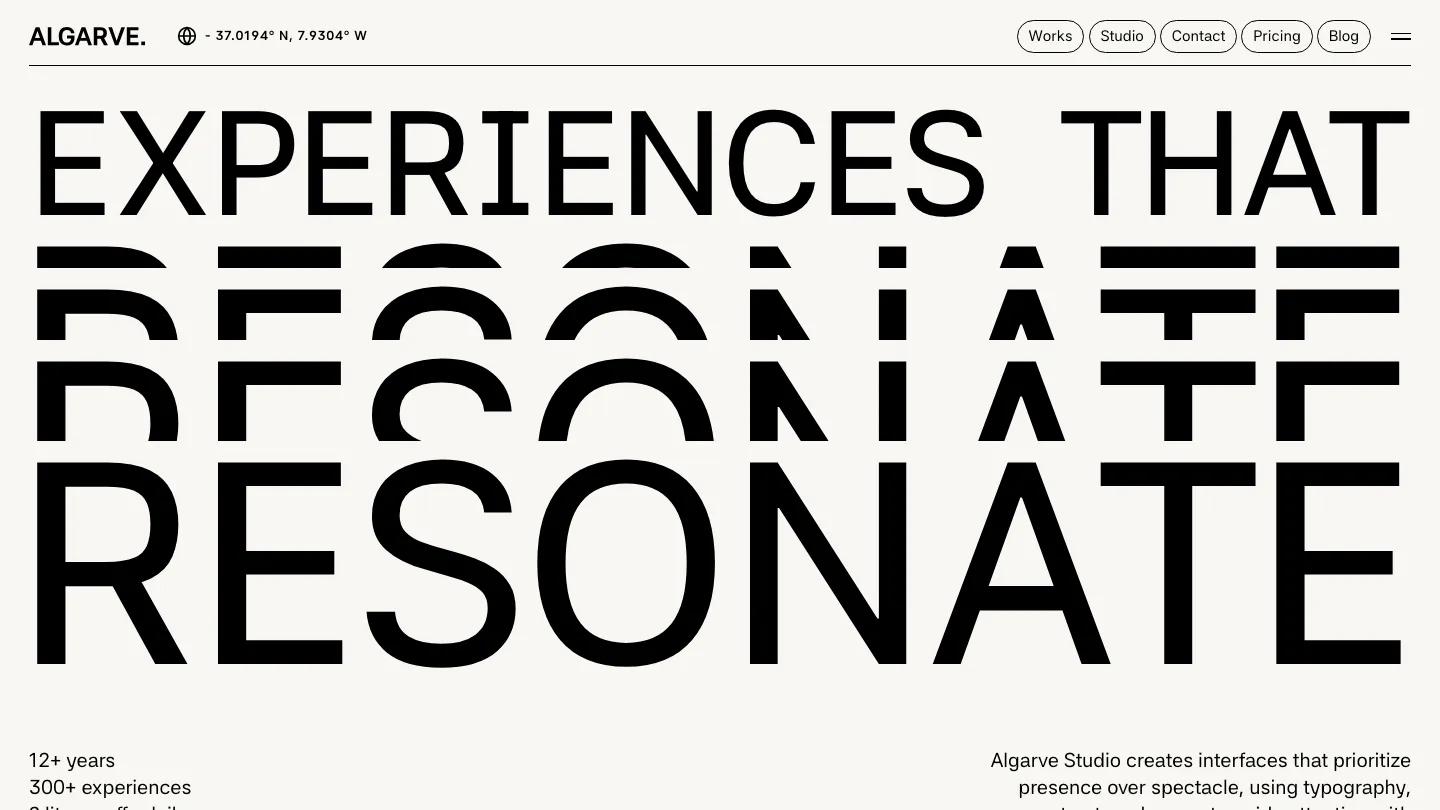
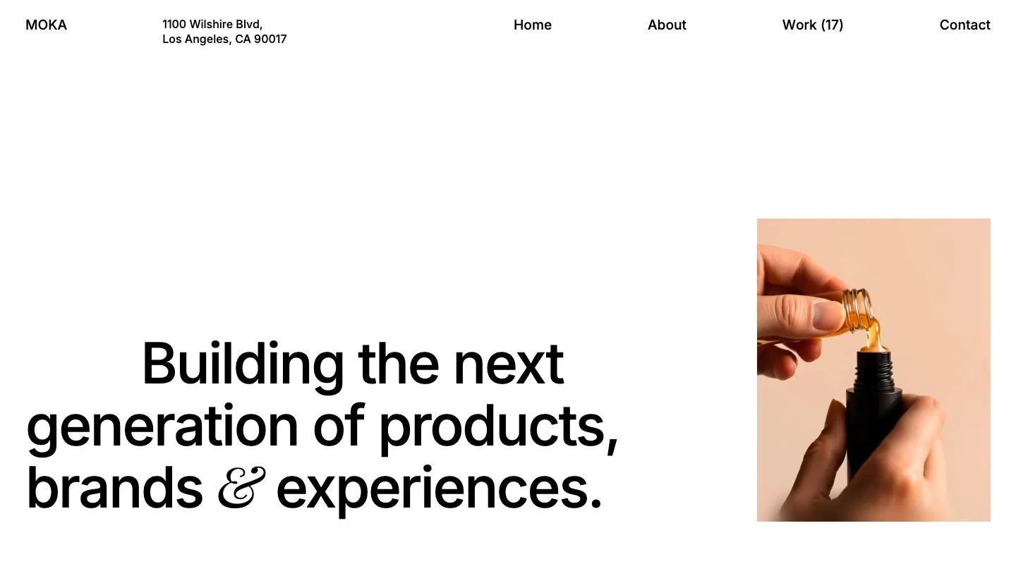
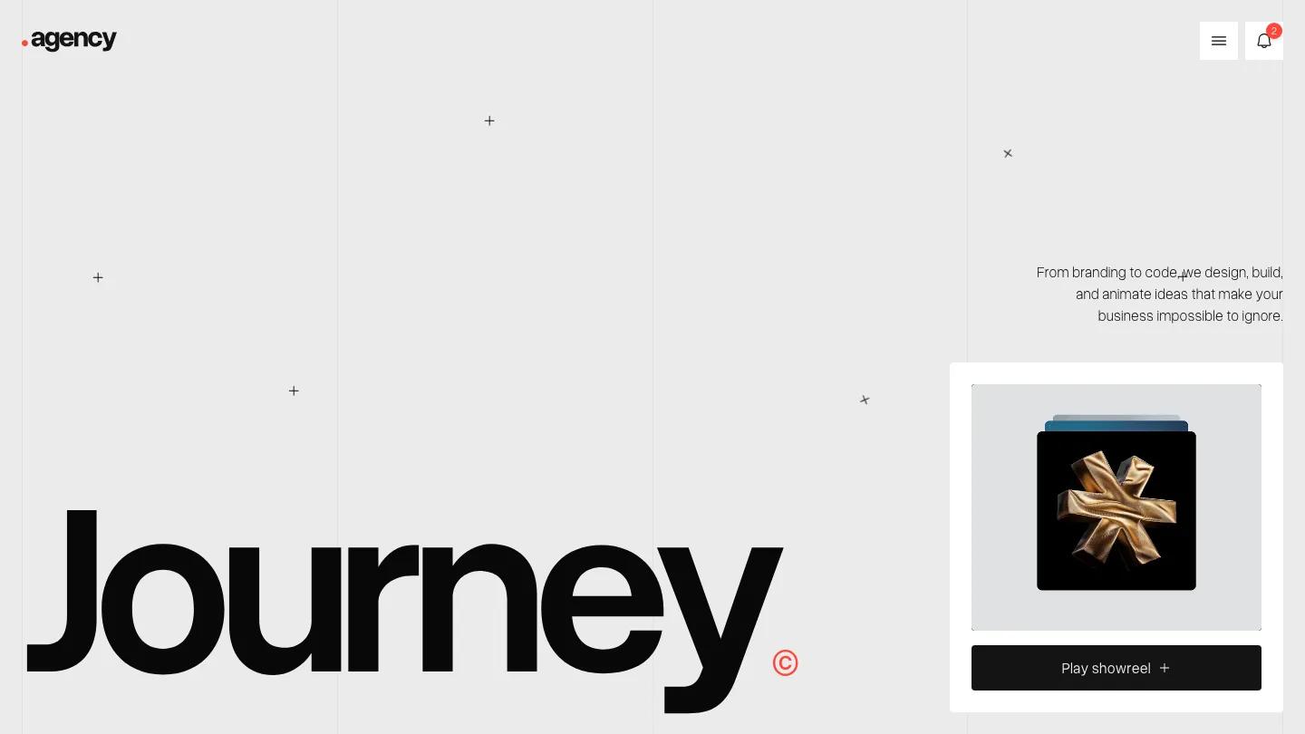
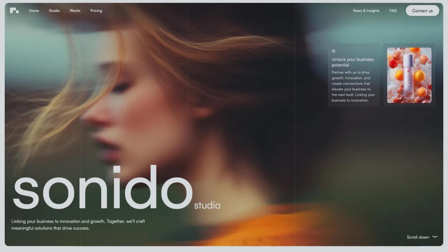
Finterm is a high-quality Webflow template for Portfolio & Agency, Business & Startup, Professional Services, Art & Design, Photography & Videography by Flow Nija.
Our Review of Finterm
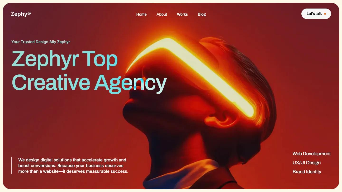
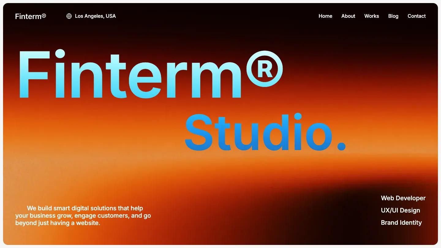
Finterm is a studio site for small design and web agencies, and the hero is the loudest part of an otherwise calm page. A rounded panel glows with a grainy orange and black gradient, and "Finterm® Studio." sits on it in big Inter, the name fading from pale cyan to blue. A short pitch line sits bottom left, three services stack bottom right, and the top bar keeps a globe icon with Los Angeles, USA beside the name and Home, About, Works, Blog, and Contact on the right.
Below the hero, Flow Nija switches to a light grey page with a clear rhythm: every section opens on a thin rule with a small label, a (Top - 25) tag, and a section number, then a huge black heading. A row of white client logo tiles comes first, then Selected Work in a two-column grid of project photos with year and service pills. Benefit mixes bento cards, one with client avatars orbiting the studio name and another a dark checklist with star bullets. Stat cards sit next to a black and white portrait, then a dark testimonial slider, a Services accordion on black, Pricing, an FAQ of white question cards with plus icons, and Article cards with Branding or Marketing pills. The About page opens with About and Studio. on either side of a rounded silhouette photo on yellow.
On a phone, the gradient panel keeps its rounded corners, the headline stays on two lines, and the services list moves under the pitch.
We'd pick Finterm for freelancers and small agencies who want a tidy, sectioned homepage with one bold color moment. The client logos are placeholders, and the testimonial and stat figures are demo text, so plan to replace them with real work before launch.
Based on the live demo, viewed on desktop and on a phone. The Design and Dev scores come from separate independent reviews. See how we score templates.
Independently evaluated by our team of 6 designers and 5 developers.











Designers score design, developers score development, and each score is the average of their independent ratings. Read about our review team and how we score templates.