12 Best Personal Website Templates for Webflow and Framer (2026)

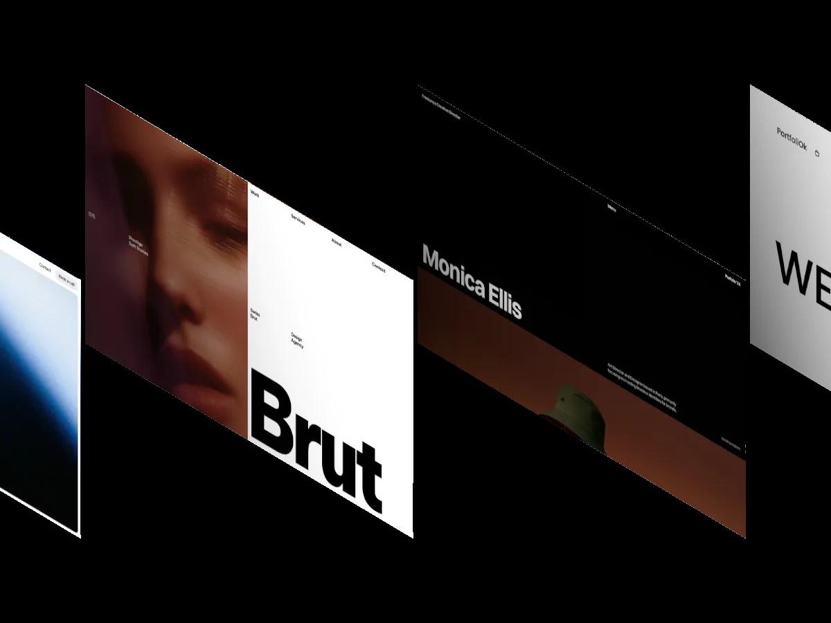
We have scored 329 templates with the Personal tag. These 12 personal website templates are genuinely built around one person, with a name-led hero, real about sections and a clear contact path. Two are free.
A personal website has one job that a studio site doesn't: it has to sound and look like one specific person. A lot of personal website templates miss that. They're agency templates with the logo swapped for a name, and you find out three pages in that the layout expects a team grid, a careers page and six service tiers you'll never fill.
We've scored 329 templates in our library that carry the Personal tag, across Webflow, Framer and Shopify. The 12 below are the strongest ones that are genuinely built around an individual: a name in the hero, an about or CV section with substance, and a clear way to get in touch. They're ranked by Overall Score, and two of them are free.
What Makes a Good Personal Website Template
A personal website template should put the person first and the portfolio second. That means a hero that can hold your name or a short statement, an about page with room for experience, clients or a bio, and a contact path that works without extra building. Everything else is optional.
Four checks save the most time when you open a demo:
- Name length. Several templates on this list set the owner's name at billboard size. A short name looks deliberate; a long one can wrap awkwardly or crop on a phone.
- About and CV depth. Some templates ship a proper experience table with dates and roles. Others give you two paragraphs and a photo.
- Writing. If you plan to publish notes or articles, check for a CMS blog. Fewer than half of the personal templates in our library include one (126 of 329).
- One page or several. A single long scroll suits freelancers who want every answer in one place. Separate pages suit people with a deep archive of work.
On platforms: Framer dominates this category with 230 of the 329 templates, and it's the natural home for a small, motion-led personal site you can launch in a weekend. Webflow has 98, and it's the better choice if your site will grow into a large archive or a regular blog. Shopify has exactly one, Exposure (Design: 7.0/10, Dev: 8.5/10, $350), which only makes sense if your personal site is mainly a shop. Browse them all on our personal website templates page, or by platform on Framer and Webflow.
The 12 Best Personal Website Templates, Ranked
Every entry links to its review page, where a screen recording of the full homepage plays beside the score breakdown.
MOSS
Design: 9.8/10
Dev: 9.7/10
Price: $49
Best for: designers and developers who want a calm, type-led personal site with a notes blog and nothing they won't use
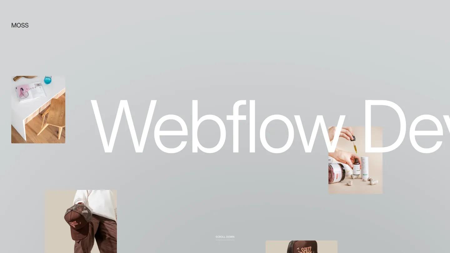
The highest scoring template in our library with a Personal tag, MOSS reads like a well-kept personal archive. The hero sets the owner's role in huge white type on soft gray, with a few small images floating at the edges, and one sans-serif carries every line on the site. A notes section gives you a home for short writing with dates, which suits people who think out loud.
Projects and notes both run through the CMS, each with detail pages, and a contact form ships ready.
Worth knowing: the demo's monochrome art direction flatters strong photography, so check that your images carry the same weight in grayscale-heavy layouts.
Olyver
Design: 9.6/10
Dev: 9.7/10
Price: Free
Best for: creative directors and product designers who want a free personal site that treats their name as the identity
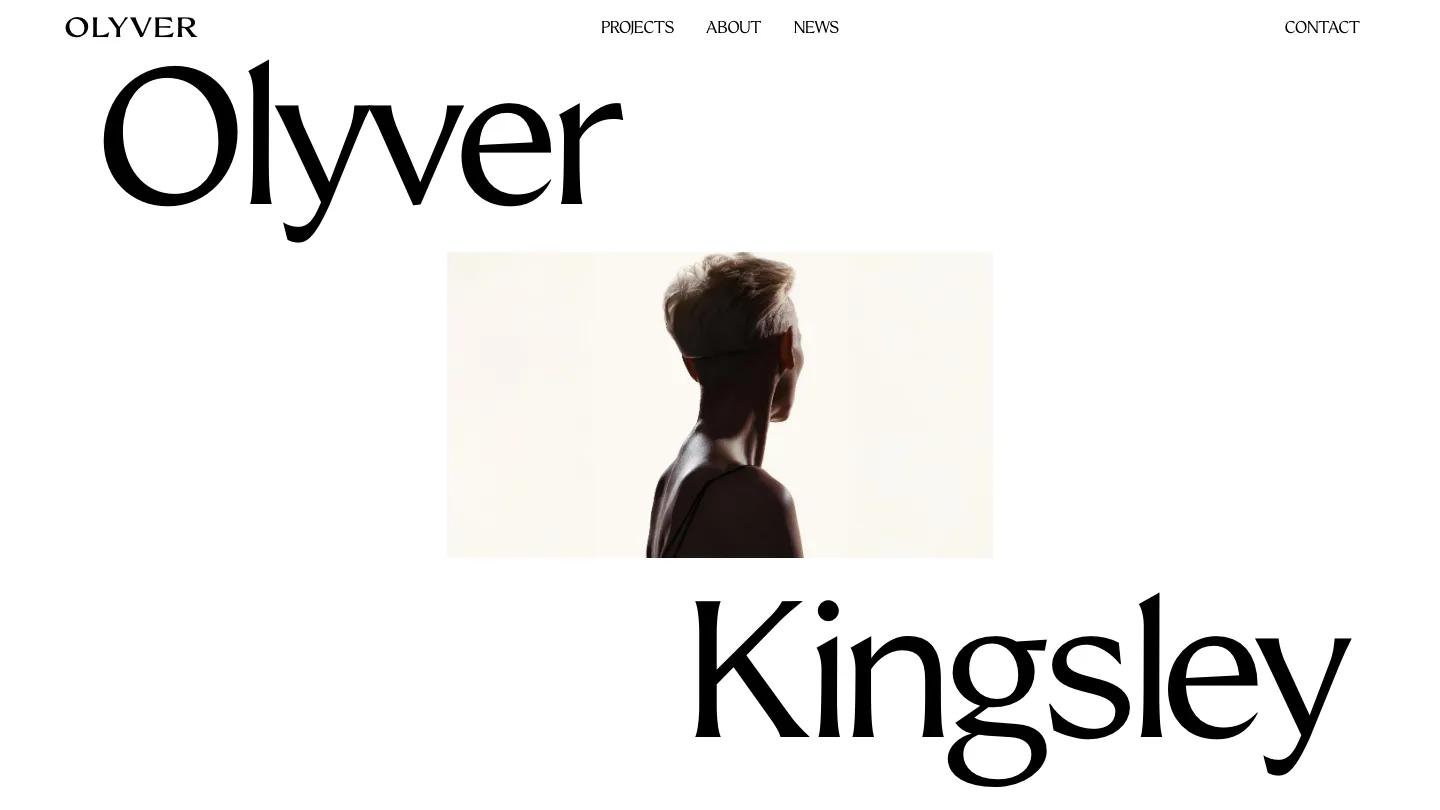
Olyver is the most literal personal template here: the first name sits top left, the surname bottom right, and one portrait fills the gap between them. The display face is soft and high contrast, so the page feels like a magazine cover rather than a résumé. Case studies follow as full-width images with a one-line summary each.
There's a news section with category labels for short posts, a contact form that asks which service someone needs, and CMS pages for every project and article. Only two paid templates in the category score higher.
Worth knowing: the layout depends on a strong portrait and strong project images; average photos leave the large blocks looking bare.
Elian
Design: 9.4/10
Dev: 9.7/10
Price: Free
Best for: designers who want a dark, bold personal site in more than one language without paying for a template
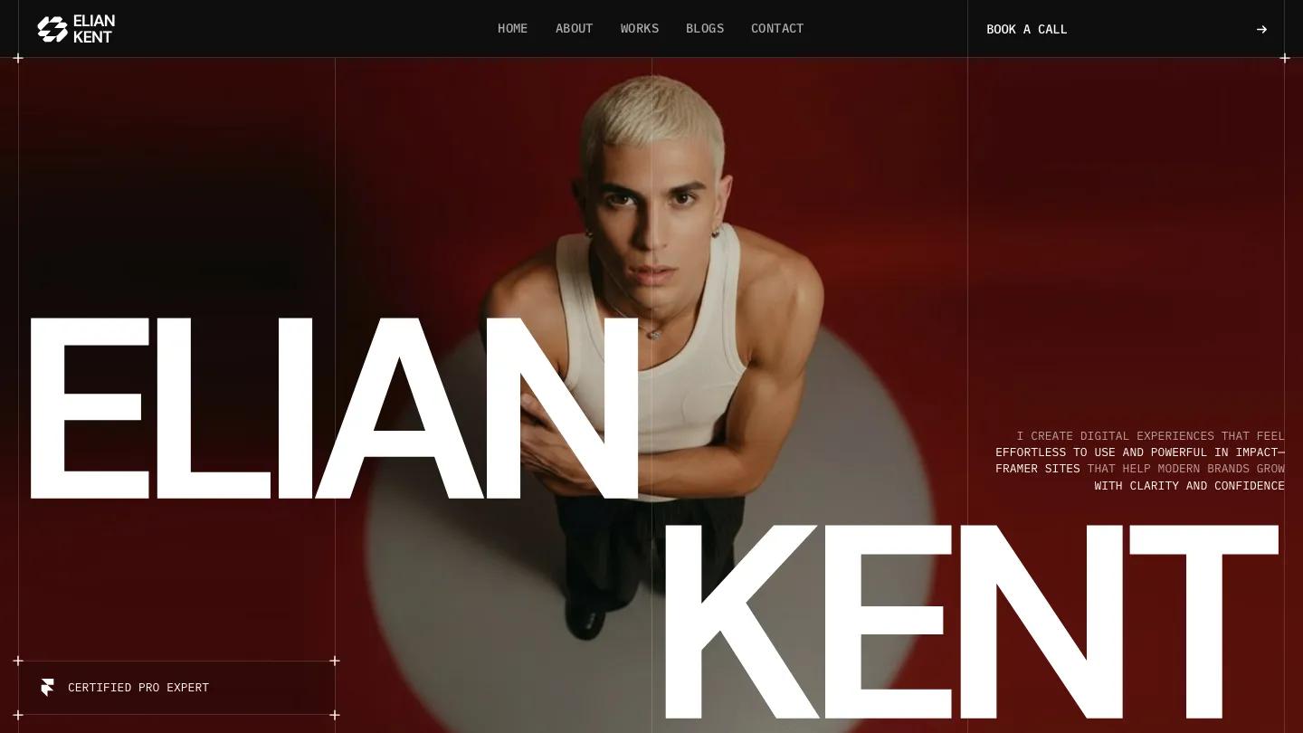
Elian splits the owner's name into massive white letters over a portrait on deep red, then moves into a case study grid tagged by discipline. Host Grotesk gives the headings a sharp, editorial edge, and the motion is limited to fades and scroll reveals.
Localization support is the standout for a free template, along with site search and a CMS blog. Projects, posts and a contact page all ship ready, and the dark theme holds up well at phone width.
Worth knowing: switching to a light color scheme means working with Framer overrides and component styles, not flipping one setting.
Portfi
Design: 9.4/10
Dev: 9.7/10
Price: $79
Best for: photographers and designers who want a personal portfolio that can also sell prints, presets or digital products
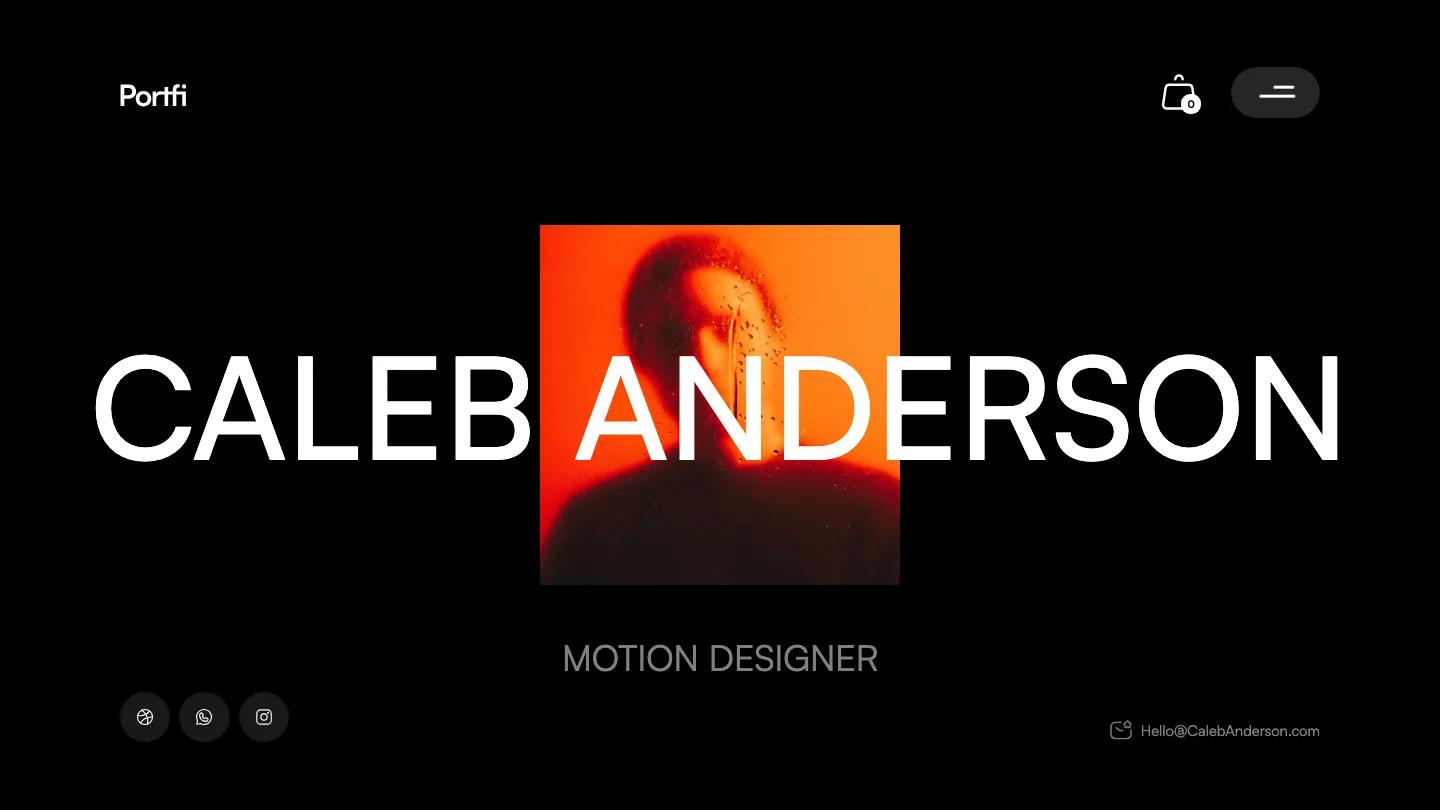
Portfi is built like a CV with a shop attached. After a black hero that layers big white type over a square portrait, the homepage moves through about, services, awards and an experience history with job titles and dates. A tools section shows software icons as pill tags, a small touch that makes the about content feel specific.
The ecommerce layer is the difference: a styled checkout with customer and shipping fields sits alongside CMS projects and a blog.
Worth knowing: the all-black canvas feels heavy on a phone, and it needs high-quality images to avoid looking empty.
Portfoliok
Design: 9.6/10
Dev: 9.4/10
Price: $79
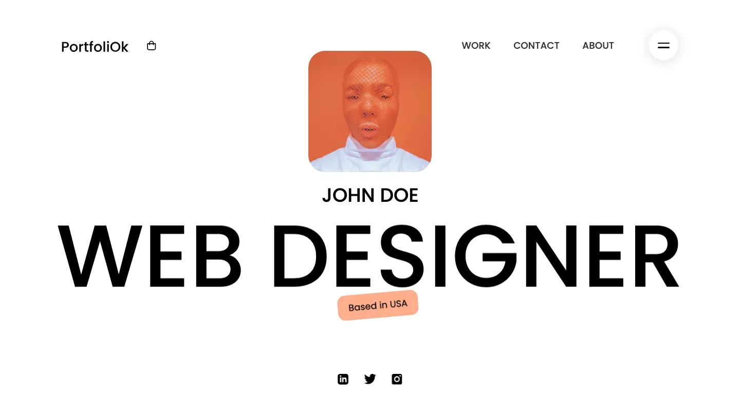
Best for: visual creatives who want a friendly, colorful personal site with a shop and skills section on Webflow
Where Portfi goes dark, Portfoliok goes bright: a round profile photo above a name and role in bold Poppins capitals, on white with a soft coral accent. Skills appear as percentage circles and awards as gradient cards in pastel pink, blue and yellow, which gives the page a playful, personal tone.
Webflow Ecommerce powers a shop page, and projects and blog posts run through the CMS, with a contact form on its own page.
Worth knowing: skill percentages and gradient cards suit a designer's site more than a photographer's, and the demo only shows five projects.
Monica Ellis
Design: 9.4/10
Dev: 9.6/10
Price: $49
Best for: senior creatives building a personal brand around their name, with a journal and archive
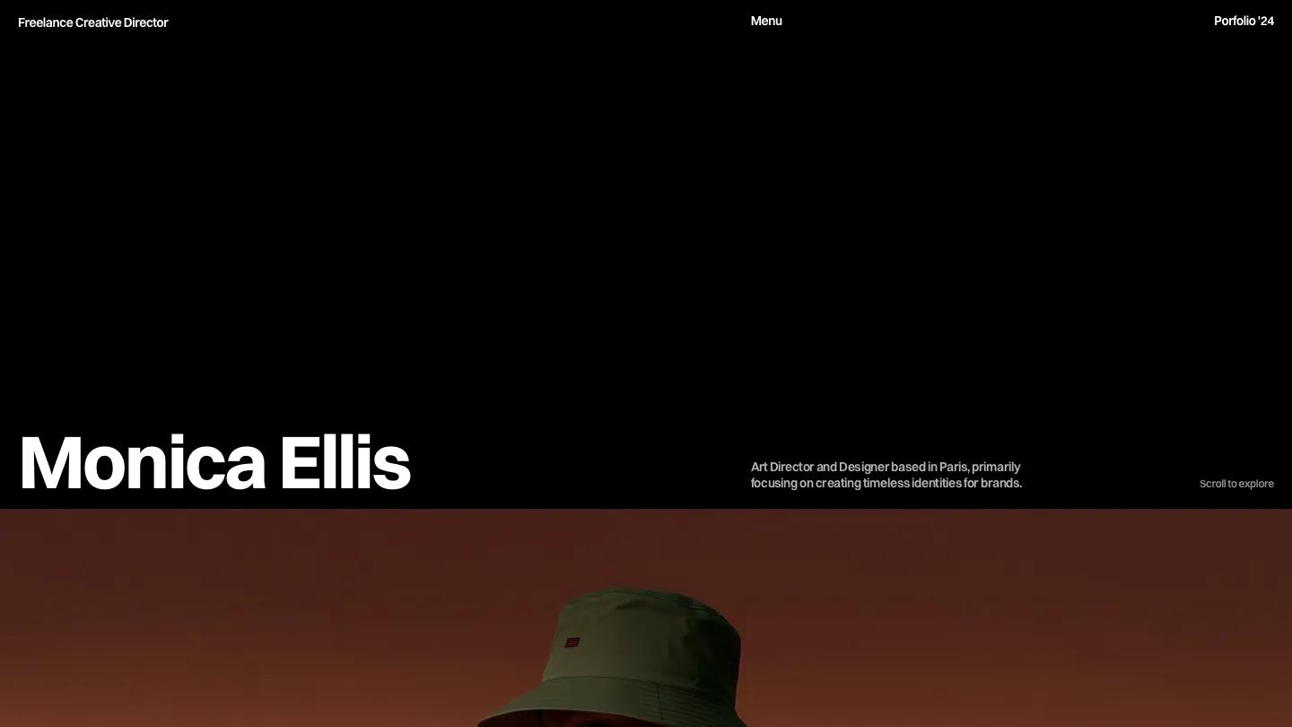
Monica Ellis opens on black with the owner's name in oversized white type and a short bio beside it. Project images follow full-bleed with rust, red and teal gradient overlays, each captioned with a name, category and year.
It ships more structure than the other name-led picks here: an archive, a journal with a horizontal carousel of posts, a careers page, custom cursors and a list or grid toggle for case studies, all on the CMS.
Worth knowing: the name-as-brand layout runs through every page, and lighter, more colorful work will fight the dark palette.
Minimuline
Design: 9.6/10
Dev: 9.4/10
Price: $69
Best for: designers with a small, stable set of projects who want a polished single-page presence with theme options
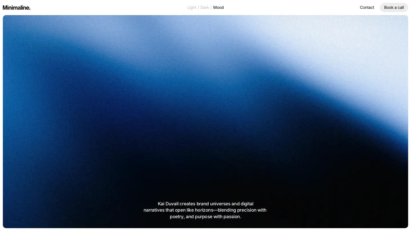
Minimuline opens on a gradient from deep blue to near black with a centered bio statement in white Inter. The header carries light, dark and a third mood theme, plus a booking link, so visitors can see the work in different settings. Gallery tiles, a recognitions area and a testimonial follow.
It's one of six templates on this list where the Design Score beats the Dev Score. Localization and P3 color support are included.
Worth knowing: the demo shows a homepage and one project page with no CMS collections, so an about page and extra project layouts are yours to build.
Clara
Design: 9.6/10
Dev: 9.4/10
Price: $59
Best for: art directors and consultants who want a calm, serif-led personal site with a services page and room to explain how they work
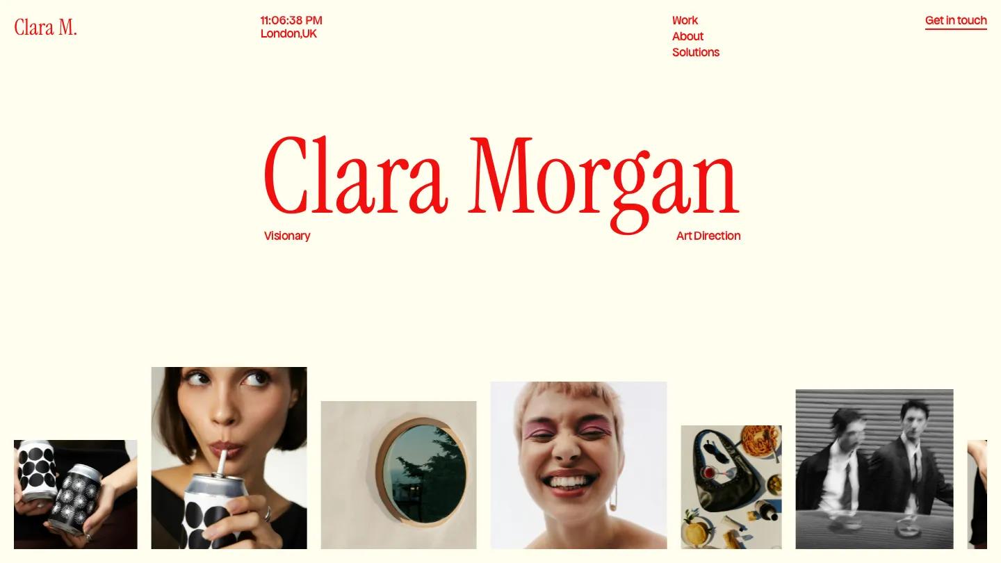
Clara centers the owner's name in a large red serif on pale cream, flanked by two small labels for role and discipline, while the header carries a live clock and location. The palette stops at cream, red and black. Generous spacing gives every thumbnail in the masonry work grid real room, which matters when single images have to carry each project.
The about page holds a long-form statement on design philosophy, a solutions page lists services, and testimonials run as horizontal cards with attribution. Projects run through the CMS, and a contact page with a form ships ready.
Worth knowing: there's no blog collection, so notes or articles need a CMS structure you build yourself.
Nolan Barret
Design: 9.4/10
Dev: 9.5/10
Price: $29
Best for: graphic and identity designers with a large body of work who would rather show than write
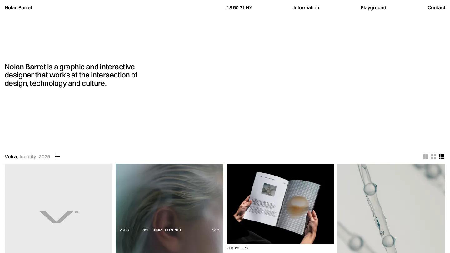
At $29, Nolan Barret is the cheapest paid template on this list, and it has the most distinctive idea. There's no hero image at all, just one small sentence about the person on a lot of white space and a header with the name and a live local clock. Each project is a row with name, discipline and year, opening into a grid of images captioned like file names.
Per-project grid controls let you switch between larger and denser layouts, which helps when posters sit next to website mockups. The Information page flips to black with columns for experience, publications, services and recognition.
Worth knowing: projects live as image sets on the homepage rather than their own pages, so there's little room for written case studies.
OXYCO
Design: 9.7/10
Dev: 9.3/10
Price: $79
Best for: designers and art directors whose work suits soft gradients and who want a type-first personal site with a blog and a shop
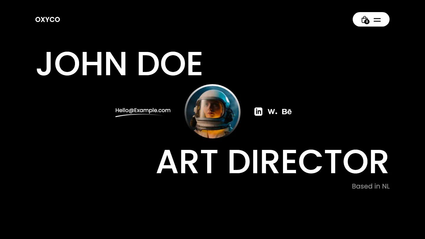
Huge white Poppins letters spell out a name and title across a black hero in OXYCO, with a circular portrait at the center and social links close by. Sections then alternate between black and gradient washes in mint, pink and pastel rainbow, and rounded corners on every card keep that contrast from feeling stark. An awards section in pastel cards gives the about content some proof.
A shop with a basic cart and checkout sits alongside CMS projects and a blog whose feed shows category tags and read-time badges. Contact and about pages ship as their own pages.
Worth knowing: the oversized hero type loses some of its impact at phone width, and the gradient palette needs to suit your work before you commit.
Olio
Design: 9.7/10
Dev: 9.0/10
Price: $49
Best for: freelance designers who want one page that covers services, resume, testimonials and FAQ
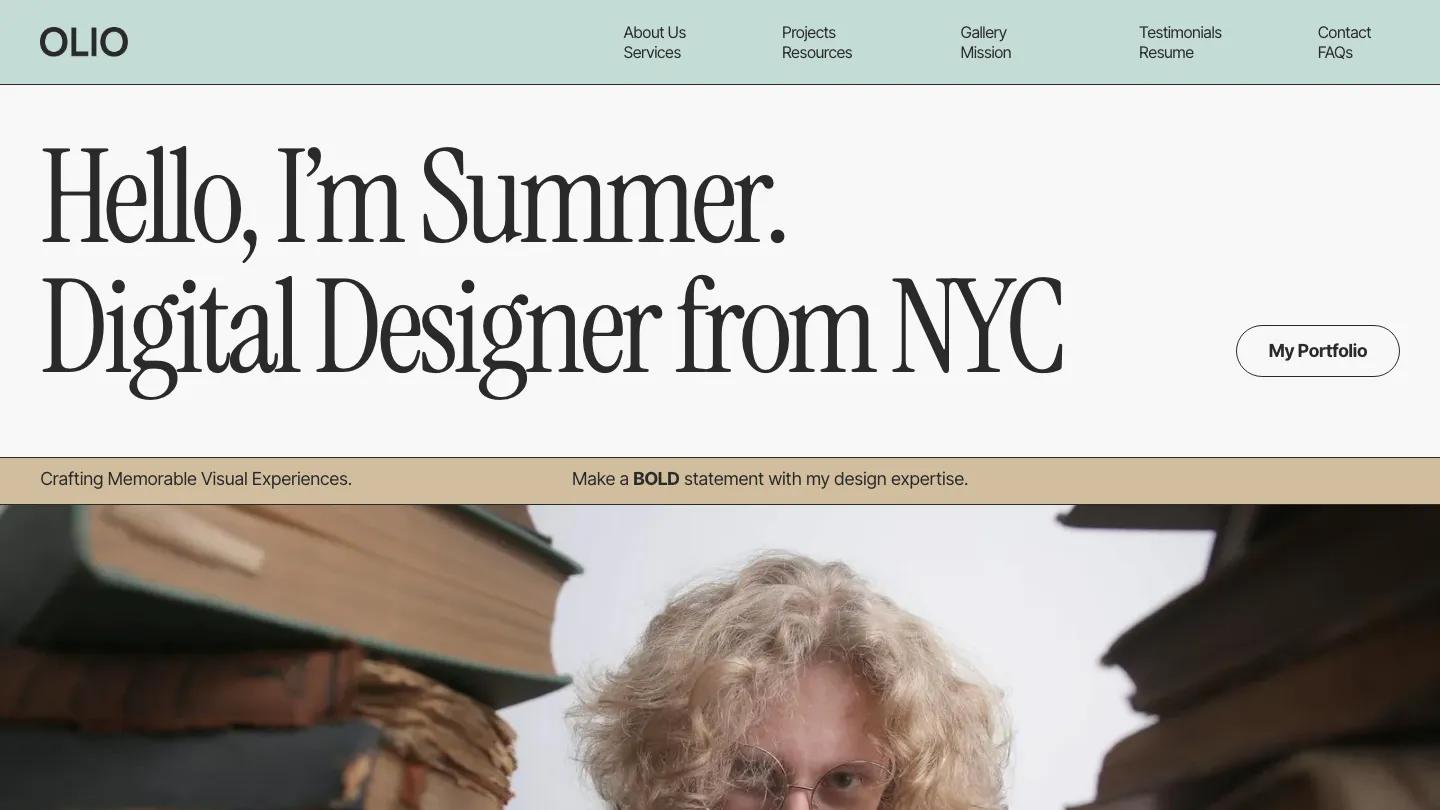
Olio shares the second highest Design Score on this list with OXYCO, behind MOSS, and has the widest gap between its two scores. It's a one-page personal site that opens with a warm, first-person greeting in large Instrument Serif and a mint header band whose menu jumps to sections on the same page. Services run as tall rows with very large names alternating left and right.
A resume section, a testimonial slider, an FAQ and a photo gallery strip all sit on the homepage, with resource articles and projects on their own CMS pages.
Worth knowing: the demo's article bodies are placeholder Latin, and putting everything on one page makes it long, so cut what you won't maintain.
Okocha
Design: 9.2/10
Dev: 9.3/10
Price: $49
Best for: solo creatives with a short name and strong visuals who want a bold, image-first homepage
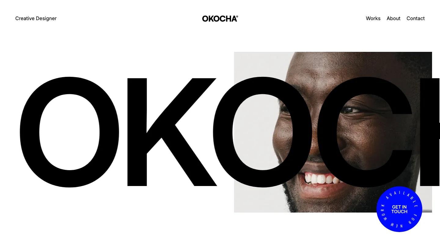
Okocha introduces its owner as loudly as possible: the name in black Inter at billboard size, overlapping a portrait so the face shows through one of the letters. A round blue badge with "available for new work" set around its edge is the only color. Selected work follows as full-width images with simple captions, and an experiments strip gives side projects a home.
The page set is small: works, about, contact and case study pages, without CMS collections.
Worth knowing: a long name won't sit in the hero the same way, and the intro paragraph is justified, which opens gaps between words on a phone.
Are Free Personal Website Templates Worth Using?
Yes, especially on Framer. 157 of the 329 personal templates in our library are free, and 144 of those are on Framer. Free personal templates average 8.0/10 overall against 8.3/10 for paid, and 18 free ones score 9.0/10 or higher. Two made this list: Olyver and Elian.
The trade-off is usually scope rather than polish. Neither free pick includes ecommerce, which Portfi, Portfoliok and OXYCO all add, and Elian ships dark only. Webflow has 13 free personal templates, and SilenceFolio is the only one at 9.0/10 or above. Browse every free option on our free templates page.
If you're comparing these with personal website templates from GitHub, the difference is mostly about upkeep. Webflow and Framer templates are edited visually and hosted by the platform, so you update text and projects without touching code or a build step.
How We Scored These
Each template here was scored independently by several designers (Design Score) and developers (Dev Score), each with 10 or more years of experience, and the published scores are their averages. We only publish templates at 7.0 overall or above, and we don't factor in creator reputation, sales or marketplace ratings. The full process is on our methodology page.
We ranked by Overall Score but left out several high scorers that carry the Personal tag while presenting a studio or agency, since they don't solve the personal site problem. For a site that presents a team, the full portfolio and agency category is the better place to start. On our listing pages, each template card plays a looping screen recording of its homepage, so you can compare these 12 without opening a single demo.
FAQ
13 Best Photography Website Templates for Webflow and Framer (2026)
by Marcus Jones
13 Best Portfolio Website Templates for Webflow and Framer (2026)
by Marcus Jones
9 Best Real Estate Website Templates for Webflow and Framer (2026)
by Thomas Martinez
10 Best Restaurant Website Templates for Webflow (2026)
by Marcus Jones
12 Best Interior Design Website Templates for Webflow, Framer and Shopify (2026)
by Marcus Jones