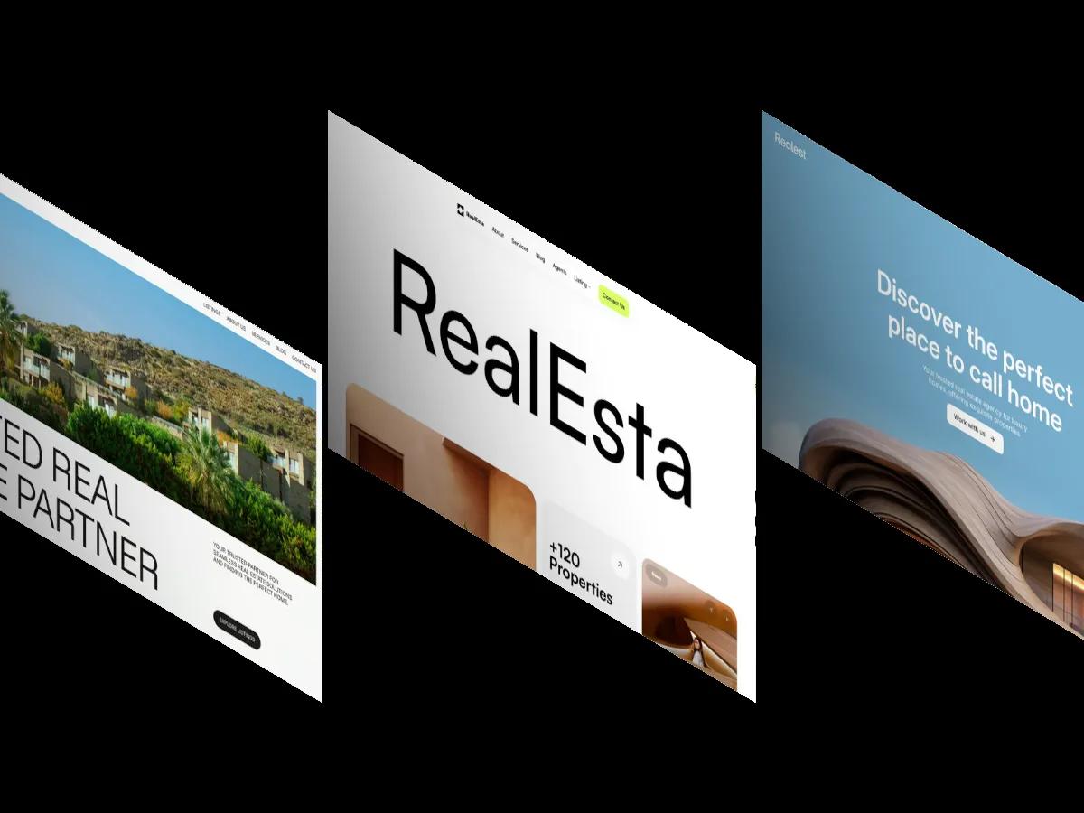
Better is a high-quality Webflow template for Portfolio & Agency, Art & Design, Photography & Videography, Personal, Professional Services, Business & Startup by Lucas Gusso.

Our Review of Better
Better is a dark, loud Webflow template for creative studios and freelancers who like big type. The hero stacks tilted project cards behind one upright card, and behind all of them the word Bigger runs edge to edge in white Bebas Neue, so the letters peek out on either side. The front card pairs a short Satoshi headline and intro on near-black with a bright lime panel holding a slashed circle logo and a small ticker along its base. The header is minimal: Home, About, and Works dropdowns on the left, Blog and Buy Template on the right, and a single word in the center that swaps between punchy comparatives as you scroll.
Lucas Gusso uses the demo homepage partly as a showcase, so below the hero you'll find a Figma file panel, then a grid of page previews in rounded gray frames: home, about, works, and contact variants, plus blog, 404, and password pages. Buyers launch from one of the home variants, which carry the real design. On the home page itself, project cards slide over each other full width, each with a photo and a giant condensed client name across it, and huge words flip between taglines before a marquee email link and a quiet four-column footer. The contact previews mix bold uppercase headlines with simple name, email, and message forms.
On a phone, Bigger fills the width above the front card, the headline reflows to a few lines, and a menu icon replaces the links.
We'd pick Better for branding studios, designers, and small agencies whose work looks good in black frames. The demo projects use famous brand names, which you'll want to swap for your own clients. The lime accent is the only color, too, so make sure it suits your brand before committing.
Based on the live demo, viewed on desktop and on a phone. The Design and Dev scores come from separate independent reviews. See how we score templates.
Independently evaluated by our team of 6 designers and 5 developers.











Designers score design, developers score development, and each score is the average of their independent ratings. Read about our review team and how we score templates.
More Like This

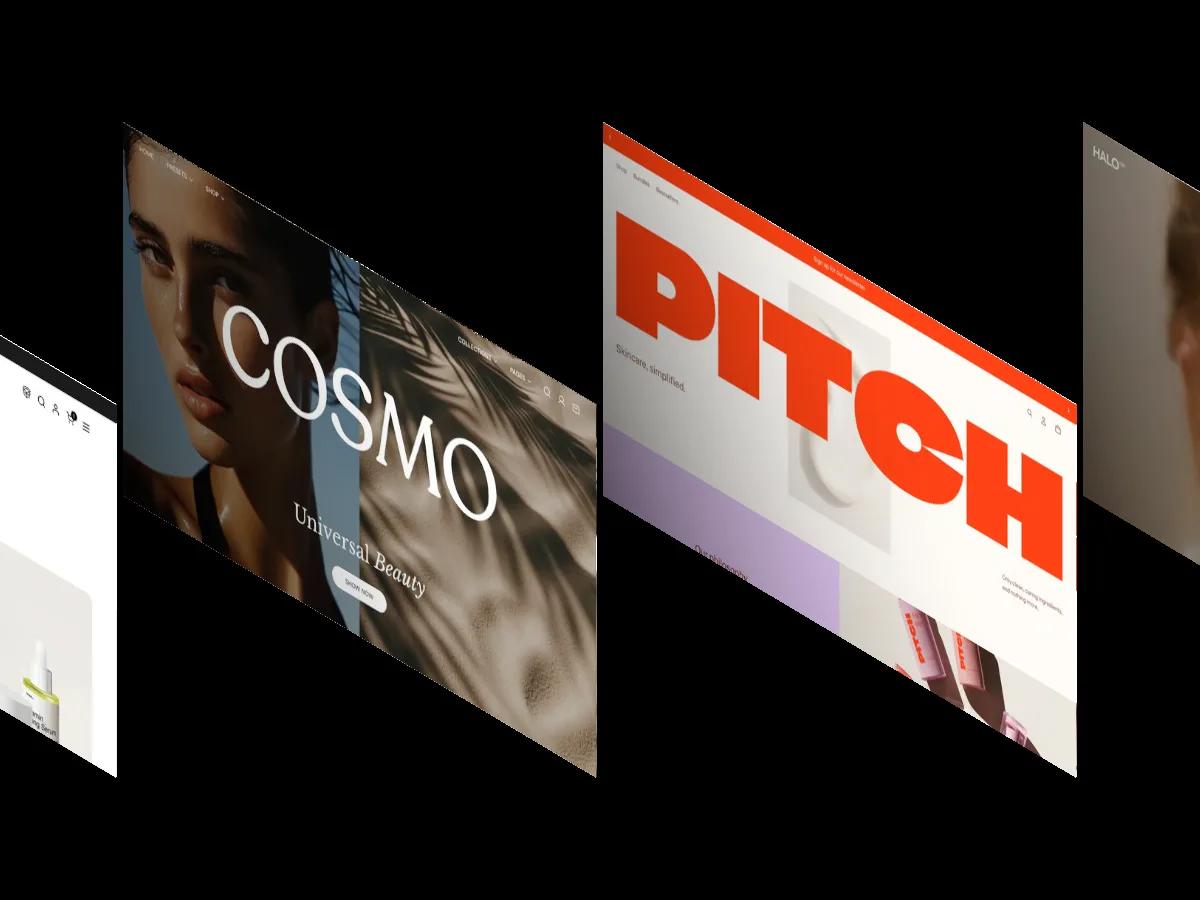
14 Best Beauty and Skincare Website Templates (2026)
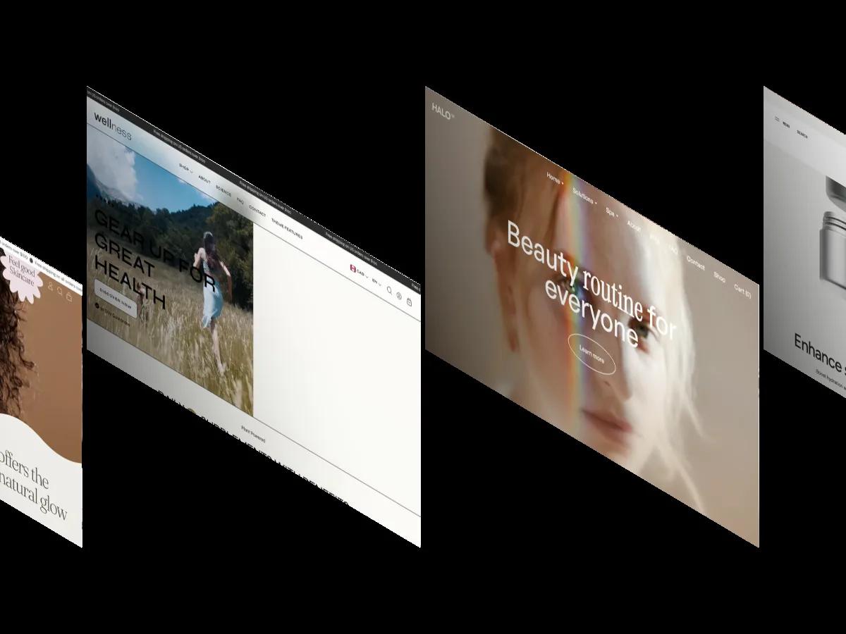
10 Best Wellness Website Templates for Studios, Therapists and Brands (2026)

Average Reading Speed: Words per Minute by Age, Language and Platform (2026)
AI and Writing Statistics 2026: What the Research Actually Says
Framer vs Webflow: What 725 Scored Templates Tell Us About Each Platform
10 Best Restaurant Website Templates for Webflow (2026)