IvyBrooks is a high-quality Webflow template for Portfolio & Agency, Personal, Art & Design, Professional Services by Jacob Nielsen.
Our Review of IvyBrooks
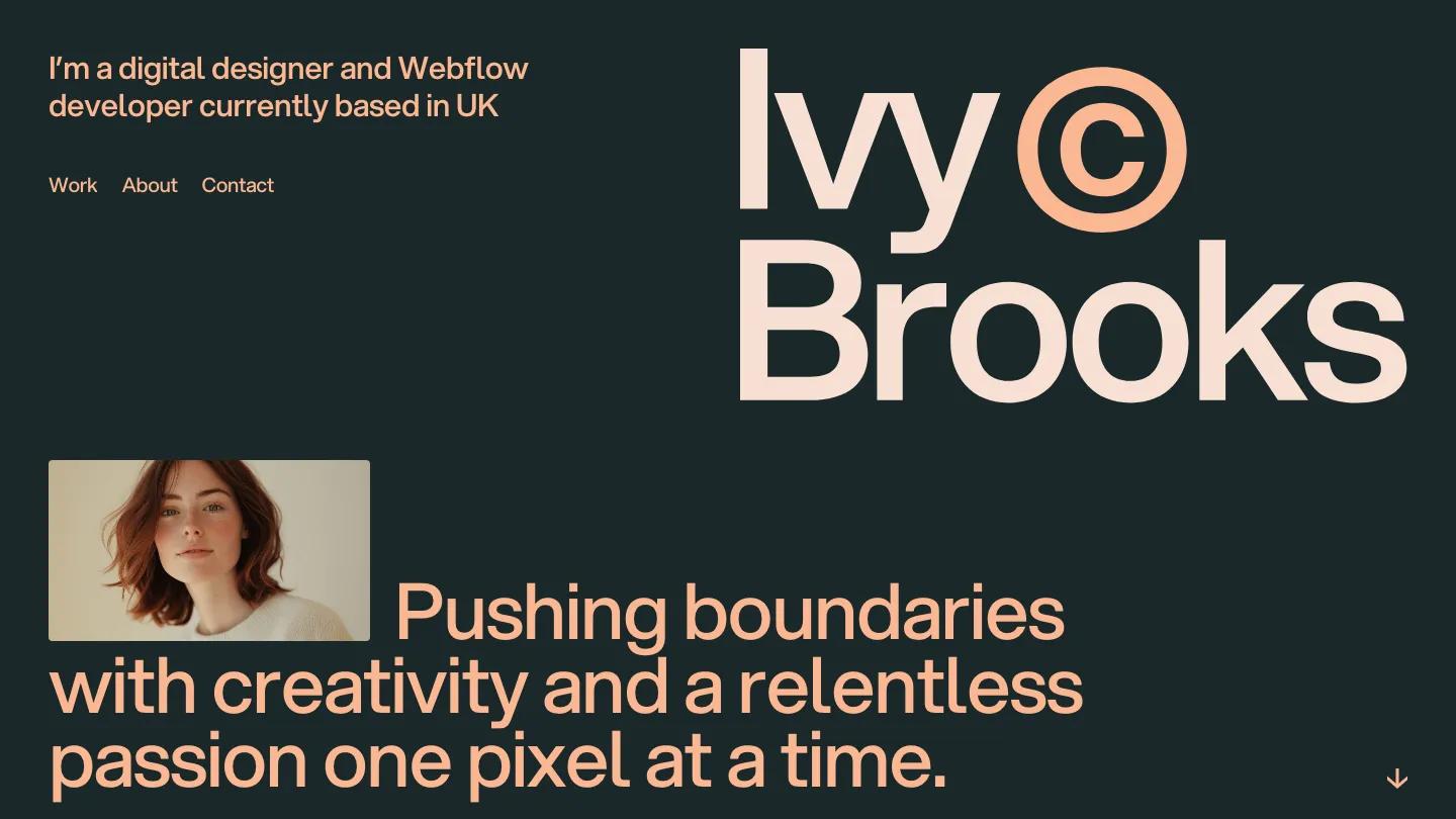
IvyBrooks is a personal site for a digital designer who also builds, and its colors set it apart. The page is a deep green-grey, almost slate, with all the type in soft peach and pale blush. The name Ivy Brooks is stacked huge on the right in Aspekta, with a circled copyright mark beside "Ivy" in the brighter peach. On the left, a short intro line sits above a plain Work, About, Contact menu. Lower down, a small portrait is tucked into the first line of a large statement, so the photo reads like a word in the sentence.
Jacob Nielsen turns the work section into a ruled list rather than a grid. Each row carries a project name, a category line, a year, a small website screenshot in the middle, and a View case link with a diagonal arrow. A giant About heading opens the next part: a portrait with name and title on the left, a large What I do statement on the right, then three service headings with short descriptions. A Selected Clients list in thin rows follows, and the footer repeats the intro line with an underlined Write me an email link. The style guide page keeps the same dark slate and peach, with large color blocks you can edit.
On a phone, the name fills the top of the screen, the menu stays as plain text links, and the portrait and statement stack neatly underneath.
We'd pick IvyBrooks for web designers and developers who want a portfolio that feels warm without going bright. The project rows still show placeholder text, with "Main Category Goes here" and the same 01 number on every row, so fill in each one before launch. And check that the small grey captions stay readable on slate.
Based on the live demo, viewed on desktop and on a phone. The Design and Dev scores come from separate independent reviews. See how we score templates.
Independently evaluated by our team of 6 designers and 5 developers.











Designers score design, developers score development, and each score is the average of their independent ratings. Read about our review team and how we score templates.