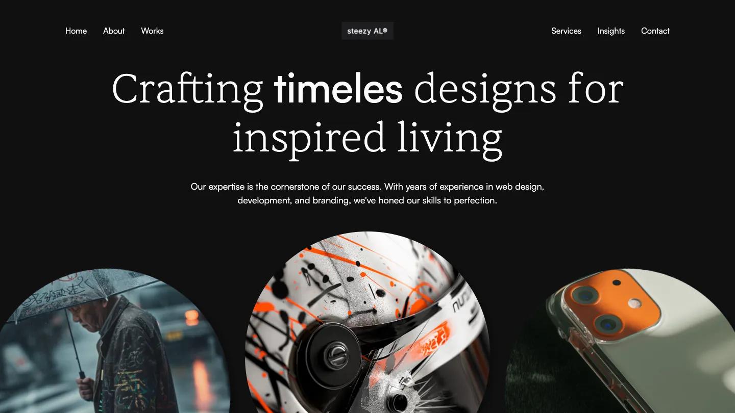
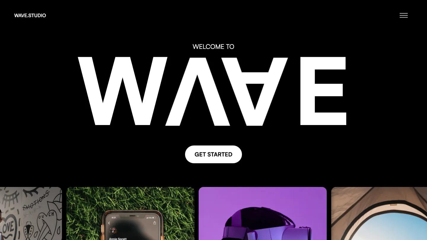
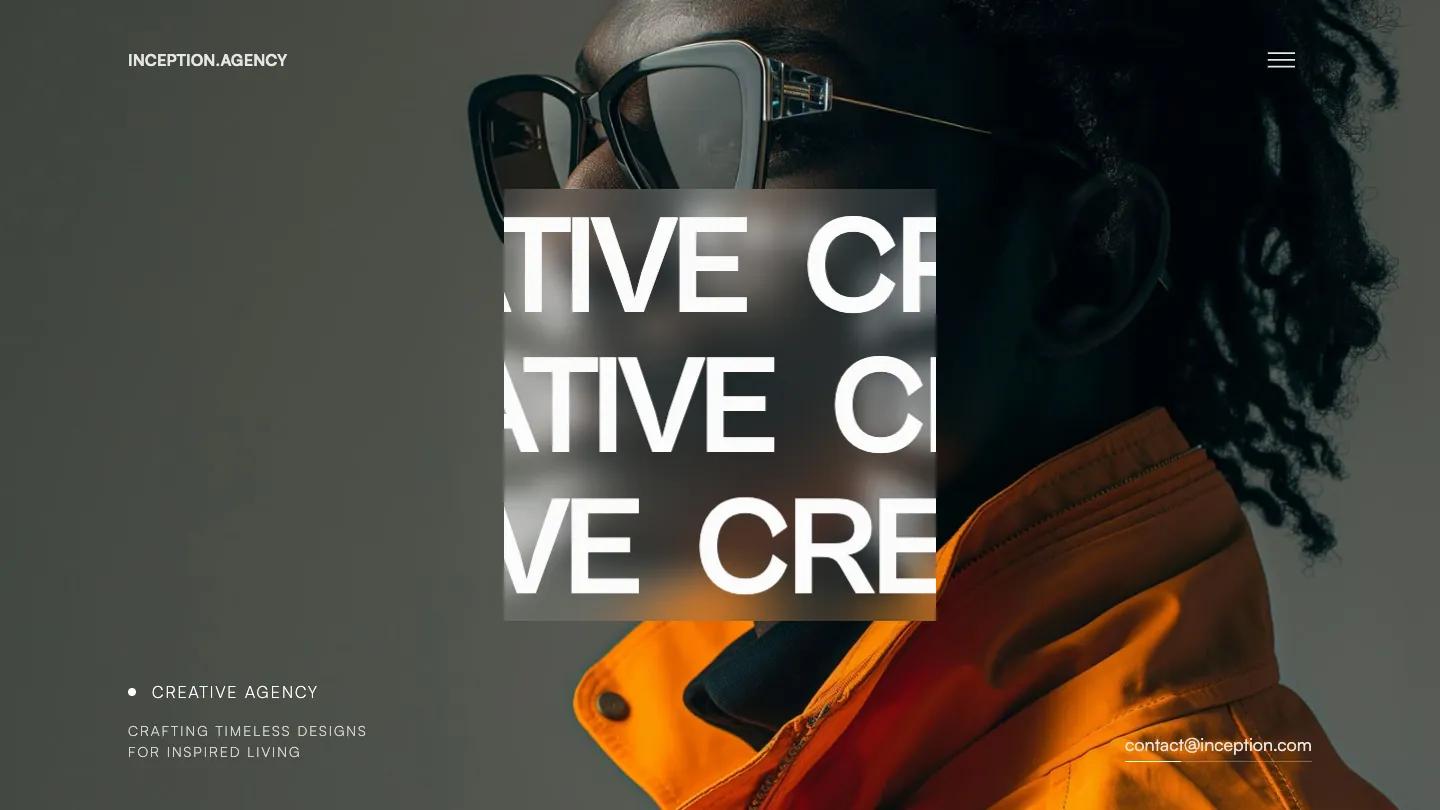
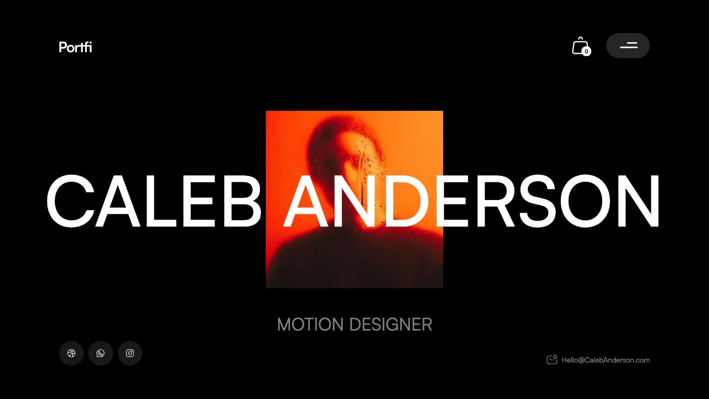
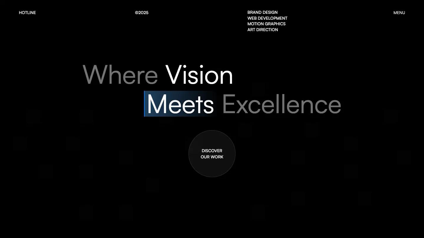
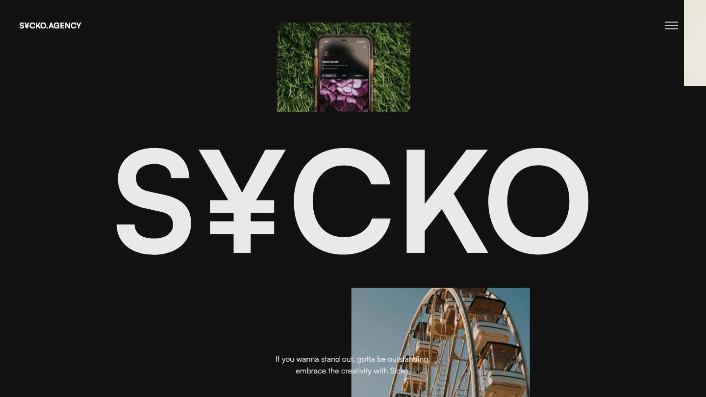
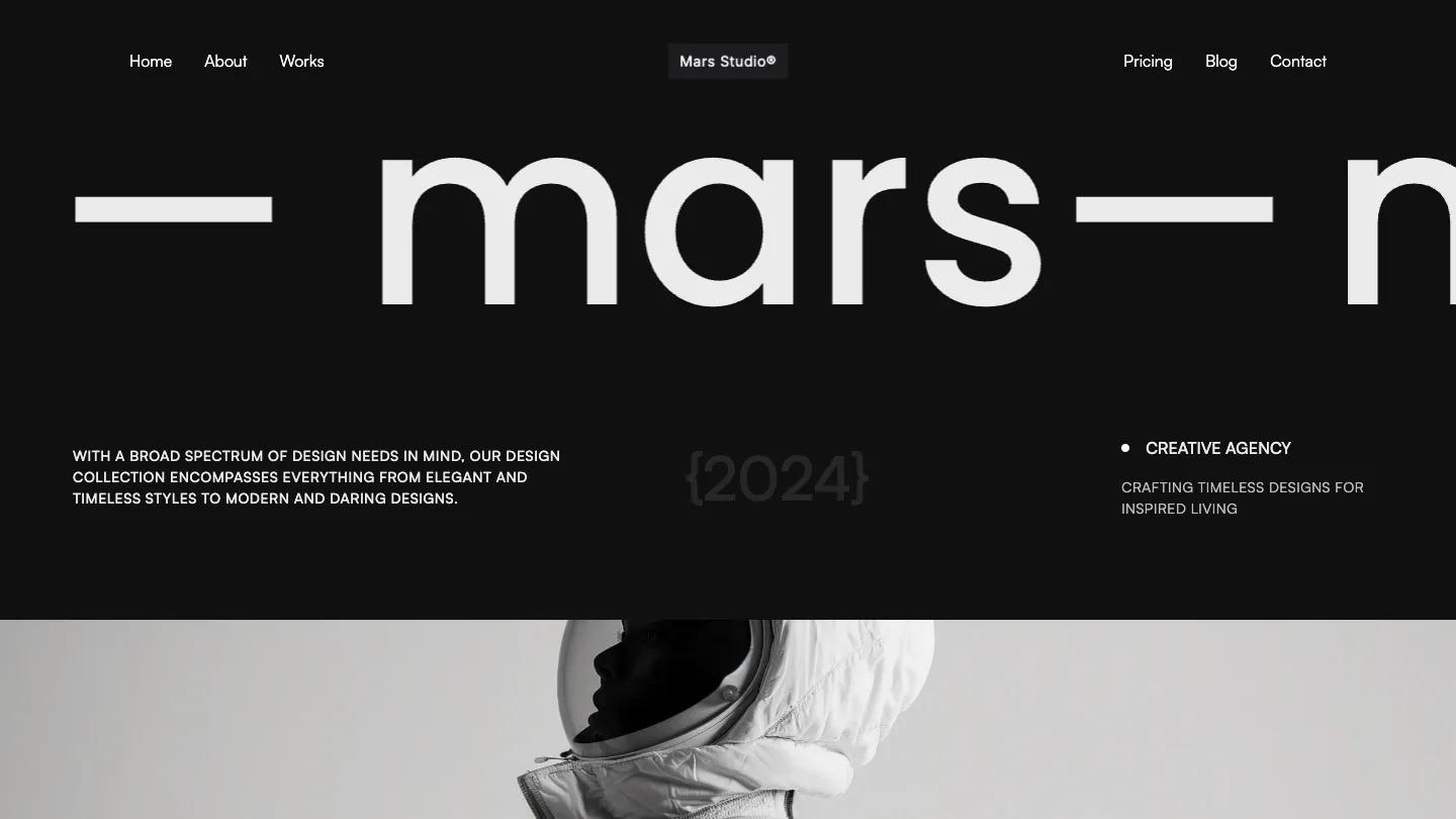
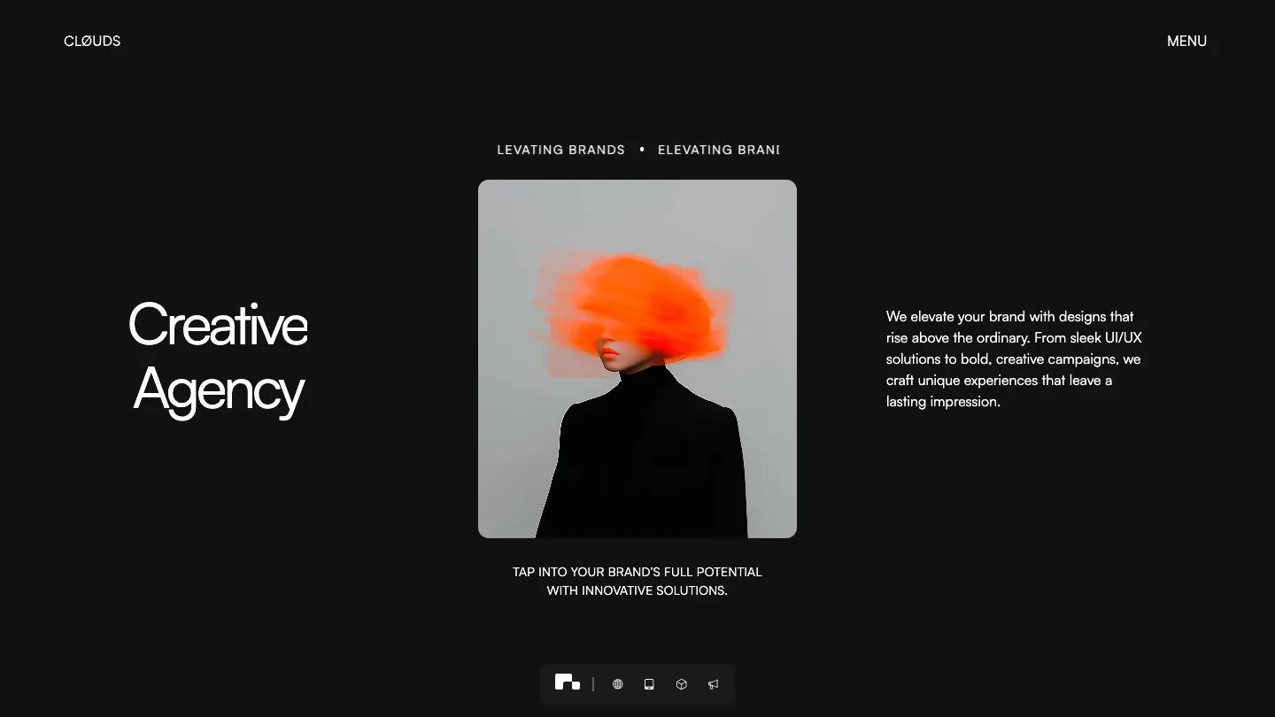
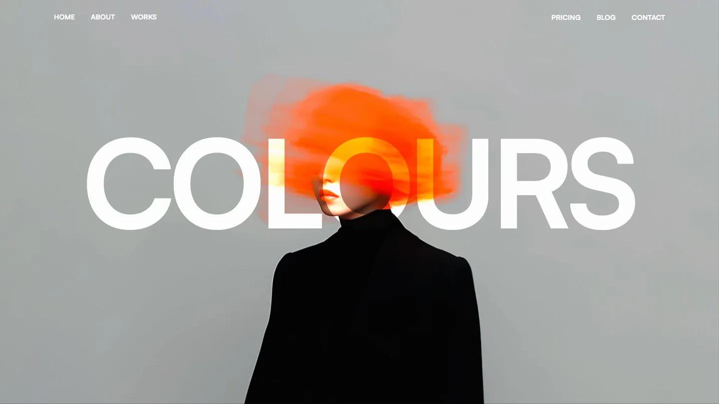
Nomade is a high-quality Webflow template for Portfolio & Agency, Professional Services, Business & Startup, Art & Design, Personal by Lucas Gusso.
Our Review of Nomade
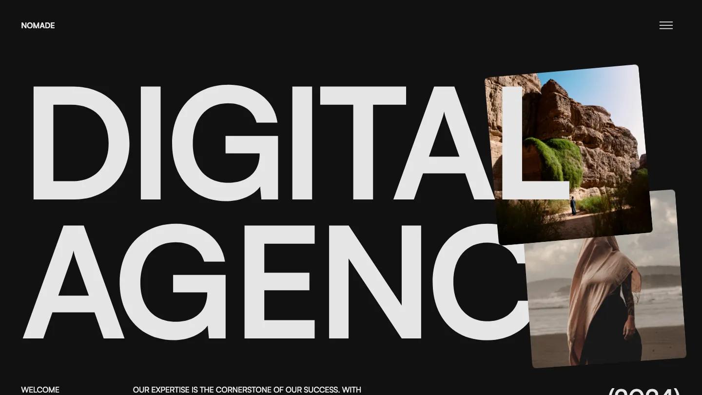
Nomade is a near-black agency site for small studios that sell branding, web design, and motion, and it opens with two words. Digital Agency fills the whole first screen in light grey Satoshi capitals, with tilted photos of desert cliffs and a woman in a sheer scarf on a beach pinned over the last letters. Under it, a short all-caps welcome line sits beside a large (2024) in parentheses. The header holds only the NOMADE wordmark and a hamburger icon, so every link lives behind the menu.
Lucas Gusso keeps the homepage moving as you scroll. The photos regroup into a loose stack, then a large statement paragraph introduces the studio in white and grey type. Our Recent Projects sets case studies in a staggered two-column grid of rounded cards, each a different color, such as a dusty pink one framing a tablet mockup, with an uppercase title and an arrow at the bottom. Awards follow as quiet ruled rows, then a Stories carousel of client quotes in dark cards with small logos and arrow buttons. Services come last as numbered rows with a rounded thumbnail, a heading like Get More Clients, and an arrow link. The About page opens on a dark photo of a lone figure in a canyon, We Are Nomade across it in giant capitals, and a short list of disciplines in the top corner.
On a phone, the headline shrinks to two lines with the photos tucked against the letters, though a large empty band sits above it before the content starts.
We'd pick Nomade for creative studios and freelance teams that want a confident dark site with lots of motion. The service rows still carry lorem ipsum, and the award names and client logos are placeholders, so plan to write real copy.
Based on the live demo, viewed on desktop and on a phone. The Design and Dev scores come from separate independent reviews. See how we score templates.
Independently evaluated by our team of 6 designers and 5 developers.











Designers score design, developers score development, and each score is the average of their independent ratings. Read about our review team and how we score templates.