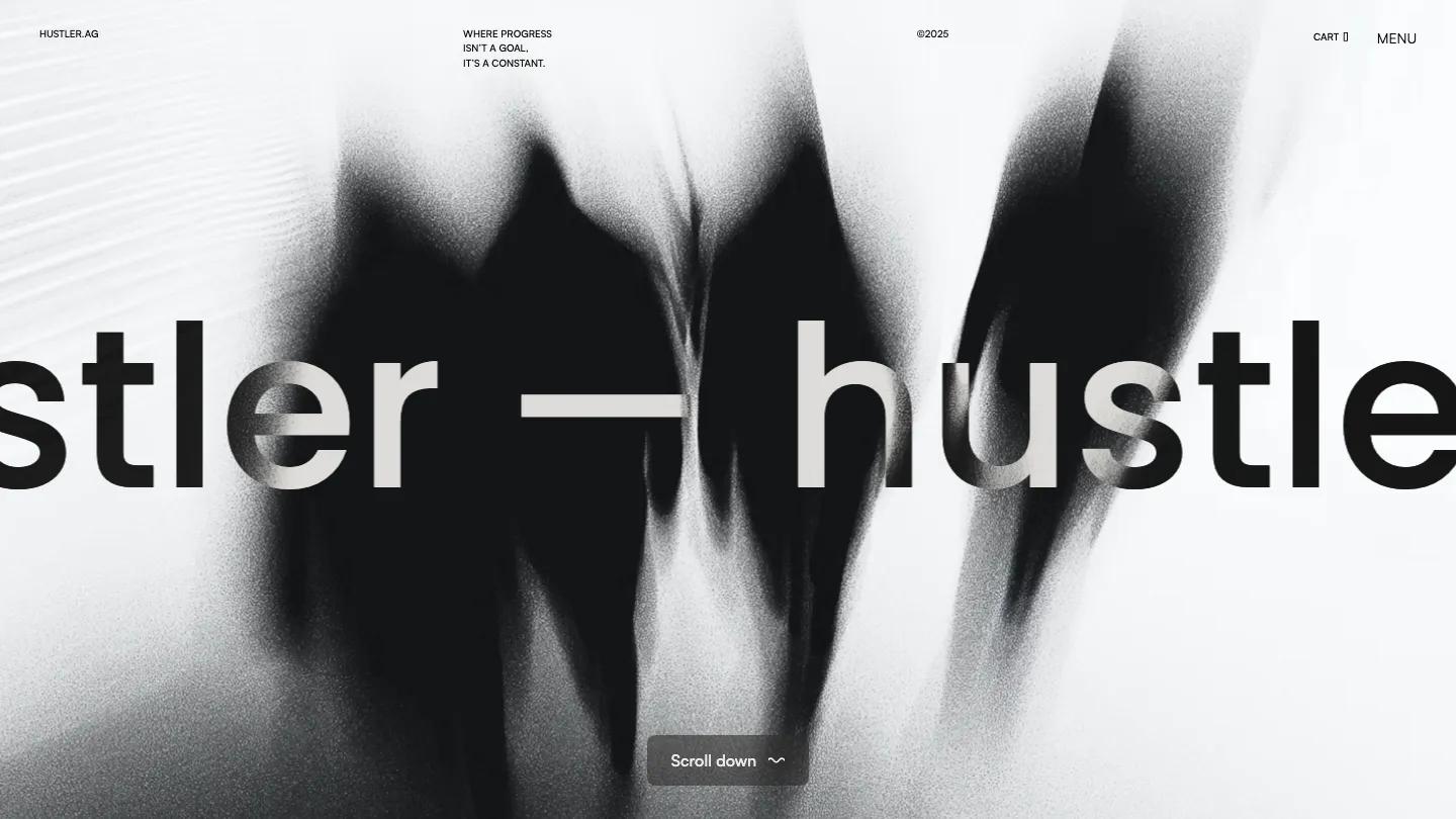
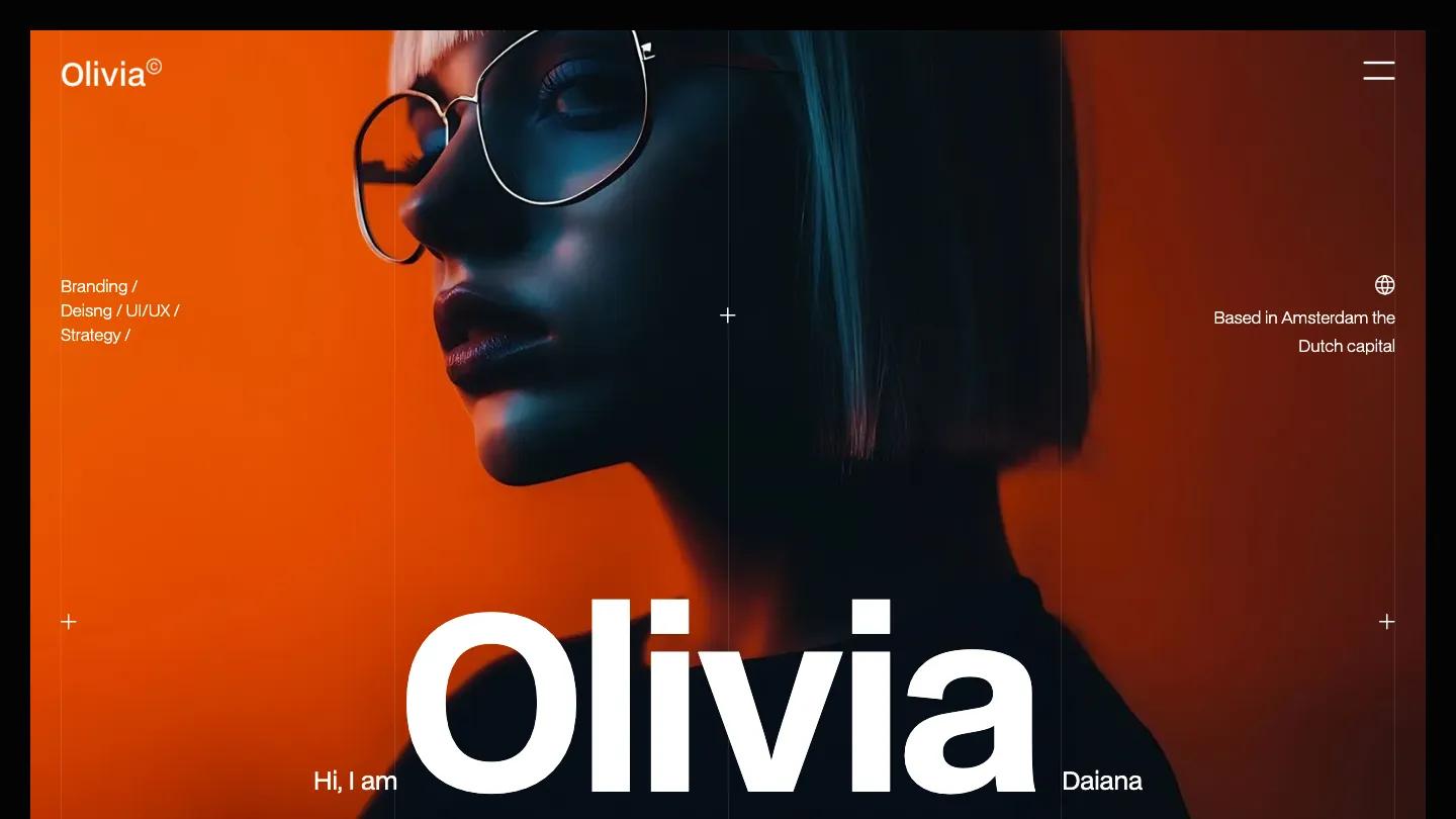
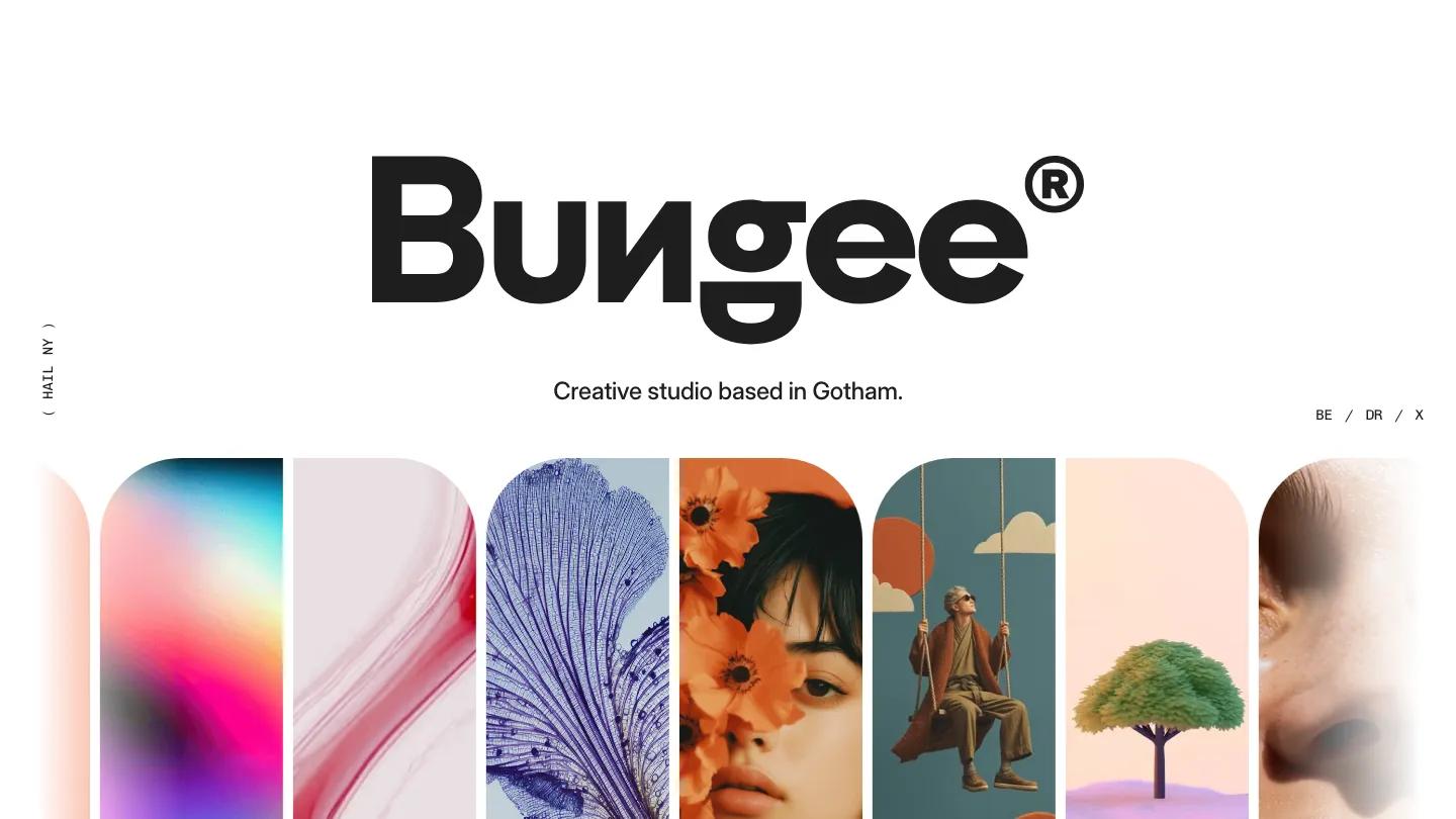
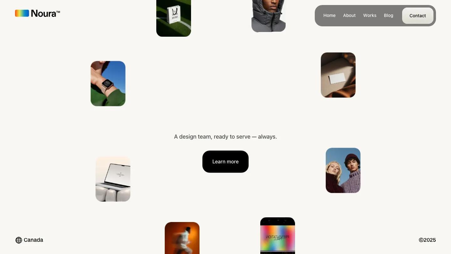
Zephyr Studio is a high-quality Webflow template for Portfolio & Agency, Professional Services, Business & Startup by Flow Nija.
Our Review of Zephyr Studio
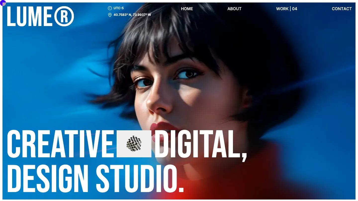
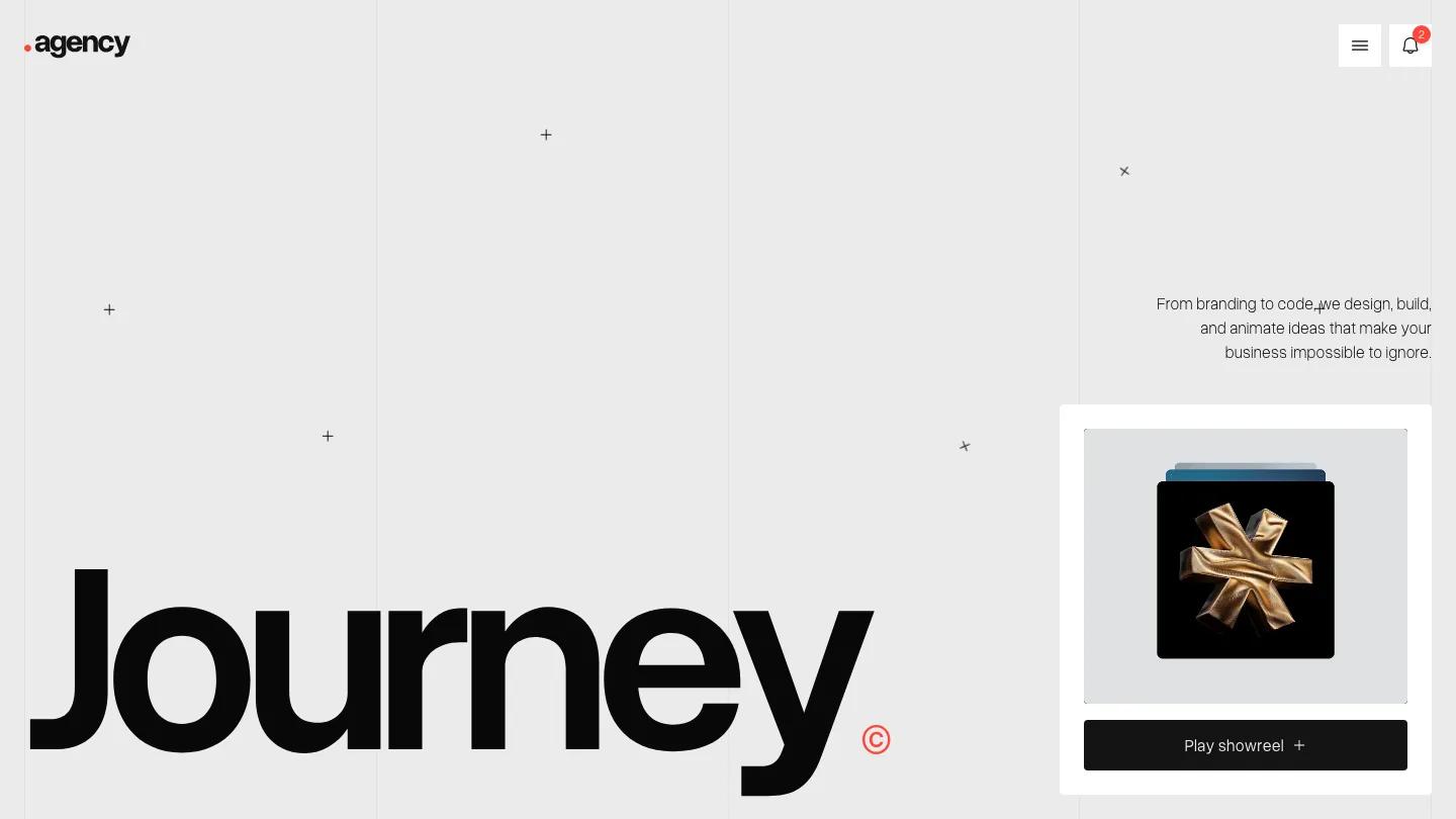
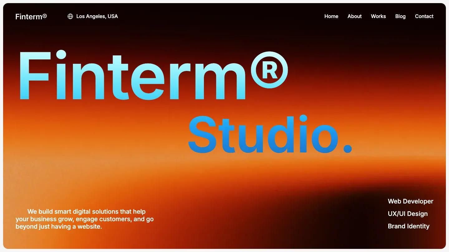
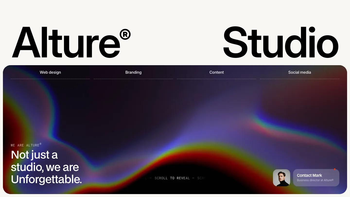
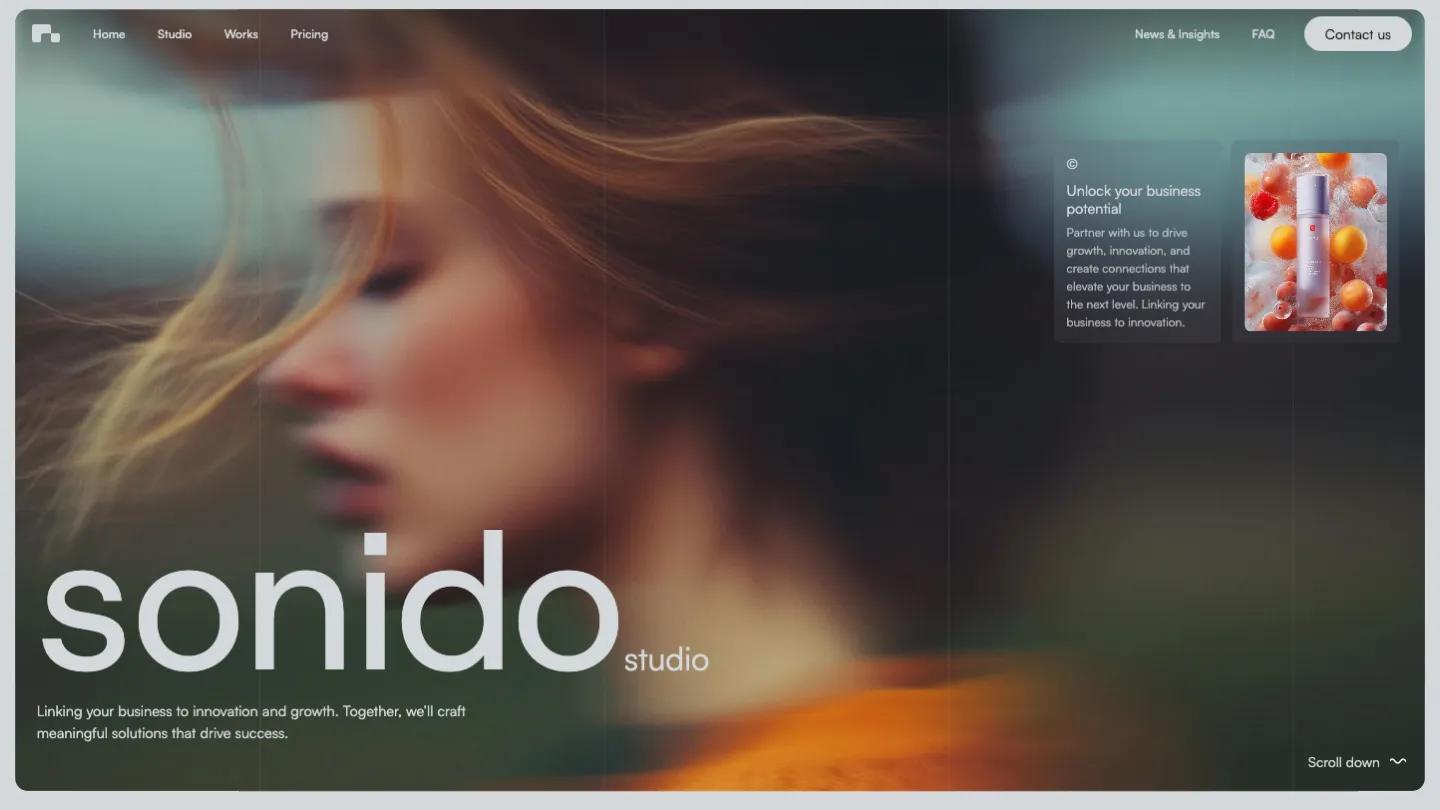
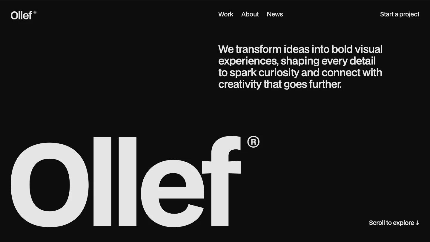
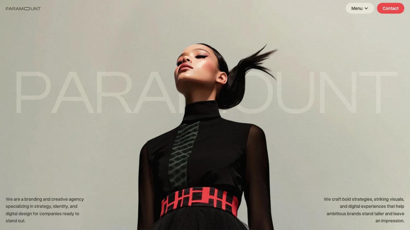
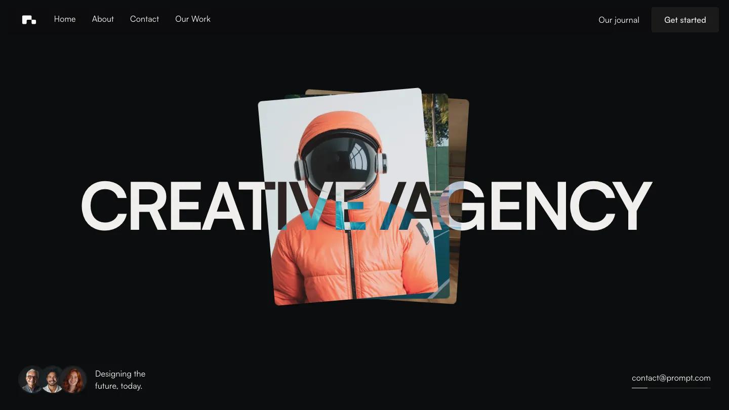
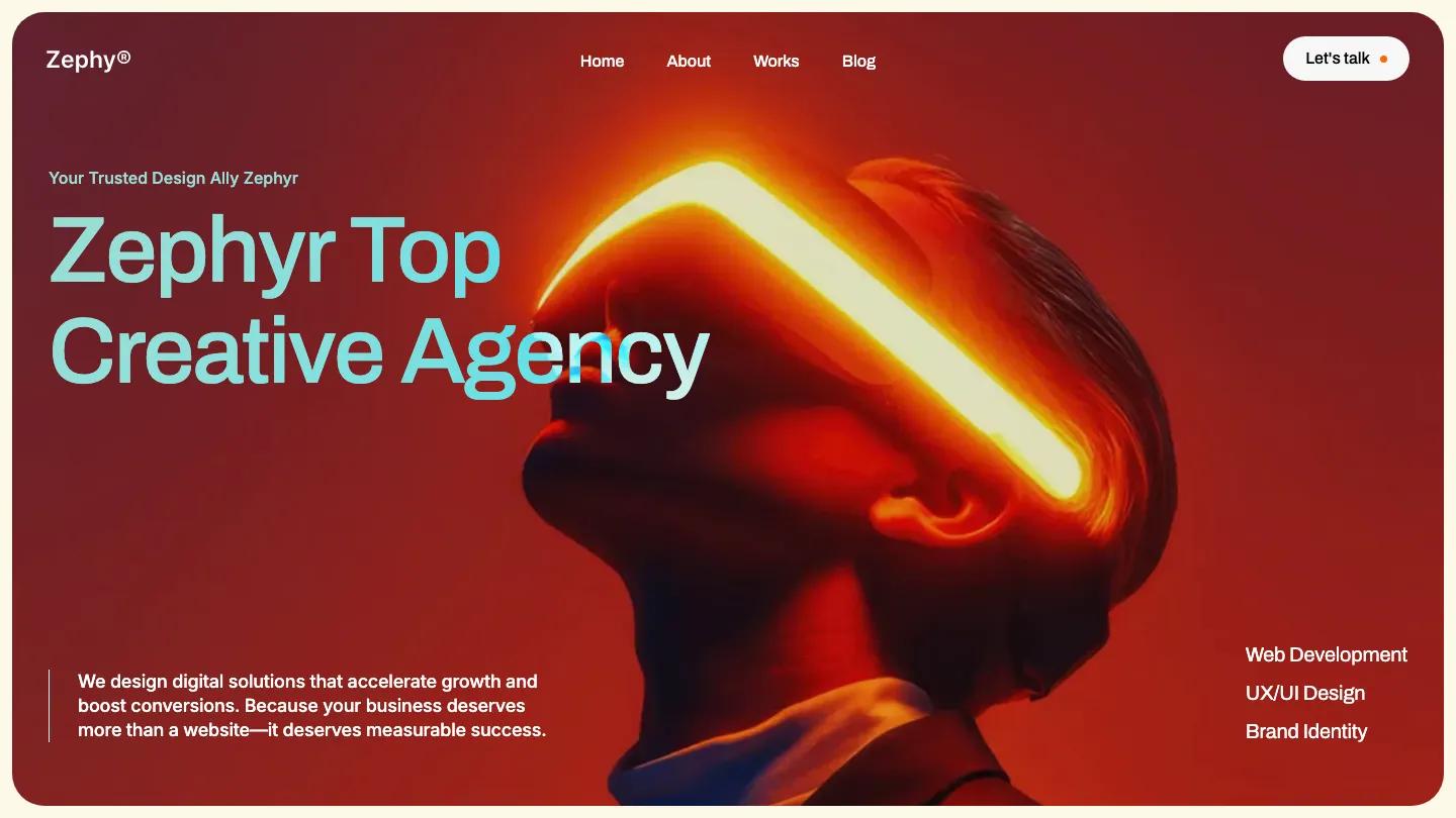
Zephyr Studio is a Webflow template for creative agencies that sell web, brand, and marketing work. The hero is a rounded panel filled with a red-lit portrait of a man wearing a glowing visor, and "Zephyr Top Creative Agency" sits across it in large Archivo with a pale aqua gradient. A short pitch with a thin vertical rule anchors the bottom left, while Web Development, UX/UI Design, and Brand Identity stack on the right. The header is simple: a small wordmark, Home, About, Works, and Blog in the center, and a white Let's Talk pill with a tiny orange dot.
Under the hero, Flow Nija switches to a warm cream background, with small orange dots marking each label. A Studio intro pairs a big statement with headline figures and a logo carousel. Selected work runs as a grid of rounded image cards, each with a name, year, and discipline overlaid, such as a blurred cyclist for Launch Space. Services then move into a black rounded block, with numbered rows like Marketing and Strategy, small pill chips, and grey motion-blur photos. Pricing cards on soft beige list what's included, and an Approach section, a black block of customer reviews, a numbered FAQ accordion, and blog cards follow above a black footer. The About page opens with an oversized "About Us" beside a short paragraph and a wide photo of a profile streaked with light.
On a phone, the hero keeps its rounded red panel, the headline wraps neatly, and the service list stays visible below the pitch.
We'd pick Zephyr Studio for small agencies and freelance teams with moody, experimental imagery. The service descriptions still carry placeholder filler text, and the client figures and placeholder logos need replacing. It's a long homepage, so trim sections you won't use.
Based on the live demo, viewed on desktop and on a phone. The Design and Dev scores come from separate independent reviews. See how we score templates.
Independently evaluated by our team of 6 designers and 5 developers.











Designers score design, developers score development, and each score is the average of their independent ratings. Read about our review team and how we score templates.