Regular is a high-quality Framer template for Portfolio & Agency, Photography & Videography, Personal, Business & Startup, Art & Design by Layout Gallery.
Our Review of Regular
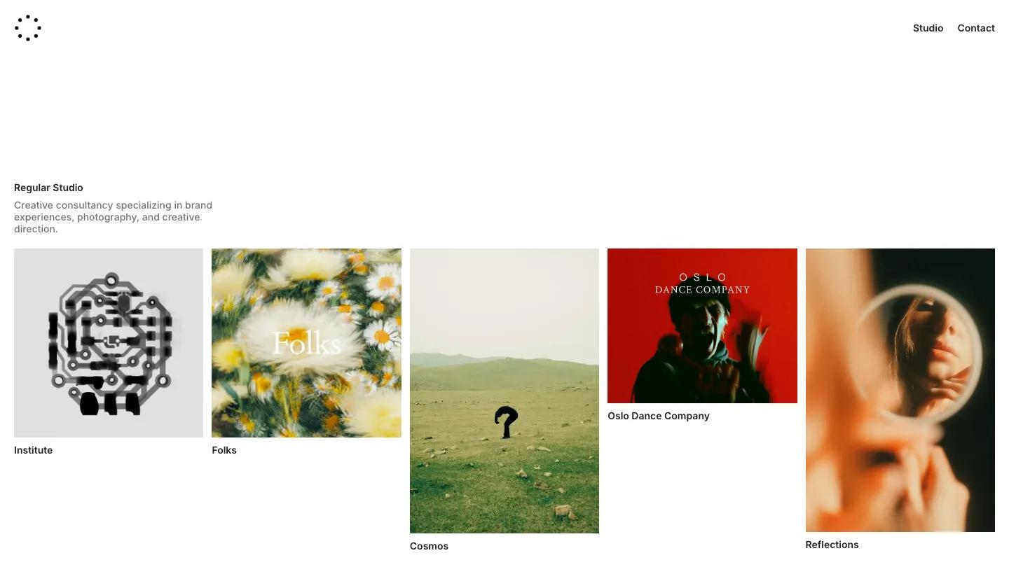
Regular lives up to its name: a white, almost silent portfolio for a small creative studio or a photographer that trusts the work to make all the noise. There's no headline in the usual sense. A ring of black dots serves as the logo at the top left, Studio and Contact sit at the top right, and after a generous white gap, a short bold "Regular Studio" line and a two-line grey description introduce the business in small sans-serif type.
Right under that, Layout Gallery lays the projects out in a five-column grid where every image keeps its own proportions. A square circuit-like emblem sits beside a field of daisies, a tall photo of a hillside with a lone question mark, a red poster for a dance company, and a blurry portrait caught in a hand mirror. Because the heights differ, the captions land at different levels, which gives the page a loose, pinned-to-the-wall rhythm. A second row brings a bright yellow fitness logo, a black and white product shot, and a botanical cover in a classic serif. A small outlined Load More button follows. The Studio page keeps the same restraint: the name on the left, two short paragraphs of grey text on the right, then a wide photo of a sunny, plant-filled interior.
On a phone, the grid drops to two columns, the images stay large, and the header keeps both links visible without a menu icon.
We'd pick Regular for photographers, illustrators, and boutique studios whose images are strong and varied enough to carry a page with almost no copy. Some project names in the demo reference real companies, so swap them for your own. And with type this small and quiet, think about whether visitors will understand what you do within the first few seconds.
Based on the live demo, viewed on desktop and on a phone. The Design and Dev scores come from separate independent reviews. See how we score templates.
Independently evaluated by our team of 6 designers and 5 developers.











Designers score design, developers score development, and each score is the average of their independent ratings. Read about our review team and how we score templates.
More Like This




14 Best Fintech Website Templates for Finance Apps (2026)
Best Framer Blog Templates 2026
9 Best Consulting and Professional Services Website Templates (2026)

AI and Writing Statistics 2026: What the Research Actually Says
13 Best Photography Website Templates for Webflow and Framer (2026)
12 Best Personal Website Templates for Webflow and Framer (2026)