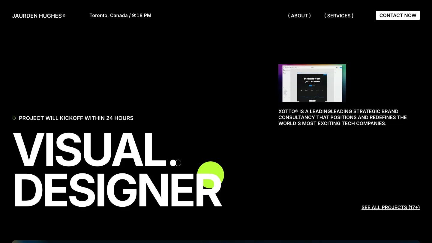
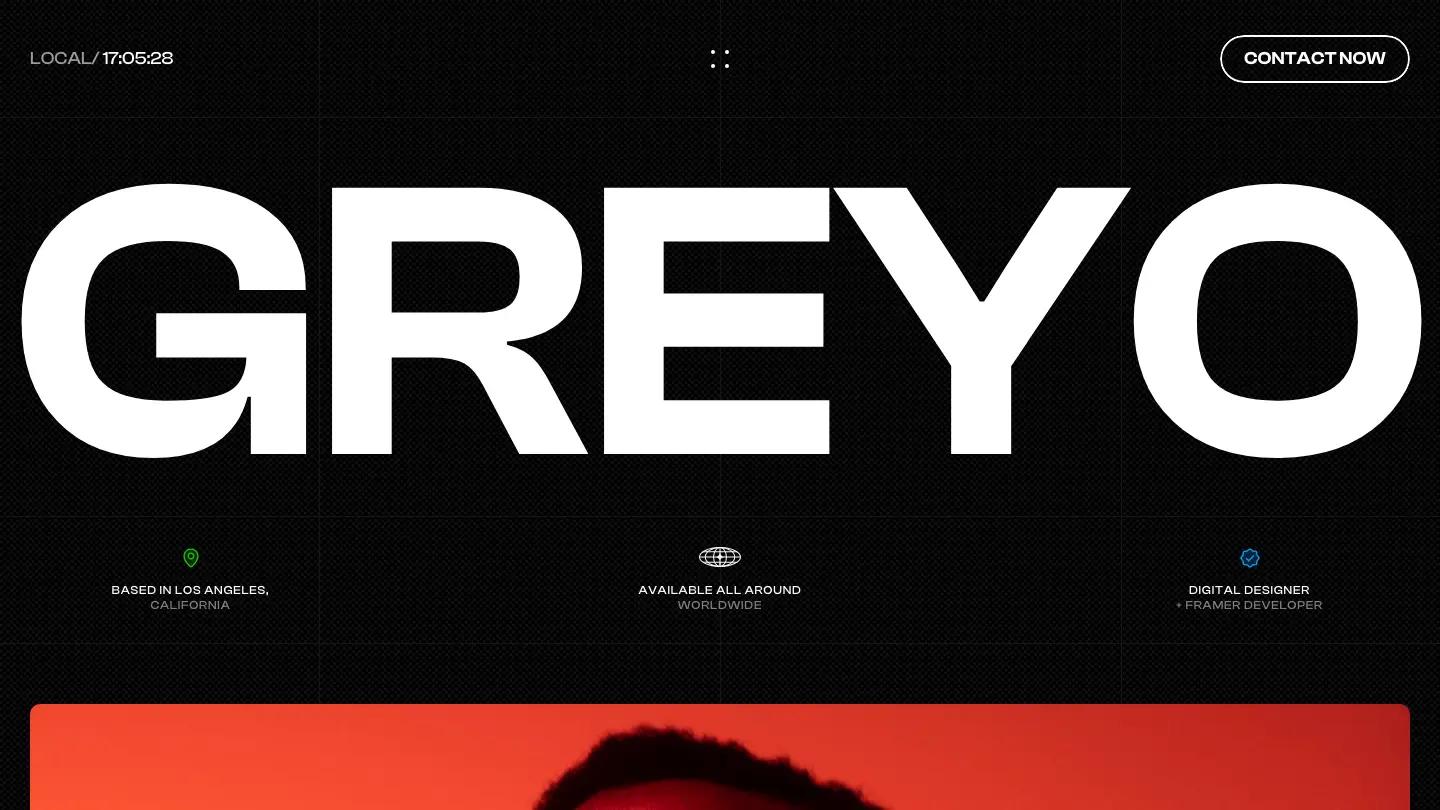
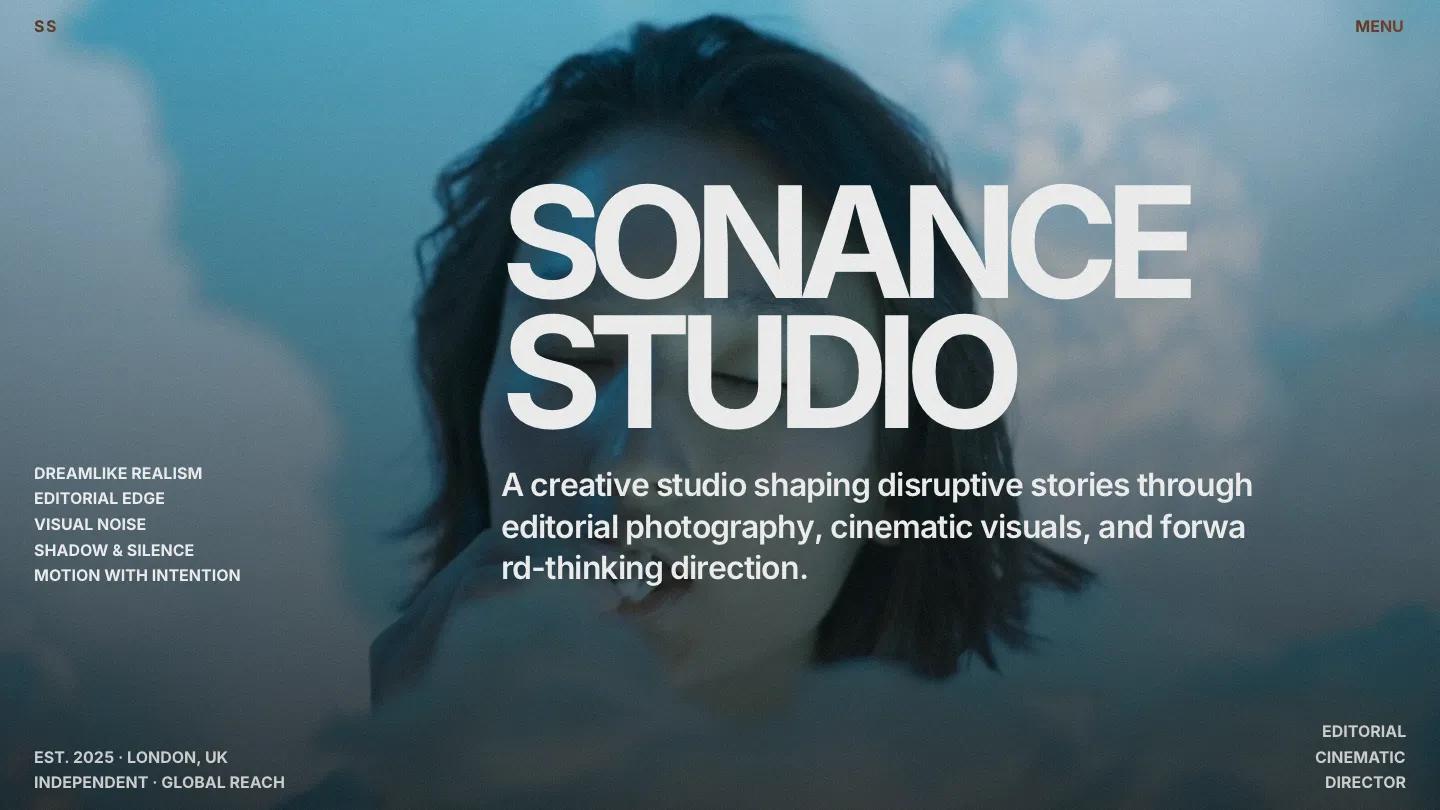
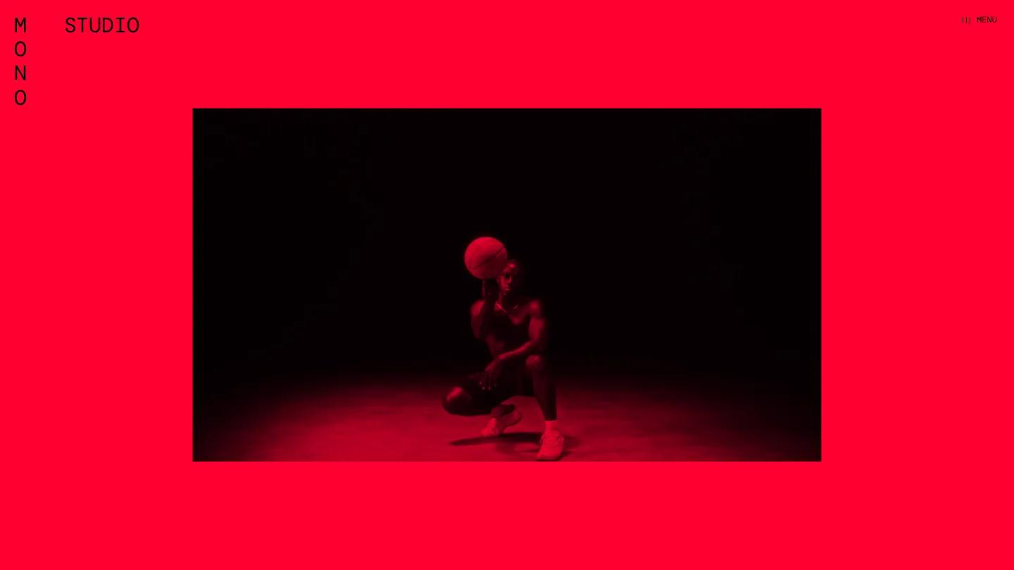
Agentum is a high-quality Framer template for Portfolio & Agency, Personal, Professional Services, Business & Startup by Alberto.
Our Review of Agentum
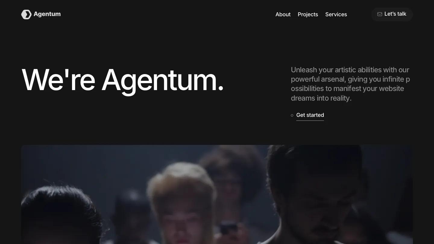
Agentum is a dark agency site for small creative studios and consultancies, and it opens with almost nothing but type. "We're Agentum." is set huge in white Inter on a charcoal background, with a short grey intro and an underlined Get Started link to its right. Below sits a wide rounded video of people lit by their phone screens. The header is minimal too: a hexagon logo, About, Projects, and Services, and a dark pill button labelled Let's Talk.
The Services section works like a scrolling list, with UI/UX, Branding, Dev, Consulting, Ads, Marketing, and Motion stacked in large type, each one brightening as it reaches the middle of the screen. A greyed placeholder logo strip follows, then Selected Work, where project covers such as Growth Loop and Motion Magic float in at slightly different sizes and positions. An About Us block pairs a heading with two short paragraphs over another full-width video, a Let the Numbers Speak row shows stats in a monospaced face, and Our Customers lays out quotes as dark cards with small portraits. The page closes with "Wanna work together?", a dark contact form, a striking image of a carved wooden figure, and a footer with the email address in large underlined type. The About page by Alberto opens on a team video with "Driven by Creativity, Powered by Results" set across it.
On a phone, the big name shrinks to a single line, a plain Menu label replaces the links, and the video drops beneath the intro text.
We'd pick Agentum for small agencies and freelance collectives who want a quiet, type-led look. We'd rewrite the stock copy, which is heavy on buzzwords, and check the intro paragraphs on desktop, where long words break awkwardly across lines.
Based on the live demo, viewed on desktop and on a phone. The Design and Dev scores come from separate independent reviews. See how we score templates.
Independently evaluated by our team of 6 designers and 5 developers.











Designers score design, developers score development, and each score is the average of their independent ratings. Read about our review team and how we score templates.