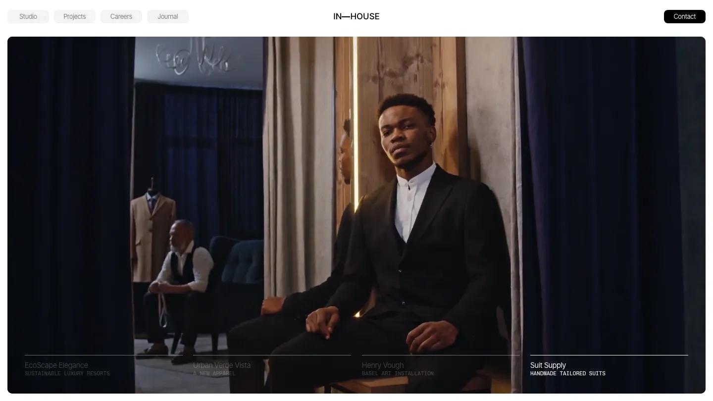
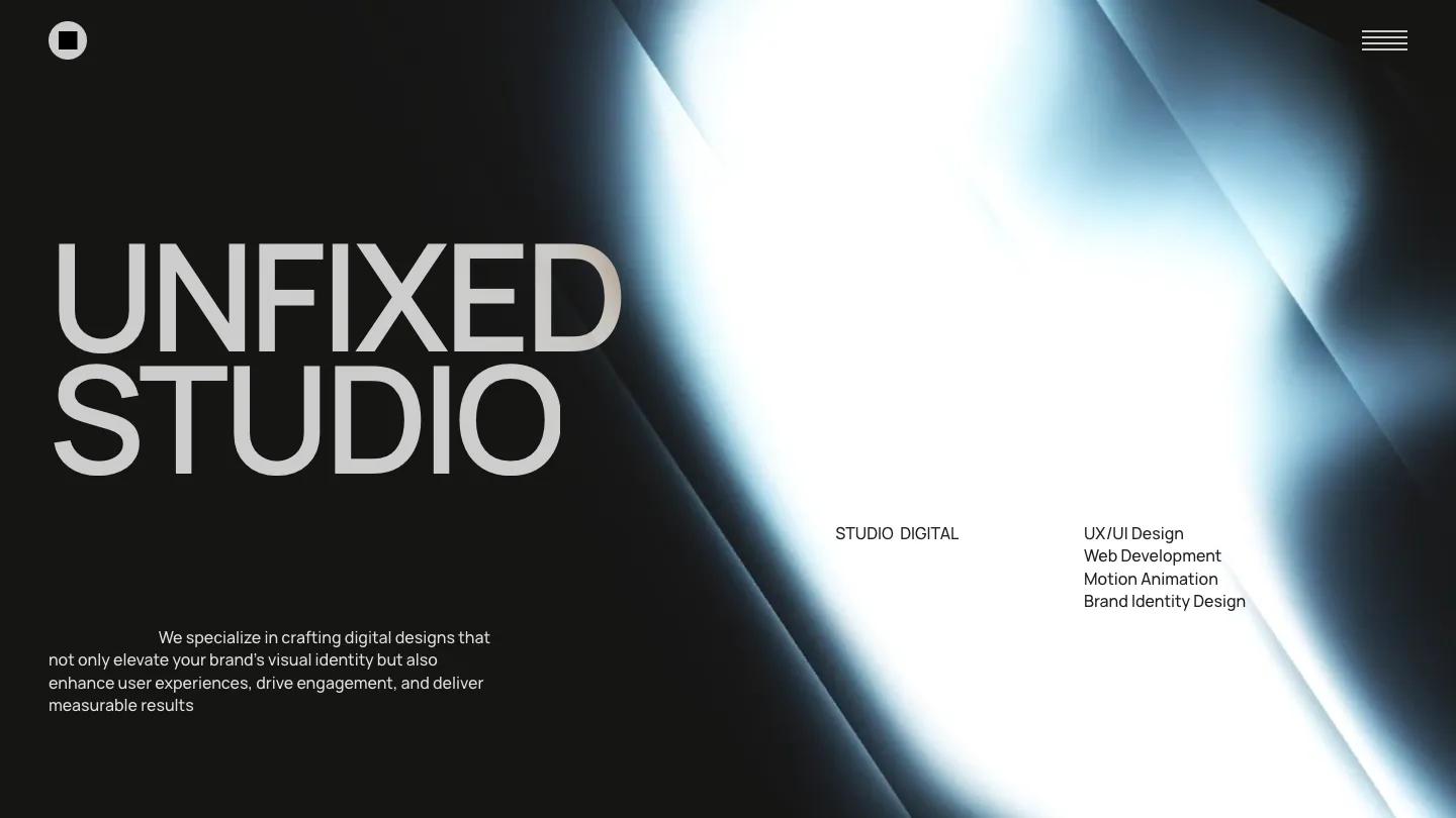
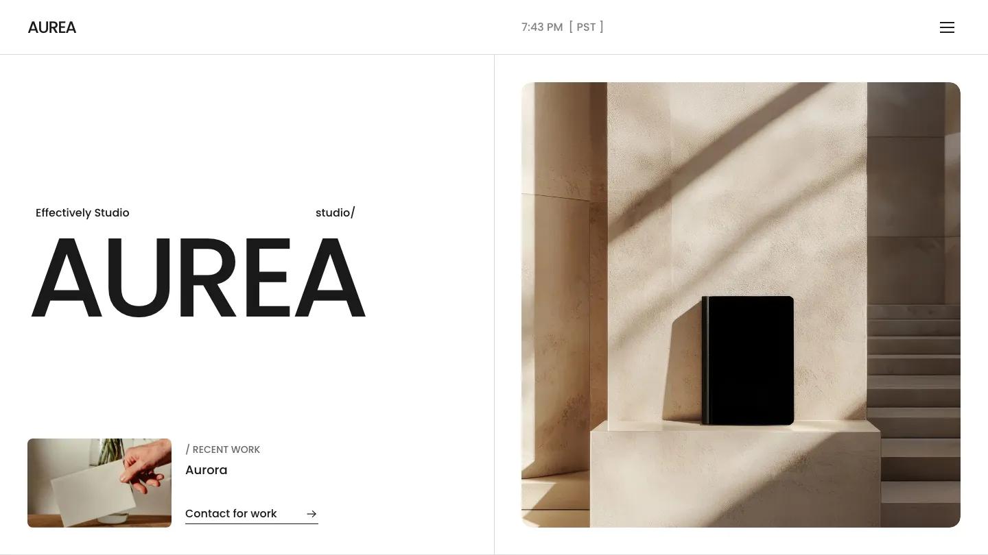
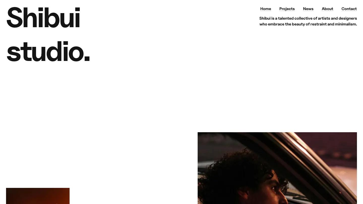
Studio Terrace is a high-quality Framer template for Portfolio & Agency, Blog & Editorial, Professional Services, Business & Startup, Art & Design, Photography & Videography by ena supply.
Our Review of Studio Terrace
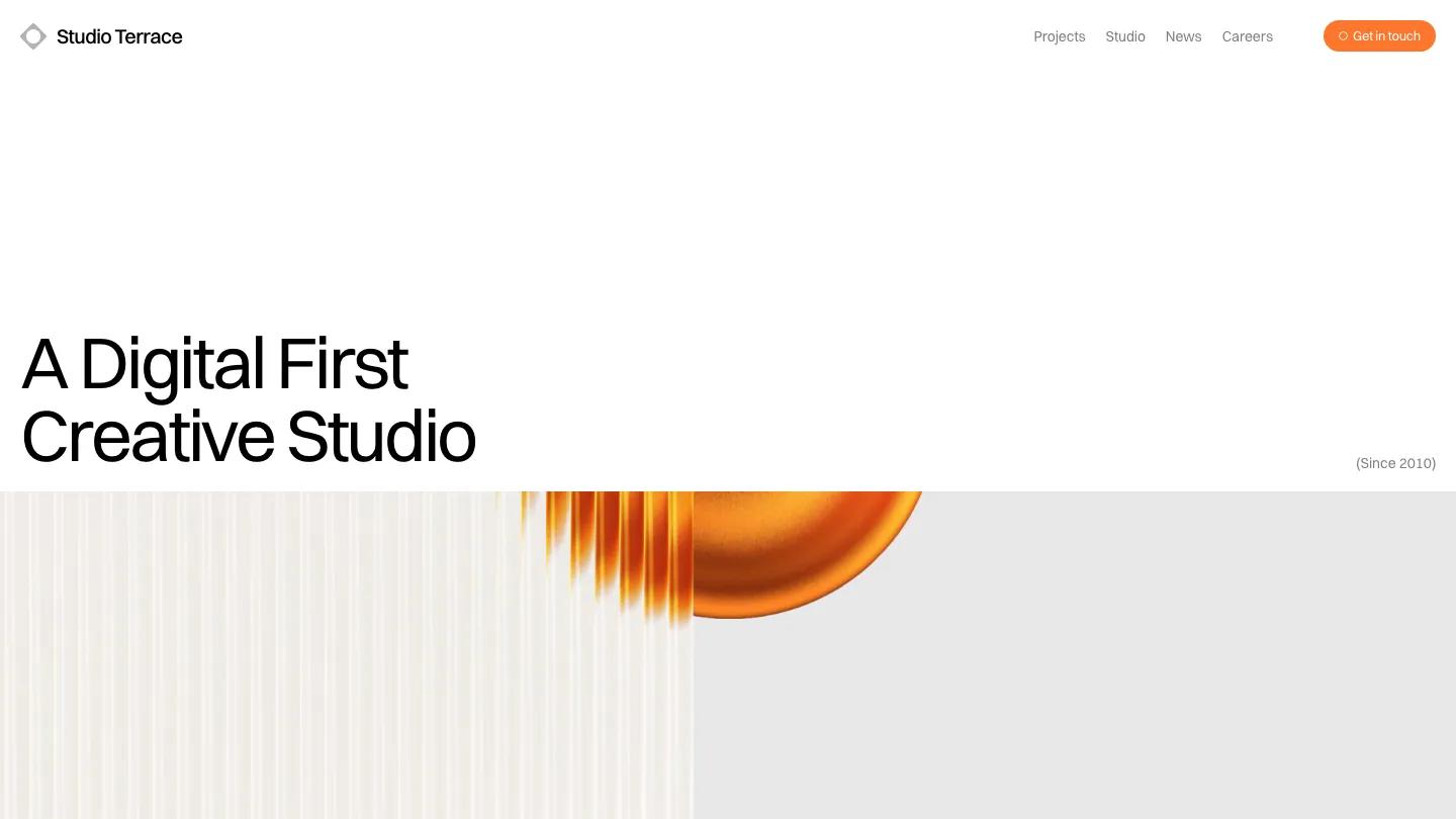
Studio Terrace is a calm, grown-up site for a small web and branding studio. The hero is mostly white space: "A digital first creative studio" sits low on the left in large Switzer, with a grey "(Since 2010)" tucked in the far corner. Underneath, a wide 3D animation of a glowing orange disc slides behind ribbed glass. The header keeps to a small diamond logo that turns as you scroll, four grey links, and an orange Get in Touch pill.
ena supply builds the rest of the homepage in a few clear steps. An About Us chip leads into a long statement in big type, then a dashed rule introduces Latest Work, with a View All Projects pill. Projects sit two across and then three across, each a large image of a website mockup on a laptop, tablet, or black stage, with discipline tags like Art Direction / Web Design in grey above the project name. The Newsroom shows four article cards with images of different heights, a headline, and a short excerpt. The footer is a nice detail: a quarterly newsletter field, live clocks for London and Amsterdam, and a plain link column. The Projects page repeats the same cards in a three-column grid, with a small floating switch at the bottom for grid or list view.
On a phone, the header shrinks to the logo and a text Menu link, but a large empty gap sits above the headline before the orange animation appears.
We'd pick Studio Terrace for digital agencies and freelance web designers who mostly show website work. Every project image here is a screen mockup, so you'll need polished device shots of your own. We'd also tighten that empty space above the mobile headline.
Based on the live demo, viewed on desktop and on a phone. The Design and Dev scores come from separate independent reviews. See how we score templates.
Independently evaluated by our team of 6 designers and 5 developers.











Designers score design, developers score development, and each score is the average of their independent ratings. Read about our review team and how we score templates.