9 Best Consulting and Professional Services Website Templates (2026)

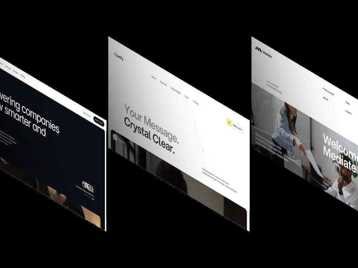
556 templates in our library carry the Professional Services tag, but only a handful are built for consultancies, law firms and communications agencies. We ranked the 9 that are, from a free Framer site for strategy firms to a $29 PR agency page.
A consulting firm sells something nobody can see before they buy it: judgment. The website has to stand in for the first meeting. It should say what you fix, show that real companies trusted you with it, and make booking a call easier than closing the tab. Most consulting website templates get the look right and miss the job, with a project grid built for a design studio and no room for a process, a team or a practice area.
Our own tags show how easy it is to pick the wrong one. Of the 981 templates we publish, 556 carry our Professional Services tag, and 521 of those also carry Portfolio & Agency. Most are creative studio sites. We went through the category, plus the few templates that carry no category tag yet, and found 9 actually built for consultancies, law firms and communications agencies. Those 9 are ranked below.
Every score comes from our multi-reviewer process: designers and developers with 10 or more years of experience score each template independently, and we publish the average. You can browse the full tag on our professional services templates page, but expect mostly studio portfolios there.
The 9 Picks at a Glance
| Template | Platform | Built for | Design | Dev | Price |
|---|---|---|---|---|---|
| Flat White | Framer | Management and strategy consultancies | 9.0/10 | 9.4/10 | Free |
| Clarify | Webflow | PR and communications agencies | 8.9/10 | 9.2/10 | $29 |
| Sincere | Webflow | Branding and communications consultancies | 8.8/10 | 9.2/10 | $29 |
| Claire | Webflow | Brand strategists and messaging consultants | 8.9/10 | 9.1/10 | $29 |
| Halden Miller | Webflow | Advisory firms and B2B service teams | 8.4/10 | 8.7/10 | $129 |
| Mediate | Webflow | Small law firms and mediators | 8.4/10 | 8.6/10 | $49 |
| Peakline | Framer | Business coaches and solo consultants | 7.2/10 | 7.4/10 | Free |
| Lawx | Webflow | Law practices on a zero budget | 7.5/10 | 7.1/10 | Free |
| Upreach | Framer | Growth and marketing consultancies | 6.9/10 | 7.1/10 | Free |
Four of the nine come from one creator, Jacob Nielsen, which says something about how thin this niche is. Six are on Webflow and three are on Framer.
What Should a Consulting Website Template Include?
A consulting website template needs five things: a headline that names the problem you solve, a services or practice area list a client can scan, a section on how you work, proof such as client logos or testimonials, and one clear path to a call or a form. Team profiles matter more here than in most niches, because clients hire people, not a brand.
Then check the build. If you publish articles or case studies, you need CMS collections, which Flat White's listing doesn't show and Sincere's feature list doesn't include. If you charge fixed fees, Flat White and Clarify ship pricing sections. Law firms should look for a practice areas page first: Mediate has the best one in our library.
On platform, Webflow suits firms that will publish regularly and want structured content. Framer suits small firms that want a polished site live quickly. Our Framer vs Webflow comparison covers the trade-offs in detail.
The 9 Best Consulting and Professional Services Templates
Ranked by Overall Score, highest first. Each name links to its review page, where a screen recording of the full homepage plays on a loop.
Flat White
Design: 8.9/10
Dev: 9.3/10
Price: Free
Best for: small management, advisory or operations consultancies that want a full site with pricing and a team page at no cost
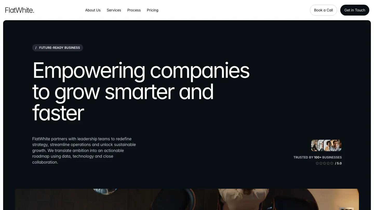
Flat White is the strongest free template we've published for a strategy consultancy, and it's written for one from the first line. Ditych dresses it in charcoal, slate and white, and the hero sits inside a near-black rounded panel with light, tightly spaced Inter type and a cluster of client avatars. The header carries both Book a Call and Get in Touch, which is the right call for a firm whose whole funnel is a conversation.
Design: 8.9/10 reflects how the homepage alternates large dark and light rounded panels without losing rhythm: a numbered service list with expandable rows, a process section with steps along a curving line, team cards with role, city and a short bio, pricing and a two-column FAQ. Dev: 9.3/10 is the highest build score on this list, and on a phone the dark hero panel holds together with the headline over four lines.
Worth knowing: the homepage is very long, and the logo strip and team cards ship with placeholder names, so plan to cut panels and fill in real people before launch.
Clarify
Design: 8.8/10
Dev: 9.2/10
Price: $29
Best for: PR firms and communications consultants who want one calm, credible page with published fees
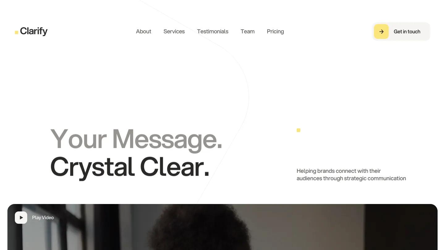
"Your message. Crystal clear." sets the tone in two shades of Aspekta, warm grey above near-black, and the rest of Clarify keeps that discipline. Every section uses the same split: a small label with a butter yellow square on the left, a large statement on the right. Yellow is the only accent, and Design: 8.8/10 rewards how far one color and one layout rule carry the page.
The practical sections are strong for a PR firm. A team panel lists each person as a row with a portrait, name, role and an envelope button, three soft beige plan cards set out the fees, and the page closes on a full yellow contact form. Dev: 9.2/10 also reflects a style guide page that lays out the palette as swatches, which makes rebranding faster.
Worth knowing: it's built as a single long page of jump links, so a firm that needs separate pages for each service will outgrow it.
Sincere
Design: 8.8/10
Dev: 9.2/10
Price: $29
Best for: consultancies that sell strategy and advice rather than visual work, and have a writer on hand
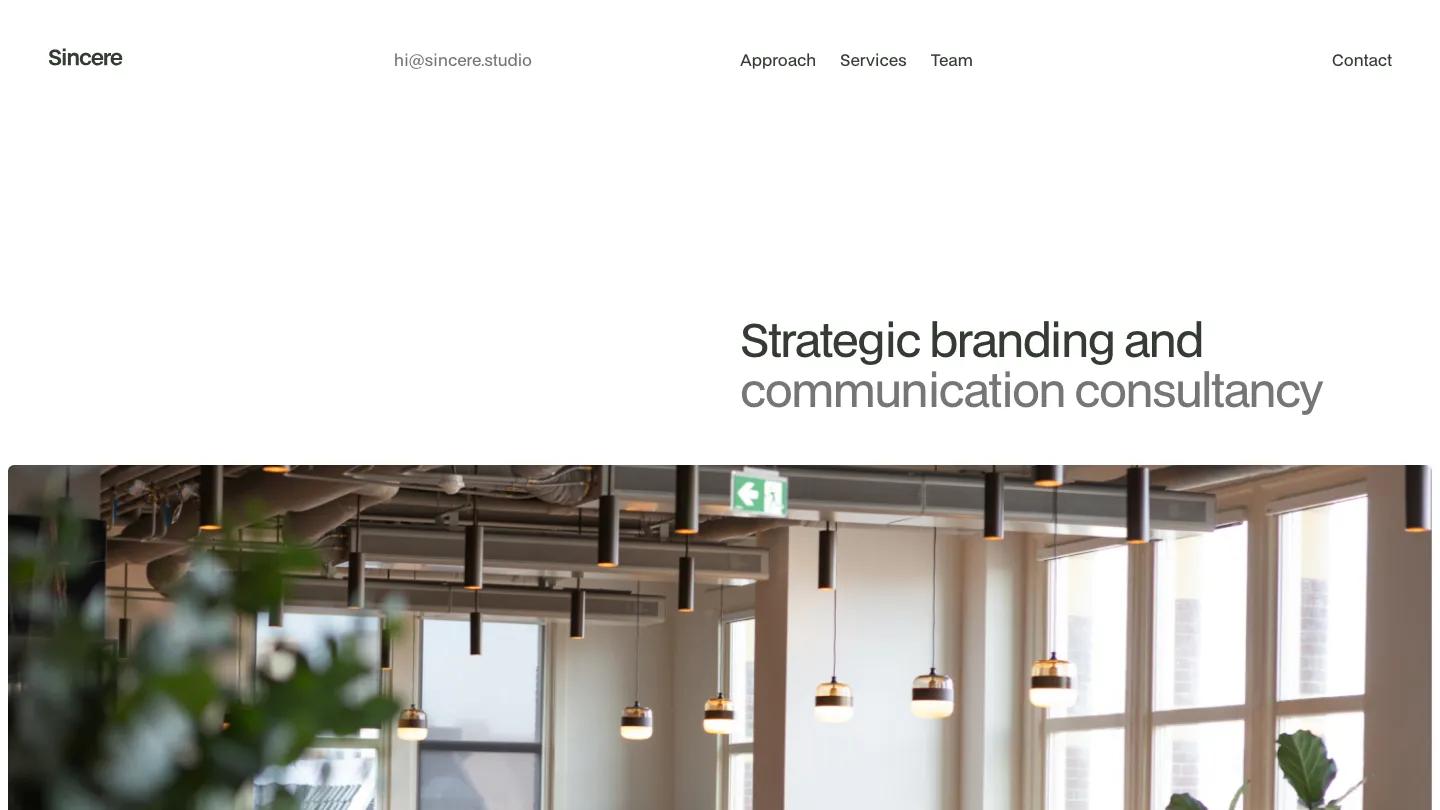
Restraint is the whole personality here. The hero is a single two-tone line, "Strategic branding and communication consultancy", set in BDO Grotesk on the right half of a white page, above a wide office photo. Small bullet labels such as Welcome, Clients and FAQ mark each section, and the approach section is the memorable part: a giant uppercase word scrolls past, then thin-ruled columns pair each step with an oversized grey numeral.
Design: 8.8/10 reflects that patience with white space. Dev: 9.2/10 covers a clean build with scroll effects, a numbered FAQ accordion and a style guide page for colors and type.
Worth knowing: there's no project imagery and no CMS in its feature list, so the page depends on strong writing, and the demo service blurbs lean on stock agency phrasing you should replace.
Claire

Design: 8.8/10
Dev: 9.1/10
Price: $29
Best for: brand strategists and messaging consultants who want their copy, not a portfolio, to win the client
Of the three Jacob Nielsen communications templates, Claire has the most color and the most character. A full-screen photo in a pale blue tint carries a long serif statement in Nyght Serif, and the name returns at enormous size in the bottom right corner, overlapping the image. Services sit on a full-bleed deep indigo band as numbered rows, and an approach section lays out principles such as Listen First in a ruled grid on pale blue.
Design: 8.8/10 reflects the confident pairing of Nyght Serif with Aspekta body text. Dev: 9.1/10 covers a build with CMS, an FAQ accordion and a style guide page showing the full palette.
Worth knowing: there's no case study grid, and a couple of demo paragraphs contain typos worth fixing before launch.
Halden Miller
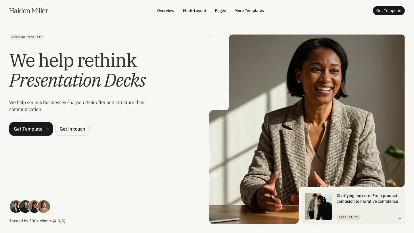
Design: 8.4/10
Dev: 8.7/10
Price: $129
Best for: advisory firms and B2B service teams that need a multi-page site with a blog, pricing and case studies
BYQ Studio wrote Halden Miller around a fictional strategy practice, and it shows in the details. The hero pairs "We help rethink Service Design" (the last words in italic IBM Plex Serif) with a photo of a consultant cut into a stepped shape and a small case study card in its corner. A floating Project phase dropdown on a later photo hints at process without needing a diagram, a nice touch for firms whose work is hard to picture.
Design: 8.4/10 reflects calm, well-spaced blocks on warm off-white, with a soft orange and pink gradient band leading into testimonials. Dev: 8.7/10 covers the widest page set of our Webflow picks: CMS, blog, pricing, services, projects and an FAQ with tabs. The page ends on two large cards, one to book a consultation and one to see services.
Worth knowing: at $129 it's the most expensive pick, and you'll need to rewrite copy that describes the firm as fictional and replace demo FAQ questions about the template itself.
Mediate
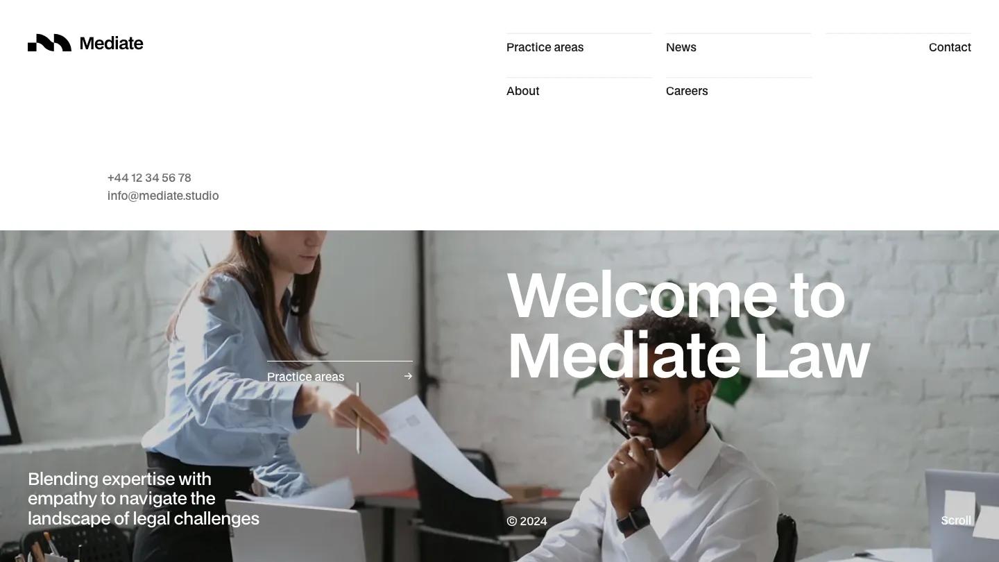
Design: 8.4/10
Dev: 8.6/10
Price: $49
Best for: small law firms and mediators that want to look modern without looking casual
Most law firm templates reach for navy, gold and a serif crest. Mediate skips all three for white space, near-black BDO Grotesk and a light grey panel or two. The header is unusual: a chunky black logo mark on the left and, on the right, a two-row grid of links on thin rules with the phone number and email tucked underneath, so a client never has to hunt for them.
Practice areas are the strongest section we've seen in this niche. They sit in a rounded grey panel as a numbered list, each row pairing a short description with a large title like Litigation or Corporate Law and an arrow. Design: 8.4/10 reflects those confident blocks. Dev: 8.6/10 covers CMS, a blog for news, a careers page and a Practice Areas page that reuses the hero format.
Worth knowing: most photos are generic office stock, and a few demo texts and page addresses contain typos, so proofread before launch.
Peakline
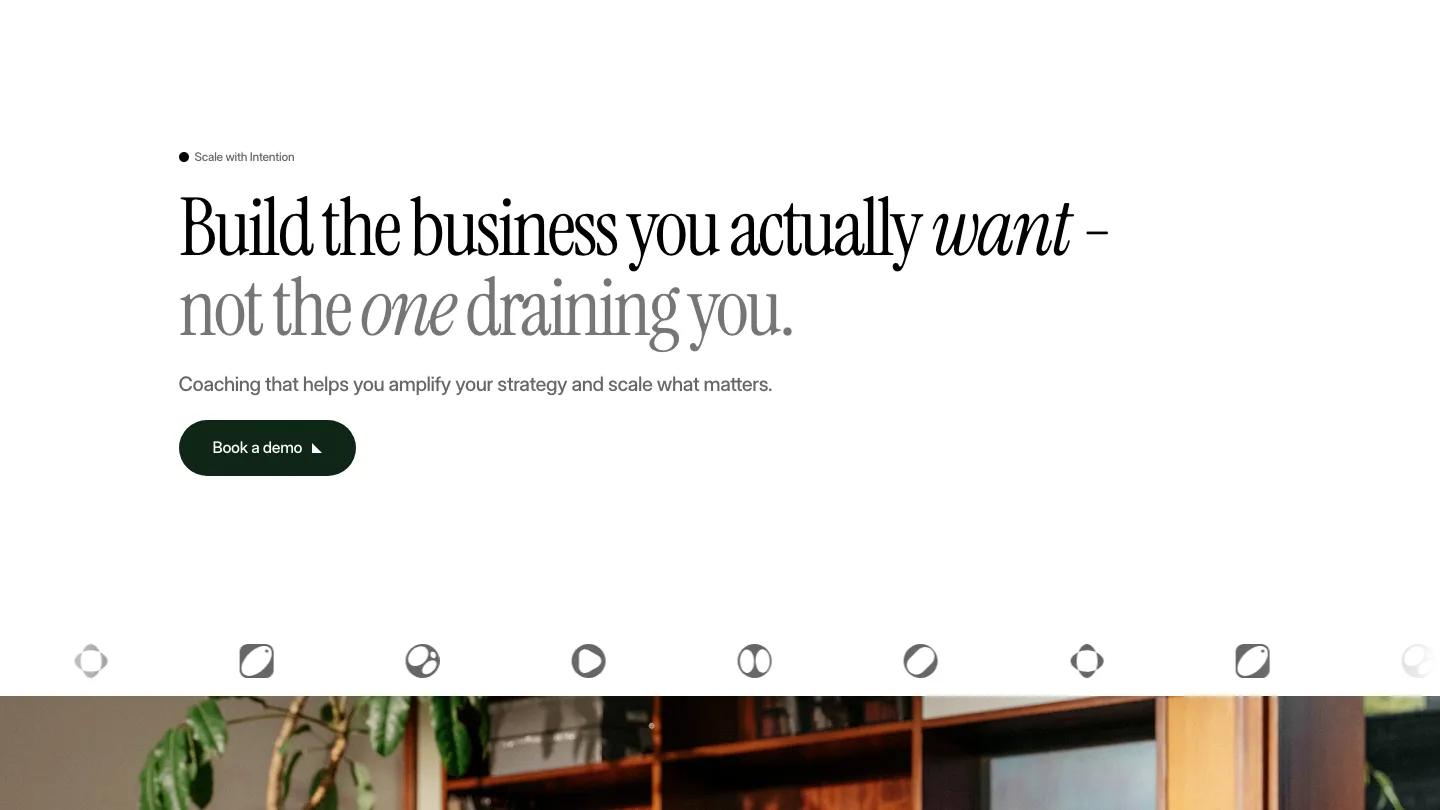
Design: 7.2/10
Dev: 7.4/10
Price: Free
Best for: business coaches and solo consultants who sell a few packages and want visitors to book a call
We haven't published a written review of Peakline yet, so this entry sticks to its scores, its listed features and what its cover shows. Moyin goes light and editorial: a condensed serif headline, "Build the business you actually want", with italic accents and a softer grey second line on plain white, then a dark green Book a demo button and a row of client logos. It reads more like a coaching practice than a firm, which suits a consultant who works alone.
Design: 7.2/10 and Dev: 7.4/10 sit in our "good with real limitations" range. Its feature list covers pricing, a blog, an about page, forms and localization, which is rare at this price and useful for consultants who work in two languages.
Worth knowing: "Book a demo" is software language, so change the button to Book a call before launch.
Lawx
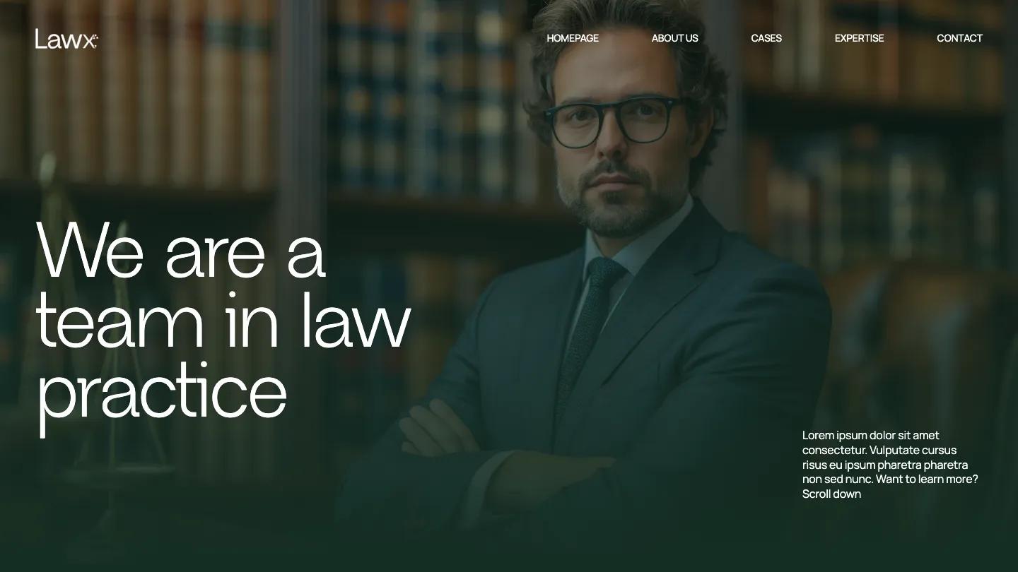
Design: 7.5/10
Dev: 7.1/10
Price: Free
Best for: solo lawyers and small practices that need a free multi-page starting point and will rewrite every line
We haven't published a written review of Lawx yet, so this entry sticks to its scores, its listed features and what its cover shows. ATWWW Templates opens on a dark green, low-lit photo of a man in a suit in front of bookshelves, with "We are a team in law practice" in large white type and a menu of About Us, Cases, Expertise and Contact. Its feature list includes CMS, a services page, a projects page for cases, forms and slideshows.
Design: 7.5/10 and Dev: 7.1/10 put it in our "good with real limitations" range. It's the only template in our library tagged for professional services alone, with no other category.
Worth knowing: placeholder Latin text is visible on the opening screen, so expect to replace copy throughout, and compare it with Mediate, which outscores it on both axes for $49.
Upreach
Design: 6.9/10
Dev: 7.1/10
Price: Free
Best for: growth consultancies and marketing advisors that sell services to other businesses and lead with client results
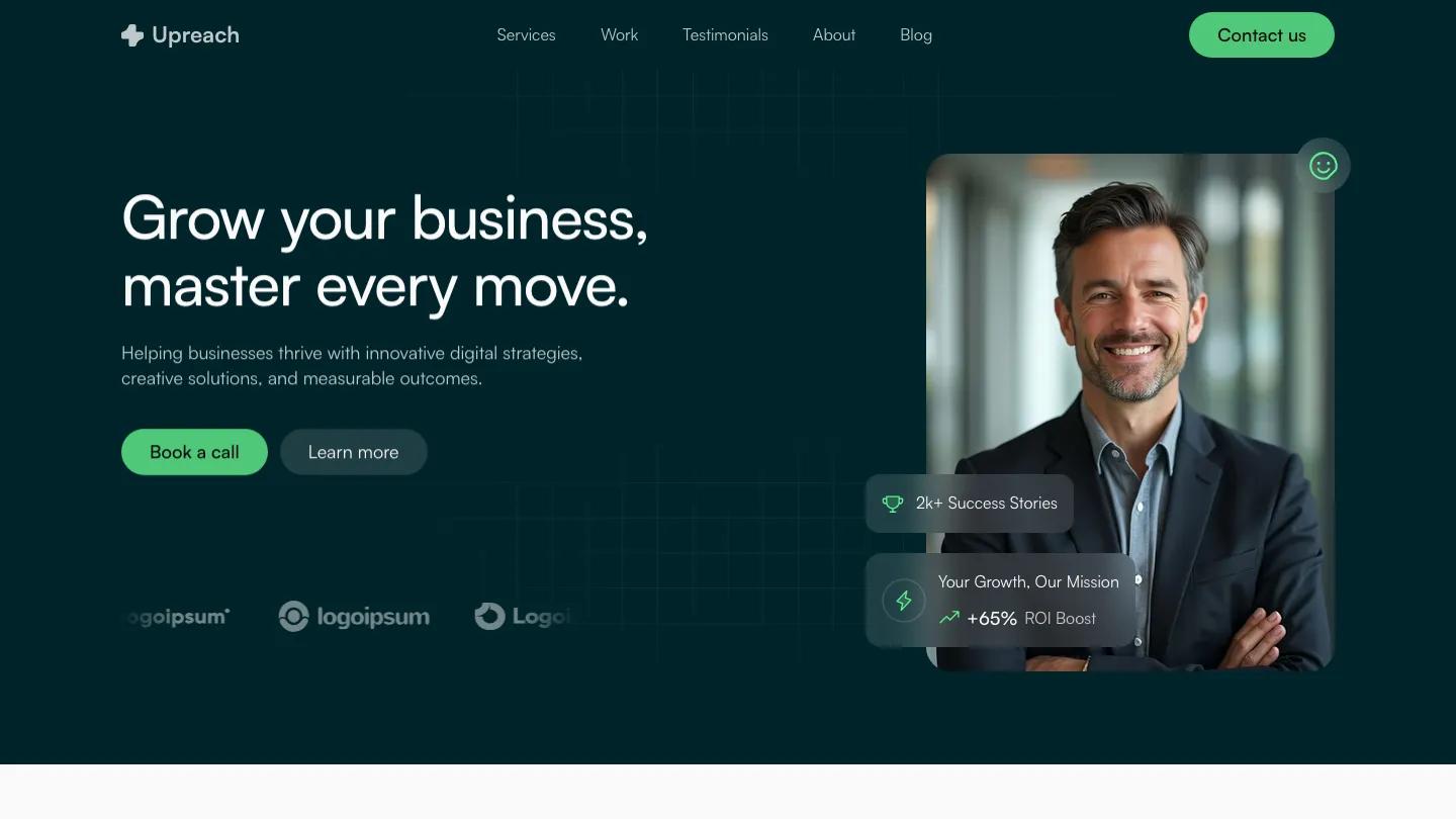
Upreach is the most sales-driven page on this list. Khurram Arain sets a deep teal hero with a faint grid, "Grow your business, master every move," a bright green Book a call button, and a portrait of a smiling consultant with floating cards for success stories and ROI. We haven't published a written review yet, so this entry draws on its scores, features and cover.
Design: 6.9/10 is the lowest design mark on this list, and Dev: 7.1/10 is just above our floor. In its favor, the feature list includes a CMS, a blog and dedicated services and projects pages, more structure than most free Framer templates offer.
Worth knowing: the demo leans on placeholder logos and made-up growth figures, so the page only looks credible once your own clients and results replace them.
Why Only 9, and How We Chose Them
Our category tags are broad, and in this one they mislead. 556 templates carry Professional Services, but 521 of those also carry Portfolio & Agency, and most were built for design studios, architecture practices and creative agencies. A studio portfolio leads with a project grid. A consultancy needs services, a process, a team and a booking path, and none of that fits naturally into a grid of case study thumbnails.
We kept a template only if its own demo is written for a consultancy, a law firm or a communications agency, and we checked every cover by eye. Therapy and counselling practices need a calmer, more personal site, so we rank those separately in our best wellness website templates. That left 9: eight from the tag, plus Flat White, which carries no category tag in our library yet. We didn't pad the list with creative agency templates that happen to share the tag.
Every template in our library has an Overall Score of 7.0 or above, the average of its Design Score and Dev Score, each averaged from independent reviewer scores. Creator reputation and sales figures play no part. The full process is on our methodology page.
Are There Free Consulting Website Templates Worth Using?
Yes, four. Flat White (Design: 9.0/10, Dev: 9.4/10) is the strongest template on this list at any price, and it's free. Peakline, Lawx and Upreach are free too, but all three score between 7.0 and 7.3 overall and need much more rewriting. For more free options outside this niche, browse our free templates page. If you're weighing a template against a custom build, our guide to website template prices shows what you get at each price point.
FAQ
14 Best Beauty and Skincare Website Templates (2026)
by Lauren Smith
10 Best Wellness Website Templates for Studios, Therapists and Brands (2026)
by Emma Clark

14 Best Fintech Website Templates for Finance Apps (2026)
by Marcus Jones
13 Best Photography Website Templates for Webflow and Framer (2026)
by Marcus Jones
10 Best Restaurant Website Templates for Webflow (2026)
by Marcus Jones