Nabule is a high-quality Framer template for Portfolio & Agency, Professional Services, Business & Startup, Personal, Blog & Editorial, Art & Design, Photography & Videography by Pawel Gola.
Our Review of Nabule
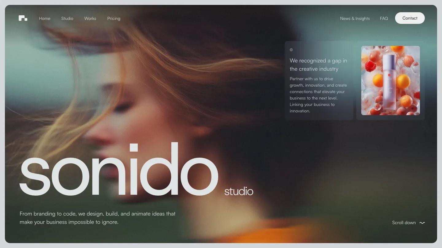
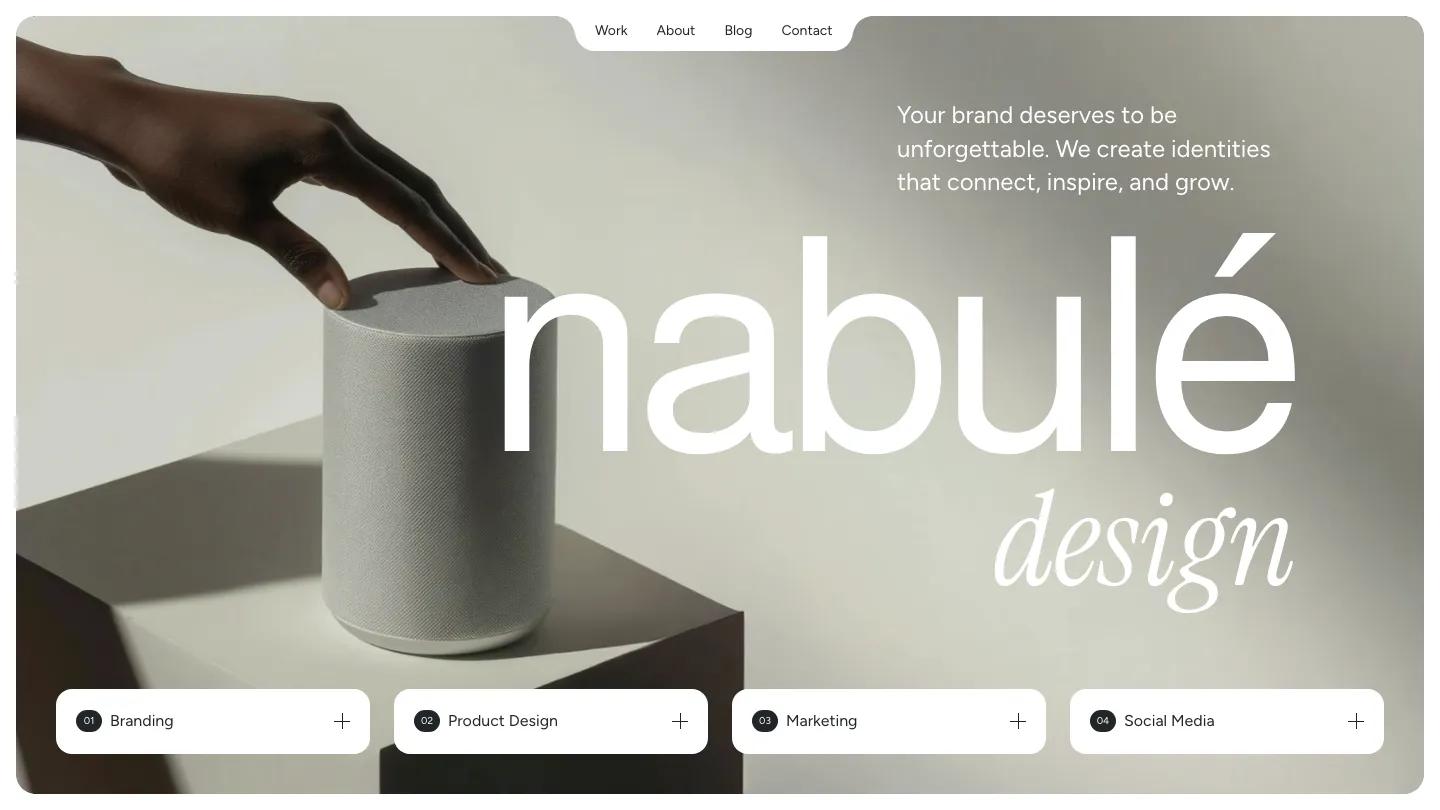
Nabule is an agency template built on one strong pairing: a clean sans serif for most of the page, and Instrument Serif in italics for the words that matter. The hero shows it right away. A giant lowercase wordmark sits over a soft, muted product photo, "design" flows underneath in italics, and the menu lives in a tab notched into the top of the rounded hero frame. Numbered service pills, from Branding to Social Media, line the bottom edge. Pawel Gola carries that rounded-card, notched-label look through every section, so the site feels like one piece.
The homepage tells a full agency story. Selected work runs as wide project cards, each with a white panel holding the year, a one-line summary, and service tags beside an oversized project name. A client logo strip, testimonials, and a process section follow, with numbered stages like Launch and small milestone tags. Then come pricing tiers with a yearly and monthly toggle, a FAQ, and recent blog posts. The Work page opens on "Our Projects" in the same sans and italic mix, with category tabs above large project cards.
The phone layout keeps the framed hero and the serif accents, and the about statement reads well at that size, with "branding" and "product design" picked out in italics.
We'd pick Nabule for branding and design studios that want to show their process and pricing, not only a portfolio. Check two things first. The pricing cards are built as monthly retainers, so project-based studios will need to rework them. And the homepage stacks a lot of sections, so plan to trim the ones you don't need.
Based on the live demo, viewed on desktop and on a phone. The Design and Dev scores come from separate independent reviews. See how we score templates.
Independently evaluated by our team of 6 designers and 5 developers.











Designers score design, developers score development, and each score is the average of their independent ratings. Read about our review team and how we score templates.