Orchid is a high-quality Framer template for Portfolio & Agency, Personal, Professional Services, Business & Startup, Blog & Editorial, Art & Design, Photography & Videography by Ava Thiery.
Our Review of Orchid
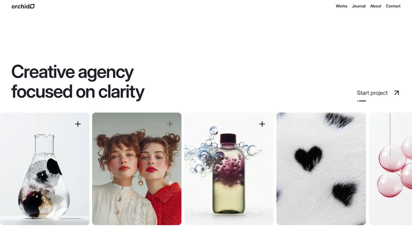
Orchid is a Framer template by Ava Thiery for a small branding and design agency. The hero is mostly white space: "Creative agency focused on clarity" in Inter Display, a Start Project link on the right, and a row of tall rounded image cards underneath, a glass flask, two red-lipped portraits, a bottle full of bubbles, a fur texture with black hearts. The palette stays white and pale blue-grey, so the surreal product imagery provides all the color.
The homepage runs long and is well organized. A logo row, an agency intro with two large project cards that list the project name and how many weeks it took, a stats row, a case study block with result cards, then services stacked as numbered panels for web development, branding, marketing and editorial design that slide over one another as you scroll, each with small tag pills. After that come latest works, a testimonial slider, a pricing block with two options, an FAQ, journal posts, and a closing call to book a short intro call. The Works page is a simple two-column grid under an Our Works heading, and the journal and about pages follow the same style. We like the project duration shown on each card; it's a small honest detail clients actually care about.
On a 390px phone the headline sits on two lines, the image row becomes a single card with arrow buttons, and the nav folds into a Menu label.
We'd pick Orchid for a design studio with polished, conceptual visuals and a clear service list. Before buying, plan to replace the stats, the conversion and recall figures in the case study, and the client logos, since all of them are sample numbers and names.
Based on the live demo, viewed on desktop and on a phone. The Design and Dev scores come from separate independent reviews. See how we score templates.
Independently evaluated by our team of 6 designers and 5 developers.











Designers score design, developers score development, and each score is the average of their independent ratings. Read about our review team and how we score templates.