Roslyn is a high-quality Webflow template for Portfolio & Agency, Art & Design, Personal, Professional Services by Jacob Nielsen.
Our Review of Roslyn
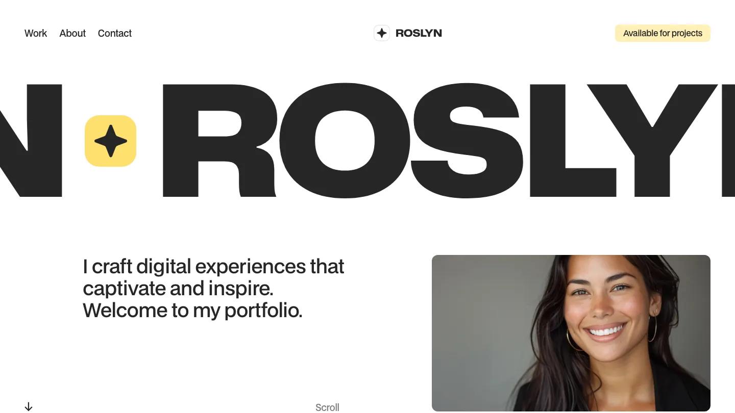
Roslyn is a one-page Webflow portfolio for a freelance designer, and it puts nearly all its personality into type. The name runs across the hero in very wide, heavy Mona Sans, looping like a marquee with a yellow rounded star badge between repeats, so you only ever see part of it at once. Below sits a short welcome line on the left and a warm, smiling portrait in a rounded frame on the right, with a quiet Scroll cue. The header is simple: Work, About, and Contact on the left, a star logo in the middle, and a soft yellow Available for Projects tag on the right.
Jacob Nielsen builds the Work section as a stack of giant project names, from Mediate to Charged, each separated by a thin rule, with a small Website label, a one-line description, and a square plus button on the right. It reads like a type specimen more than a gallery. The About part opens with "Nice to Meet You" in the same heavy capitals, partly overlapping the portrait, followed by a larger intro statement, two short columns of bio, and tidy two-column lists of services and clients under grey labels. The page ends with "Work with Me" in pale grey above the email address set huge in black. The style guide page shows the restrained palette, a run of greys from charcoal to near white.
On a phone, the wordmark still scrolls past, the menu stays visible as plain text links, and the portrait drops under the welcome line.
We'd pick Roslyn for designers and developers whose projects have short, punchy names. Long titles won't fit the giant type well. We would also fix the misspelled user experience entry in the services list before going live.
Based on the live demo, viewed on desktop and on a phone. The Design and Dev scores come from separate independent reviews. See how we score templates.
Independently evaluated by our team of 6 designers and 5 developers.











Designers score design, developers score development, and each score is the average of their independent ratings. Read about our review team and how we score templates.