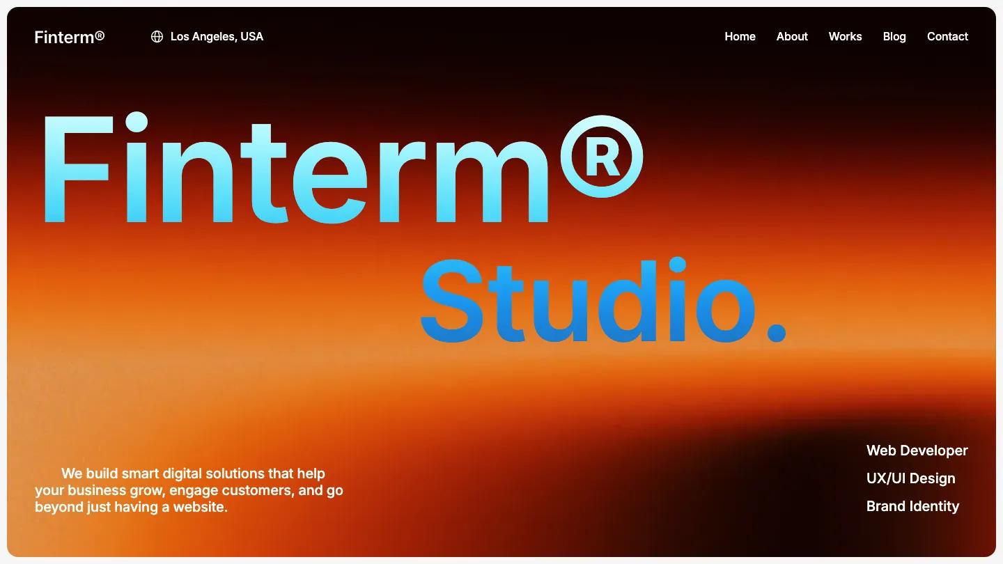
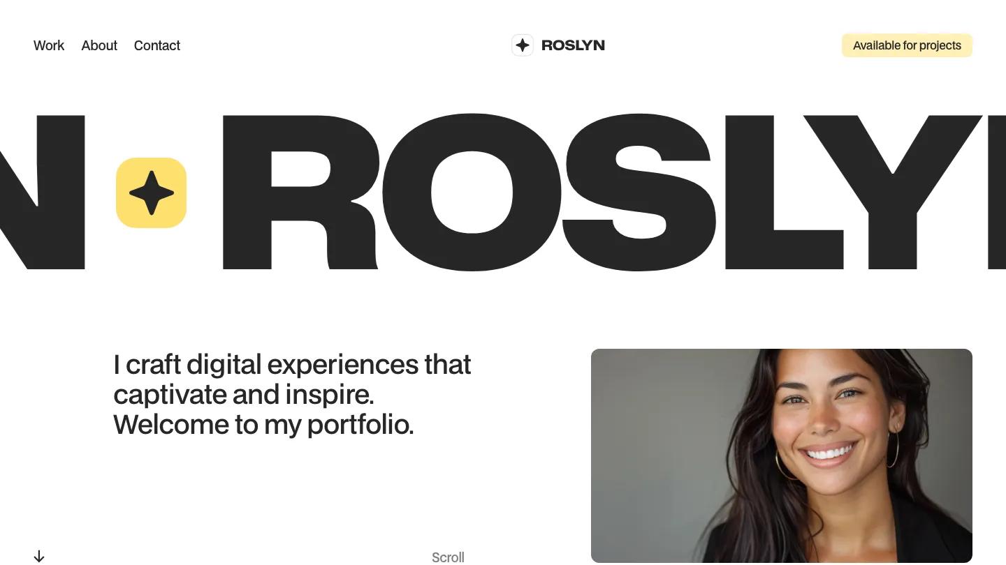
Marisol is a high-quality Webflow template for Portfolio & Agency, Personal, Art & Design, Professional Services by Slate Dept.
Our Review of Marisol
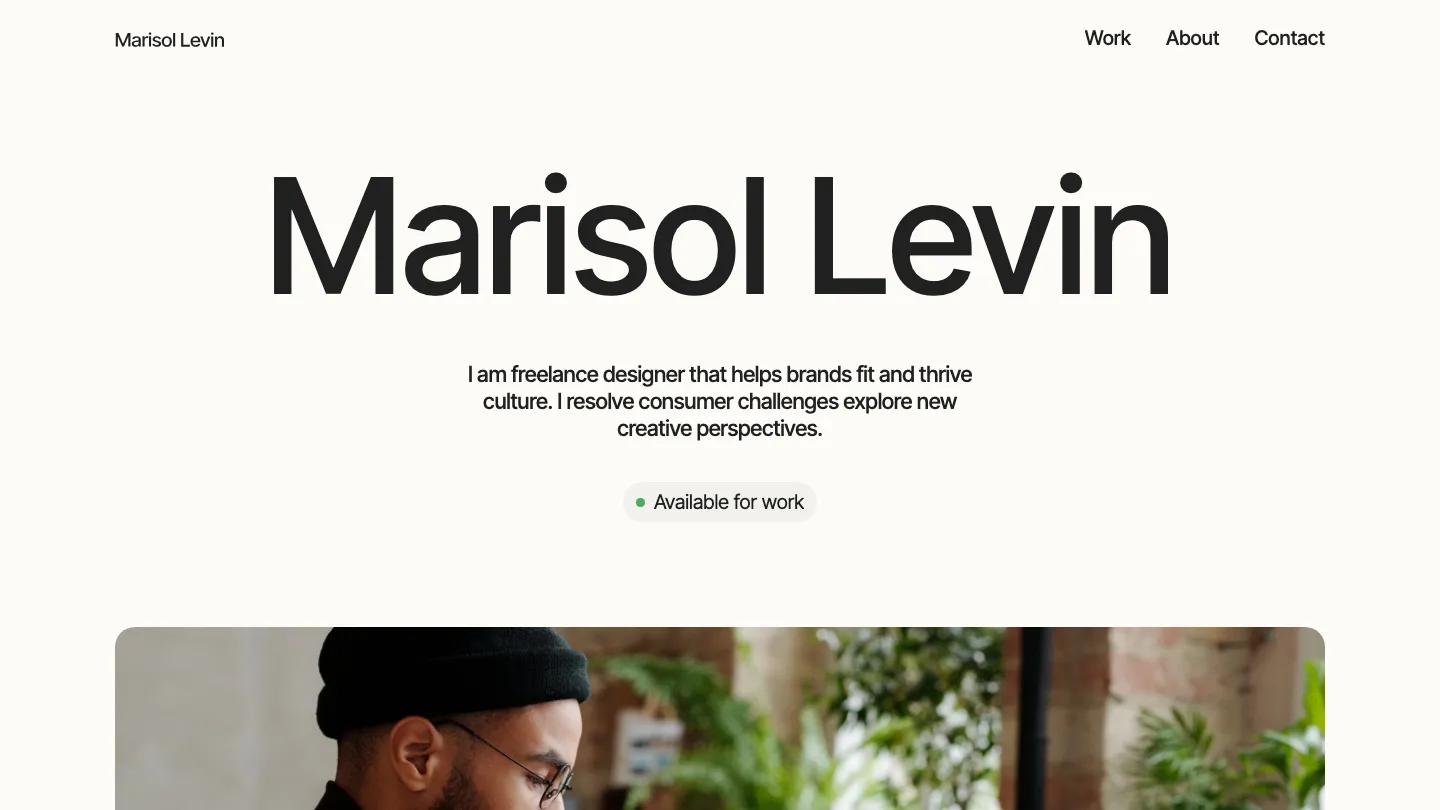
Marisol is a one-person portfolio for a freelance designer, and it keeps almost everything in a single typeface. The name Marisol Levin fills the top of a warm off-white page in huge Inter Tight, with a short centered intro below it and a soft grey pill that reads Available for work, marked by a small green dot. Under that sits a wide photo with rounded corners of someone working at a laptop among plants. The header is just the name on the left and Work, About, and Contact on the right.
Slate Dept builds the rest of the homepage on a two-column grid with thin divider lines. About me puts a label on the left and a large paragraph on the right, followed by big stat numbers for completed projects, years of experience, and awards, each with a small grey caption. Featured work comes next, with an All projects pill and a two-up grid of mockup photos (business cards, a book, a magazine spread), each captioned with a project name and its discipline. A numbered Services list follows with an arrow at each row, and the page closes on a black band with a large Contact me heading. The Work page greets visitors with a plain percentage counter while it loads.
On a phone, the name breaks onto two lines and still reads clearly, the availability pill stays centered, and the menu folds into a two-line icon.
We'd pick Marisol for brand and graphic designers who want a calm, text-led site with room for a handful of strong mockups. Check the demo copy closely before launch: one service name and parts of the bio contain typos, and the stats are placeholders. And with so little color, your project photos have to carry all the personality.
Based on the live demo, viewed on desktop and on a phone. The Design and Dev scores come from separate independent reviews. See how we score templates.
Independently evaluated by our team of 6 designers and 5 developers.











Designers score design, developers score development, and each score is the average of their independent ratings. Read about our review team and how we score templates.