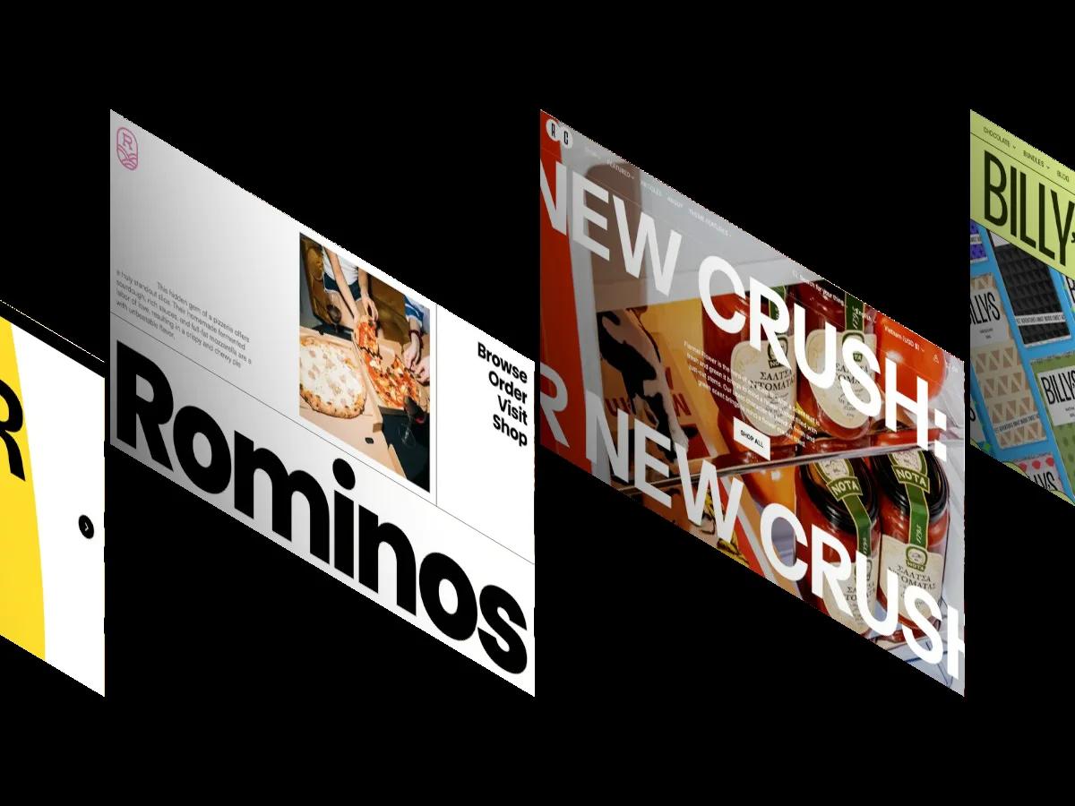
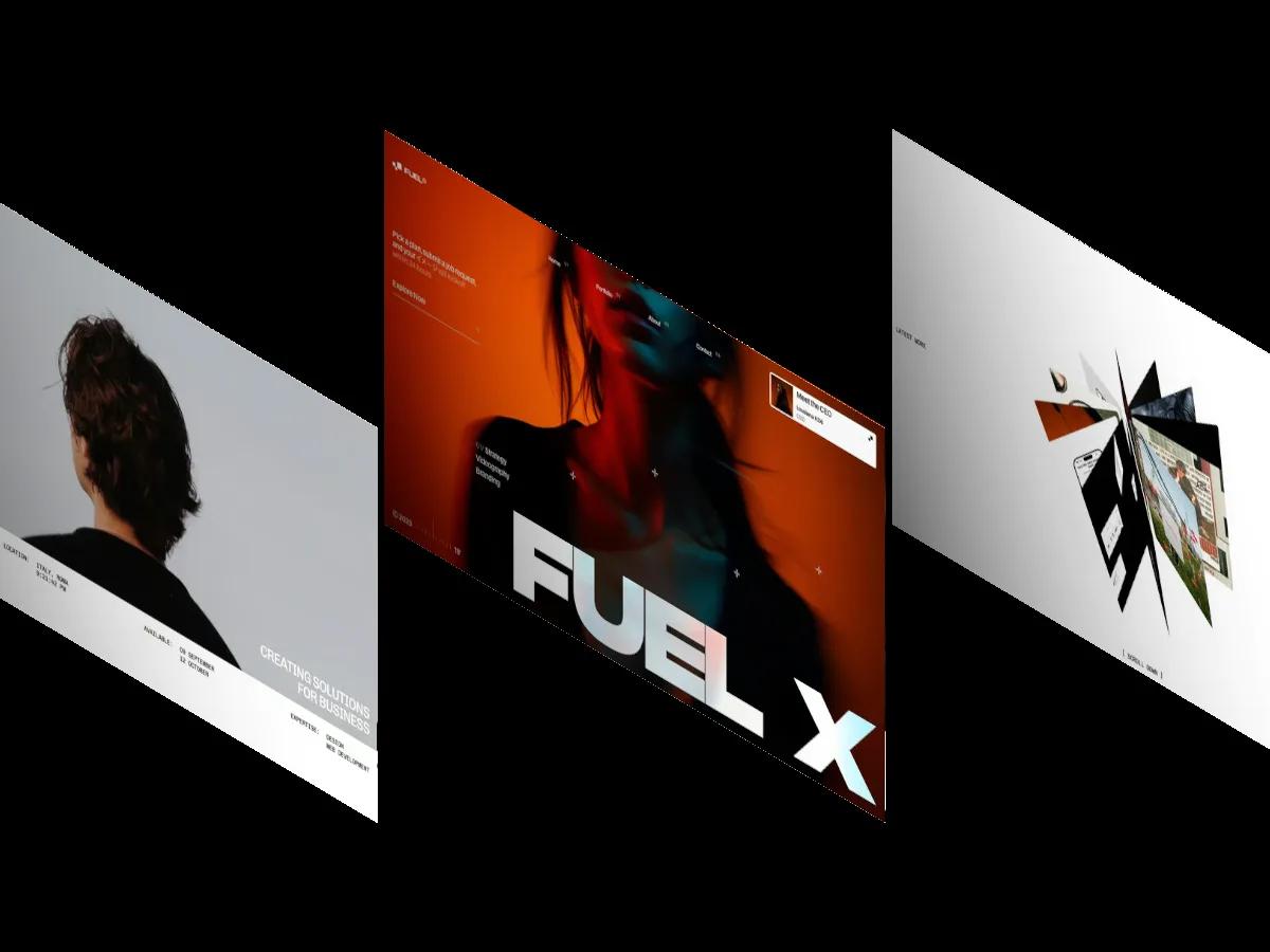
Satoshi is a high-quality Webflow template for Professional Services, Financial Services by JP.
Our Review of Satoshi
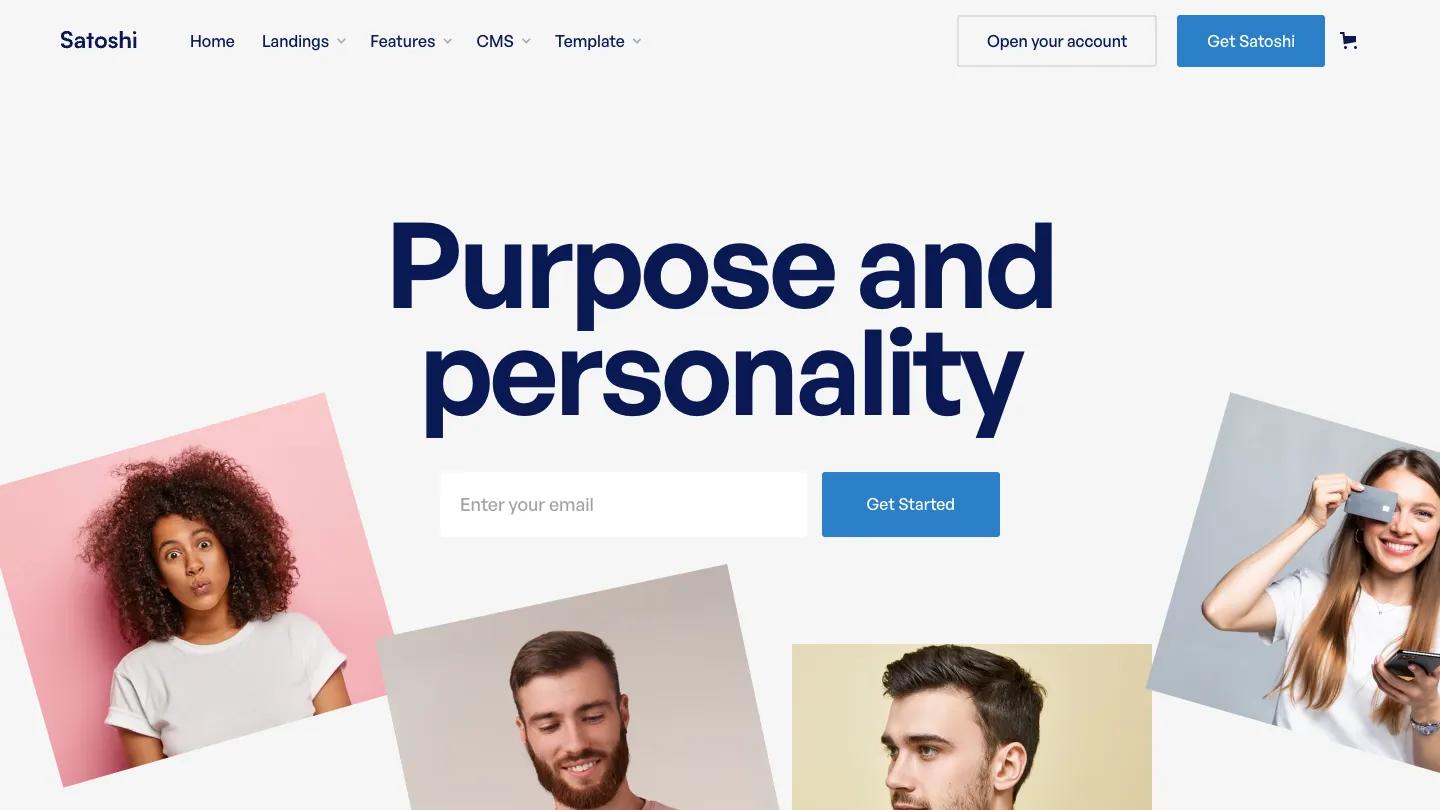
Satoshi is a kit for digital banks, payment apps, and personal finance startups, and its front page works as a catalog. "Meet Satoshi." opens the page in heavy navy General Sans, with a muted blue-grey line and a solid blue button below. Below, a sticky side menu of Landing Pages, Features Pages, CMS, and Forms sits beside a grid of page previews, each captioned with its name. Buyers start from one of the landing layouts rather than this page. The header carries Home, Landings, Features, CMS, and Template dropdowns, an outlined Open your account button, a blue Get Satoshi button, and a cart icon.
The first landing layout shows what JP is going for. A blue ticker runs across the top, and "Banking made simple." fills a deep navy hero in two shades of blue, with a hand-drawn purple underline beneath the second word and an email field paired with a Get Started button. Further down the landing pages, we found an "All-in-one online banking" block with a phone mockup of a balance chart flanked by round icon features, a dark split panel with a portrait, testimonial cards with small avatars, and a navy closing band with checkmark perks. The feature and form previews add an FAQ grid, a scrolling cashback banner, and contact pages that pair a portrait with a short form.
On a phone, the catalog page centers its heading and button neatly, the header shrinks to the wordmark, cart, and a hamburger, and the previews fall into a two-column grid.
We'd pick Satoshi for fintech founders who want lots of banking-style layouts to mix and match. Much of the body copy is still placeholder Latin, so plan a real writing pass, and the testimonial cards need genuine customer quotes before launch.
Based on the live demo, viewed on desktop and on a phone. The Design and Dev scores come from separate independent reviews. See how we score templates.
Independently evaluated by our team of 6 designers and 5 developers.











Designers score design, developers score development, and each score is the average of their independent ratings. Read about our review team and how we score templates.