Builder Studio is a high-quality Webflow template for Professional Services, Art & Design, Portfolio & Agency, Furniture & Interior Design by Onixtheme.
Our Review of Builder Studio
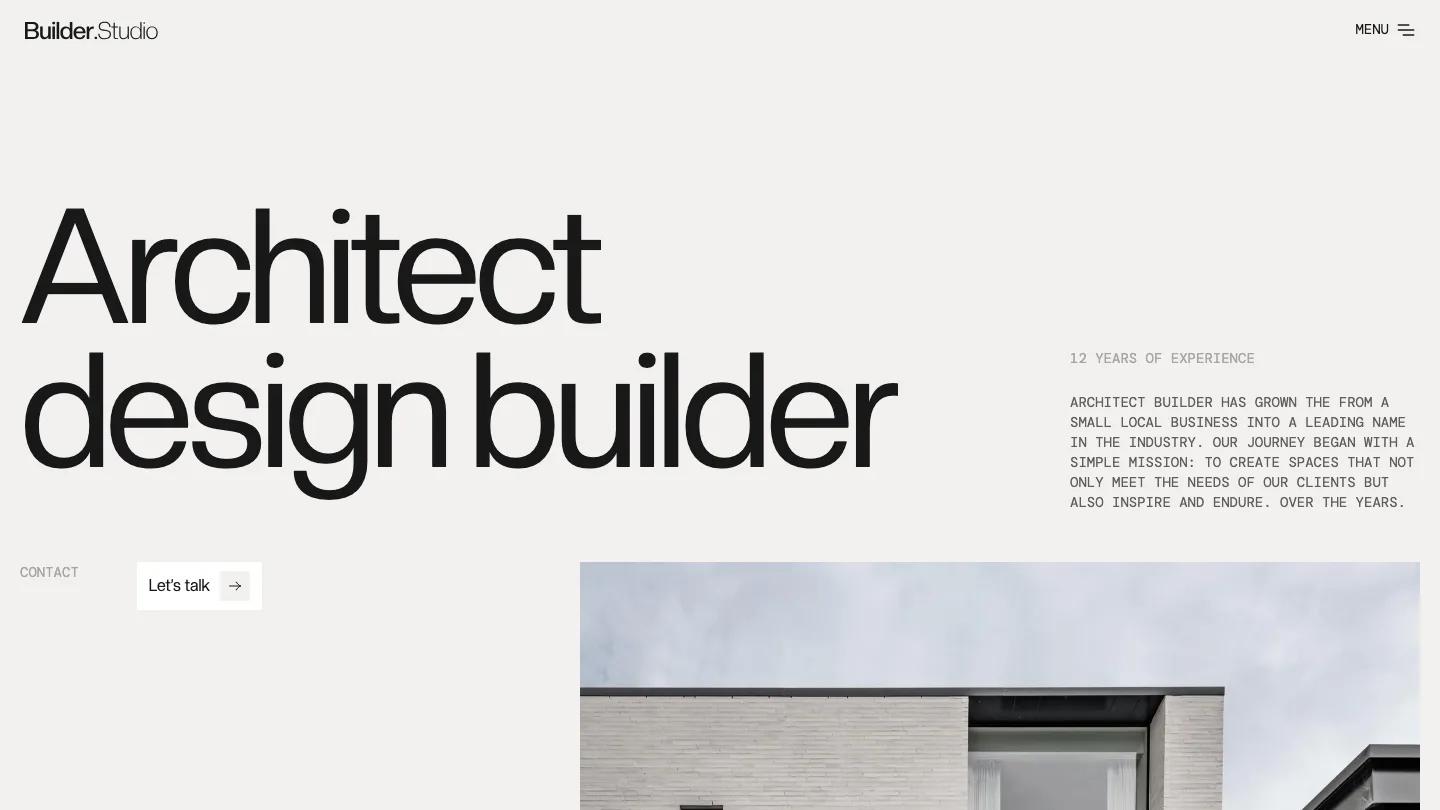
Builder Studio is an architecture firm site that plays two typefaces against each other on a warm, putty-colored page. "Architect design builder" fills the hero in huge, tightly spaced Creatodisplay, and right under it the copy switches to small grey capitals in a typewriter-style mono for the experience line and studio intro. A white Let's talk button with a boxed arrow sits beside a Contact label, and a crisp photo of a pale brick house starts below the fold. The header stays almost bare: a Builder.Studio wordmark on the left, MENU with a hamburger icon on the right.
Onixtheme lays the homepage out in white panels and plain bands. A We are block pairs a big grey and black heading with a paragraph, then services sit in a white card as a list of large titles, Commercial space, Interior design, and Architecture, each with mono copy and a View service arrow. Projects follow in a two-column grid of sculptural white buildings, captioned with name and year. An oversized projects counter, a news grid with one featured story and two smaller ones, an FAQ accordion with arrow boxes, and a contact form beside an Our clients logo panel finish the page. The About page opens on a giant "We are dynamic" heading with a tall Scroll to down tab at the right edge.
On a phone, the hero headline drops to a sensible size, the mono intro stays readable, and the house photo follows the button.
We'd pick Builder Studio for architects, interior designers, and small build firms that want a restrained, gallery-like site. Proofread the demo copy carefully: some headings have grammar slips, and every FAQ item repeats the same question. The all-caps mono paragraphs also get tiring at length, so keep them brief.
Based on the live demo, viewed on desktop and on a phone. The Design and Dev scores come from separate independent reviews. See how we score templates.
Independently evaluated by our team of 6 designers and 5 developers.











Designers score design, developers score development, and each score is the average of their independent ratings. Read about our review team and how we score templates.