Madera is a high-quality Webflow template for Professional Services, Portfolio & Agency, Art & Design, Furniture & Interior Design by Lucas Gusso.
Our Review of Madera
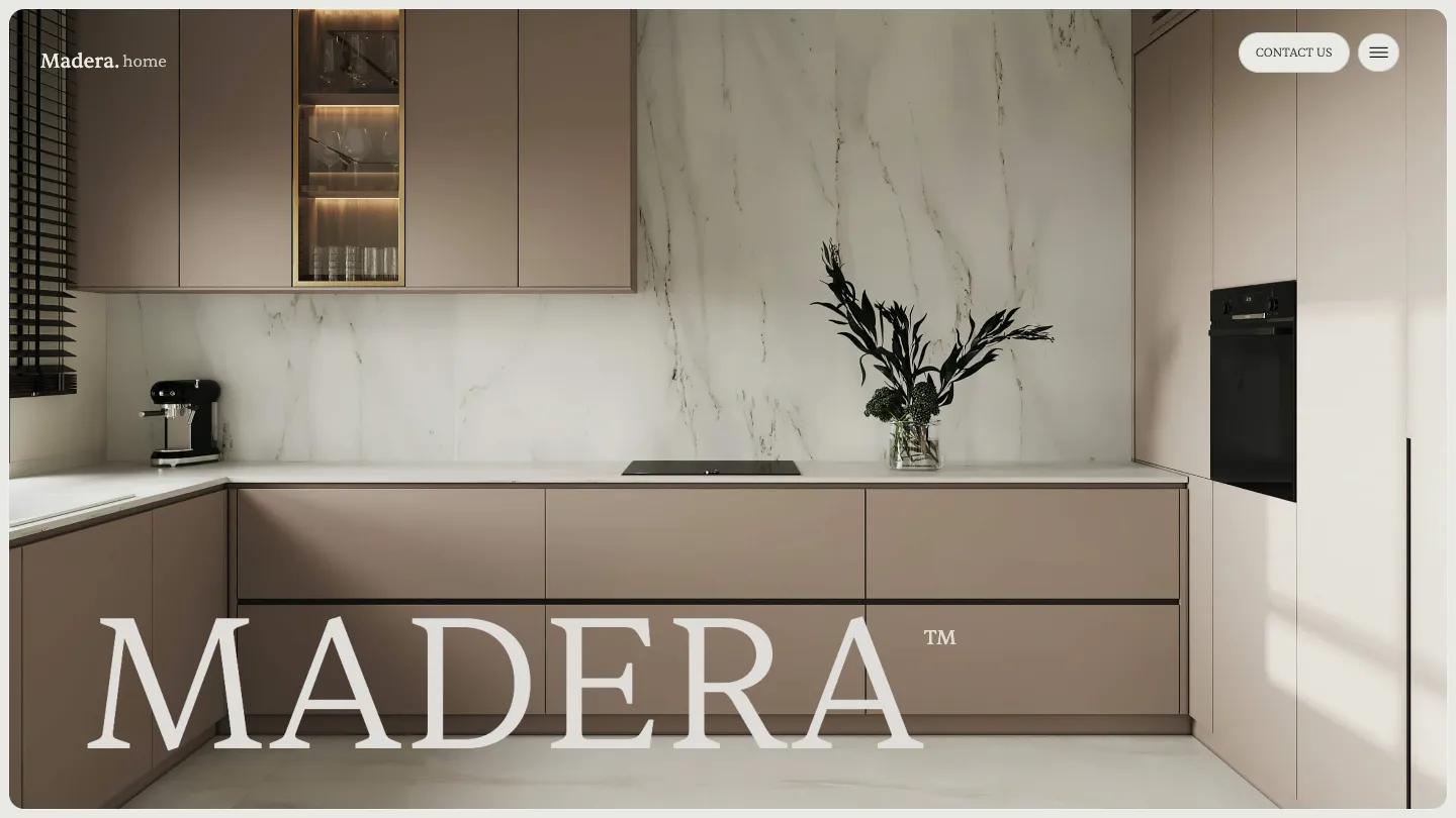
Madera is built for interior designers and architecture studios, and it looks the part from the first frame. The demo opens on a rounded, full-width photo of a cream living room with a glowing round wood panel and bronze drum tables, and "Madera" set across it in huge light Sentient serif with a small asterisk mark. The palette stays greige and warm taupe. The header is tucked away: a wordmark on the left, plus a pill-shaped Contact Us button and a round menu button on the right.
Lucas Gusso uses the demo homepage as a showroom for the kit. A centered statement with a few words tinted taupe sits above View Our Work and Buy Template pills, then large white cards preview the home, about, work, team, contact, pricing, blog, and shop layouts. The real Home page is calmer and more useful. The wordmark sits big and dark on the plain background over a pair of rounded photos, then a swipeable row of tall interior shots, project banners like Beach Bungalow with a small Residential pill, and team cards that set each name and role in white serif over a portrait. The footer repeats the giant wordmark above a short row of social links.
On a phone, the hero swaps in a different sunlit room, the wordmark shrinks to fit the width, and the Contact Us pill drops away, leaving only the round menu button.
We'd pick Madera for interior design practices, furniture studios, and residential architects with a strong library of styled room photography. Everything depends on those soft, neutral images, so a darker or more colorful portfolio will fight the palette. The homepage you see first is a sales page, so plan to launch from one of the home layouts and swap out the team names and portraits.
Based on the live demo, viewed on desktop and on a phone. The Design and Dev scores come from separate independent reviews. See how we score templates.
Independently evaluated by our team of 6 designers and 5 developers.











Designers score design, developers score development, and each score is the average of their independent ratings. Read about our review team and how we score templates.