Mediate is a high-quality Webflow template for Professional Services, Portfolio & Agency, Business & Startup by Jacob Nielsen.
Our Review of Mediate
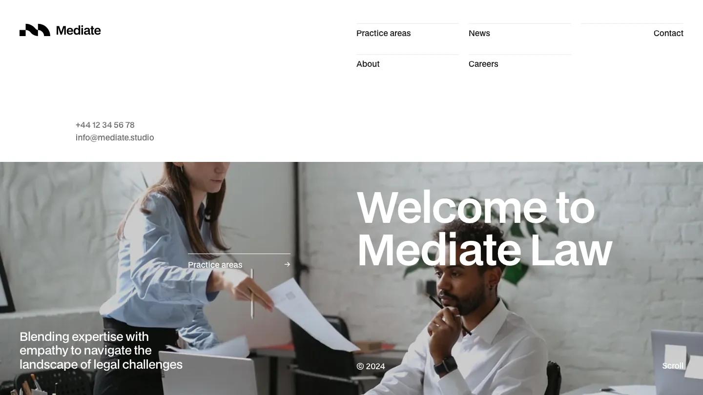
Mediate is a refreshingly unstuffy law firm site. Instead of navy, gold, and a serif crest, it uses white space, near-black BDO Grotesk, and a light grey panel or two. The header is unusual: a chunky black logo mark on the left, and on the right a two-row grid of links (Practice areas, About, News, Careers, Contact), each on its own thin rule, with the phone number and email tucked underneath. The hero is a wide photo of hands typing at a laptop, with "Welcome to Mediate Law" in large white type and an underlined Practice areas link beside it.
Jacob Nielsen builds the homepage from big, confident blocks. Practice areas sit in a rounded grey panel as a numbered list: each row pairs a short grey description with a large title like Litigation or Corporate Law and an arrow on the far right. A long statement about the firm's values follows in bold display type, then a careers prompt, a client list, and a news row of four photo cards with dates. The page closes on a dark rounded panel with soft curved shapes, a "Take the first step" message, and a Get in touch link. The Practice Areas page reuses the hero format with a photo of two people talking across a table.
On a phone, the link grid folds into a two-line menu icon, the hero text stacks cleanly over the photo, and the opening statement reads well in large bold type.
We'd pick Mediate for small law firms, mediators, and consultancies that want to look modern without looking casual. Most of the photos are generic office stock, so real shots of your team will make a big difference. Proofread the demo copy and page addresses too, since a few contain small typos.
Based on the live demo, viewed on desktop and on a phone. The Design and Dev scores come from separate independent reviews. See how we score templates.
Independently evaluated by our team of 6 designers and 5 developers.











Designers score design, developers score development, and each score is the average of their independent ratings. Read about our review team and how we score templates.
More Like This




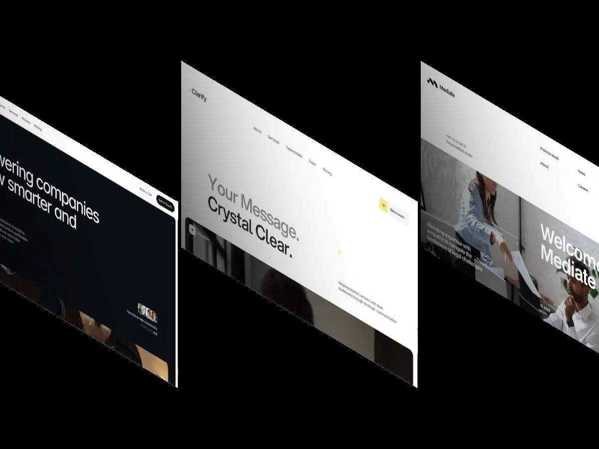
9 Best Consulting and Professional Services Website Templates (2026)

14 Best Fintech Website Templates for Finance Apps (2026)
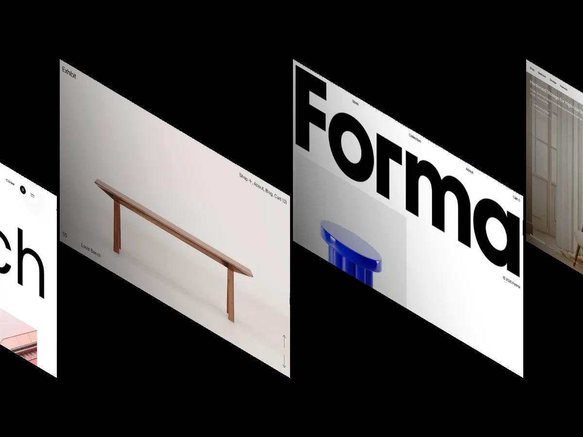
12 Best Interior Design Website Templates for Webflow, Framer and Shopify (2026)

How to Use, Customize, and Edit a Webflow Template
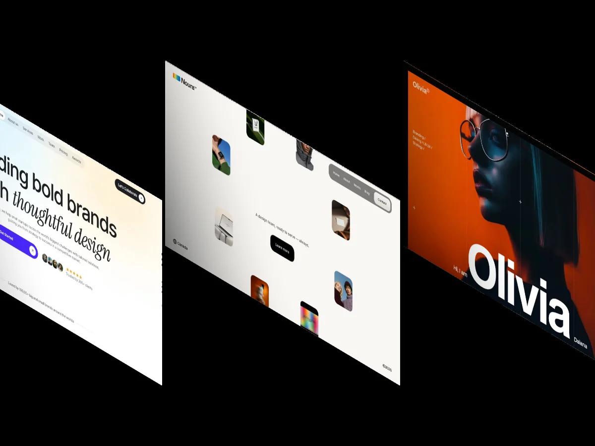
30 Best Free Webflow Website Templates 2026
Website Template Glossary: Every Term You'll Actually Need