ArchiCraft is a high-quality Webflow template for Professional Services, Real Estate & Property, Portfolio & Agency, Art & Design by Flowaze.
Our Review of ArchiCraft
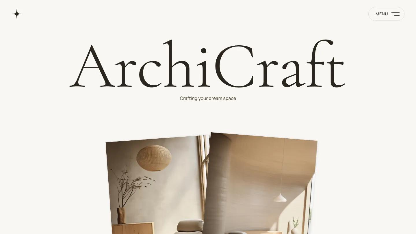
ArchiCraft is built for architecture and interior design studios that want a calm, editorial presence. The homepage opens with a large serif wordmark and the tagline "Crafting your dream space" set in a quiet beige and cream palette. Below that, a hero image shows a minimalist interior with natural light, woven pendant lamps, and organic shapes. The Cormorant Garamond headings are large and classical, while Manrope body text keeps everything readable. The layout mixes full-width photography with asymmetric image blocks that overlap slightly, giving the page a considered, magazine-like rhythm.
The demo includes pages for about, projects, services, contact, and blog, plus a checkout flow and ecommerce product pages tagged as packages. The projects section uses the CMS to display portfolio pieces like coastal retreat and downtown loft renovation, each with its own detail page. The services homepage section lists interior design, decoration, and space planning as expandable accordion items. Fourteen slider or carousel elements across the site suggest heavy use of image galleries and rotating content blocks. A contact form is present, and the template ships with a 404 page, style guide, and changelog.
The mobile screenshot shows the homepage stacks cleanly at 390 pixels. The large serif title scales down but remains legible, and the image blocks reflow into a single column without awkward gaps. The hamburger menu sits in the top right, and the overall hierarchy holds.
We'd pick ArchiCraft for firms with a strong photo library and a preference for understated type over bold graphics. The ecommerce setup is a nice addition for selling design consultations or packages. One thing to check is whether the accordion-heavy services layout suits your content, since it hides detail by default and may need rewriting if you prefer everything visible at once.
Based on the live demo, viewed on desktop and on a phone. The Design and Dev scores come from separate independent reviews. See how we score templates.
Independently evaluated by our team of 6 designers and 5 developers.











Designers score design, developers score development, and each score is the average of their independent ratings. Read about our review team and how we score templates.