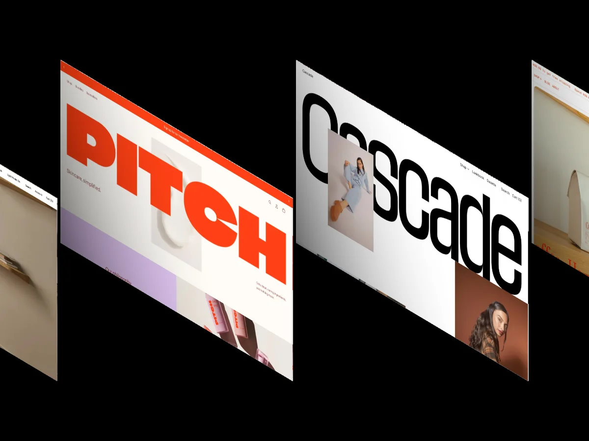
15 Best Webflow Templates for SaaS and Tech Startups 2026

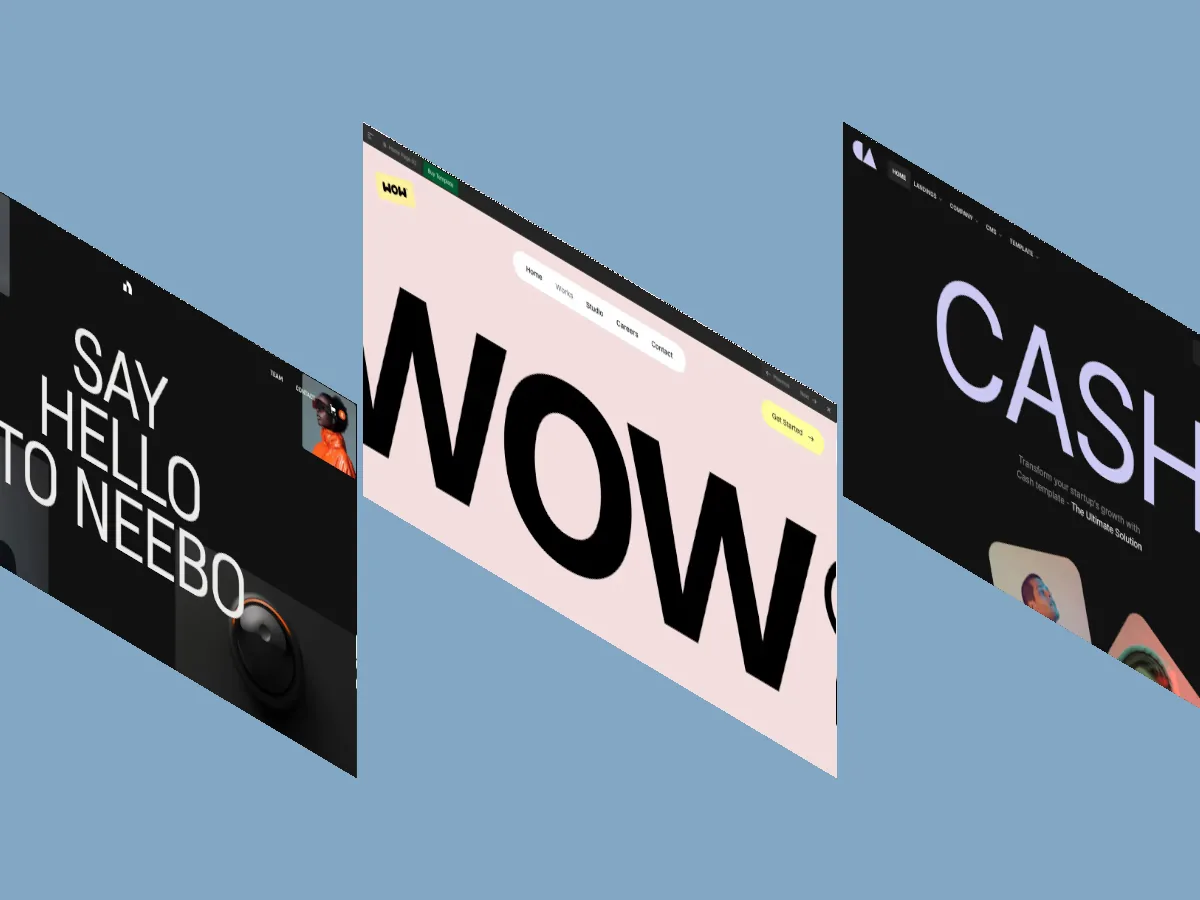
Most Webflow SaaS templates recycle the same hero-grid-pricing layout, and marketplaces won't tell you which builds hold up. We scored all 65 Technology & Software templates in our library and these 15 came out on top. Every one clears 9.1/10 overall, with prices from $29 to $149.
Three hours into template shopping for a SaaS launch, every option starts to blur: full-width hero, three-column feature grid, pricing table, dark footer with a gradient button. The layouts look interchangeable because most creators copy whatever converted last year, and marketplaces sort by popularity, not quality.
This list cuts through that. Our library holds 65 Webflow templates tagged Technology & Software, and our reviewers scored every one of them. The 15 below are the best Webflow SaaS templates we've published, ranked by Overall Score from top to bottom. Each one clears 9.1/10, which puts it comfortably inside the top third of the 333 Webflow templates in our library, where only 29.4 percent score 9.0/10 or above.
Every score here comes from multiple professional designers and developers reviewing the template independently. If you want the reasoning behind the numbers, our post on how we score templates explains the full process.
What are the best Webflow SaaS templates in 2026?
Cash, Clixr E-commerce, and SaaSly. lead our 2026 ranking of Webflow templates for SaaS and tech startups. All 15 templates in this roundup hold an Overall Score above 9.1/10, based on independent Design and Dev scores averaged from multiple reviewers with 10 or more years of industry experience. Prices run from $29 to $149, against a $79 average for paid Webflow templates in our library.
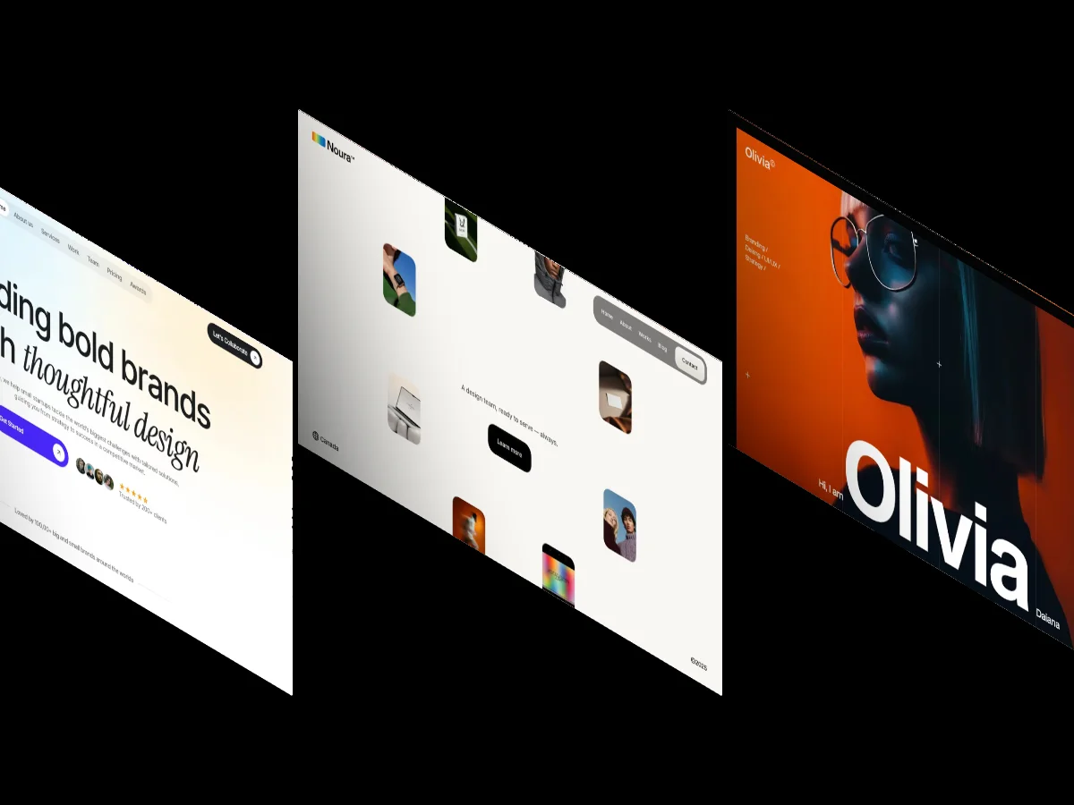
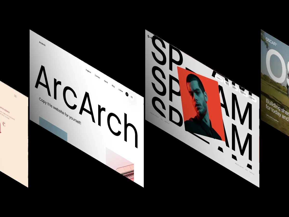
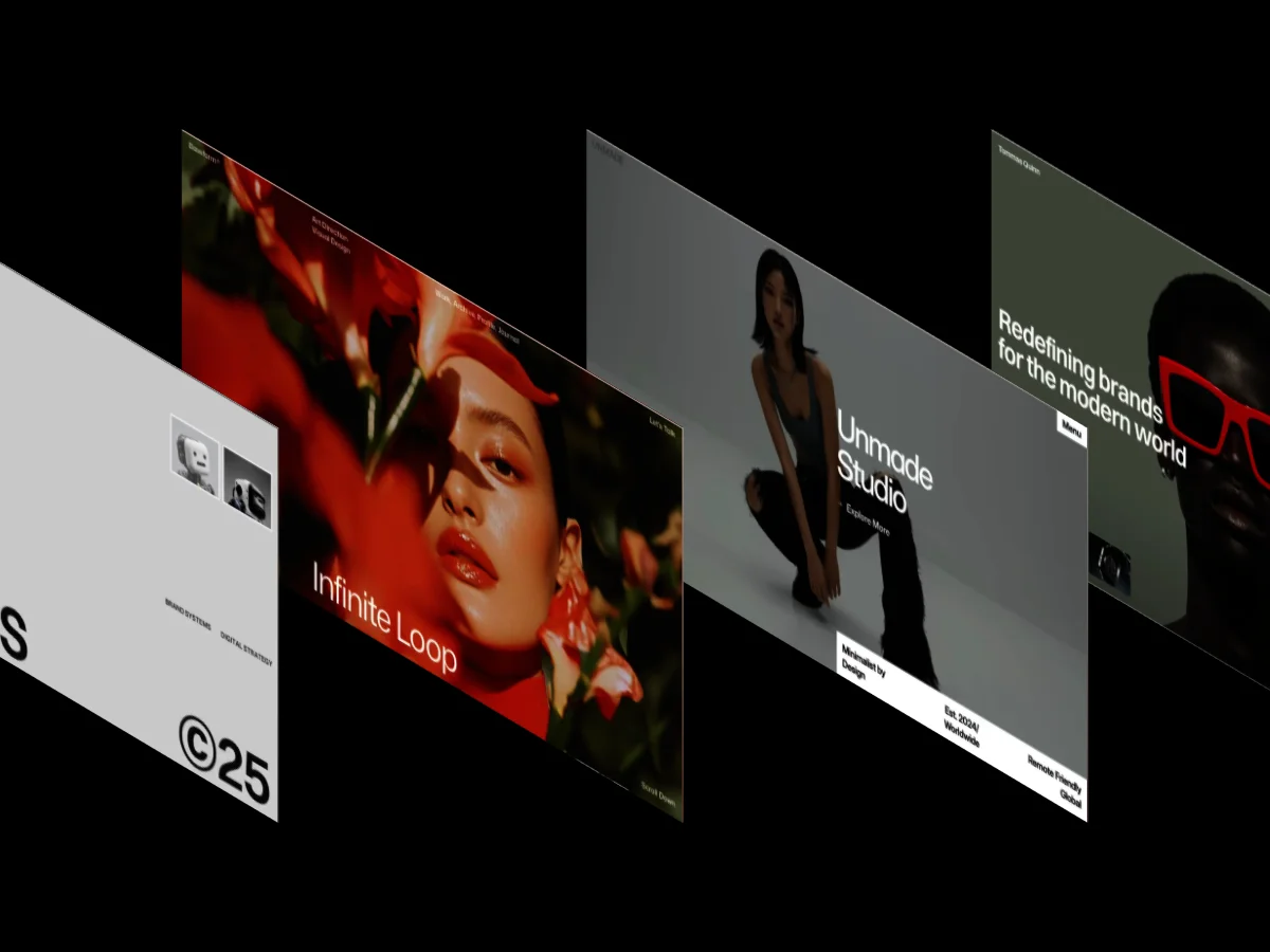
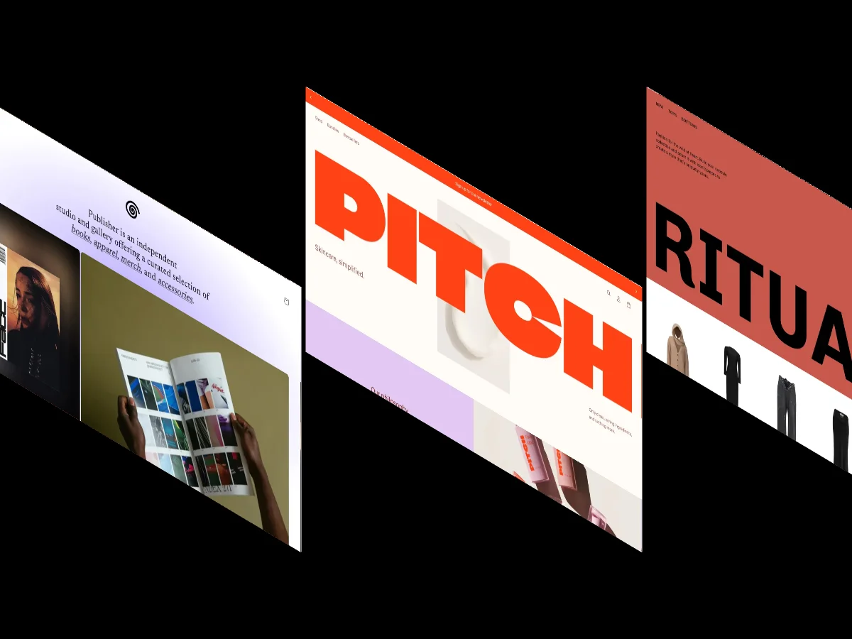
On our listing pages, hovering over any template card plays a looping screen recording of that template's full homepage, so you can scan all 15 of these in a few minutes without opening a single external tab. If your budget is zero, we also keep a separate ranking of the 30 best free Webflow templates, though free options average 7.7/10 overall against 8.4/10 for paid.
The 15 best Webflow SaaS templates, ranked
Cash
- Design: 9.6/10
- Dev: 9.7/10
- Price: $129
- Best for: fintech and B2B SaaS products that want a dark, corporate marketing site and don't need ecommerce
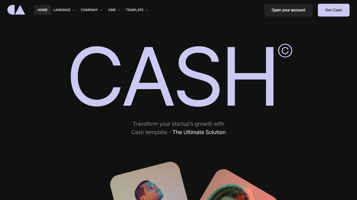
Cash tops this ranking on the strength of its build. The Dev: 9.7/10 reflects a class structure disciplined enough to extend without fighting the original author, plus CMS collections wired for a blog that a non-developer can actually run. Nothing in the file reads like a one-off hack.
The design holds up the dark palette with typography rather than decoration. Heading weights step down in a clear scale, body copy keeps enough contrast against the dark background to stay readable at mobile widths, and the 3D transforms in the hero add depth without turning the page into a demo reel.
Worth knowing: there's no dedicated pricing page in the feature set, so plan to assemble one from the existing sections before launch.
Clixr E-commerce
- Design: 9.5/10
- Dev: 9.8/10
- Price: $79
- Best for: software or hardware companies that sell products directly and need ecommerce wired in from day one
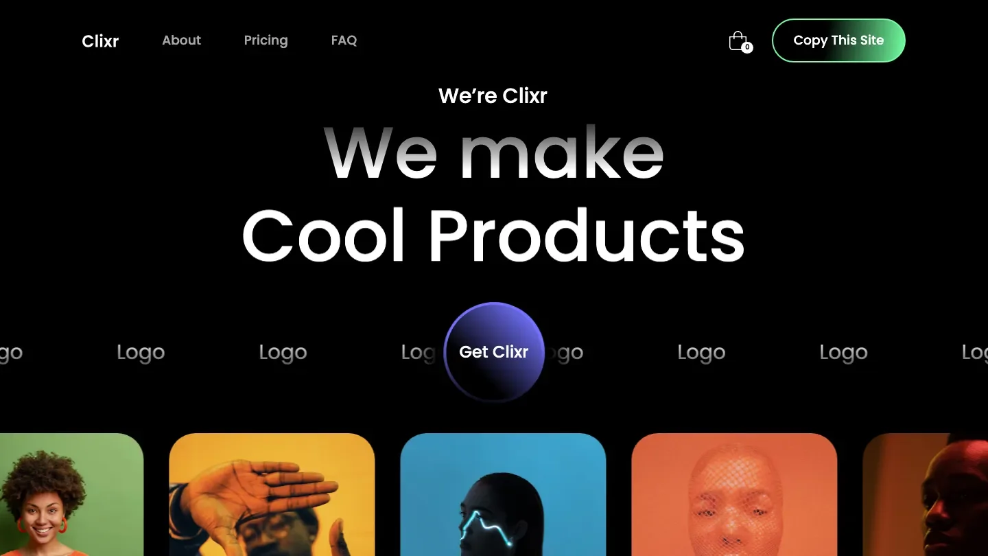
The Dev: 9.8/10 here is the highest development score in this roundup, and it comes from scope handled well. Clixr ships ecommerce, CMS collections, a blog, pricing, and a full page set including 404, about, services, and contact, and the build stays organised across all of it. Reusable components keep the sixteen listed features from collapsing into spaghetti.
Visually it works the dark, minimal register: background video in the hero, slideshows and tickers for product motion, and a layout that gives products room instead of cramming them into dense grids. For a SaaS company that also sells hardware, merch, or paid digital goods, this is the most complete package on the list at $79.
Worth knowing: the ecommerce structure assumes you'll use Webflow's native commerce, so check its transaction fees and product limits against your catalogue before committing.
SaaSly.

- Design: 9.5/10
- Dev: 9.7/10
- Price: $79
- Best for: early-stage SaaS teams that want the entire marketing site, blog included, running in a weekend
Few templates ship a page inventory this complete at $79. SaaSly. includes pricing, blog, about, services, contact, projects, a 404, and ecommerce support, all backed by CMS collections. The Dev: 9.7/10 reflects how consistently those pages share components: change a button style once and it propagates everywhere it should.
Where Cash and Clixr go dark, SaaSly. runs light and typographic. Bold headline sizes carry the hierarchy, and generous spacing between sections keeps long pages reading fast. That makes it a strong match for a product still explaining itself to the market, since the type-first layout puts messaging ahead of imagery.
Worth knowing: the bold typographic style depends on short, punchy copy, and long feature descriptions will crowd the layouts it ships with.
Get Swipe
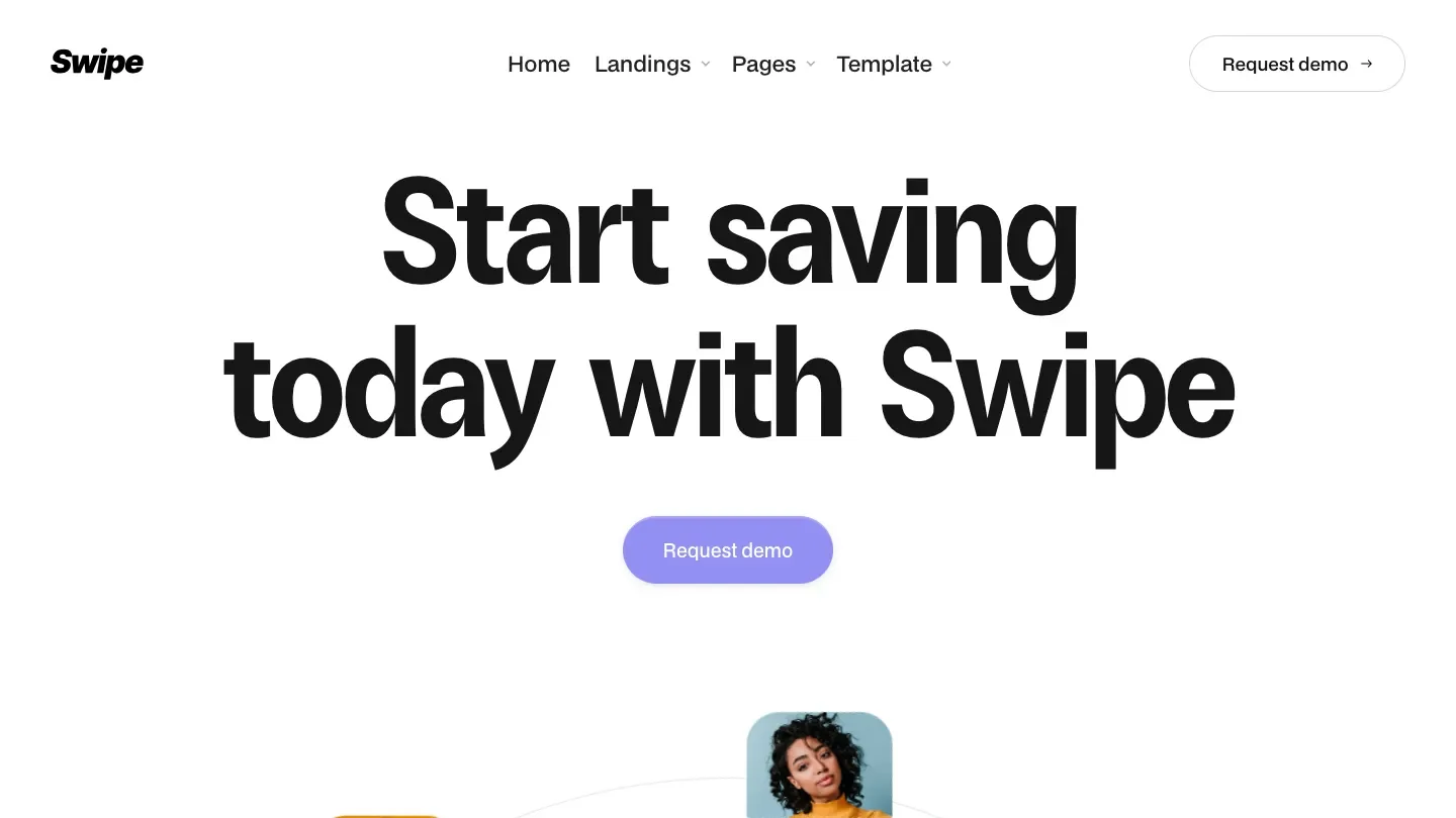
- Design: 9.6/10
- Dev: 9.5/10
- Price: $79
- Best for: consumer-facing apps and payment products that want colour and personality instead of another dark gradient
Where most SaaS templates default to dark gradients, Get Swipe goes the other way: playful, colourful, and bold, with a Design: 9.6/10 that ties for the second highest in this list. The colour application is what earns it. Bright accents sit on generous white space rather than fighting each other, so the pages feel energetic without tipping into noise.
The feature set is leaner than the entries above it: blog, forms, about, contact, components, and a 404, but no ecommerce and no dedicated pricing page in the listed features. The Dev: 9.5/10 reflects a tidy build within that smaller scope, with components structured for reuse.
Worth knowing: confirm the blog setup matches your publishing plans, because the leaner feature list means less CMS depth than the top three entries.
Zuno
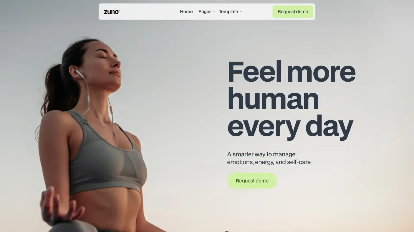
- Design: 9.5/10
- Dev: 9.6/10
- Price: $129
- Best for: wellness-tech and consumer SaaS brands that need a friendly, light aesthetic more than a deep page inventory
Zuno reads friendlier than anything above it on this list. The light, playful styling and its category spread across Beauty & Personal Care and Wellness & Health make it the obvious pick for a health app, a booking product, or any SaaS whose buyers are consumers rather than procurement teams. Background video and 3D transforms give the hero motion, and the typographic styling keeps the rest of the page calm around it.
The Dev: 9.6/10 is notable given how much animation is in play. Interactions are built cleanly enough that stripping or adjusting them won't unravel the layout, and the CMS wiring covers the included pages properly.
Worth knowing: there's no blog or pricing page in the listed features, so content marketing plans will need extra build time.
Waitlists
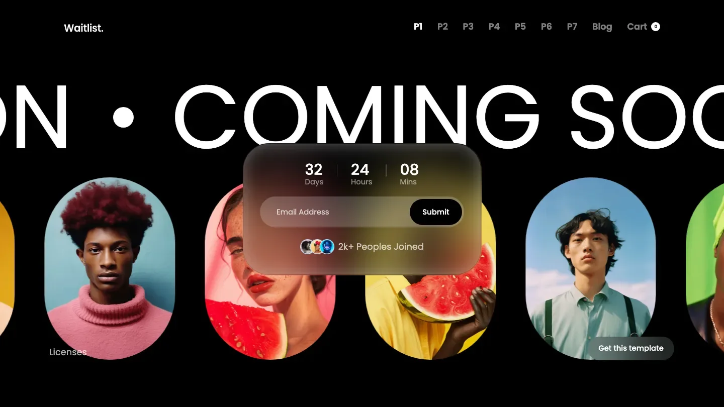
- Design: 9.7/10
- Dev: 9.4/10
- Price: $79
- Best for: pre-launch products collecting signups now and shipping a full site later
The highest Design Score in this roundup belongs to a pre-launch template. Waitlists earns its Design: 9.7/10 with a dark, typographic layout where the signup form is the unmistakable centre of every page, exactly what a waitlist site should do. Bold display type and restrained animation give it presence without distracting from the one action that matters.
It's more complete than most coming-soon templates: blog, CMS, ecommerce support, components, and a 404 all ship in the box, so it can grow past launch day. The Dev: 9.4/10 sits a third of a point below the design mark, mostly reflecting that some sections are purpose-built for the waitlist flow rather than general reuse.
Worth knowing: the entire structure is organised around signup capture, so treat it as a launch vehicle and expect real restructuring work when the product goes live.
Neebo
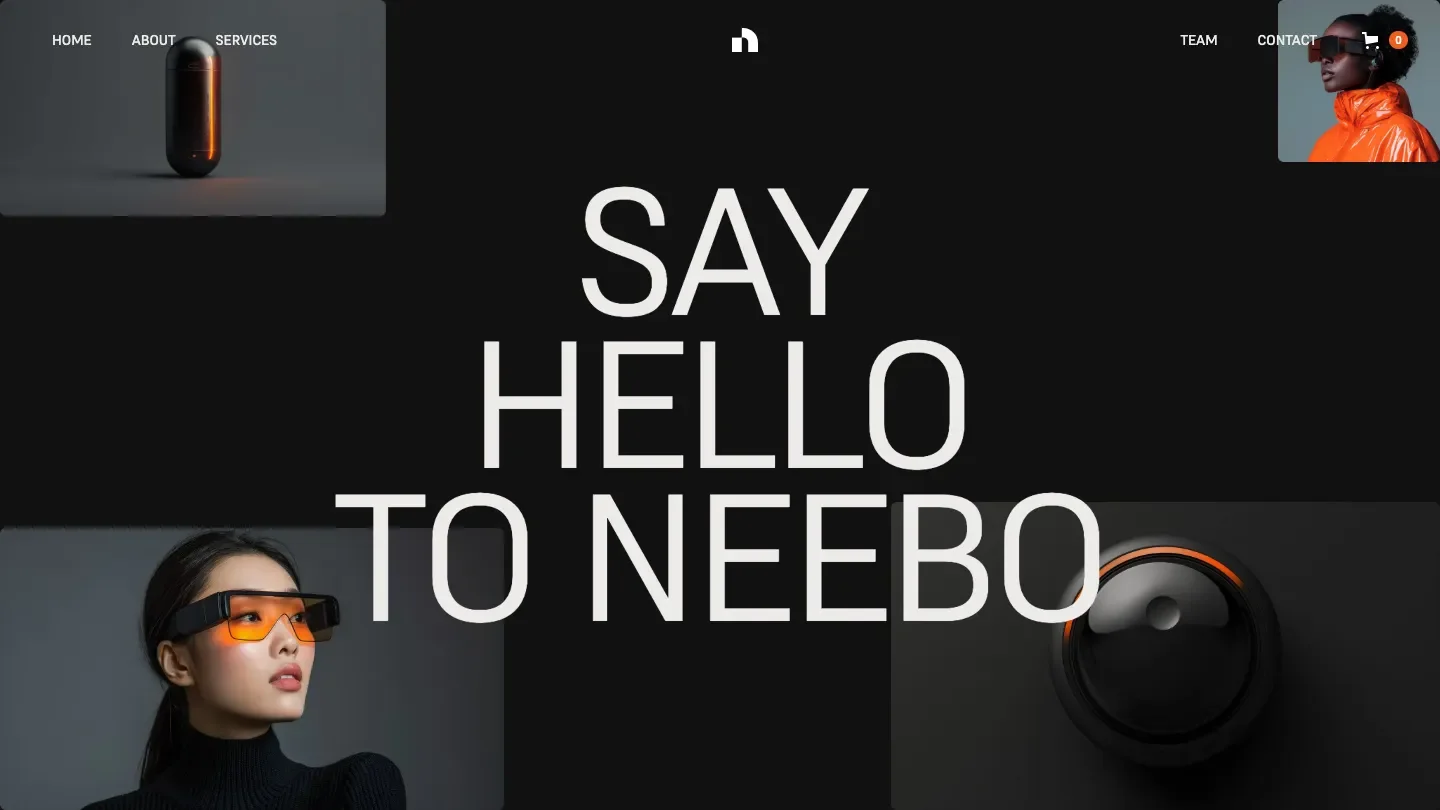
- Design: 9.4/10
- Dev: 9.6/10
- Price: $129
- Best for: digital product companies selling templates, plugins, or courses through a dark storefront
Dark, restrained, and built to sell digital goods: that's Neebo's whole pitch, and it executes. The Dev: 9.6/10 reflects an ecommerce and CMS structure that handles a real product catalogue, plus a jobs and careers page that most SaaS templates skip entirely. Components are organised for reuse, which matters when a storefront grows past its launch inventory.
Design-wise it stays minimal and lets products carry the visual weight, with 3D transforms adding just enough dimension to the product presentation. The Design: 9.4/10 is the lower of its two scores, and the gap shows in the marketing pages, which are competent but less distinctive than the commerce views.
Worth knowing: there's no blog in the listed features, so plan for extra CMS work if content is part of your acquisition strategy.
Wow
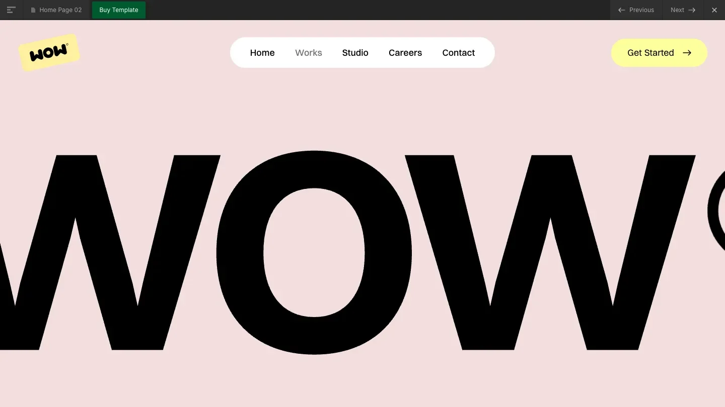
- Design: 9.6/10
- Dev: 9.4/10
- Price: $129
- Best for: startups that want an illustrated identity strong enough to stand out in a screenshot-heavy market
Illustration carries the identity here. Wow pairs bold illustrated elements with a dark base, and the Design: 9.6/10 rewards how deliberately those illustrations are placed: they anchor sections and explain concepts rather than decorating margins. In a category where every competitor screenshots their dashboard, that's a genuine differentiator.
The build covers CMS, components, projects, contact, about, and a careers page. The Dev: 9.4/10 reflects solid structure with a caveat: illustration-heavy layouts mean image assets need managing carefully to keep load times down, and swapping the illustrations for your own brand's set is a bigger job than swapping photos.
Worth knowing: the feature list includes no blog and no pricing page, so two staple SaaS pages need building from scratch.
Mollie
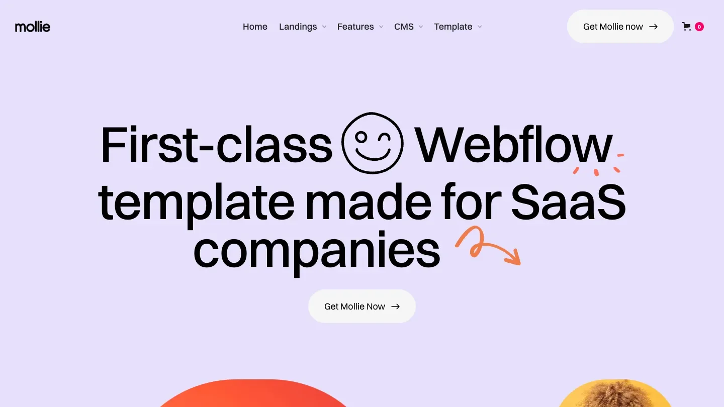
- Design: 9.5/10
- Dev: 9.4/10
- Price: $149
- Best for: funded B2B startups that want a warm, illustrated corporate site with every standard page included
At $149, Mollie is the most expensive entry in this roundup, nearly double the $79 median for paid Webflow templates in our library. The price buys completeness: pricing, blog, careers, about, services, contact, ecommerce, and a full CMS, which is the widest standard-page coverage of any light-themed template on this list.
The design mixes clean corporate structure with illustration and colour, landing somewhere friendlier than Cash but more buttoned-up than Get Swipe. The Design: 9.5/10 reflects consistent spacing and a colour system that stays coherent across a large page count, which is harder than it sounds. Dev: 9.4/10 is strong, though a site this large means more collections and components to learn before customising confidently.
Worth knowing: you're paying a premium for page coverage, so if you only need five pages, cheaper entries on this list deliver similar quality per page.
Fluke
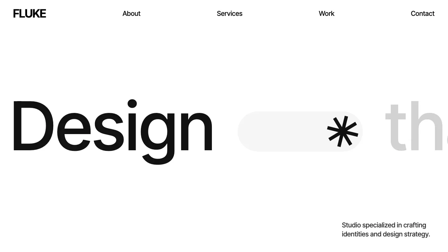
- Design: 9.4/10
- Dev: 9.4/10
- Price: $29
- Best for: dev shops and technical consultancies that need a sharp static site and can live without a CMS
The $29 price makes Fluke the cheapest template on this list, and the scores don't read like it. Design: 9.4/10 and Dev: 9.4/10 put it dead even across both axes, a balance only one other entry here manages. The light, typographic layout is disciplined: minimal styling, tight grids, and 3D transforms plus animation used sparingly enough to feel intentional.
The catch is scope. There's no CMS and no blog in the feature list, so this is a static marketing site: services, projects, about, contact, and a 404. For an agency-style tech consultancy that updates content quarterly, that's fine. For a startup planning weekly publishing, it isn't.
Worth knowing: without CMS collections, every content update means editing the Designer directly, which rules out handing the site to a non-technical teammate.
Human+Machine

- Design: 9.5/10
- Dev: 9.3/10
- Price: $99
- Best for: AI startups and creative-tech studios that want motion and bold type to do the selling
BYQ Supply built Human+Machine around motion, and it shows in both scores. The Design: 9.5/10 rewards a dark, typographic system where background video, tickers, and animation create momentum down the page, a fit for AI products that want to feel like the future without saying so in the copy. The name isn't subtle about the target audience, and neither is the aesthetic.
Dev: 9.3/10 is the widest design-to-dev gap in the top eleven, and it traces to the animation load. The CMS and blog wiring are sound, but the interaction stack takes real care to modify, and heavy motion always deserves a performance check on mid-range phones.
Worth knowing: test the animation-heavy pages on a throttled connection before buying, because this much motion is a liability on slow networks if left untuned.
Nexxar

- Design: 9.5/10
- Dev: 9.2/10
- Price: $39
- Best for: hardware and gadget brands that need a focused dark storefront, not a sprawling marketing site
Nexxar keeps its scope deliberately narrow. Six listed features, a dark minimal aesthetic, and ecommerce at the centre: this is a storefront for a tech product, priced at $39. The Design: 9.5/10 comes from restraint, with bold type on a dark ground and product imagery given room to breathe, a look that suits gaming gear and consumer hardware, which matches its category tags.
The Dev: 9.2/10 reflects a clean but small build. No CMS, no blog, no component library in the listed features, so what you see is close to what you get. That keeps the learning curve short and the customisation ceiling low at the same time.
Worth knowing: without a CMS, scaling past a handful of products or adding content pages means significant manual build work.
Axel
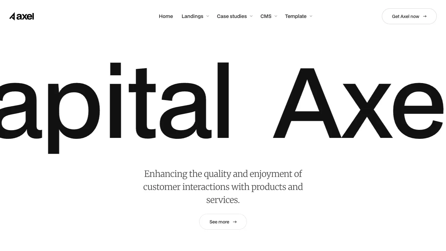
- Design: 9.5/10
- Dev: 9.2/10
- Price: $129
- Best for: fintech and B2B teams that need pricing, careers, blog, and commerce pages in one light-themed system
Thirteen listed features make Axel one of the broadest builds in this roundup: CMS, ecommerce, pricing, blog, careers, services, about, contact, forms, components, and 3D transforms all ship in the box. Its category tags span Financial Services and Digital Products, and the light, corporate, typographic styling fits that brief, closer to a bank's design system than a startup's.
The Design: 9.5/10 reflects consistency at scale, since keeping spacing and type coherent across that many page types is where most large templates fall apart. The Dev: 9.2/10 is a third of a point back, mostly because breadth this wide means more collections and interactions to audit before you customise.
Worth knowing: the corporate restraint that makes it credible for fintech will feel flat for a consumer product that needs personality.
Faang
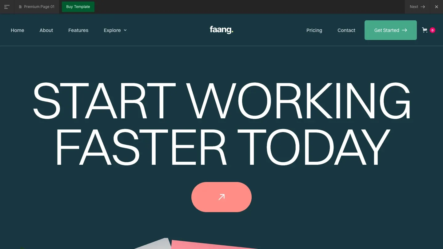
- Design: 9.3/10
- Dev: 9.3/10
- Price: $129
- Best for: B2B products that want a quiet, credible corporate site and already have their content strategy elsewhere
Restraint defines Faang. Light, clean, and corporate, it's the template equivalent of a well-cut grey suit, and the even Design: 9.3/10 and Dev: 9.3/10 reflect a build with no weak axis. CMS, ecommerce, pricing, and components are all present and wired sensibly.
The listed feature set is noticeably lean for the price: no blog, no dedicated about or contact pages in the feature list, no 404. At $129, that's the same price as Axel with roughly half the page coverage. What you're buying instead is a tight, consistent system that's fast to learn and hard to break.
Worth knowing: compare the live preview's page list against your sitemap before buying, because several standard pages will need assembling from the included components.
Mercury

- Design: 9.3/10
- Dev: 9.1/10
- Price: $129
- Best for: SaaS teams that want a monochrome editorial look with a full page set and modest animation
Mercury closes the list with the only monochrome system in this roundup. Lucas Gusso's template runs a full inventory, with fifteen listed features covering CMS, ecommerce, blog, pricing, careers, background video, and animation, all inside a light, minimal palette that relies on typography and spacing instead of colour for hierarchy.
That's a harder trick than it looks, and the Design: 9.3/10 reflects it landing more often than not. The Dev: 9.1/10 is the lowest development score here, which still places it above 96 percent of the Webflow templates in our library. The gap shows up in places where interactions feel one-off rather than systematised.
Worth knowing: monochrome designs live or die by photography quality, so budget for strong imagery or the restraint reads as emptiness.
How we picked these
Every template on this list went through the same process as the rest of our library. Multiple reviewers, professional designers and developers each with 10 or more years of industry experience, scored each template independently. Designers assess typography, layout hierarchy, spacing, and responsive behaviour for the Design Score. Developers assess class structure, CMS implementation, breakpoint handling, and performance for the Dev Score. The published numbers are the averaged result of all individual reviewer scores.
We only publish templates with an Overall Score of 7.0 or above, and templates below that threshold are not listed, period. Creator reputation, sales volume, and marketplace ratings play no part in selection. For this roundup, we took the 65 Webflow templates tagged Technology & Software and ranked them by Overall Score; these 15 came out on top. The full process is documented on our methodology page.
FAQ
How much should I pay for a Webflow SaaS template?
Paid Webflow templates in our library average $79, with a range of $24 to $169. The 15 templates in this roundup run from $29 (Fluke) to $149 (Mollie). Price tracks page coverage more than quality here, since even the $29 entry scores 9.4/10 on both axes.
Are there good free Webflow templates for SaaS?
Our library includes 36 free Webflow templates, and they average 7.7/10 overall against 8.4/10 for paid ones. None of the free Technology & Software options cracked the top 15 in this ranking. Our roundup of the 30 best free Webflow templates covers the strongest free options across all categories.
Do I need to know code to customise these templates?
No. Webflow is a visual builder, and every template here scores 9.1/10 or higher on our Dev Score, which factors in how cleanly the build can be customised without touching code. The templates without a CMS (Fluke and Nexxar) are the exception in one sense: routine content updates require working in the Webflow Designer rather than a simple editor view.
What's the difference between the Design Score and the Dev Score?
The Design Score measures visual quality: typography, layout hierarchy, spacing, colour application, and how the design holds across screen sizes. The Dev Score measures build quality: class structure, CMS implementation, responsive breakpoint handling, and loading performance. Both are scored out of 10 by separate specialist reviewers, and we publish them independently rather than blending them, because a template can be beautiful and badly built at the same time.
Should I build my SaaS site on Webflow or Framer?
Webflow offers deeper CMS and ecommerce capability, which matters for content-heavy or commerce-connected SaaS sites; Framer is faster for launching design-forward marketing pages. Our library shows 65 Technology & Software templates on Webflow against 31 on Framer. For a full breakdown, see our platform comparison.
How current are these scores?
Scores reflect our reviewers' most recent evaluation of each template, and we re-verify roundups when scores change. Template creators do update their work, so check the template detail page for the current published numbers before buying.