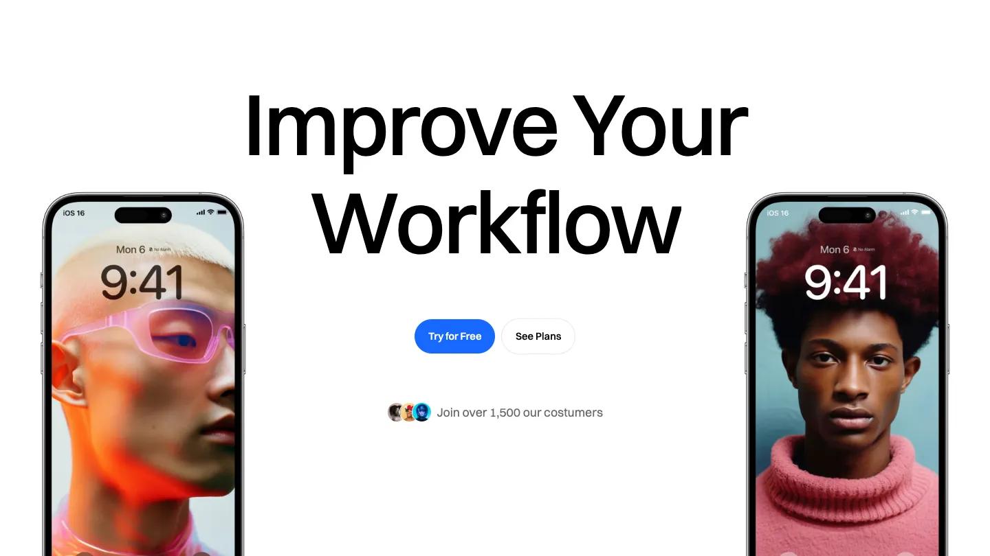
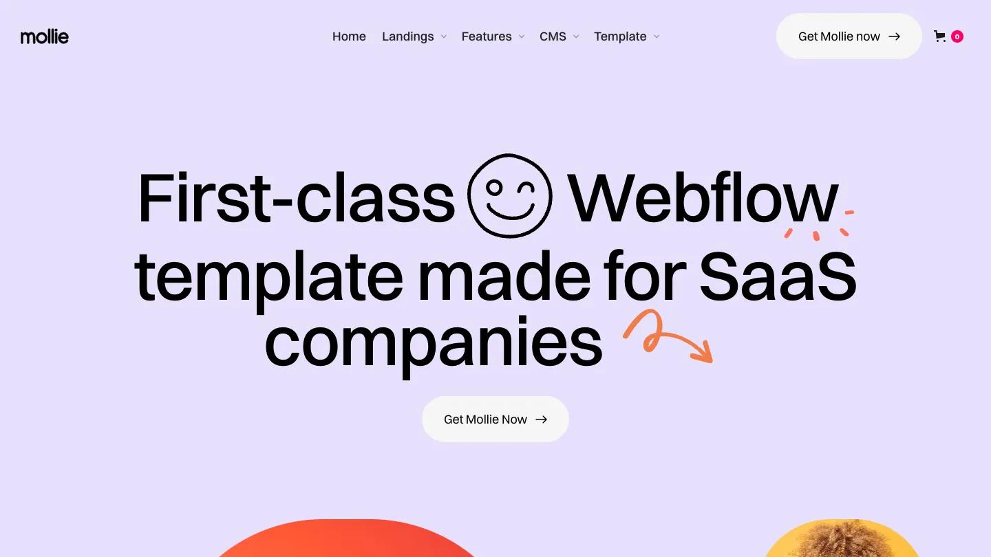
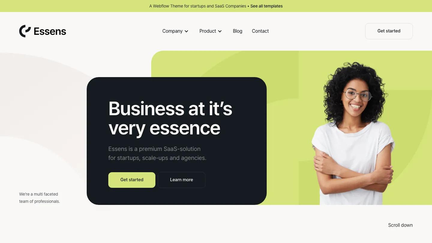
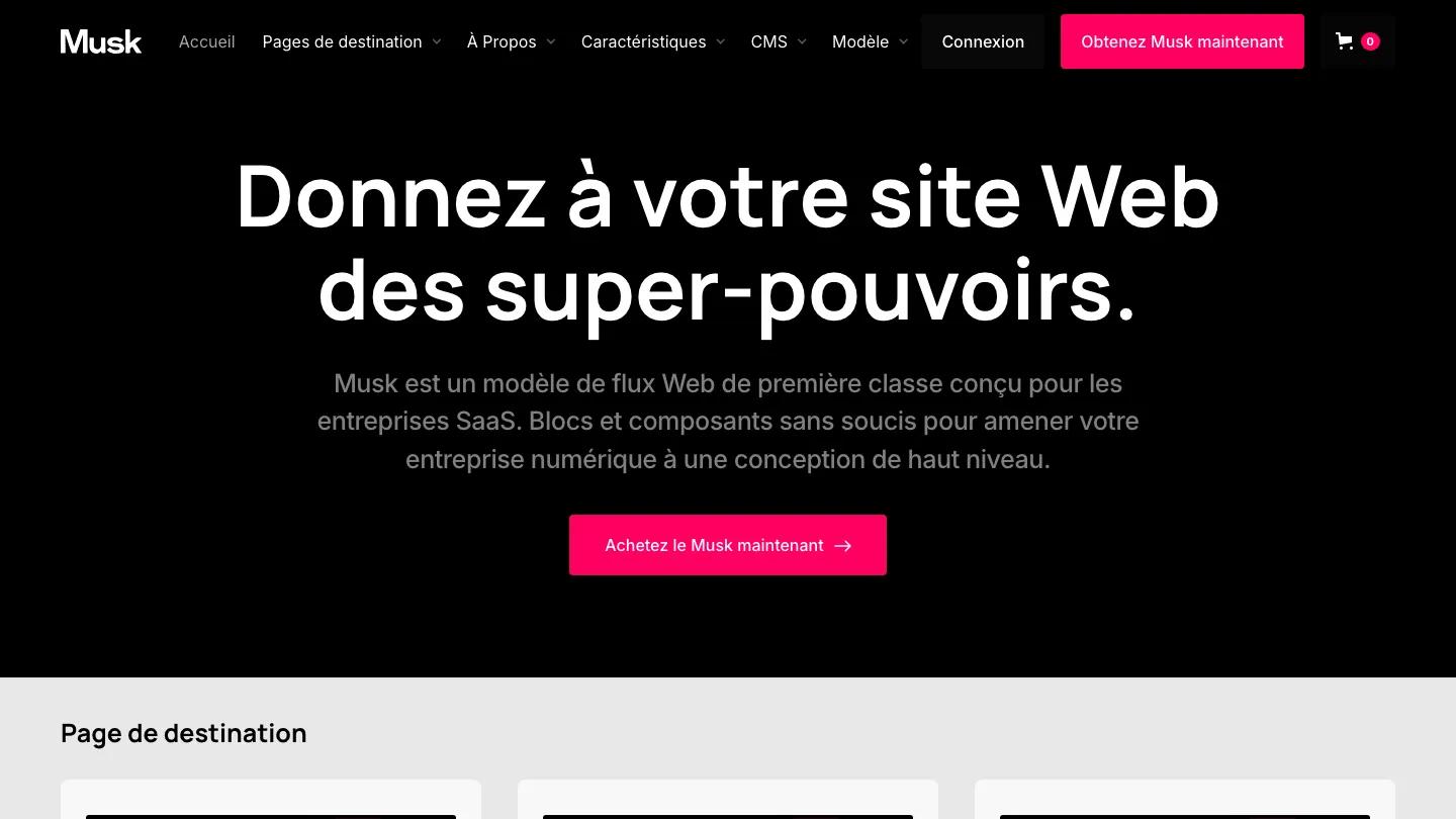
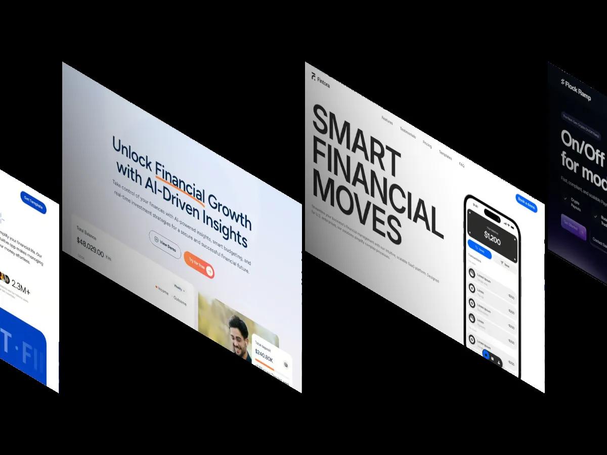
Axel is a high-quality Webflow template for Technology & Software, Retail & E-commerce, Financial Services, Business & Startup, Digital Products by JP.
Our Review of Axel
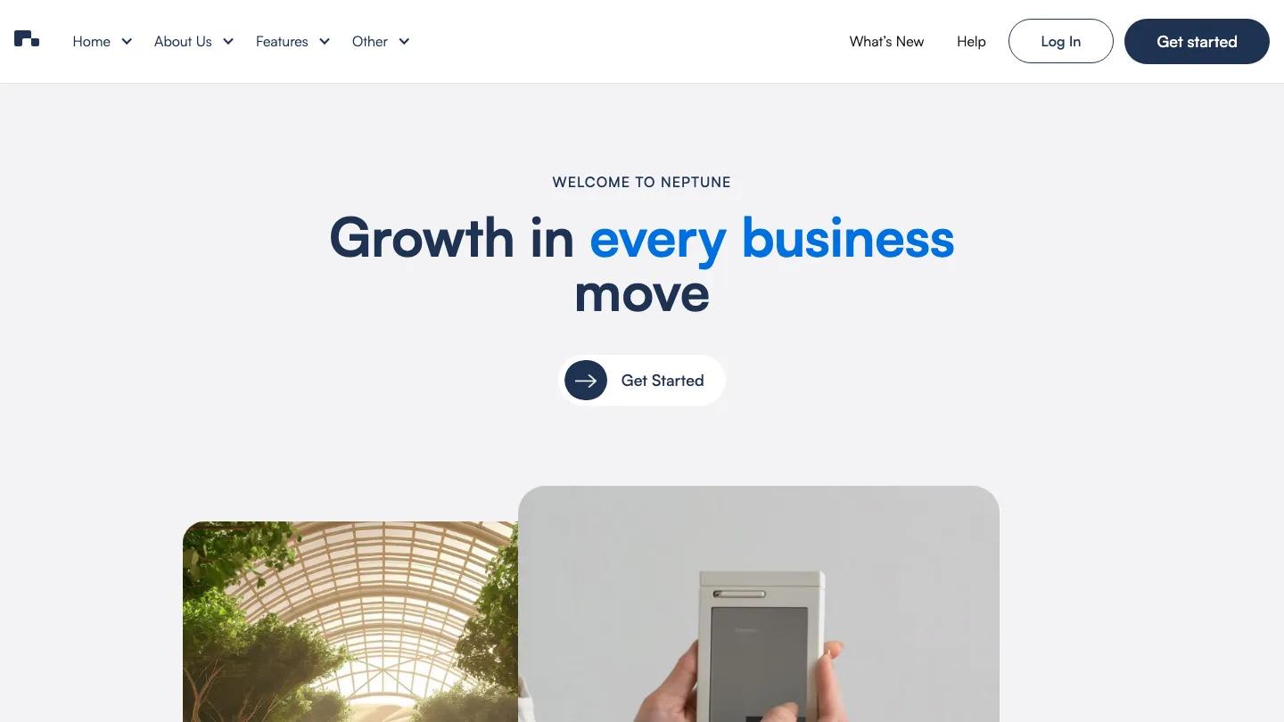
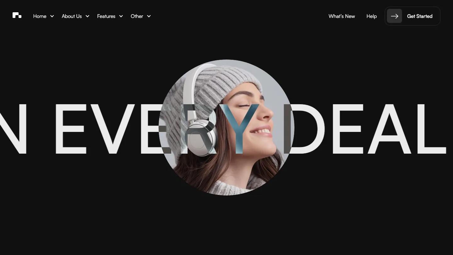
Axel is less a single website than a kit of startup and business landing pages built on one consistent design system. The demo homepage is really a showcase: a short intro and a grid of thumbnails for every landing page, plus menus for Landings, Case Studies, CMS, and Template pages and a cart icon in the header. Pick a landing and the real character shows up. The first opens on a muted olive card with "The power to scale faster" in big, light Bdo Grotesk, with portrait photos and soft color blocks floating around and behind the words.
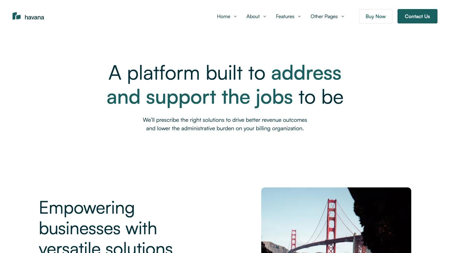
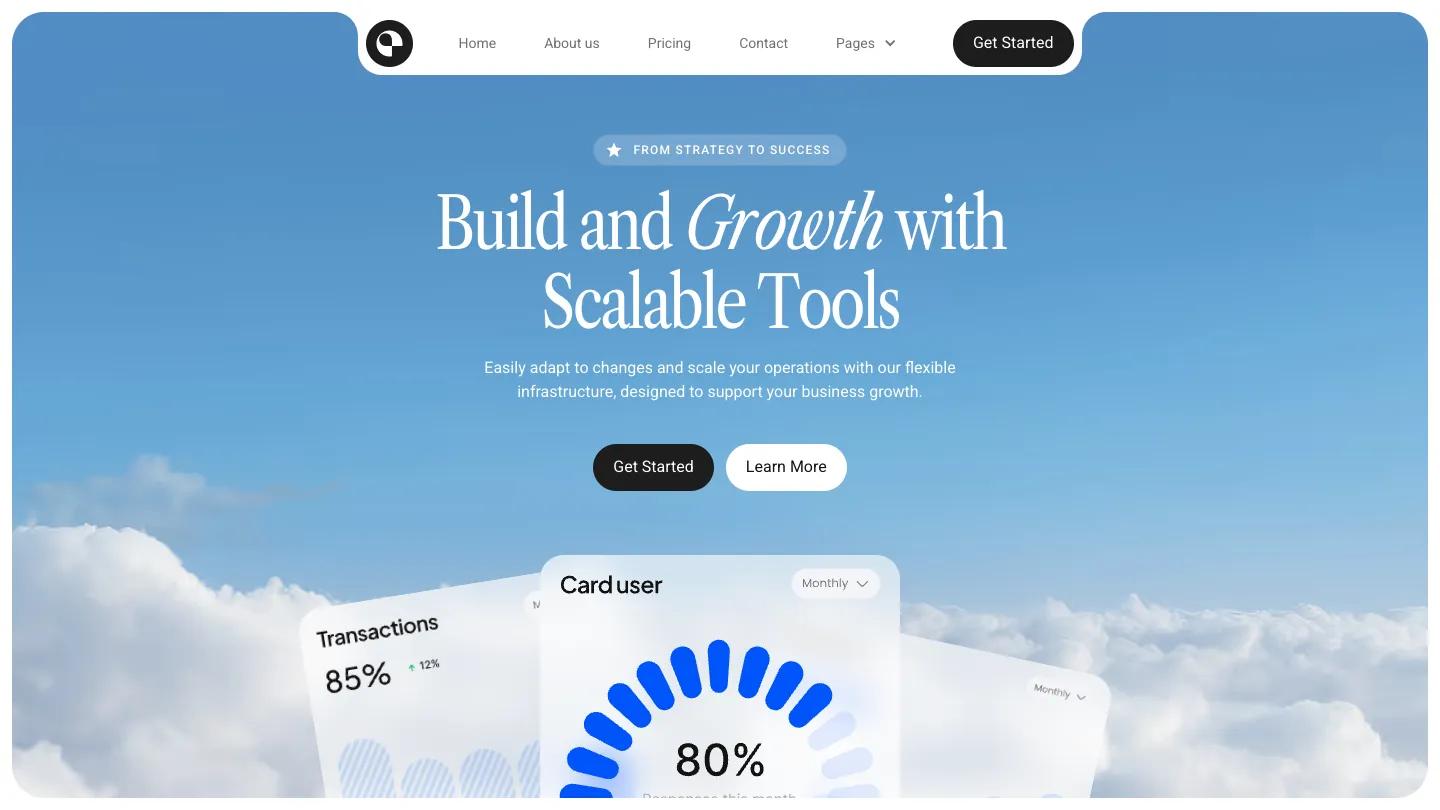
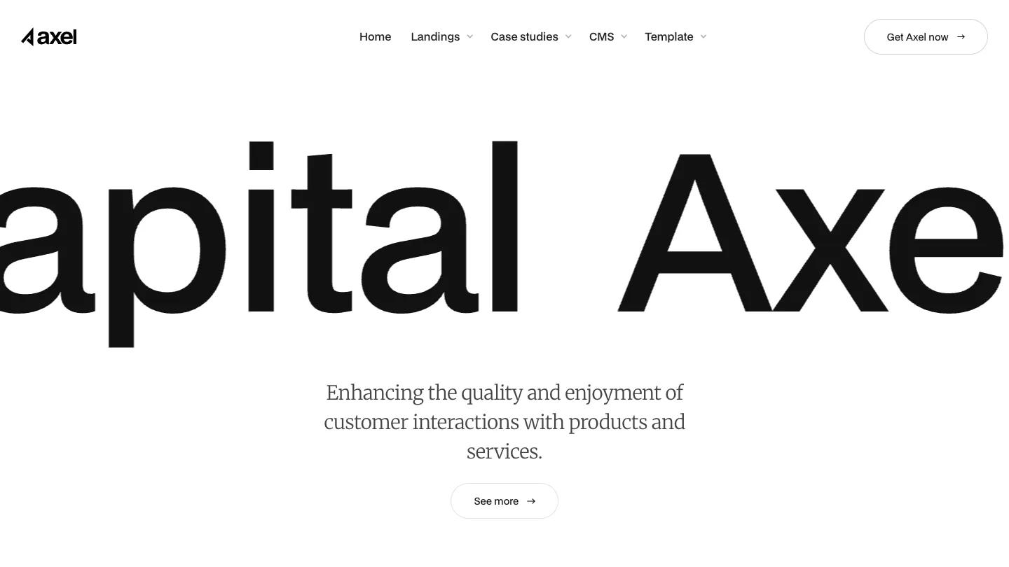
JP keeps the whole kit calm and corporate in a good way. Sections sit on sage and off-white backgrounds, with split blocks like Expert Mentorship Program pairing a tall portrait with a pale card, an outlined Get Started Now pill, and a short strategy note underneath. Testimonials are centered and quiet, with a large quote, a small avatar, the person's role, and a company logo. The other landing pages remix the same parts with different headlines, from Axel Capital to "Building bridges to success", and there are case study pages for sample companies, so you can mix sections without anything clashing.
On a phone, the hero card keeps its floating photo collage around the headline, and split sections stack neatly with the image above the text card.
We'd pick Axel for SaaS, fintech, and consulting businesses that want a polished, neutral base and the freedom to choose a layout. The flip side of that range is decision work: you'll pick one landing as your homepage and remove the rest, and the demo copy is generic enough that every headline needs rewriting before launch.
Based on the live demo, viewed on desktop and on a phone. The Design and Dev scores come from separate independent reviews. See how we score templates.
Independently evaluated by our team of 6 designers and 5 developers.











Designers score design, developers score development, and each score is the average of their independent ratings. Read about our review team and how we score templates.