FormaFabrika is a high-quality Webflow template for Professional Services, Art & Design, Portfolio & Agency by Digital Garden.
Our Review of FormaFabrika
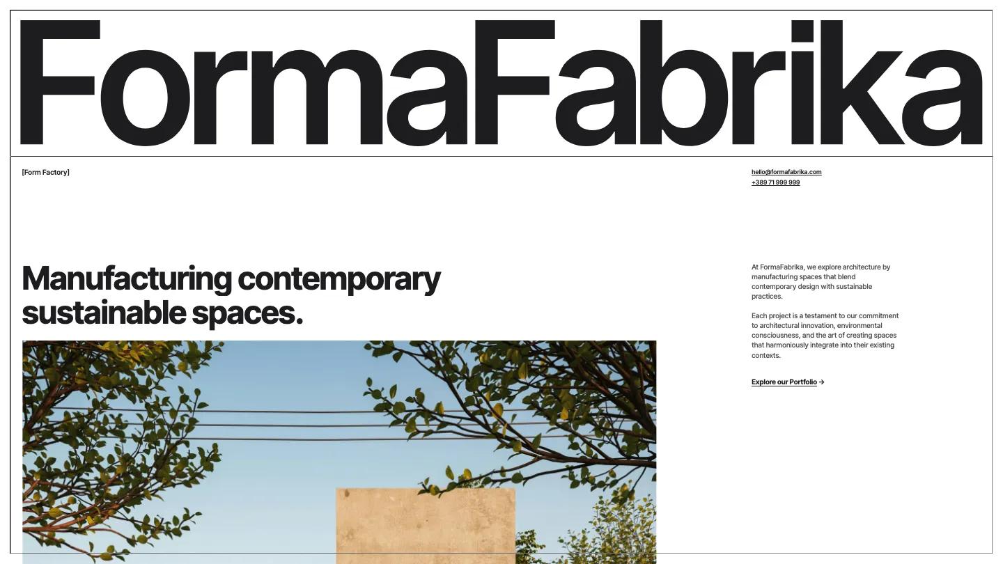
FormaFabrika is an architecture studio site built like a technical drawing. The whole page sits inside a thin black frame. The studio name stretches edge to edge in heavy Inter Tight at the top, a bracketed [Form Factory] tag and contact details sit under it, and the headline, "Manufacturing contemporary sustainable spaces.", leads into a large photo of a concrete house at golden hour. The navigation is unusual: a bar fixed to the bottom of the screen with the logo on the left and boxed Studio, Services, Projects, Journal, and Contact tabs on the right.
Digital Garden repeats one move for every section: a huge black heading resting on a ruled line, a small square-bulleted label beside it, and a short note on the right. Services lists residential architecture, public space interventions, and urban recycling, followed by a View all Services link. Projects pairs wide photos with a neat spec sheet of category, development year, location, and area, as in Revive Urban Renewal. Stories runs client quotes in bold type across columns divided by hairlines, and the Journal shows dated article cards with square photos and Read more links. The Studio page opens on a big statement about a small team of architects, with a narrow column of text beside a candid photo of the team gathered over a table.
On a phone, the frame and bottom bar stay in place, the wordmark still fits on one line, and the menu tabs fold into a hamburger icon.
We'd pick FormaFabrika for architects, interior studios, and garden designers with strong project photography. The demo journal copy is heavy on buzzwords, so rewrite it before launch, and we'd check that your own studio name fits the full-width wordmark as neatly as this one does.
Based on the live demo, viewed on desktop and on a phone. The Design and Dev scores come from separate independent reviews. See how we score templates.
Independently evaluated by our team of 6 designers and 5 developers.











Designers score design, developers score development, and each score is the average of their independent ratings. Read about our review team and how we score templates.