TITARVL is a high-quality Framer template for Portfolio & Agency, Personal, Art & Design, Professional Services, Business & Startup by Titarvl.
Our Review of TITARVL
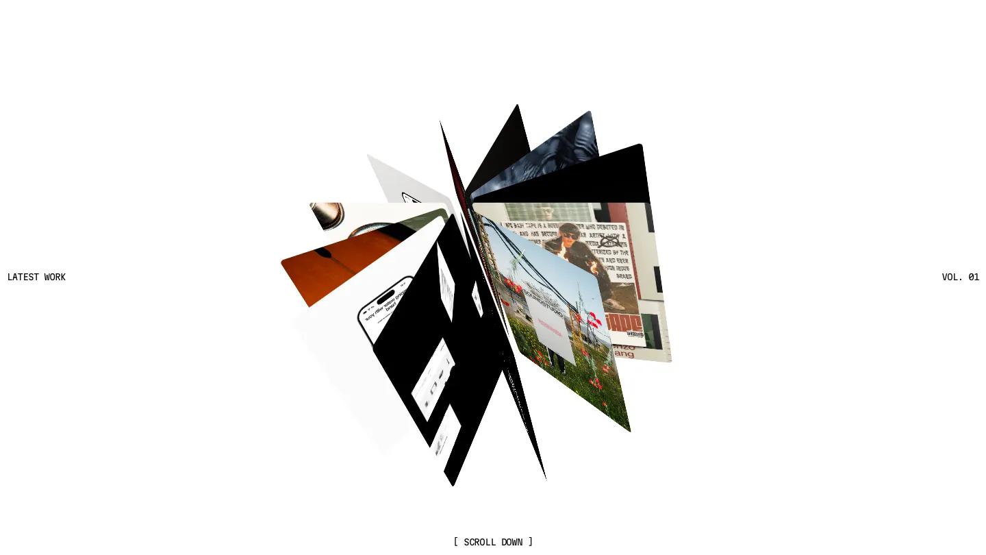
TITARVL is a portfolio for designers who want the site itself to feel like a piece of work. The homepage opens on a fan of project cards turning in 3D around the center of a white page, with small mono labels reading Latest Work and Vol. 01 at the edges and a bracketed scroll prompt below. It's a confident first move, and the whole template keeps that pairing of oversized uppercase Inter Display and tiny typewriter-style captions.
Scrolling down, a huge all-caps statement about the practice sits beside a black, corridor-like gallery where photo and video projects line the walls in perspective. Further along there's a stats block, a testimonials section titled Voices Behind the Work, and a contact form under a big Say Bonjour heading, with clean underlined fields for name, email, phone, topic, and message. The Works page switches to calm mode: a grid of numbered projects at staggered heights, a grid and list toggle, and a header that shows a live local clock next to the city. Each project opens its own case study.
On a phone, the projects stack into a single column of large cards with the same numbered mono captions, which reads well. The intro is slow to clear, though. The page sat on a blurred black loading screen for several seconds before anything appeared.
We'd pick TITARVL for brand and web designers, or small studios, whose work looks good in motion. It leans on video and 3D effects, so it suits a portfolio with strong visual projects more than a services-first business, and we'd shorten that intro before launch.
Based on the live demo, viewed on desktop and on a phone. The Design and Dev scores come from separate independent reviews. See how we score templates.
Independently evaluated by our team of 6 designers and 5 developers.











Designers score design, developers score development, and each score is the average of their independent ratings. Read about our review team and how we score templates.
More Like This







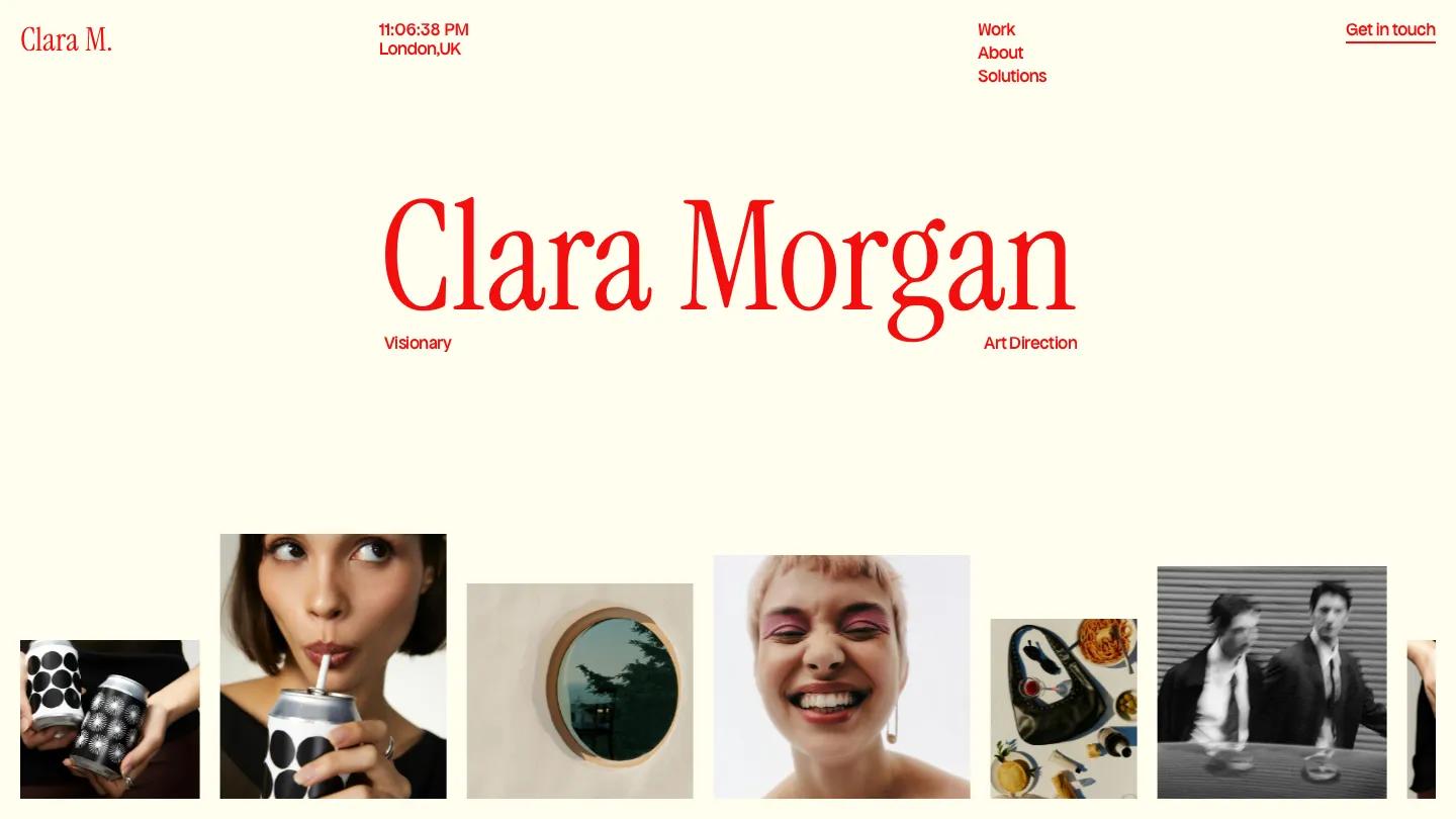


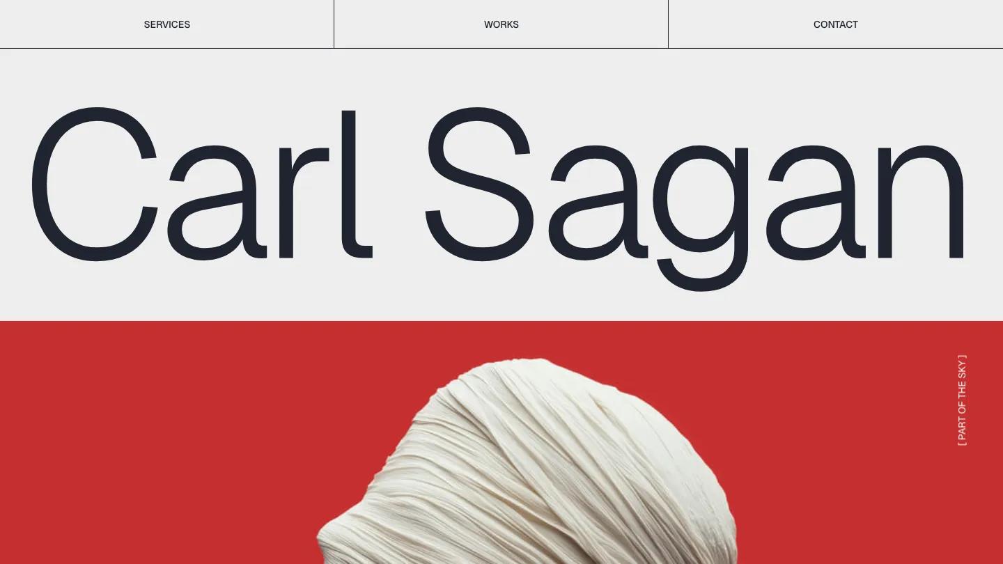
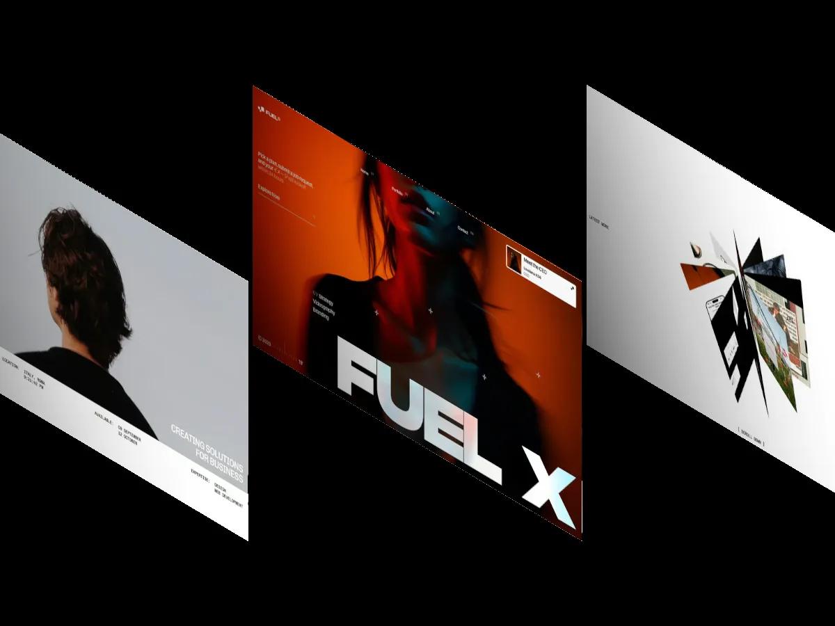
13 Best Portfolio Website Templates for Webflow and Framer (2026)

Where to Find Free and Premium Framer Templates

How to Create and Sell a Framer Template

How to Use, Customize, and Change a Framer Template
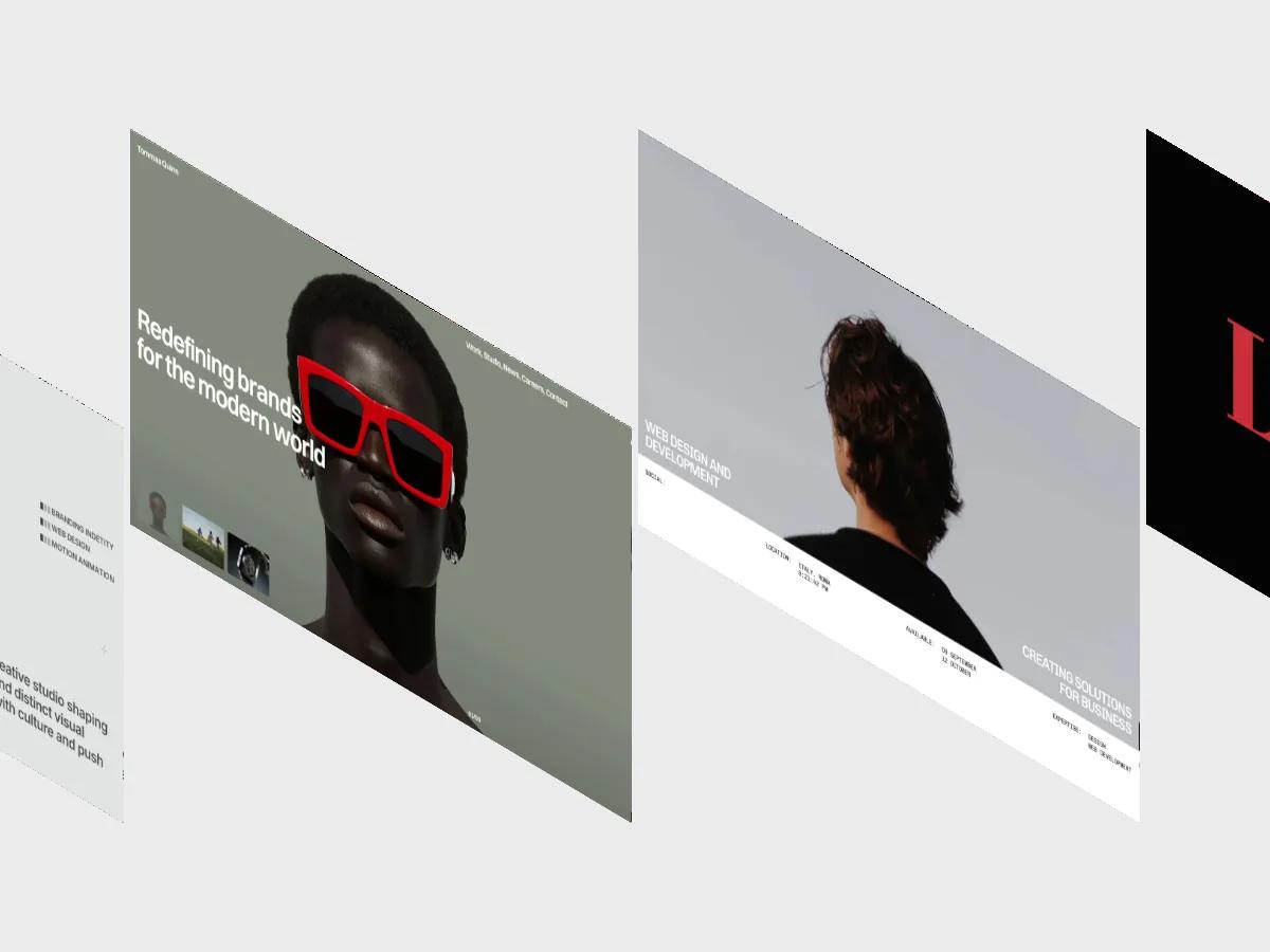
20 Best Framer Portfolio Templates 2026 (Scored by Designers)
30 Best Free & Paid Framer Website Templates 2026