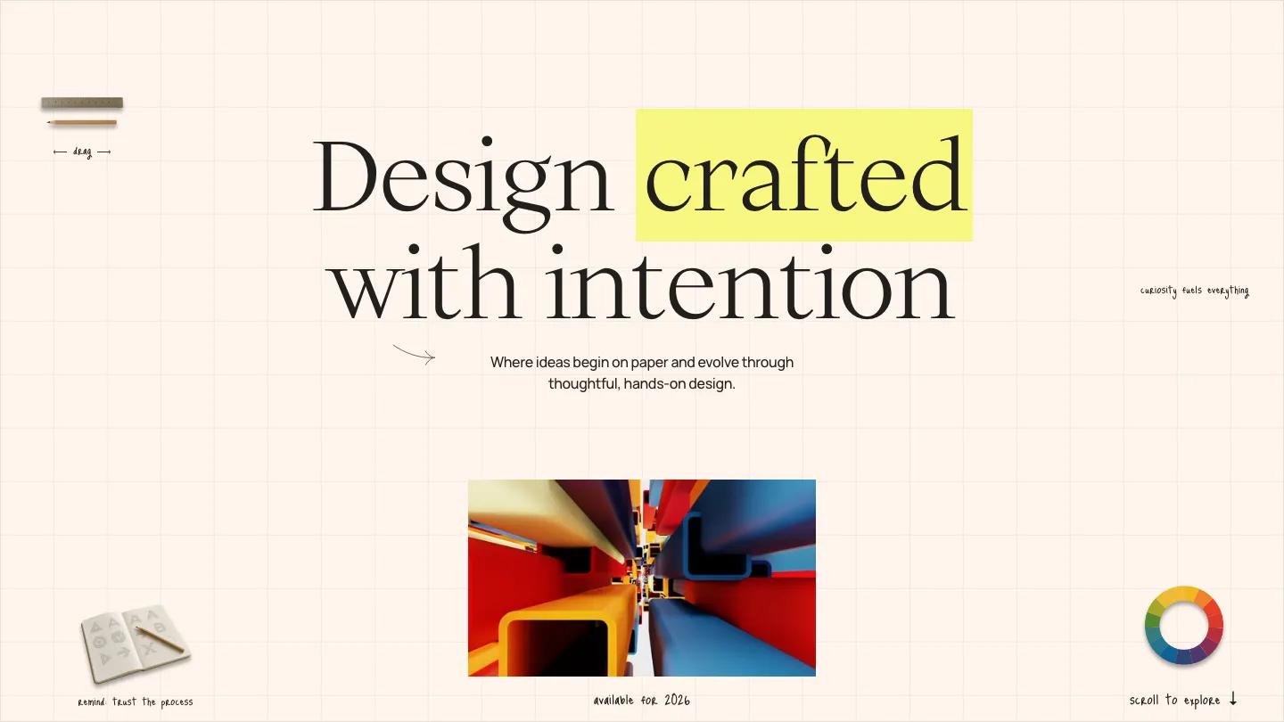
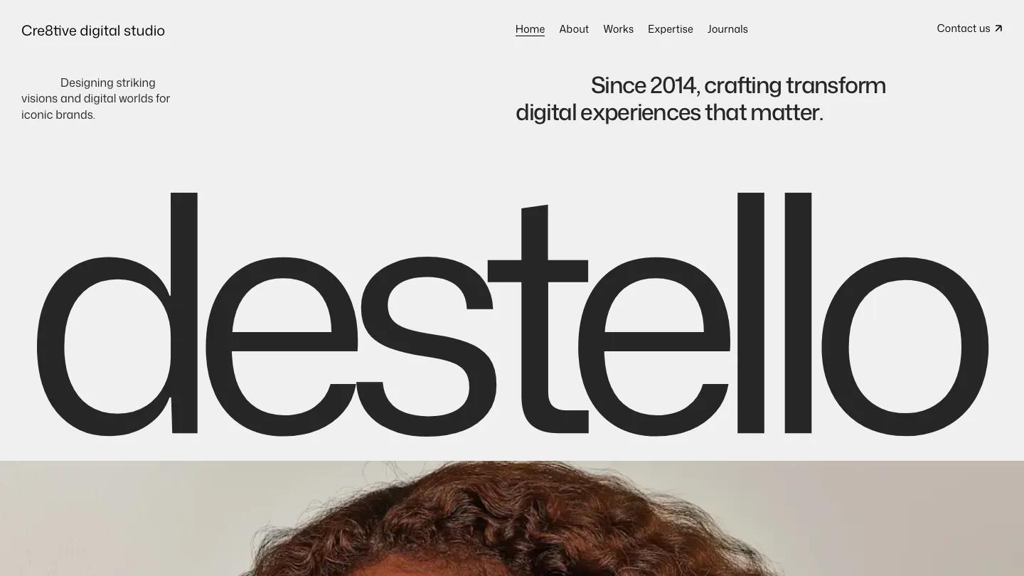
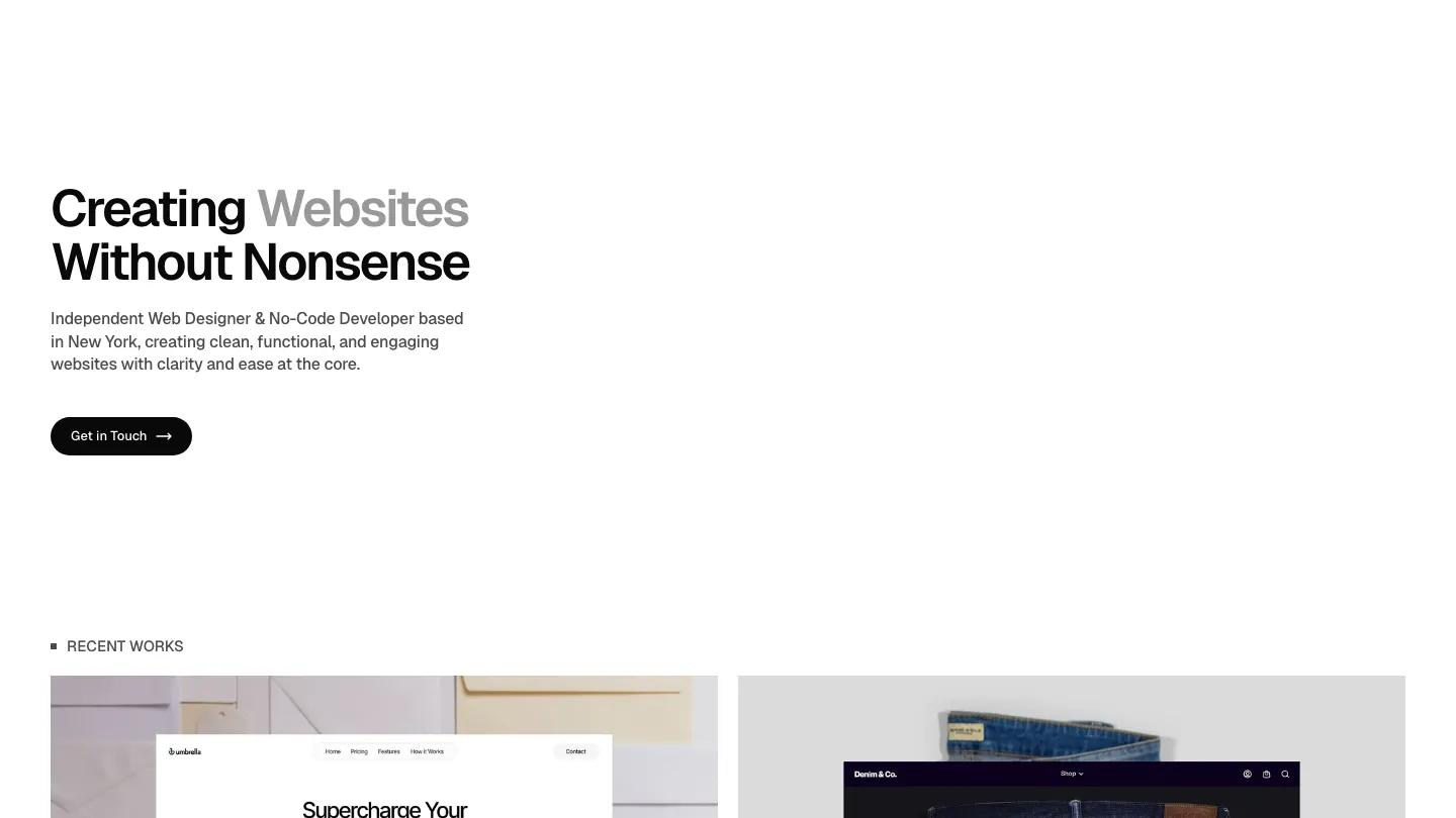
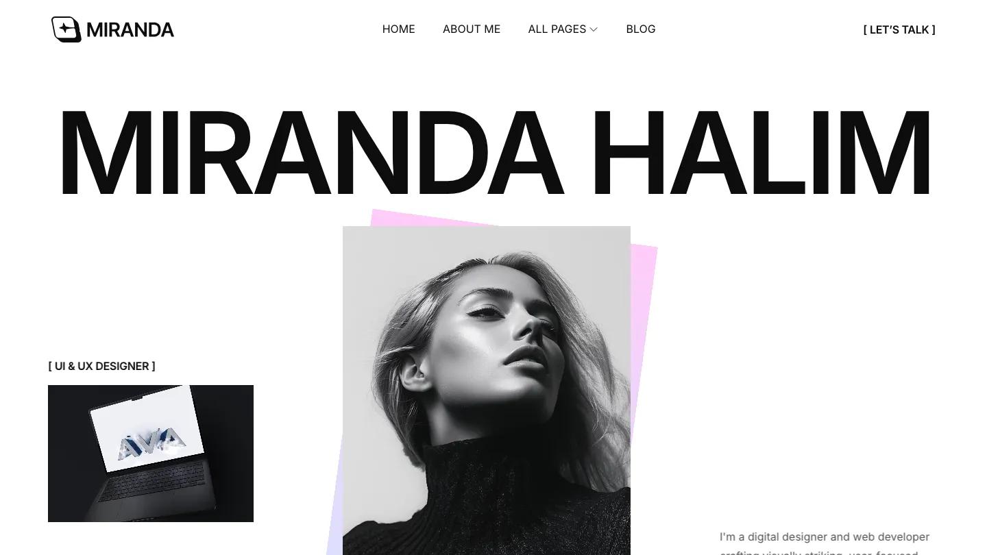
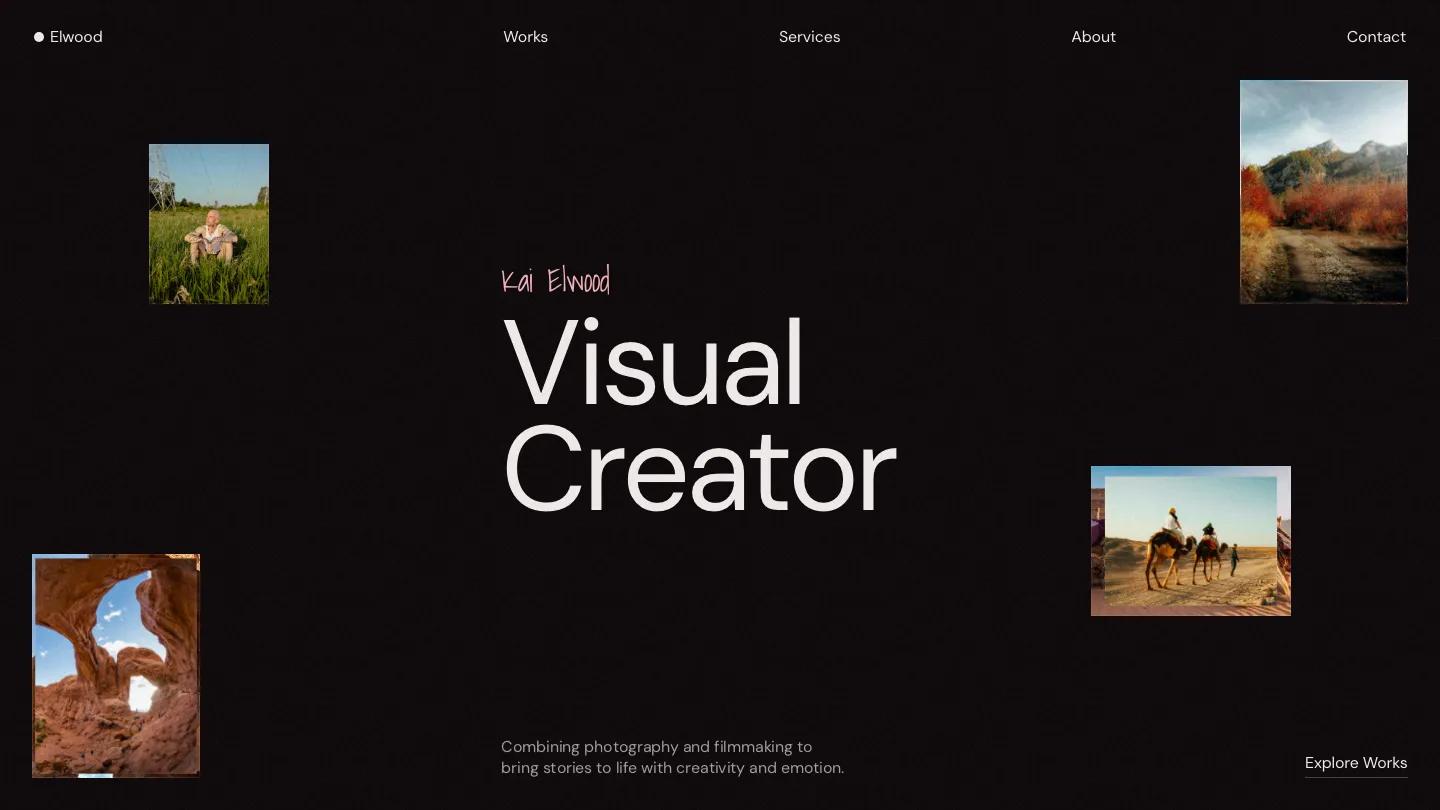
AUREA is a high-quality Framer template for Portfolio & Agency, Professional Services, Art & Design, Business & Startup by Kota.
Our Review of AUREA
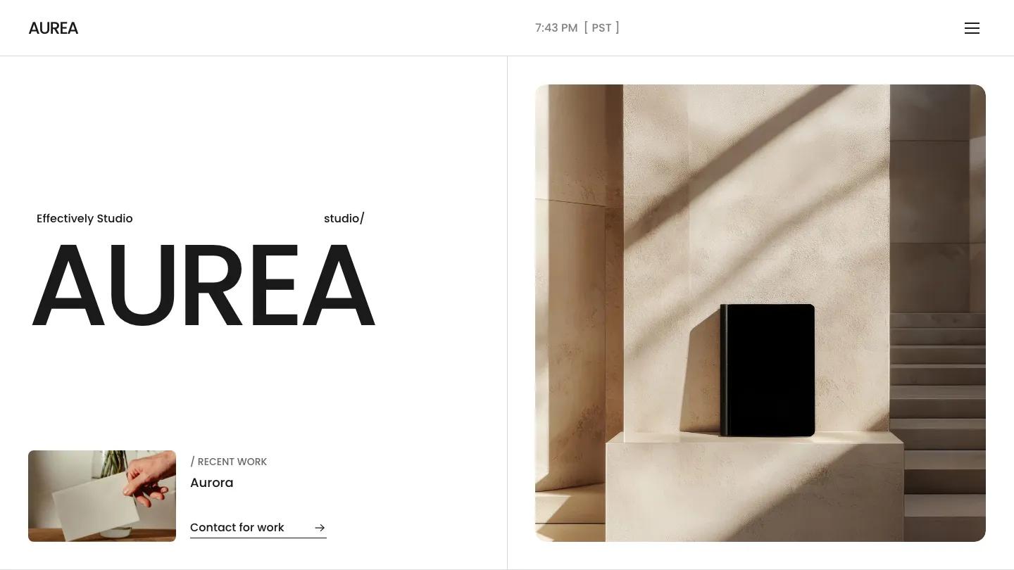
AUREA is a calm, grid-minded Framer template from Kota for design studios that want to look established and well organised. The hero splits the screen down the middle. On the left, the studio name sits in big black Poppins, and a recent work card with a thumbnail and a Contact for Work link sits below. On the right, a rounded photo shows a black notebook on a stone plinth in raking sunlight, all warm beige and shadow. The header is spare: wordmark on the left, a live clock with the time zone in the middle, and a menu icon on the right.
The homepage moves through clearly labelled sections. A short studio statement leads into a scattered grid of mockups over faint oversized text, then a partner line with a row of client logos. Numbers Don't Lie stacks huge figures for countries, projects, and years against short notes, separated by thin rules. Selected Works uses full-width dark project banners with names and disciplines, and the services list sets Brand Design to Development in large type. A row of award cards, a dark band of client quotes that open like an accordion, and an Articles grid with dated story cards close it out. The About page opens with a giant "About Us" above a wide, rounded team photo.
On a phone the header and name stay tidy, but the beige hero photo gives way to a dense collage of website screens, which feels busier than the desktop version.
We'd pick AUREA for branding studios and small digital agencies who want structure over flash. Before launch, replace the award cards, which use well-known design award names, and check that the stats match their captions, since one figure and its description disagree in the demo.
Based on the live demo, viewed on desktop and on a phone. The Design and Dev scores come from separate independent reviews. See how we score templates.
Independently evaluated by our team of 6 designers and 5 developers.











Designers score design, developers score development, and each score is the average of their independent ratings. Read about our review team and how we score templates.