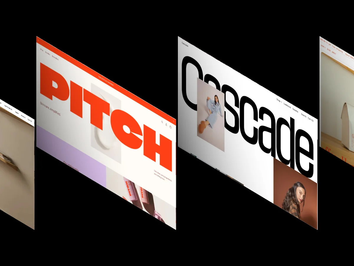
20 Best Framer Portfolio Templates 2026 (Scored by Designers)

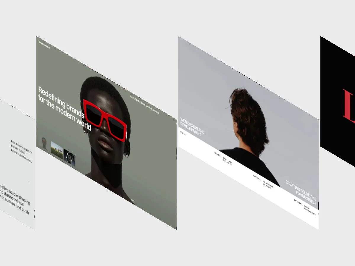
344 of the 361 Framer templates in our library carry the Portfolio & Agency tag, which makes choosing harder, not easier. We ranked the 20 that scored highest under our multi-reviewer scoring process, including six free picks. Every entry clears 9.4/10 on both design and development.
Framer's marketplace has a portfolio problem, and it isn't a shortage. 344 of the 361 Framer templates in our library carry the Portfolio & Agency tag. That's 95 percent of everything we've published for the platform competing for the same buyer, which turns finding the best Framer portfolio templates into a filtering problem rather than a discovery problem.
We've scored every one of those templates through our multi-reviewer process, where each published number is the averaged result of independent scores from designers and developers with 10 or more years of experience. The 20 templates below are the highest scoring portfolio templates in our Framer library, and every one sits at 9.4/10 or above on both the Design Score and the Dev Score.
Six of the 20 are free. The paid picks run from $39 to $129. If you want the wider view beyond portfolios, our 30 Best Free & Paid Framer Website Templates 2026 covers the whole platform.
Why is picking a Framer portfolio template so hard?
Because nearly every Framer template is a portfolio template. 344 of the 361 Framer templates in our library carry the Portfolio & Agency tag, which is 95 percent of the platform's output competing in one category. Volume that lopsided produces hundreds of near-identical dark grids and type-led homepages, so the real work is separating templates that look good in a thumbnail from templates that hold up once you build on them.
The average Framer template in our library scores 8.2/10 overall, which is solid, but averages don't help you when 344 options wear the same label. Ranked, verified scores do.
The 20 best Framer portfolio templates, ranked
Every entry below links to our full review page, where you can watch a screen recording of the template's homepage and check the complete score breakdown. Templates are ordered by Overall Score, highest first.
TITARVL
- Design: 9.7/10
- Dev: 9.65/10
- Price: $49
- Best for: solo designers and small studios that want motion-heavy case study presentation without building the interactions themselves
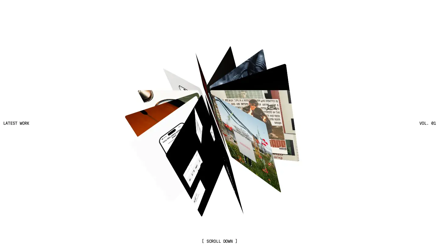
TITARVL holds the shared top spot with Design: 9.7/10, the highest design score of any portfolio template in our Framer library. The score reflects restraint applied to an effect-heavy toolkit: 3D perspective effects on project cards, a custom cursor, and sticky scrolling sections all sit inside a light, typographic layout where the type carries the hierarchy and the motion stays supporting cast. Nothing fires at once, which is exactly the discipline most animated portfolios lack.
The Dev: 9.65/10 comes from a component library and layout templates that are genuinely reusable. Duplicating a case study page and swapping in CMS content takes minutes, and the services page slots in cleanly for freelancers who sell productized work rather than just displaying finished projects.
Worth knowing: there's no blog collection, so if you plan to publish writing next to your work, you'll be building that CMS structure yourself.
Zeentra

- Design: 9.7/10
- Dev: 9.65/10
- Price: $79
- Best for: agencies that need blog, careers, and services pages running alongside the portfolio from day one
Framerbite built Zeentra for teams rather than individuals, and the page inventory shows it: blog, jobs and careers, services, overlays and modals for case study detail, plus vector sets and variable fonts bundled in. Design: 9.7/10 ties TITARVL at the top of the category, but the two earn it differently. Zeentra lets color into an otherwise minimal system and uses it as a wayfinding device across sections, so each area of the site reads as its own space without breaking the whole.
Dev: 9.65/10 reflects a CMS deep enough to run a real agency site. Posts, projects, and job listings each get their own collection, which means content editors never touch layout to publish.
Worth knowing: solo freelancers will pay for careers and blog infrastructure they may never populate, and empty sections read worse than absent ones.
Olyver
- Design: 9.6/10
- Dev: 9.65/10
- Price: Free
- Best for: designers with strong project imagery who want scroll and text animation without paying for it
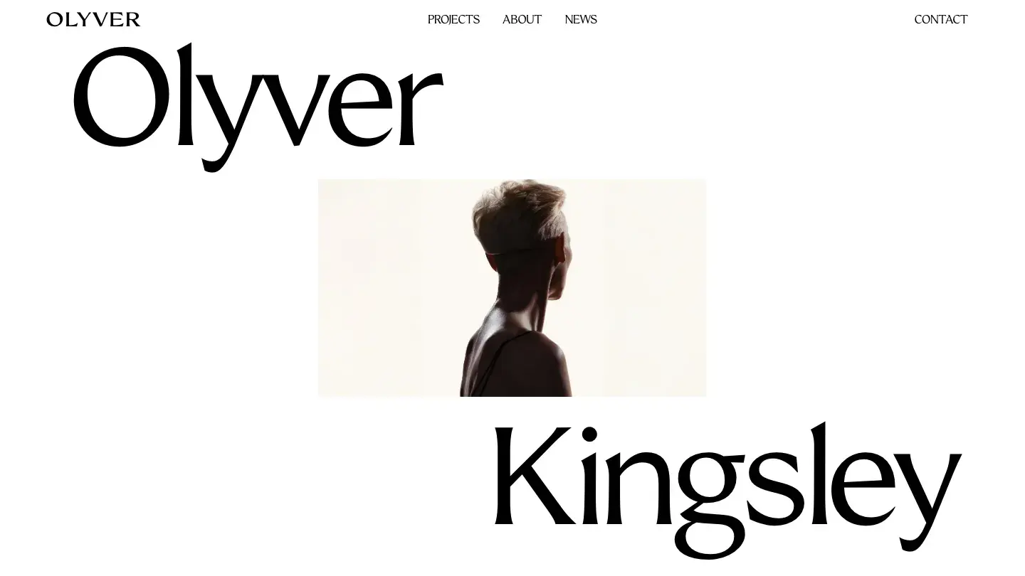
The highest scoring free template in our entire Framer library is Olyver, at Design: 9.6/10 and Dev: 9.65/10. FTC Studio stacks scroll effects, text effects, a custom cursor, and rich media support into a light, minimal layout, and the design score holds because the motion follows the content instead of fighting it: text reveals pace the reading, scroll effects mark section changes, and the project grid stays legible throughout.
The dev score is the quieter achievement. Every animation is built from reusable components rather than one-off interactions, so removing an effect you don't want doesn't break the page around it. For context, the free Framer templates in our library average 8.0/10 overall. Olyver clears that by a wide margin.
Worth knowing: the animation density flatters strong imagery and exposes weak imagery, so test with your actual project shots before committing.
Unmade
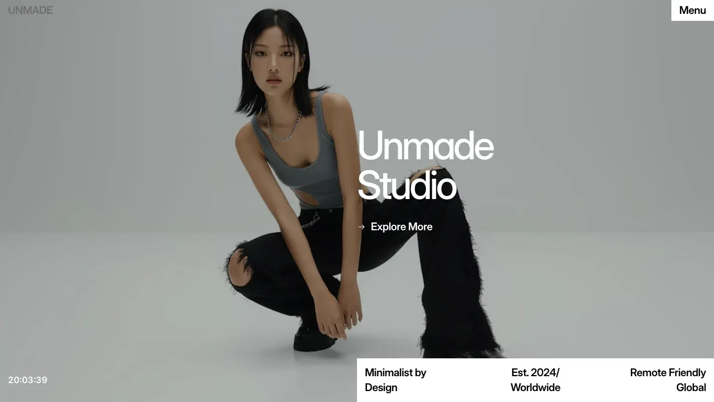
- Design: 9.55/10
- Dev: 9.65/10
- Price: $39
- Best for: illustrators and designers who want both light and dark themes at the lowest paid price on this list
At $39, Unmade is the cheapest paid entry here and doesn't read like it. Arian structures the homepage around a disciplined grid with illustration accents, and the bundled light and dark themes are both finished designs rather than one palette inverted. The grid holds its column logic down to mobile widths instead of collapsing everything into a single anonymous stack, which is where most portfolio grids quietly fall apart.
Dev: 9.65/10 ties the highest dev score on the list. Overlays and modals behave properly on small screens, and the CMS is wired for both projects and a blog out of the box.
Worth knowing: there's no dedicated contact page in the template; a form component ships, but you assemble the page around it yourself.
Fabrica
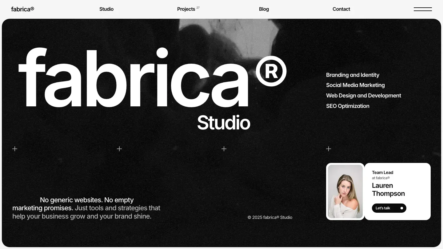
- Design: 9.45/10
- Dev: 9.65/10
- Price: $129
- Best for: studios and agencies that need site search, pricing, and careers pages, not just a project gallery
Nothing else on this list ships as much infrastructure as Fabrica: site search, a pricing page, jobs and careers, background video support, and a blog alongside the portfolio core. Anatolii Dmitrienko keeps the design monochromatic and type-led, so your case study imagery supplies all the color the layout has, and the typography does the heavy lifting with bold weight contrast between display and body sizes.
Dev: 9.65/10 is earned by how well that much surface area holds together. Search works against real CMS content rather than existing as a stub, and the blog and careers collections are structured, not decorative. At $129 it's the most expensive pick here and sits near the top of Framer pricing overall, where the ceiling in our library is $199.
Worth knowing: a personal portfolio will use maybe half of these pages, so the price only makes sense for a studio that needs the full set.
Elian
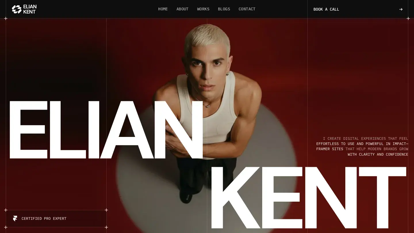
- Design: 9.45/10
- Dev: 9.65/10
- Price: Free
- Best for: multilingual portfolios that need localization support without a paid template budget
Free templates almost never ship localization support. Elian does, alongside P3 wide-gamut colors and site search, a feature set we'd normally expect at $60 or more. Zaid Khan builds the layout as a dark grid with clear typographic hierarchy: display type anchors each section, and the grid spacing stays consistent enough that dense project archives don't turn into visual noise.
Dev: 9.65/10 is the standout number. The localization structure means a second language doesn't require duplicating every page, and the CMS covers projects and a blog with fields that make sense for real content.
Worth knowing: the design is built dark-first with no bundled light theme, so if your work photographs better on white, you're recoloring the entire system.
Le Reve
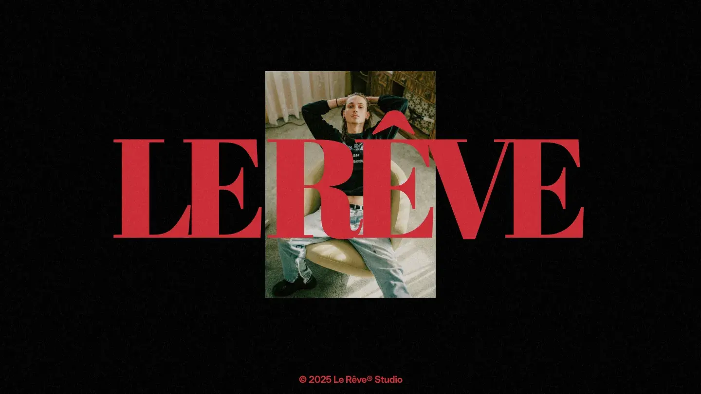
- Design: 9.5/10
- Dev: 9.6/10
- Price: $39
- Best for: photographers who want a monochrome presentation layer with a real theme toggle at a low price
Photographers get the most out of Le Reve. Arian's second entry on this list runs dark and monochrome with variable fonts handling the display type, and it includes a light and dark theme toggle in a $39 package, which is rare at that price. Design: 9.5/10 reflects how the monochrome discipline forces attention onto the photography; the layout never competes with the work it presents.
Dev: 9.6/10 comes from sticky scrolling and slideshow components that stay smooth under image-heavy content, plus a CMS that handles projects and a blog without restructuring.
Worth knowing: there's no contact page and no form component anywhere in the template, so client inquiries mean wiring your own form or linking out to email.
Gordian
- Design: 9.5/10
- Dev: 9.55/10
- Price: Free
- Best for: designers who want a fast, focused project index and nothing else on the page
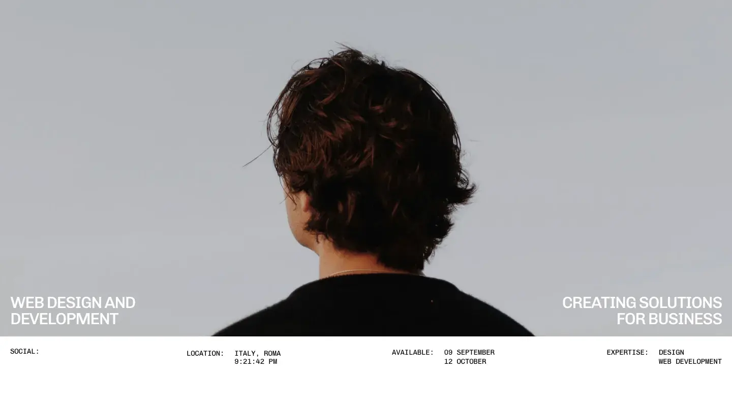
Eight features. That's the entire Gordian spec sheet: multi page, projects, animation, CMS, components, responsive layout, an about page, and typography. Satto.studio cut everything else, and the focus shows in the Design: 9.5/10. The light, type-led project index gives each piece of work room to breathe, and the animation is limited to transitions that guide rather than perform.
Dev: 9.55/10 on a free template with this little surface area means what exists is built properly. The CMS project collection is simple enough that a first-time Framer user can populate it in an afternoon.
Worth knowing: no contact page, no forms, no blog, no 404 page; Gordian is a gallery plus an about page, and everything else is on you.
TommasQuinn
- Design: 9.45/10
- Dev: 9.6/10
- Price: $49
- Best for: small studios that present case studies in overlays instead of separate page loads
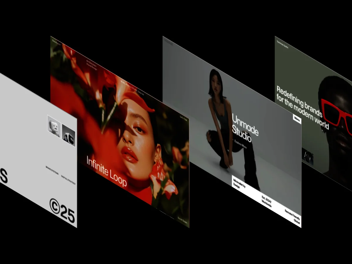
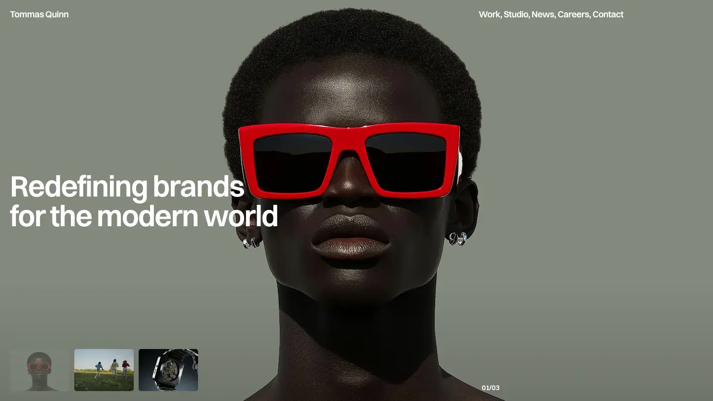
ena supply approaches monochrome light layouts with more editorial intent than most portfolio templates manage. TommasQuinn earns Design: 9.45/10 through typographic contrast, pairing large display type against restrained body copy so the hierarchy reads instantly, even on a palette with almost no color in it.
The distinctive engineering choice is the overlay system. Case study details open in modals rather than new pages, which keeps browsing fast, and Dev: 9.6/10 reflects how reliably those modals handle scroll position and close states. Blog and careers collections round it out for small teams.
Worth knowing: there's no services page, so studios selling fixed-scope offers will be assembling one from the component library.
FRQNCY
- Design: 9.45/10
- Dev: 9.6/10
- Price: $79
- Best for: design studios whose work supplies the color and who want a strict monochromatic grid around it
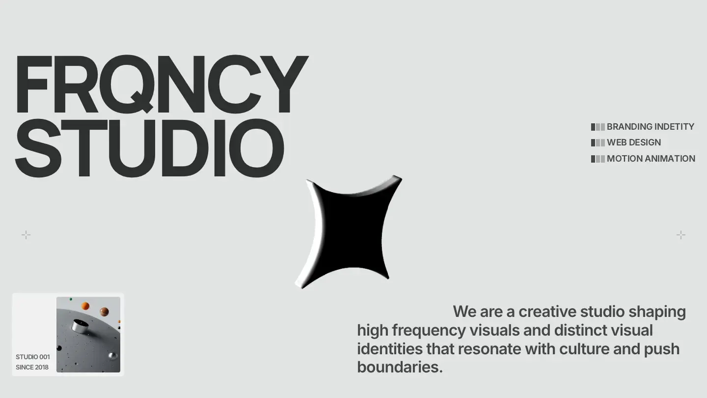
There's no blog in FRQNCY, and it reads as a decision rather than an omission. Fahlevi commits the entire template to a monochromatic grid system with variable fonts and a custom cursor, and Design: 9.45/10 reflects how strictly the grid is enforced: every section aligns to the same column structure, which gives the whole site an engineered calm that most portfolios chase and miss.
Dev: 9.6/10 comes from layout templates and overlays that respect that grid at every breakpoint. Sticky scrolling sections resize without breaking alignment, which is harder to get right than it sounds.
Worth knowing: with no slideshow components and no rich media support, image sequencing happens inside the grid or not at all; motion-heavy showreels need a different template.
Monica Ellis
- Design: 9.45/10
- Dev: 9.55/10
- Price: $49
- Best for: individual creatives building a personal brand where their own name is the identity
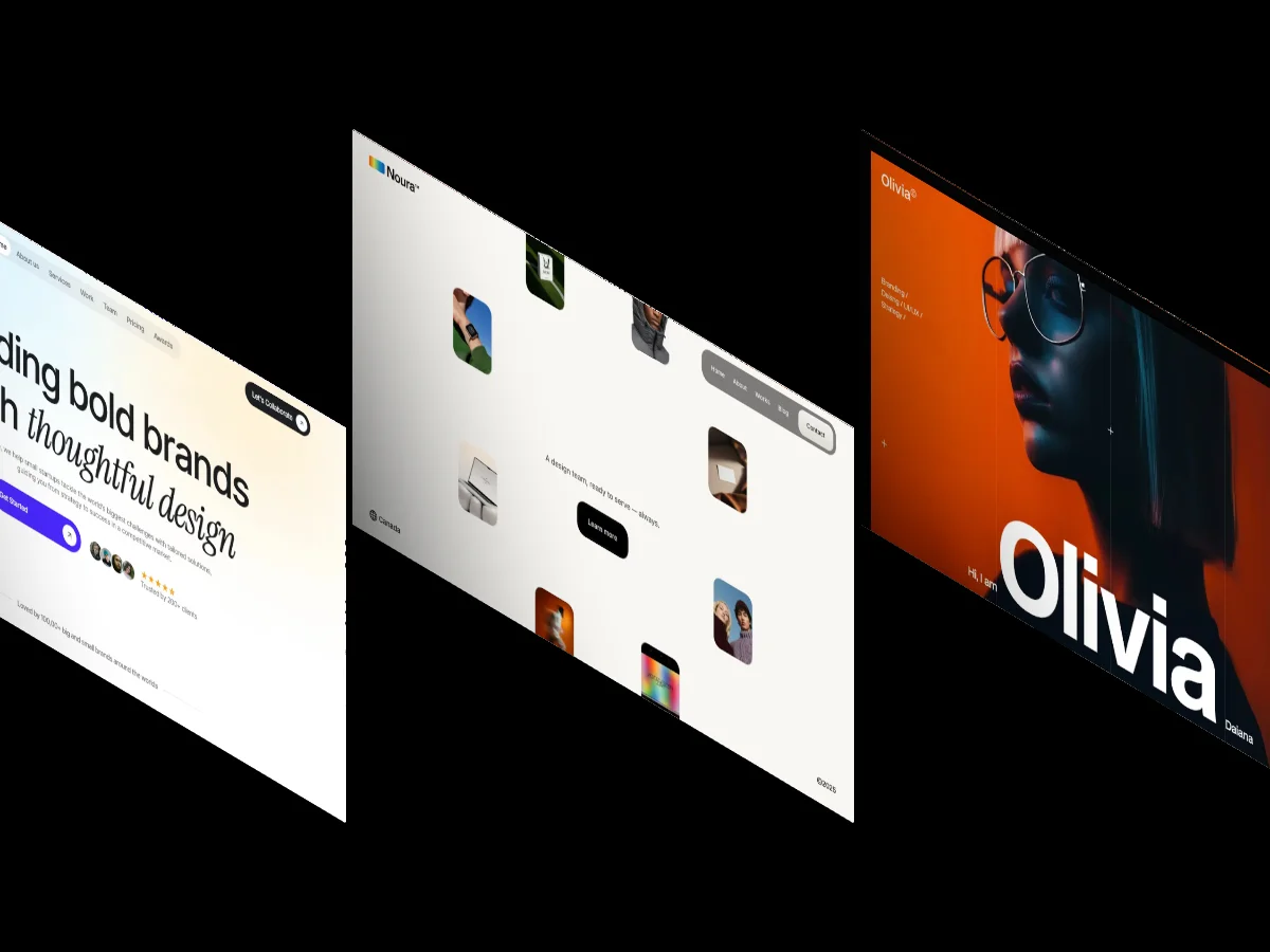
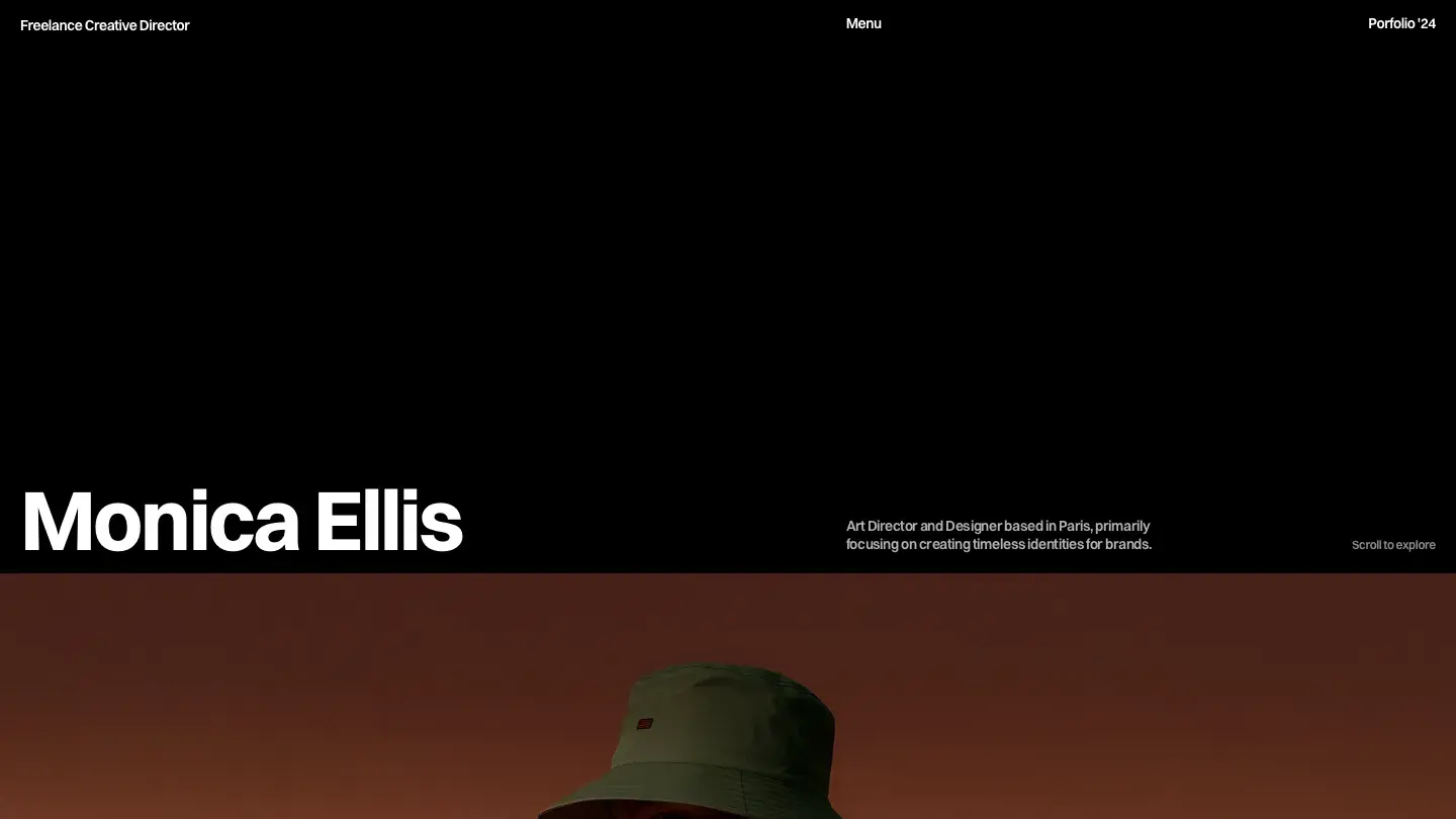
Structured as a named personal site, Monica Ellis works best when one person is the brand. ena supply's second entry on this list goes dark and bold where TommasQuinn goes light and quiet, with heavy display type and a custom cursor setting a more assertive tone. Design: 9.45/10 reflects how well that boldness stays organized; the dark sections use spacing rather than dividers to separate content, and it holds at mobile widths.
Dev: 9.55/10 covers a surprisingly complete build for a personal template: blog, careers, and project collections all ship wired, with overlays handling project detail views.
Worth knowing: the personal-name identity runs through every page, so teams adopting it will be restructuring copy and navigation, not just swapping a logo.
ZeroFrame
- Design: 9.45/10
- Dev: 9.55/10
- Price: $69
- Best for: photographers and visual studios that want a dark grid with depth effects instead of a flat one
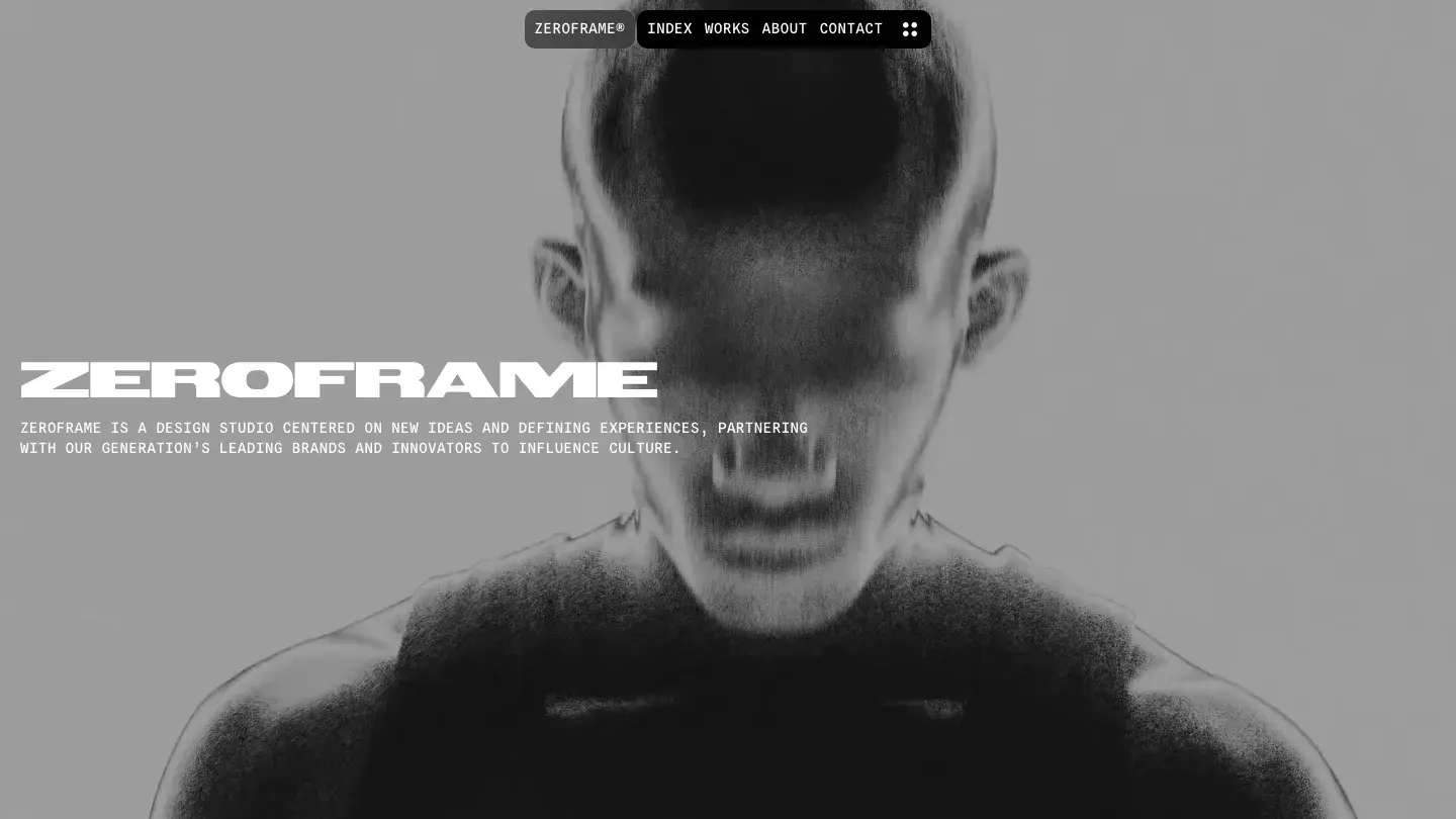
Dark grid portfolios are the most crowded corner of an already crowded category, and ZeroFrame executes the format better than nearly all of them. Satto.studio adds 3D perspective effects to the project cards and a custom cursor to the browsing experience, which gives the dark grid actual depth. Design: 9.45/10 reflects that the effects reinforce the grid rather than distract from it.
On the build side, Dev: 9.55/10 covers sticky scrolling that stays smooth with heavy photography and a CMS spanning projects, blog, and careers. The page inventory suits a working studio, not just a name card.
Worth knowing: the contact page ships without a form component, so inquiries route through links unless you add one yourself.
Fuel
- Design: 9.45/10
- Dev: 9.55/10
- Price: Free
- Best for: freelancers with productized service tiers who need a pricing page in a free template
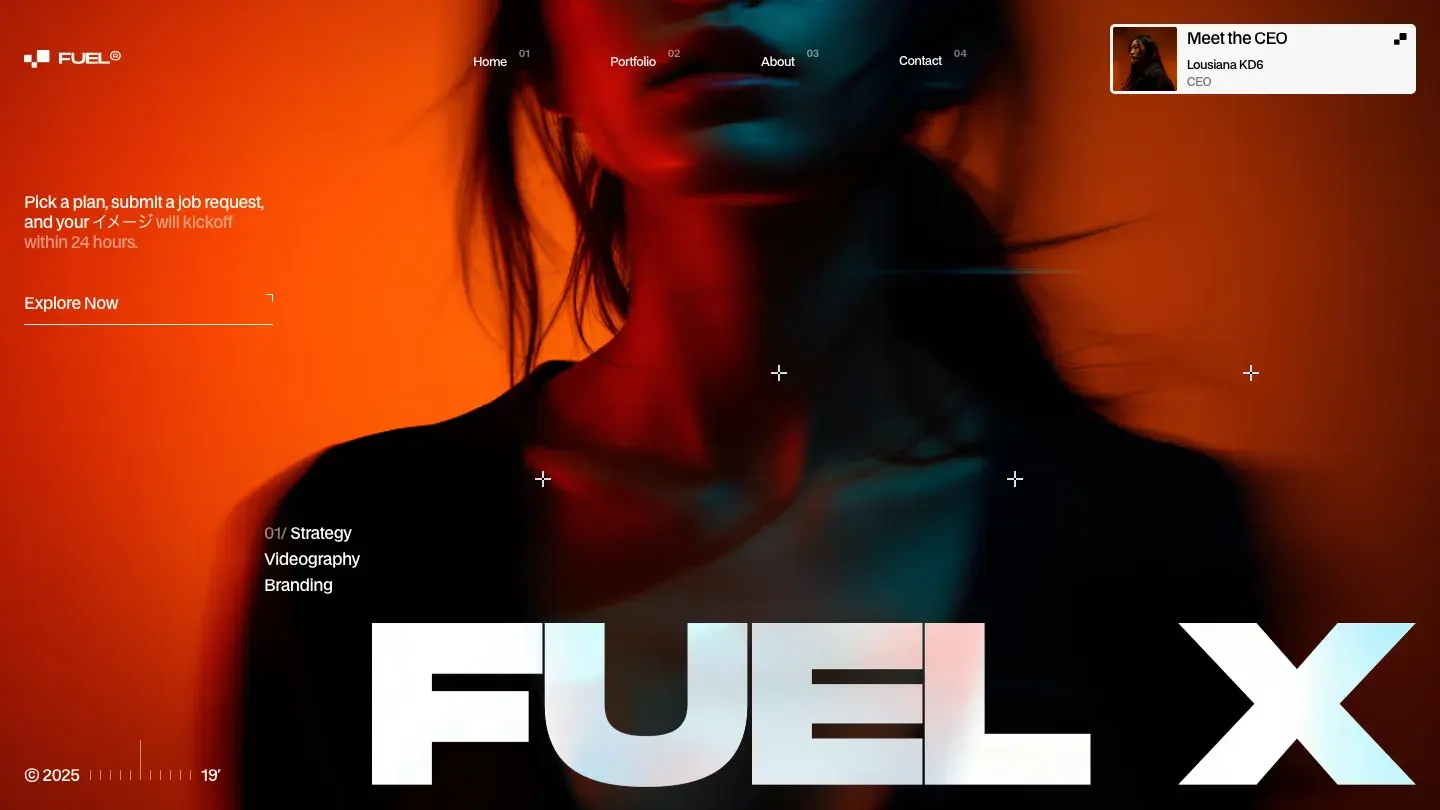
Of the six free templates on this list, Fuel carries the largest feature set: a pricing page, 3D perspective effects, variable fonts, overlays and modals, a blog, and a page inventory most paid templates don't match. Westhill Studio keeps the design light and typographic, and Design: 9.45/10 reflects type that scales confidently from display headlines down to dense pricing tables without losing its rhythm.
Dev: 9.55/10 in a free package this large is the real story. The CMS handles projects and posts, the overlays behave on mobile, and the layout templates make new pages consistent by default.
Worth knowing: the pricing page assumes productized services with fixed tiers, so freelancers who quote per project will cut it and adjust the navigation that expects it.
Elias

- Design: 9.5/10
- Dev: 9.5/10
- Price: $79
- Best for: photographers who want a small, finished site rather than a large, flexible one
Identical scores on both axes are uncommon in our library, and Elias lands exactly there: Design: 9.5/10, Dev: 9.5/10. Alexandre Herbigneaux builds photography-first, with rich media support, a custom cursor, and variable fonts serving a deliberately small page set: projects, about, contact, and a 404. The design score reflects how the type stays out of the photography's way while still holding structure.
That small footprint is also the trade. The CMS covers projects and nothing else, so the build quality shows in depth rather than breadth: the project collection handles large image sets without the layout degrading.
Worth knowing: no blog and no services page at $79 means you're paying for finish, not flexibility; check that four page types is genuinely all you need.
Rabah
- Design: 9.45/10
- Dev: 9.55/10
- Price: $99
- Best for: photographers and videographers who need both a light and dark presentation of the same work
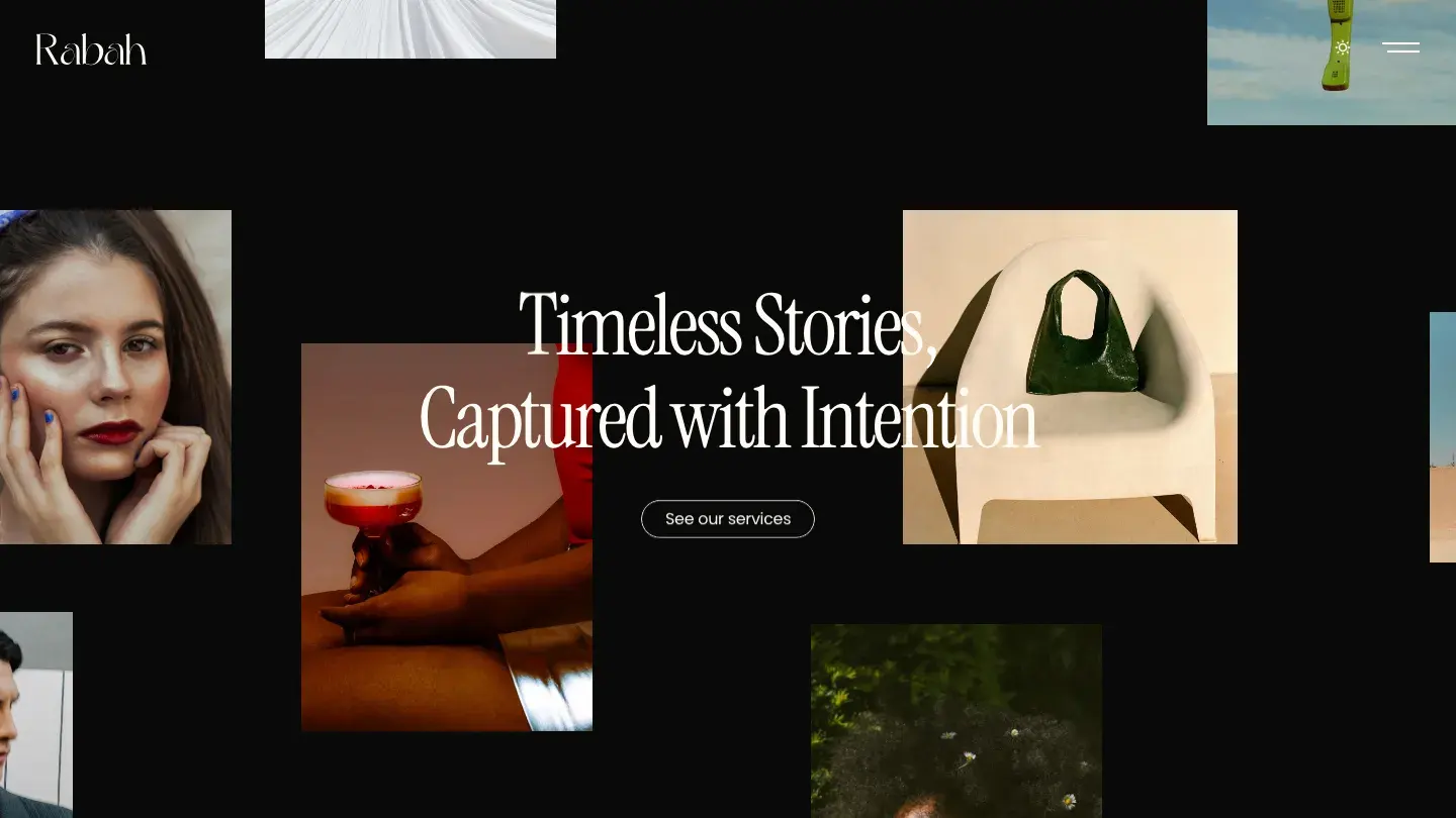
A $99 price tag puts Rabah near the top of Framer's paid range, where the median paid template in our library costs $59. What justifies it: a light and dark theme where both modes are genuinely designed, 3D perspective effects on project cards, and a services page aimed at photographers and videographers who sell shoots, not just display them. Design: 9.45/10 reflects a grid that survives the theme switch without any section going murky.
Dev: 9.55/10 covers the theme implementation itself, which is the hard part; components respond to the mode change consistently instead of leaving stray light elements on dark pages.
Worth knowing: there's no blog collection at this price, and Zeentra covers that gap for $20 less if publishing matters to you.
SwissBrut
- Design: 9.45/10
- Dev: 9.55/10
- Price: Free
- Best for: designers who want a brutalist, Swiss-grid identity and can accept its polarizing first impression
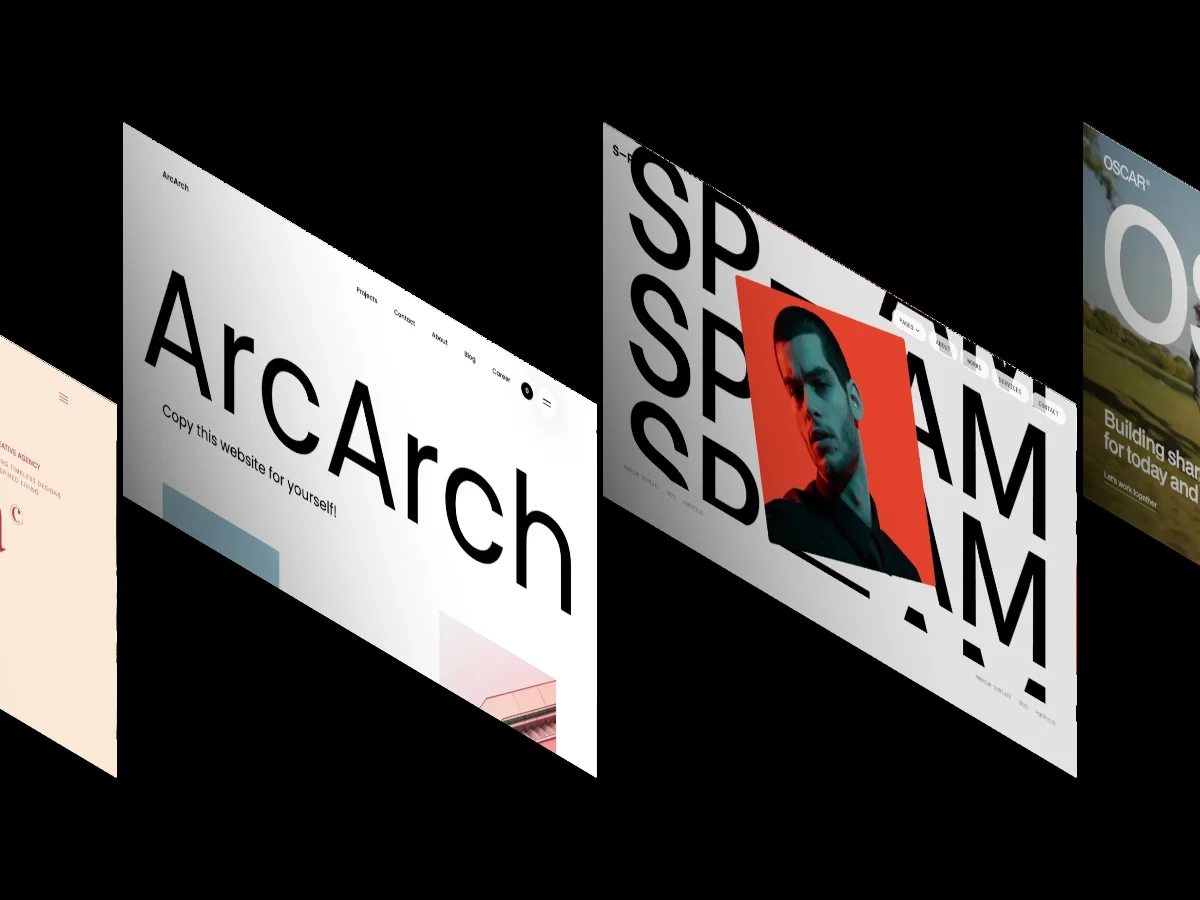
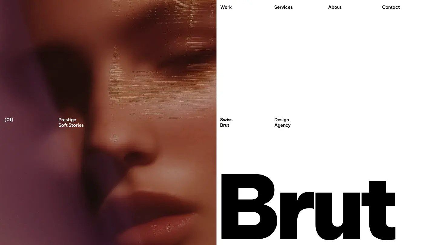
Swiss grid principles and brutalist type give SwissBrut the most recognizable visual identity of any free template here. Big display sizes, hard alignment, and aggressive whitespace produce a site that looks designed on purpose, and Design: 9.45/10 reflects that the brutalism is structural, not cosmetic; the grid logic underneath is rigorous.
Getting Dev: 9.55/10 out of a free template with 3D perspective effects and layout templates included makes SwissBrut one of the better value picks on this list. The CMS project collection and contact form ship working, which many stylized templates skip.
Worth knowing: brutalist typography polarizes clients, so show the demo to whoever approves the design before you build on it.
Plutarch

- Design: 9.45/10
- Dev: 9.55/10
- Price: $59
- Best for: motion designers and event studios whose work is video-led rather than still-image-led
Motion carries Plutarch. Background video, rich media support, slideshows, and a custom cursor stack into a dark layout aimed at events, entertainment, and art projects rather than corporate studio work; it's the only entry here carrying an Events & Entertainment tag. Design: 9.45/10 reflects restraint in how the video is framed: dark surrounds and controlled type keep the moving content from overwhelming the page.
Dev: 9.55/10 comes from the motion being componentized, so swapping a background video or slideshow doesn't mean rebuilding a section from scratch.
Worth knowing: background video punishes lazy asset handling, so compress your footage properly or loading performance on mobile connections will suffer.
Minimuline
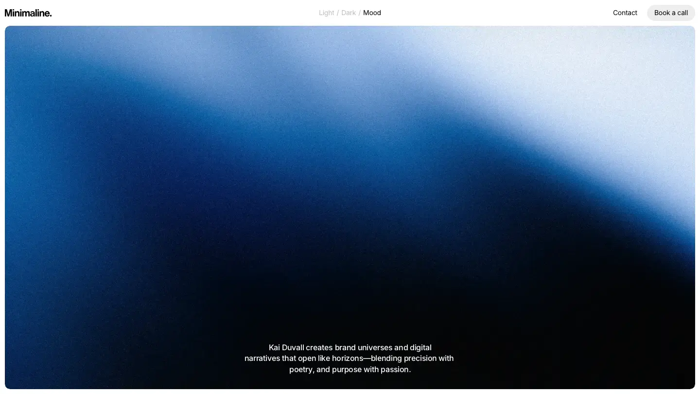
- Design: 9.55/10
- Dev: 9.4/10
- Price: $69
- Best for: portfolios with a small, stable set of case studies that won't grow past a handful of pages
Minimuline is one of only two entries where the Design Score beats the Dev Score, at Design: 9.55/10 against Dev: 9.4/10, and the gap has a concrete cause: there are no CMS collections. Every project is a static page. What the design score buys you is real: localization support, P3 colors, finished light and dark themes, and overlays that make the minimal layout feel considered rather than empty.
Basit A. Khan clearly optimized for presentation over content operations. If your portfolio is six case studies that change once a year, the static approach is actually simpler than a CMS.
Worth knowing: six static case study pages are manageable and thirty are not, so check your archive size before choosing it.
OXR
- Design: 9.4/10
- Dev: 9.55/10
- Price: Free
- Best for: videographers and studios with motion footage ready to lead the homepage
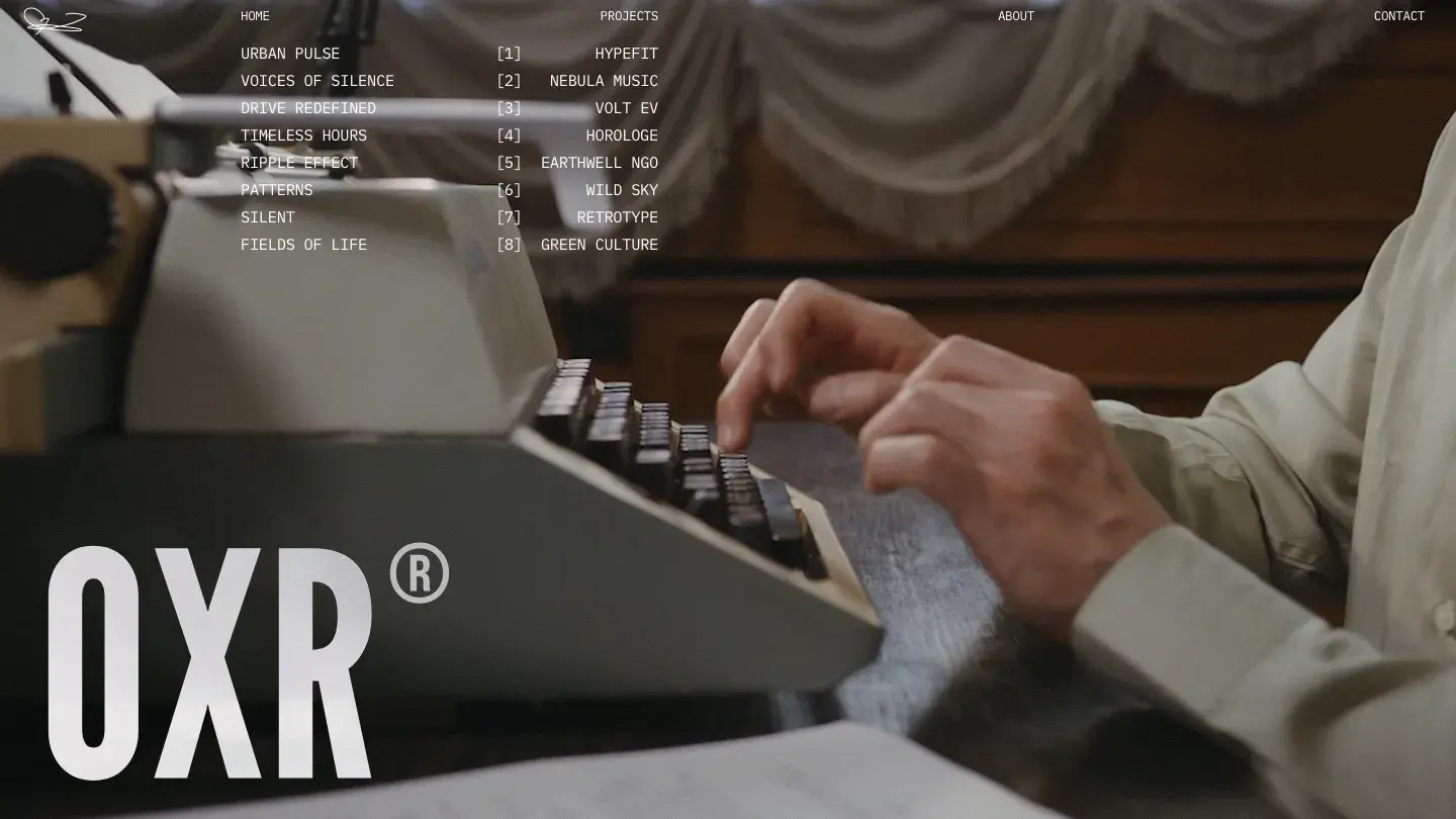
A background video hero opens OXR, with scroll effects pacing the project index below it, all free from Timur Bazarbaev. Design: 9.4/10 is the lowest design score on this list, which says more about the list than the template; the light, typographic layout is composed, and a services page gives it more commercial structure than most free portfolios carry.
Dev: 9.55/10 reflects the harder engineering: scroll effects that don't stutter over rich media, a working contact form, and a CMS project collection that handles video embeds cleanly.
Worth knowing: there's no blog collection, and the hero is built around video; if you don't have motion footage, the strongest section of the template goes unused.
Clara
- Design: 9.55/10
- Dev: 9.4/10
- Price: $59
- Best for: illustrators and print designers whose work suits still, careful presentation over motion
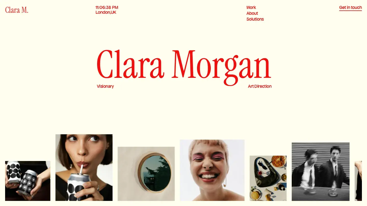
Closing the list, Clara pairs the same design-over-dev profile as Minimuline (Design: 9.55/10, Dev: 9.4/10) with a more conventional structure underneath: CMS-driven projects, a services page, contact, about, and a 404 all ship ready. Shahtaj Baig keeps the layout light and bold, with display type doing the visual work and generous spacing giving each project its own stage.
The Dev: 9.4/10 reflects a build that's correct but modest. There are no slideshows, no scroll effects, and no theme toggle, so what you see in the demo is close to the ceiling of what the template does.
Worth knowing: Clara presents work statically, which suits illustrators and print designers far better than motion designers with reels to run.
How we picked these
Every template on this list went through the same process as everything else in our library. Multiple reviewers, professional designers and developers each with 10 or more years of industry experience, scored each template independently: designers assessed visual quality for the Design Score, developers assessed build quality for the Dev Score. The published scores are the averaged result of all individual reviewer scores. Nothing below an Overall Score of 7.0/10 gets published, and creator reputation, sales volume, and marketplace ratings play no part in selection.
These 20 sit far above that floor. Only 24.9 percent of the Framer templates in our library score 9.0/10 or higher overall, and every entry here clears 9.4/10 on both axes. The full process is documented on our methodology page.
One practical tip for narrowing the list: on our listing pages, hovering over any template card plays a looping screen recording of that template's full homepage. You can visually compare all 20 of these in a couple of minutes without opening a single external tab.
FAQ
Are free Framer portfolio templates good enough for client work?
The best ones are. Six of the 20 templates on this list are free, and all six score 9.4/10 or above on both axes, led by Olyver at Design: 9.6/10 and Dev: 9.65/10. Across our whole library, free Framer templates average 8.0/10 overall against 8.3/10 for paid, so the quality gap is real but small at the top end.
How much do Framer portfolio templates cost?
Paid Framer templates in our library average $68, with a median of $59 and a full range of $19 to $199. The paid picks on this list run from $39 (Unmade and Le Reve) to $129 (Fabrica). Framer is also unusually generous with free options: 48 percent of the Framer templates we've published cost nothing.
Do I need to write code to use these templates?
No. Framer templates are built visually, and everything on this list ships with components and CMS collections you edit through Framer's interface. The exceptions worth planning for are the gaps we flagged: templates like Le Reve and Gordian ship without forms or contact pages, so filling those gaps takes assembly work inside Framer, though still no code.
What do the Design Score and Dev Score actually measure?
The Design Score covers visual quality: typography, layout hierarchy, spacing, color application, and how the design holds across screen sizes. The Dev Score covers build quality: component structure, CMS implementation, responsive breakpoint handling, and loading performance. Both are averaged from multiple independent reviewers, and we've written a full breakdown in how we score templates.
Should I build my portfolio on Framer or Webflow?
For a design-led portfolio that needs to look distinctive and launch fast, Framer is the stronger fit; its animation tooling is built into the canvas rather than layered on top. Webflow wins when your portfolio needs deeper CMS logic or will grow into a larger content site. Our platform comparison walks through the decision in detail.
Why do all 20 templates score so close together?
Because this is the top of a large, deep category. With 344 portfolio templates published for Framer in our library, the difference between rank 1 and rank 20 compresses to a quarter of a point. At this level, the deciding factors are fit rather than quality: whether you need a blog, a theme toggle, localization, or a pricing page matters more than a 0.1 score difference.