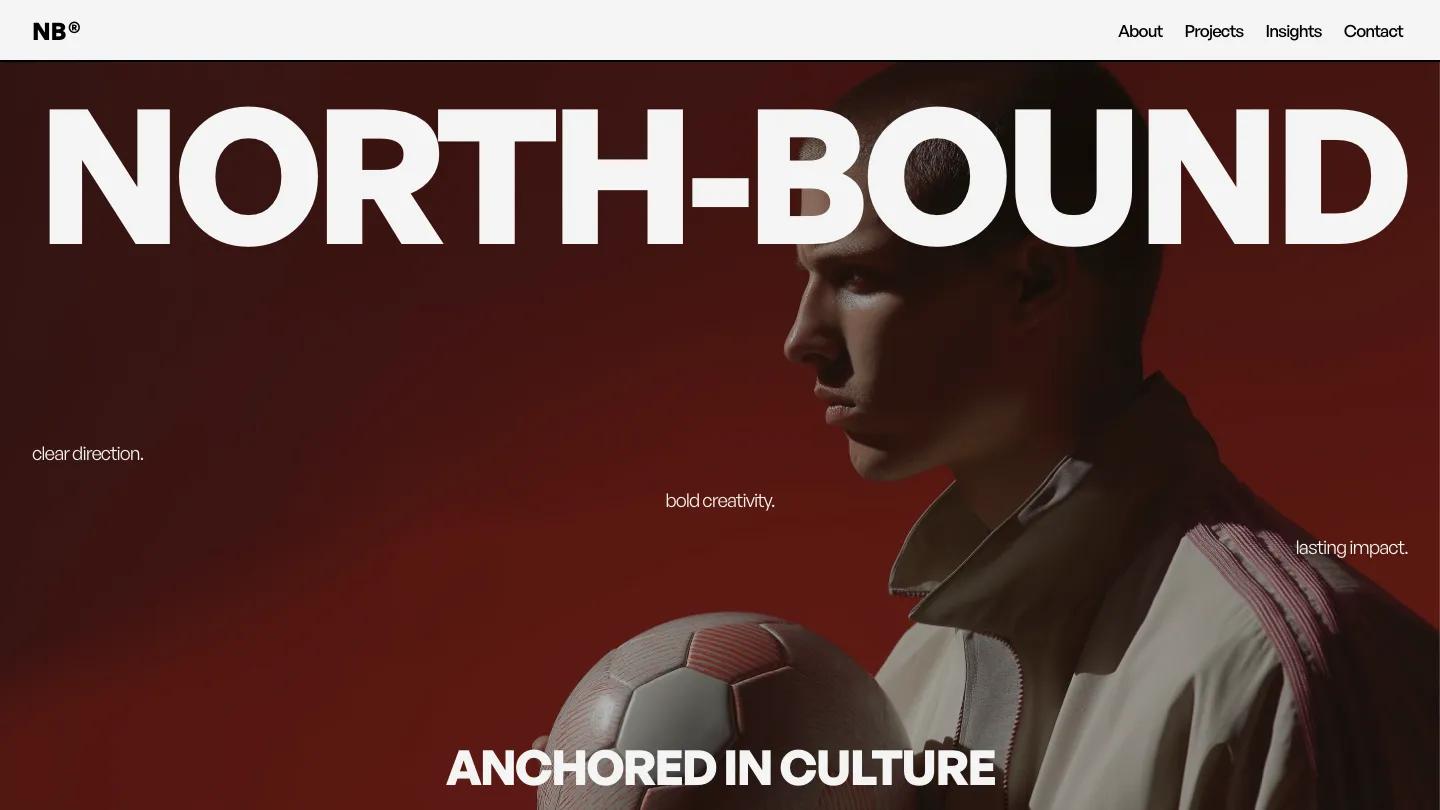
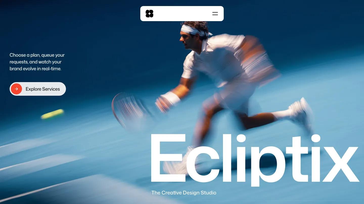
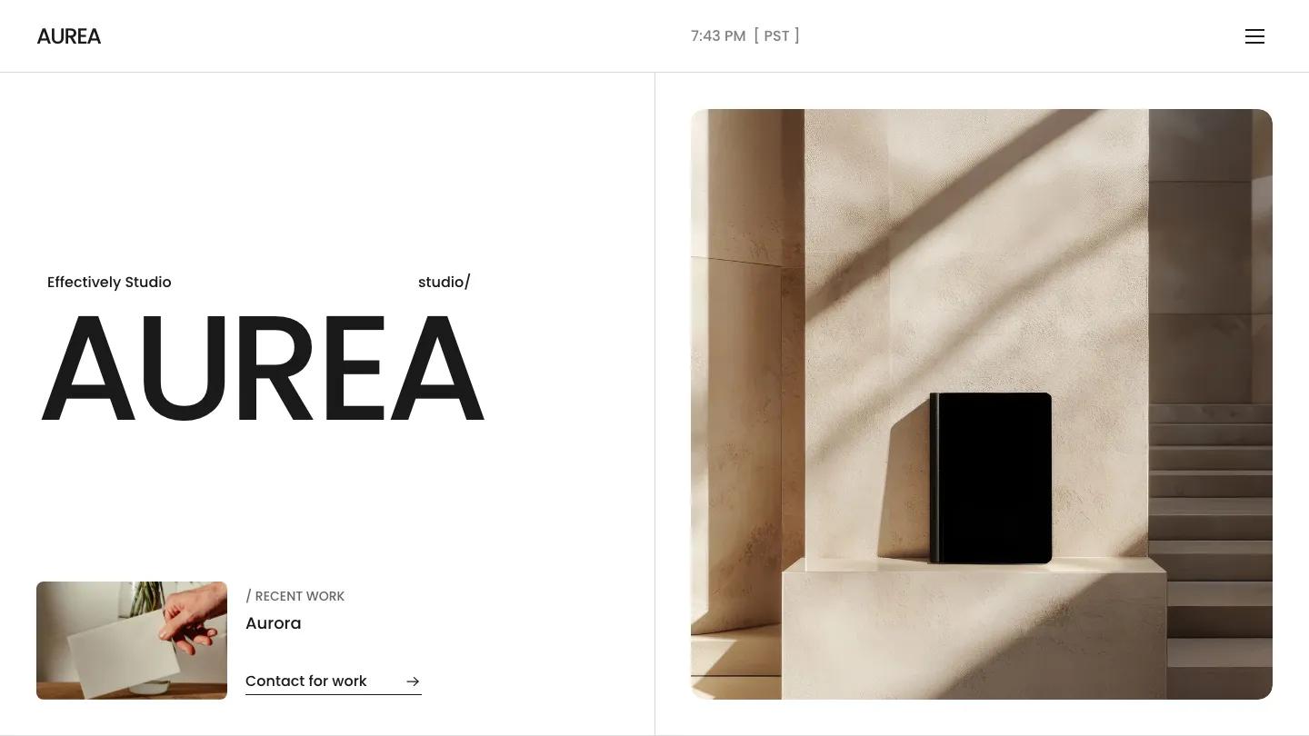
Naoto Studio is a high-quality Framer template for Portfolio & Agency, Art & Design, Professional Services, Business & Startup by Flowit Supply.

Our Review of Naoto Studio
Naoto Studio is a Framer site for a small branding and motion agency, and it opens with real warmth. The hero is a blurred wash of amber, mustard, and black, like light leaking through film, with the studio name set across the bottom in enormous white Switzer. A short positioning line sits on the right with an underlined Contact Us link and an arrow. The header is just the name on the left and Home, Works, Studio, News, and Contact on the right, each with a tiny superscript number.
Flowit Supply lets the page go white and spacious once you scroll. A selected work heading slides across the screen, then projects appear in a staggered two-column layout, with small images like a blue-lit profile portrait and a cloth-bound book cover floating at different heights, each with a plain caption. The disciplines section pairs a short intro and a Let's Connect link with an accordion of services in bold type, from Motion Design and Brand to 3D Rendering and Content Creation. Our Values follows in a numbered grid, then a soft pastel gradient band, a bold closing line asking if you've got a project, and a footer with sitemap and social columns. The Works page leads with a Showcase: Brand Solutions heading and a large portrait on the right.
On a phone, the gradient fills the screen, the name drops to a smaller size above the intro, and the menu collapses into a square plus button.
We'd pick Naoto Studio for brand, motion, and 3D studios that want a calm, editorial frame. Proofread before launch: several service labels and the disciplines heading ship with spelling mistakes. The staggered work grid also leaves big white gaps, so it needs plenty of strong project imagery to feel full.
Based on the live demo, viewed on desktop and on a phone. The Design and Dev scores come from separate independent reviews. See how we score templates.
Independently evaluated by our team of 6 designers and 5 developers.











Designers score design, developers score development, and each score is the average of their independent ratings. Read about our review team and how we score templates.