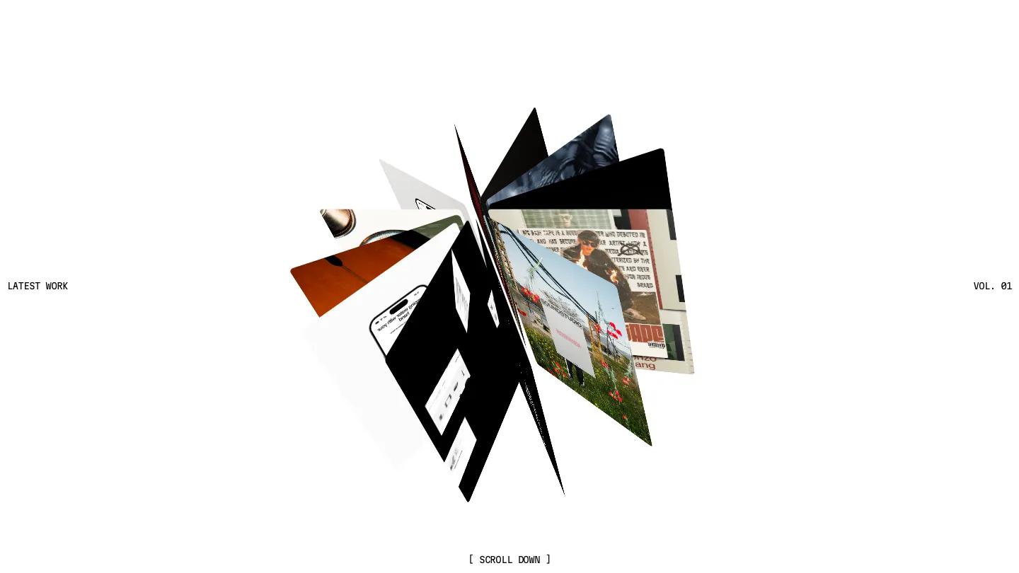
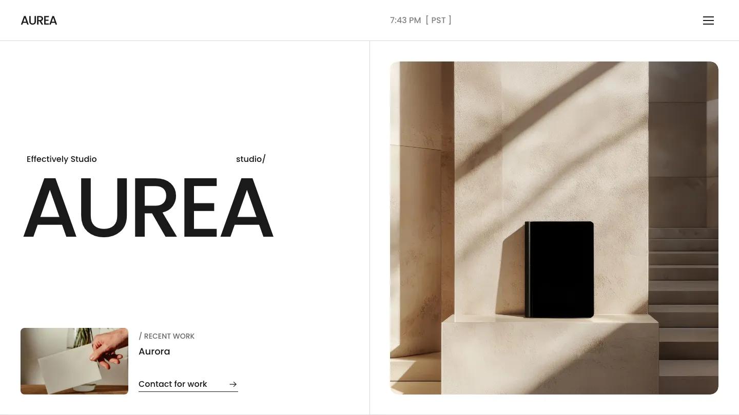
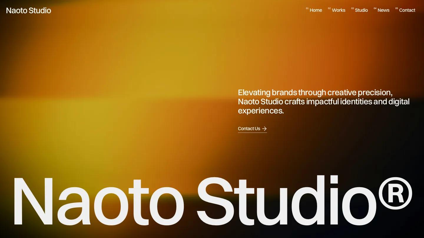
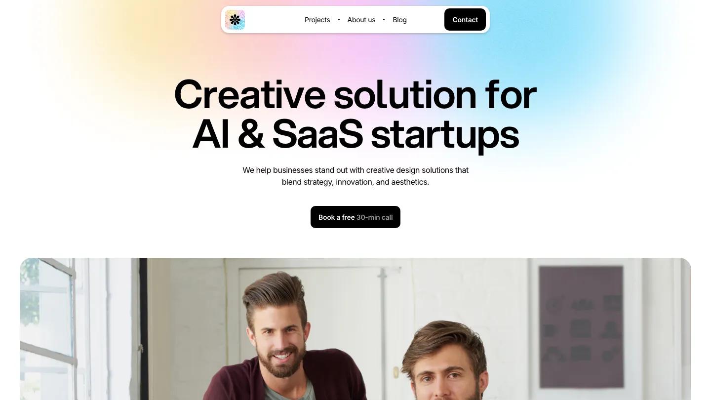
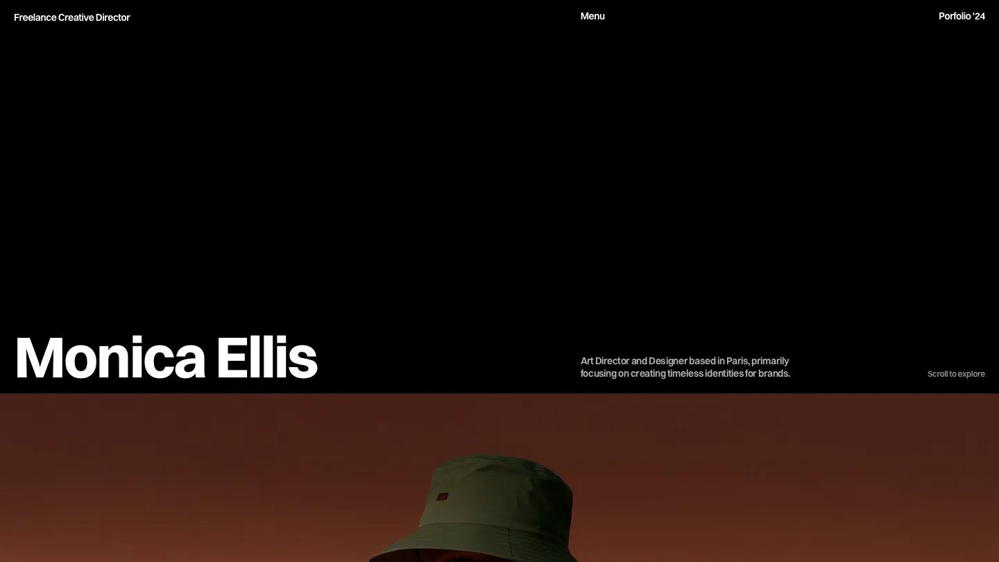
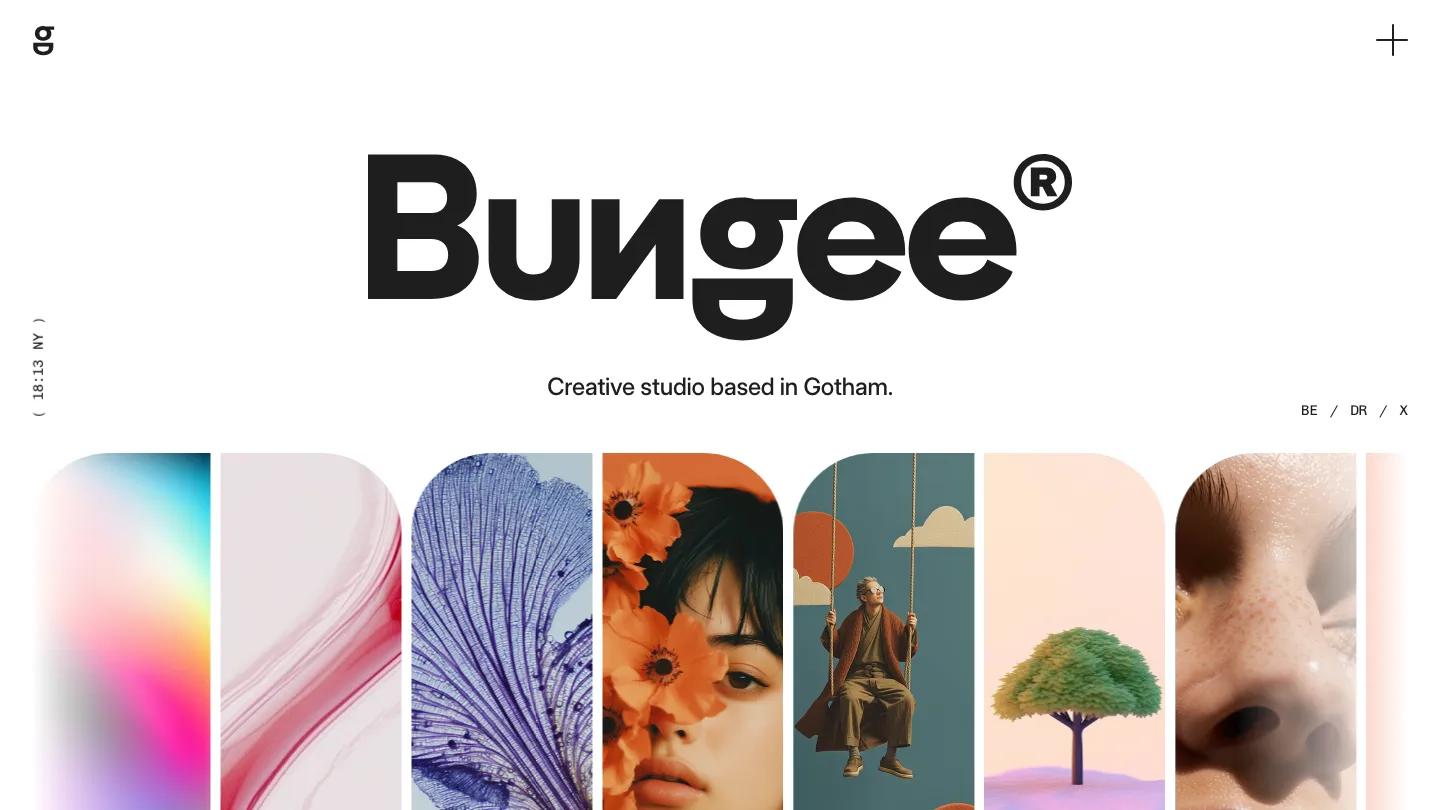
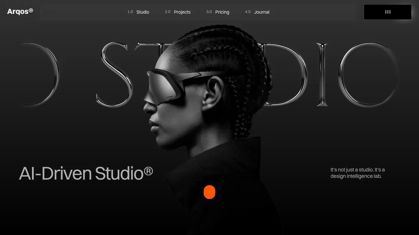
Brave Studio is a high-quality Framer template for Portfolio & Agency, Professional Services, Art & Design, Business & Startup, Personal by Framer Box.

Our Review of Brave Studio
Brave Studio is an agency site for studios that want to sound loud, with nearly everything set in uppercase Mona Sans. The hero splits the studio name in two, Brave in the top left and Studio lower on the right, both in huge silver letters laid over a black and white portrait of a woman under a sheer veil. A numbered What we do list runs down the bottom left, a short studio blurb and a pill View our works button sit opposite, and the header pairs the Brave. wordmark with map coordinates and a plain uppercase menu.
Below, the page switches to white for an About Us block with a numbered label, the headline Crafting ideas that inspire, and a tall photo of a dancer on sand dunes. Services is the strongest part: a half-width portrait on one side and a black panel stacking Branding, Design, Development, Photography, and Marketing in bold type, each with a small plus icon. Selected Work uses big square project cards with the title in the top corner, an arrow button, and pill category tags. News crops its post images into wide rounded capsules, and Why choose us floats white bordered cards with line icons over drifting black smoke. Framer Box gives the About page a giant two-line heading, a Based in London row, and overlapping photos.
On a phone, the split hero tightens into two smaller words, the service list stays readable over the portrait, and the menu moves behind a hamburger icon.
We'd pick Brave Studio for branding and design agencies that like an editorial, all-caps voice. All that uppercase gets heavy in the long paragraphs, so we'd keep body copy short or switch it to sentence case. The London location and coordinates also need replacing.
Based on the live demo, viewed on desktop and on a phone. The Design and Dev scores come from separate independent reviews. See how we score templates.
Independently evaluated by our team of 6 designers and 5 developers.











Designers score design, developers score development, and each score is the average of their independent ratings. Read about our review team and how we score templates.