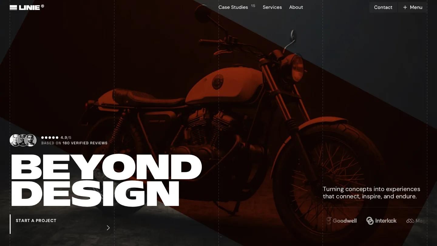
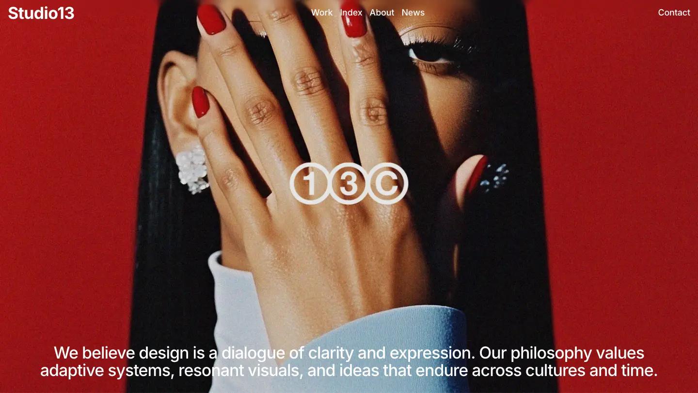
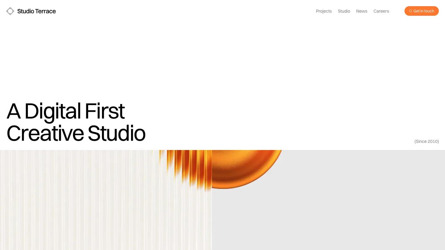
Opus is a high-quality Framer template for Portfolio & Agency, Professional Services, Business & Startup by Krzysztof Hejna.
Our Review of Opus
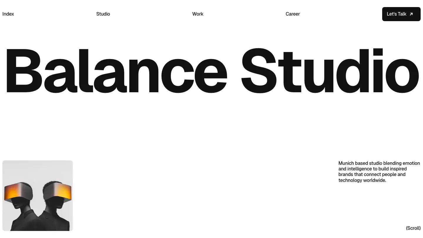
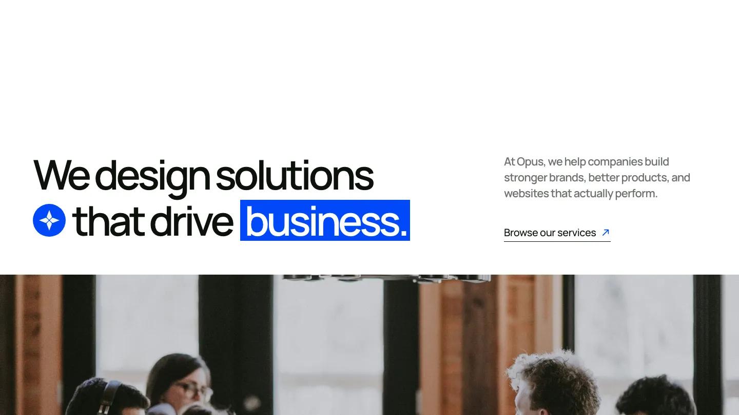
Opus is a Framer template by Krzysztof Hejna for digital agencies, and it starts loud. The studio name fills the first screen in two staggered lines of heavy black Inter Display, so tight the letters almost touch, on plain white. Everything else is restrained: black, white, a warm off-white for some sections, and one electric blue used for the Menu button and the small dot labels above each heading. The navigation hides behind that blue Menu pill, so the type gets the stage to itself.
A wide office photo leads into a short mission statement, then the services appear as a numbered list of large names that expand with a plus icon. A collage of project mockups follows, and a dark process section where four tall cards sit side by side and the active one opens to show its description. A team photo carries three stats along its bottom edge, followed by recent projects and a pricing block with a toggle and three plans. Testimonials, an FAQ, a blog row and a dark footer close it out. The Projects page opens on "Discover our recent projects" above large mockup images. We like the process cards, because they keep four steps on one screen without a wall of text.
On a 390px phone the two-line name still dominates the top, with the intro statement and a Browse Our Services link below and the blue Menu pill in the corner.
We'd pick Opus for a small web and branding agency that sells packaged plans. Before launch, rewrite the team size and project counts and decide whether you want public pricing at all, since it takes up a full section.
Based on the live demo, viewed on desktop and on a phone. The Design and Dev scores come from separate independent reviews. See how we score templates.
Independently evaluated by our team of 6 designers and 5 developers.











Designers score design, developers score development, and each score is the average of their independent ratings. Read about our review team and how we score templates.