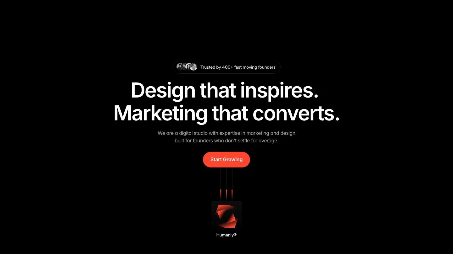
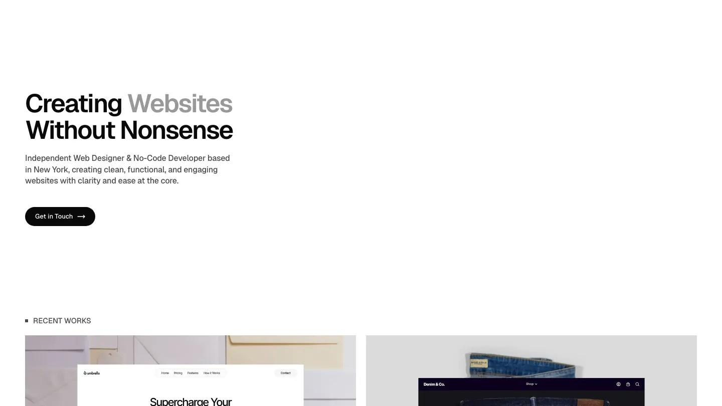
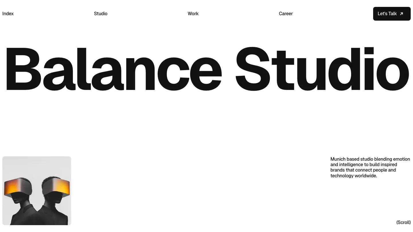
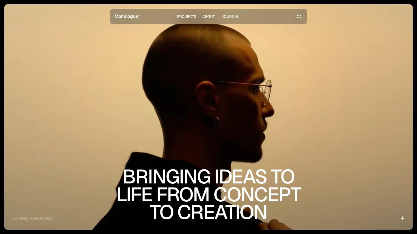
Linie is a high-quality Framer template for Portfolio & Agency, Professional Services, Business & Startup by Slava Burian.
Our Review of Linie
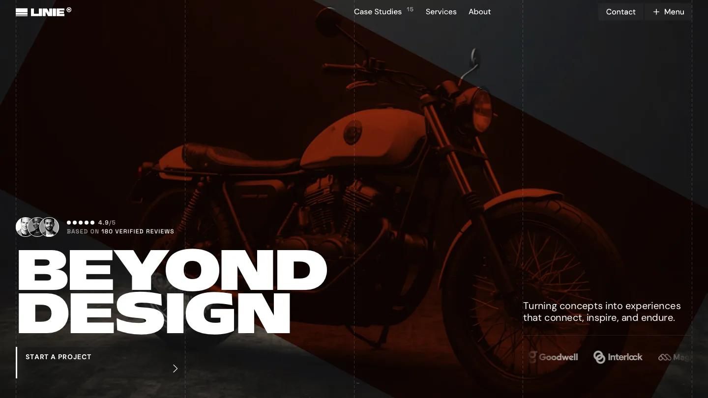
Linie is an agency site with an architect's sense of order, aimed at design and digital studios that want to look exacting. Thin dashed lines mark the column grid across every section, and the hero places "Beyond design" in Mattone, an ultra-wide, heavy display face, over a dark photo of a red lounge chair half lost in shadow. A Start a Project block with a red left edge sits beneath it, and client logos scroll along the bottom. The header pairs a striped Linie wordmark with Case Studies, Services and About, plus a Contact button and a Menu toggle.
Slava Burian gives every section a numbered label and a giant headline. What We Do lists services as numbered rows with small tag lists and a photo, True Clarity runs a split image tinted red on one side and grey on the other, and Why Us turns key figures into tall white cards staggered along the grid. Case studies such as AlphaWave sit on a black panel with industry, tools, challenge and solution fields beside a moody bike photo. Client Feedback lays quotes out as dated columns with portraits, followed by team, pricing, an accordion FAQ titled Need Help?, a journal row and a Stay Updated sign-up. The contact page sets "Say hello" huge on the right, with a named project contact on the left and a soft grey form below.
On a phone, the headline still reads clearly on two lines, the start block goes full width, and a single Menu button replaces the links.
We'd pick Linie for branding and product design studios with real case studies to show. The homepage is very long, so cut sections you can't back up. The hero badge, feedback quotes and percentage stats are placeholders that need honest replacements before launch.
Based on the live demo, viewed on desktop and on a phone. The Design and Dev scores come from separate independent reviews. See how we score templates.
Independently evaluated by our team of 6 designers and 5 developers.











Designers score design, developers score development, and each score is the average of their independent ratings. Read about our review team and how we score templates.