Studio13 is a high-quality Framer template for Portfolio & Agency, Professional Services, Art & Design, Business & Startup by Green Yang.
Our Review of Studio13
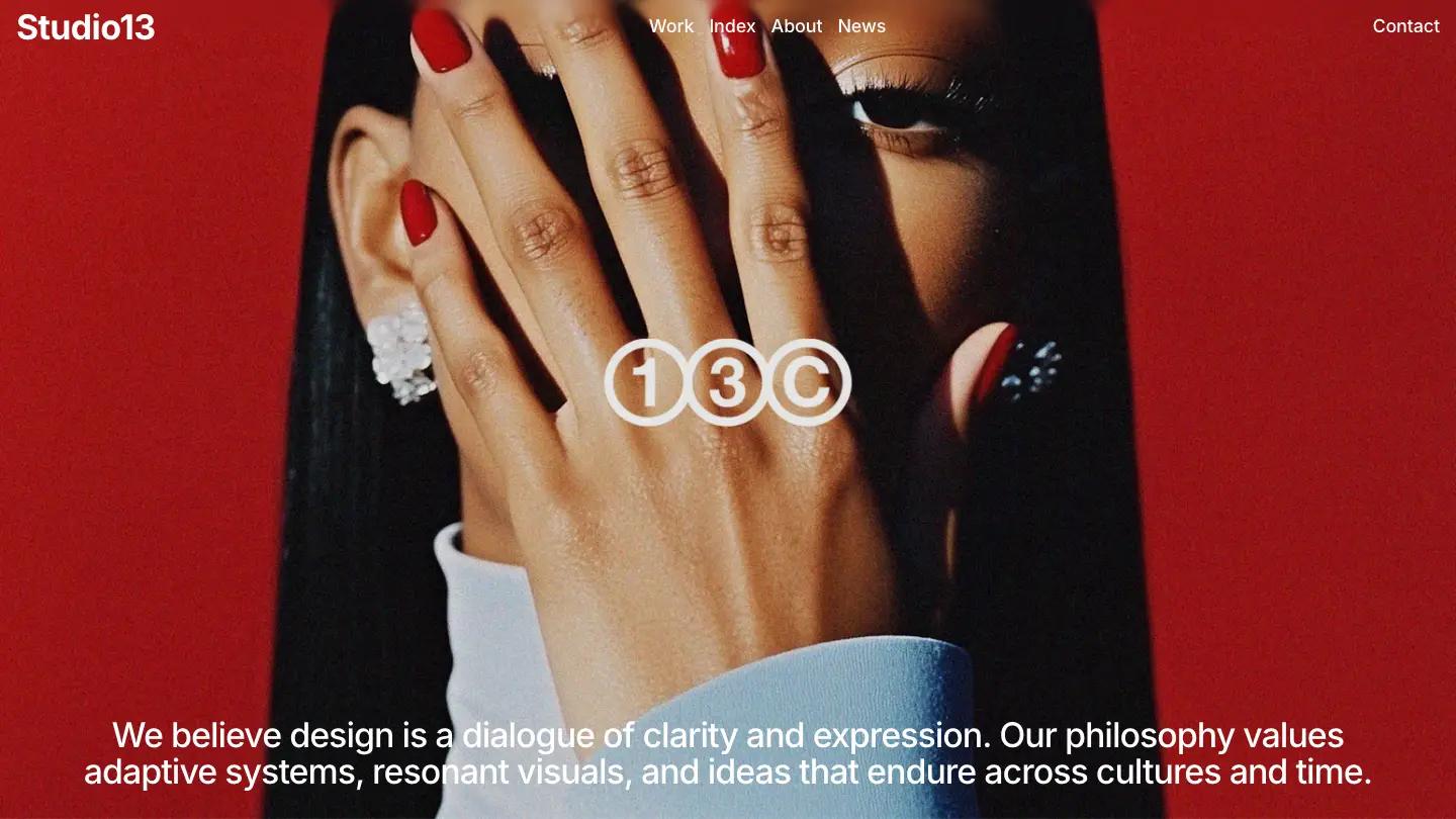
Studio13 is a portfolio and agency site for small design studios, and it opens with real nerve. The first screen is a close-cropped fashion portrait on a deep red backdrop, a hand with red nails covering one eye, and a small outlined 13C monogram floating in the middle. A studio statement in white Inter runs across the bottom, starting "We believe design is a dialogue of clarity and expression." The header stays spare: the wordmark on the left, Work, Index, About, and News in the center, and Contact alone on the right.
Scrolled, the page turns white and calm. A Services band places a single square image in the center with a pill caption like Tone, and the discipline on the right changes with the images, from Creative Direction to Visual Identity. Selected Works follows with a superscript project count and an uneven grid of large rounded images, each captioned with a name and a grey line such as Branding, Motion. Design in Numbers sets big figures between thin vertical rules, News shows three image cards, and Voices from our partners alternates quote and photo rows, each photo carrying a white Learn more pill. Green Yang keeps the Work page simple: a giant heading over a two-column grid of the same captioned images.
On a phone, the portrait keeps its drama and the menu folds into a Menu label. The statement runs long there and gets cut off at the bottom, so trim it.
We'd pick Studio13 for branding studios, creative directors, and small agencies whose work photographs beautifully. The design is mostly white space and imagery, so weak project photos will show immediately. The homepage is also long, and we'd cut any section you can't fill with real numbers or real partner quotes.
Based on the live demo, viewed on desktop and on a phone. The Design and Dev scores come from separate independent reviews. See how we score templates.
Independently evaluated by our team of 6 designers and 5 developers.











Designers score design, developers score development, and each score is the average of their independent ratings. Read about our review team and how we score templates.