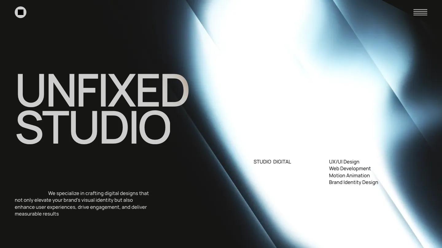
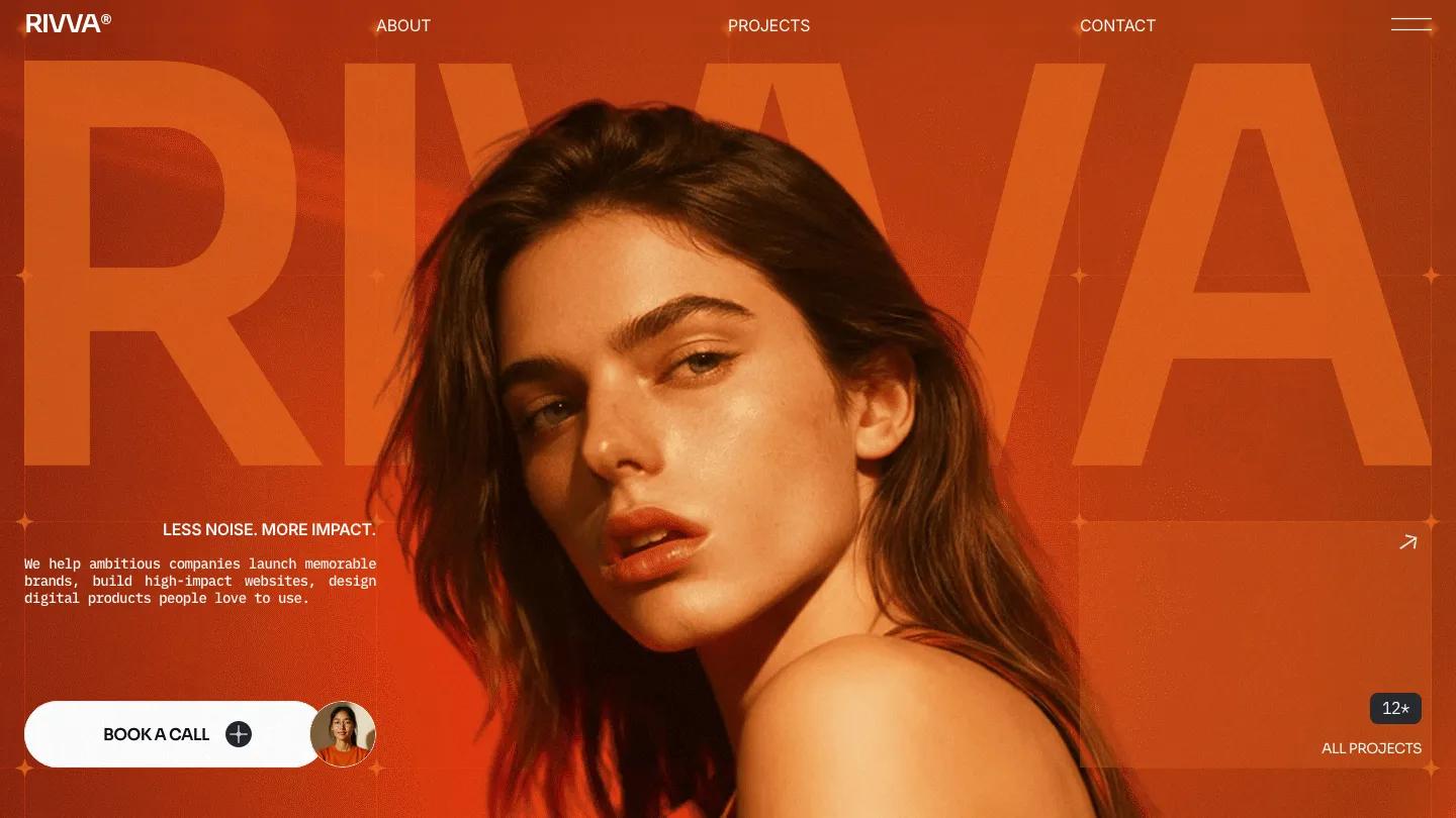
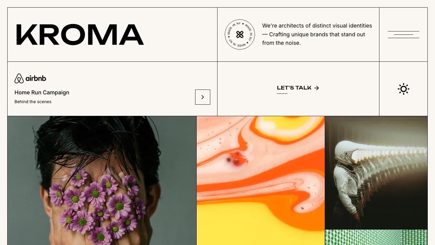
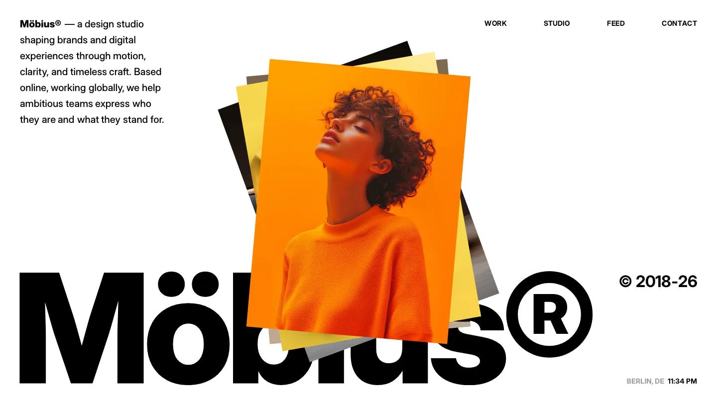
Sonido is a high-quality Framer template for Portfolio & Agency, Professional Services, Business & Startup by Lucas Gusso.
Our Review of Sonido
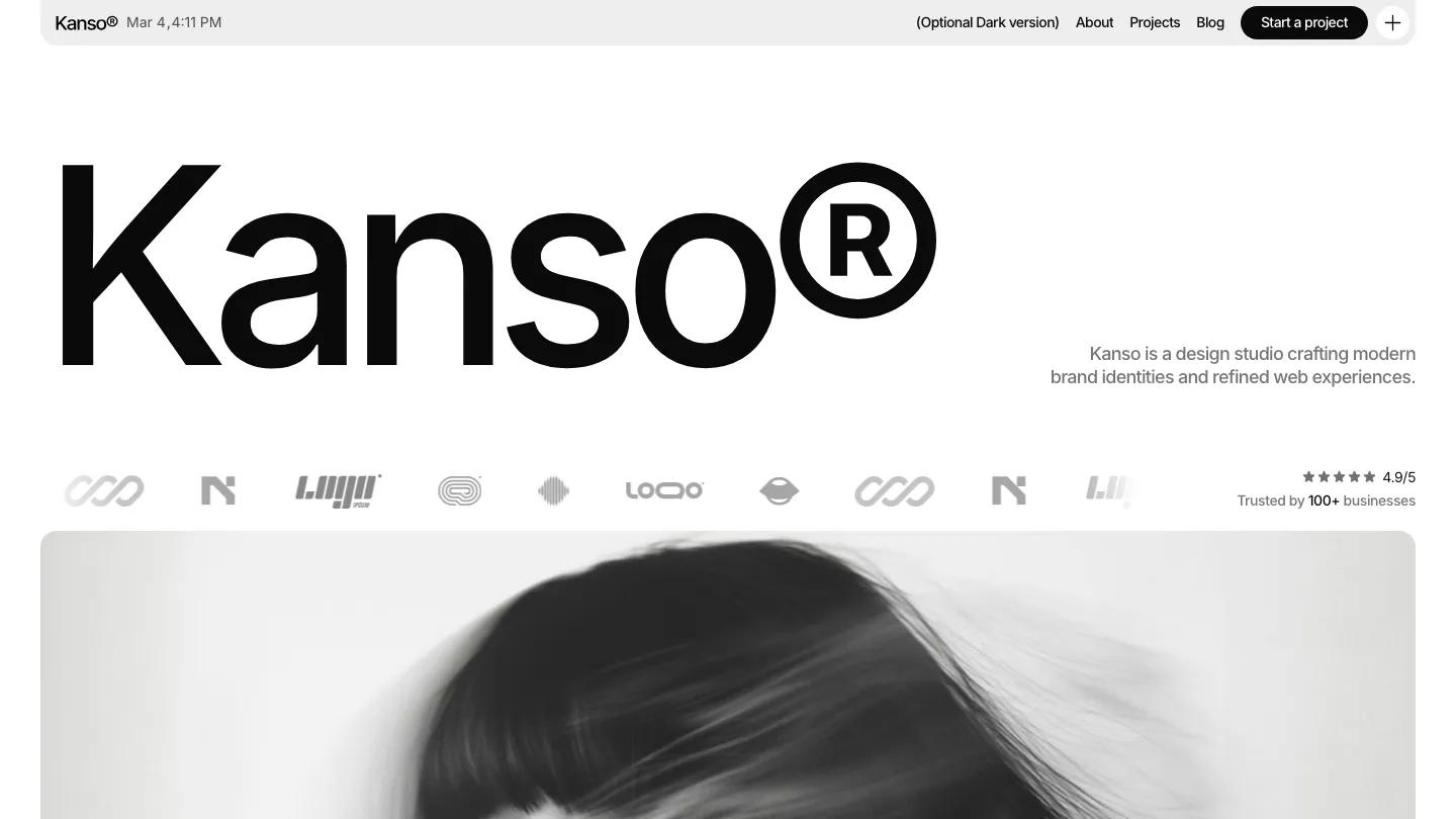
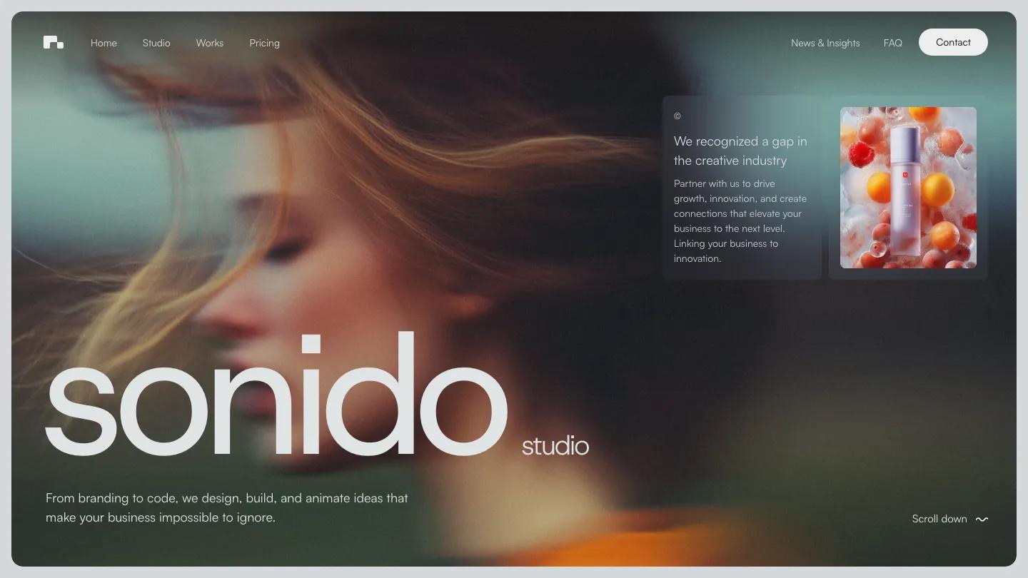
Sonido is a studio site for a small branding and web agency, and it opens with a mood before any pitch. A soft-focus portrait of a woman with wind-blown copper hair fills a rounded panel, and the studio name sits over it in huge lowercase sans-serif, with a tiny "studio" tag trailing after it. One line underneath promises ideas that make a business impossible to ignore. The page is a cool pale grey-blue, and the header is just a blocky logo and a Menu button.
Lucas Gusso keeps the structure calm. Three service cards for Branding, Design, and Development pair surreal photography, a floating astronaut among them, with short captions. Featured work follows as wide rounded images, each with an uppercase name such as Run or Circle and a one-line description, ending in a dark View all portfolio pill. An About block splits two paragraphs across columns above team cards with seated portraits and roles. Then come a testimonial heading with a coral highlight on one phrase, a red silhouette photo, figures set in a monospaced face, a pricing intro, and a News & Insights row of blog cards. The Contact page lists email, phone, and address in big type, then lets visitors pick a service from rounded pills before a budget question.
On a phone, the portrait fills the screen inside its rounded frame, the wordmark shrinks to one line, and a small Scroll down cue sits at the bottom.
We'd pick Sonido for small design studios that want a quiet, editorial site built around strong imagery. The homepage runs very long, so we.d trim it. The stats and testimonial copy are demo text to replace, and one heading has a typo. Navigation also hides behind the Menu button on desktop, which some visitors may miss.
Based on the live demo, viewed on desktop and on a phone. The Design and Dev scores come from separate independent reviews. See how we score templates.
Independently evaluated by our team of 6 designers and 5 developers.











Designers score design, developers score development, and each score is the average of their independent ratings. Read about our review team and how we score templates.