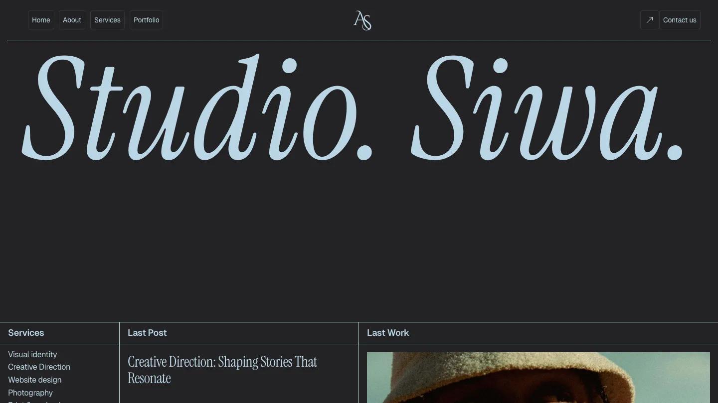
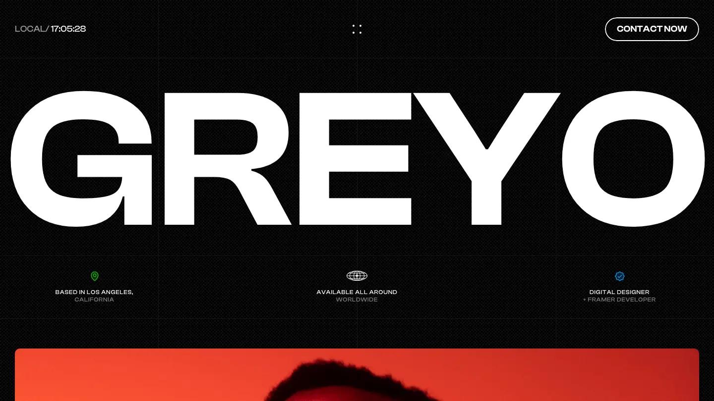
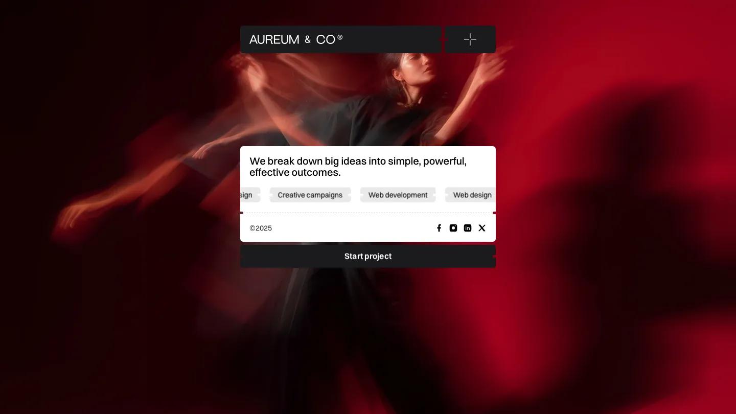
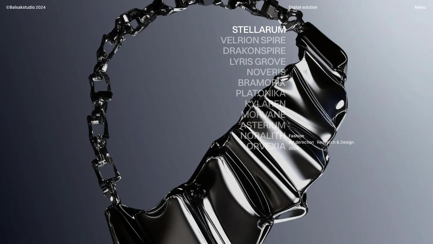
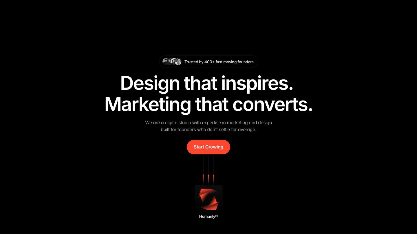
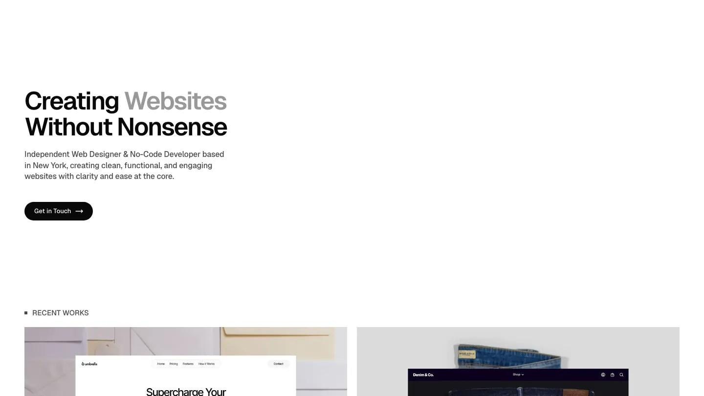
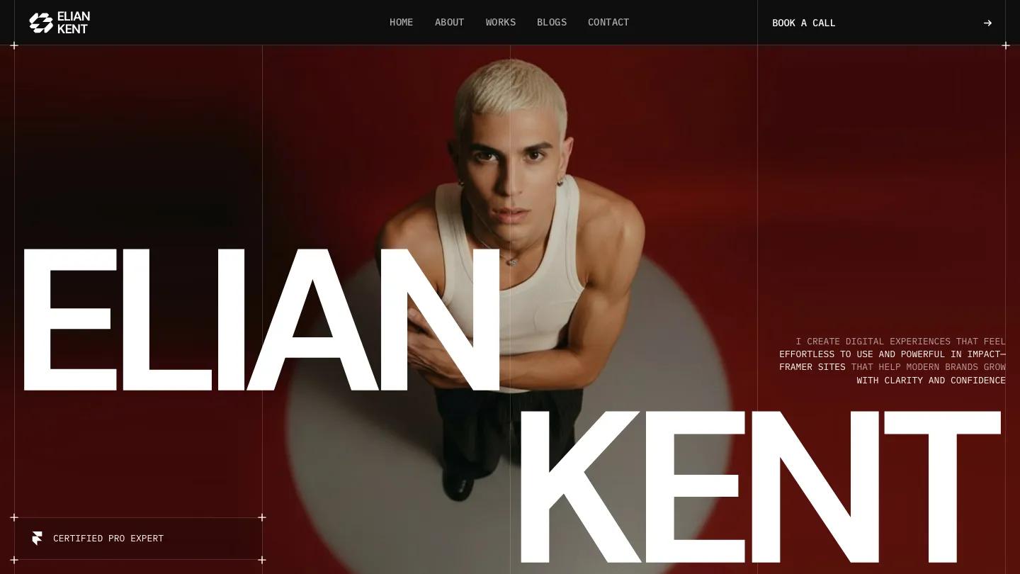
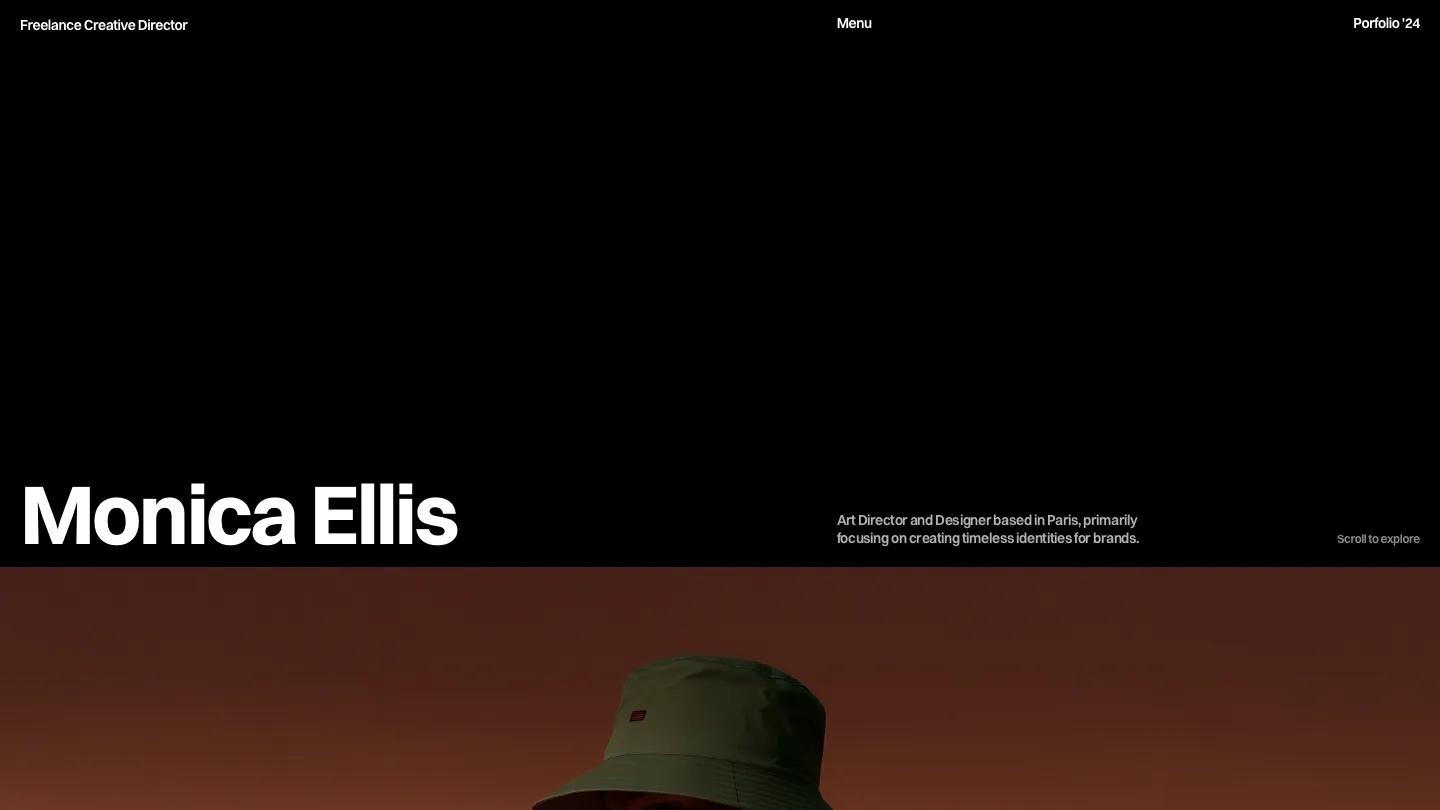
Scarlet is a high-quality Framer template for Portfolio & Agency, Art & Design, Professional Services, Business & Startup, Photography & Videography by Thaer Swailem.

Our Review of Scarlet
Scarlet is a design studio site that makes its name literal from the first second. The hero is a full-screen video in a rounded frame: a woman in a cream blazer holds a red paper parasol trailing ribbons, posed in front of a huge red circle. "Scarlet Design Studio®" sits along the bottom in heavy white Geist beside a short intro line. The nav stays light and minimal, with Studio, Projects, and Blog on the right and an outlined Contact us button.
Thaer Swailem follows a familiar agency order but executes it with care. Selected Work sets projects in a two-column grid of rounded image cards, each with a client name and year in the lower corner, over moody photography like a red-lit portrait or a racket on a clay court. A numbered services list runs on a black panel, then Our process pairs a bold statement in black and grey with stacked white step cards, from Discovery and Strategy to Launch and Optimization. Pricing has a Monthly and Yearly toggle, plan cards with a Most popular flag, and black Get started bars over included features. An FAQ accordion, blog cards with dates, and a giant "Let's Work Together." headline inside a black-outlined frame round things off. The About page puts the studio pitch in large white type over a full-bleed street photo of the team.
On a phone, the parasol video still fills the screen and the studio name breaks onto three bold lines at the bottom, which looks deliberate.
We'd pick Scarlet for small branding and web studios that sell retainers or packages. The pricing section assumes subscription plans, so adjust or remove it if you quote per project. The About headline also drops a word, so proofread it before launch.
Based on the live demo, viewed on desktop and on a phone. The Design and Dev scores come from separate independent reviews. See how we score templates.
Independently evaluated by our team of 6 designers and 5 developers.











Designers score design, developers score development, and each score is the average of their independent ratings. Read about our review team and how we score templates.