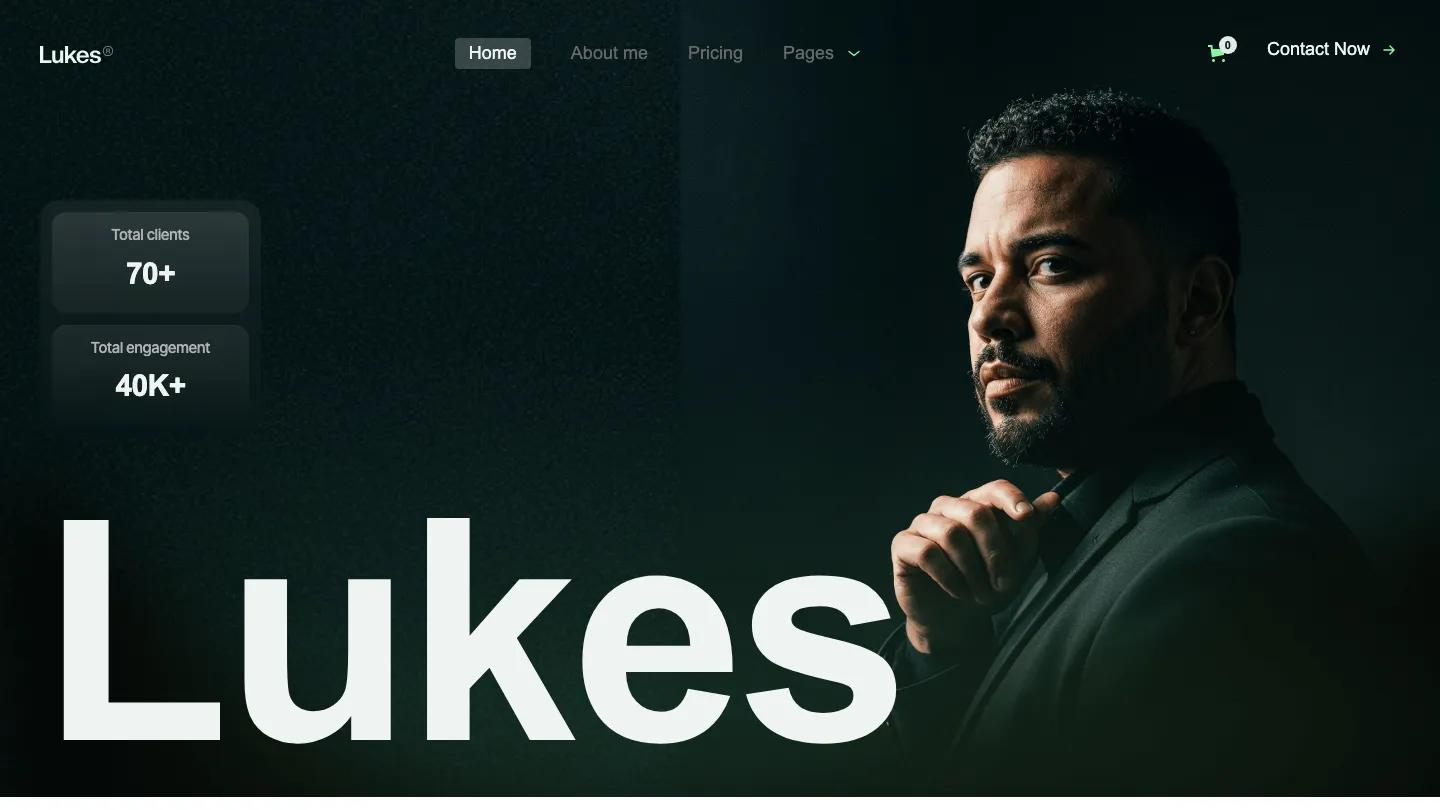
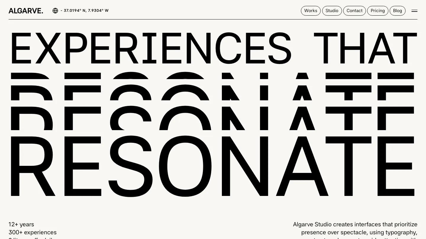
Lumon is a high-quality Webflow template for Portfolio & Agency, Professional Services, Art & Design, Photography & Videography, Business & Startup by Lucas Gusso.
Our Review of Lumon
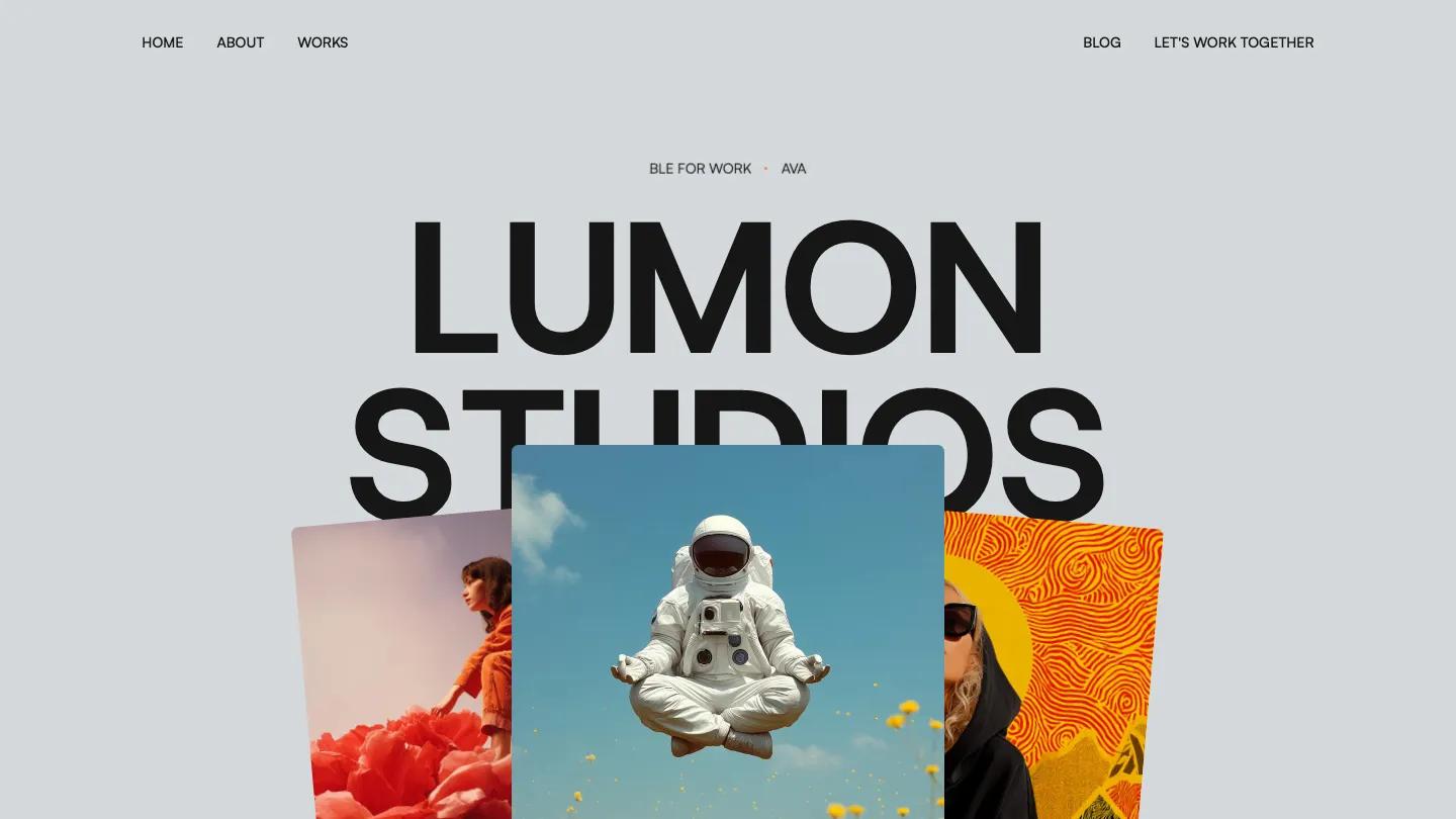
Lumon is a studio portfolio for small branding and web design teams, and it pairs a cool, pale blue-grey page with bursts of surreal, saturated imagery. The hero stacks the studio name in heavy black Host Grotesk capitals under a ticker reading "Available for work" with a small coral dot. Three photo cards fan out beneath the name: a woman climbing a giant red flower, an astronaut meditating above yellow wildflowers, and a hooded figure against an orange swirl pattern. Navigation splits Home, About and Works on the left from Blog and Let's Work Together on the right.
As you scroll, those cards straighten into a three-column services row for Branding, Design and Development, each with a short caption. A large Satoshi statement about simplifying the complex follows, with one phrase highlighted in a coral block. Lucas Gusso then lays out selected work in a two-column grid of big rounded images, with project names like Space and Botic beside one-line descriptions, before a giant marquee asking if you're ready to build something remarkable runs across the page above a dark Let's Connect button. News & Insights shows blog cards with soft product photos, and a black footer repeats the name in thin type. The About page opens with "Design that speaks. Branding that sticks." beside a small avatar card, then drops into a full-width photo of a bottle among fruit and ice.
On a phone, the name still fills the width in two bold lines, the fanned cards sit at the bottom of the first screen, and a plain Menu link replaces the split navigation.
We'd pick Lumon for design studios and freelancers with a strong, colorful body of visual work. The highlighted phrase in the intro has a grammar slip, and the About page uses a placeholder founder name, so rewrite both before launch.
Based on the live demo, viewed on desktop and on a phone. The Design and Dev scores come from separate independent reviews. See how we score templates.
Independently evaluated by our team of 6 designers and 5 developers.











Designers score design, developers score development, and each score is the average of their independent ratings. Read about our review team and how we score templates.