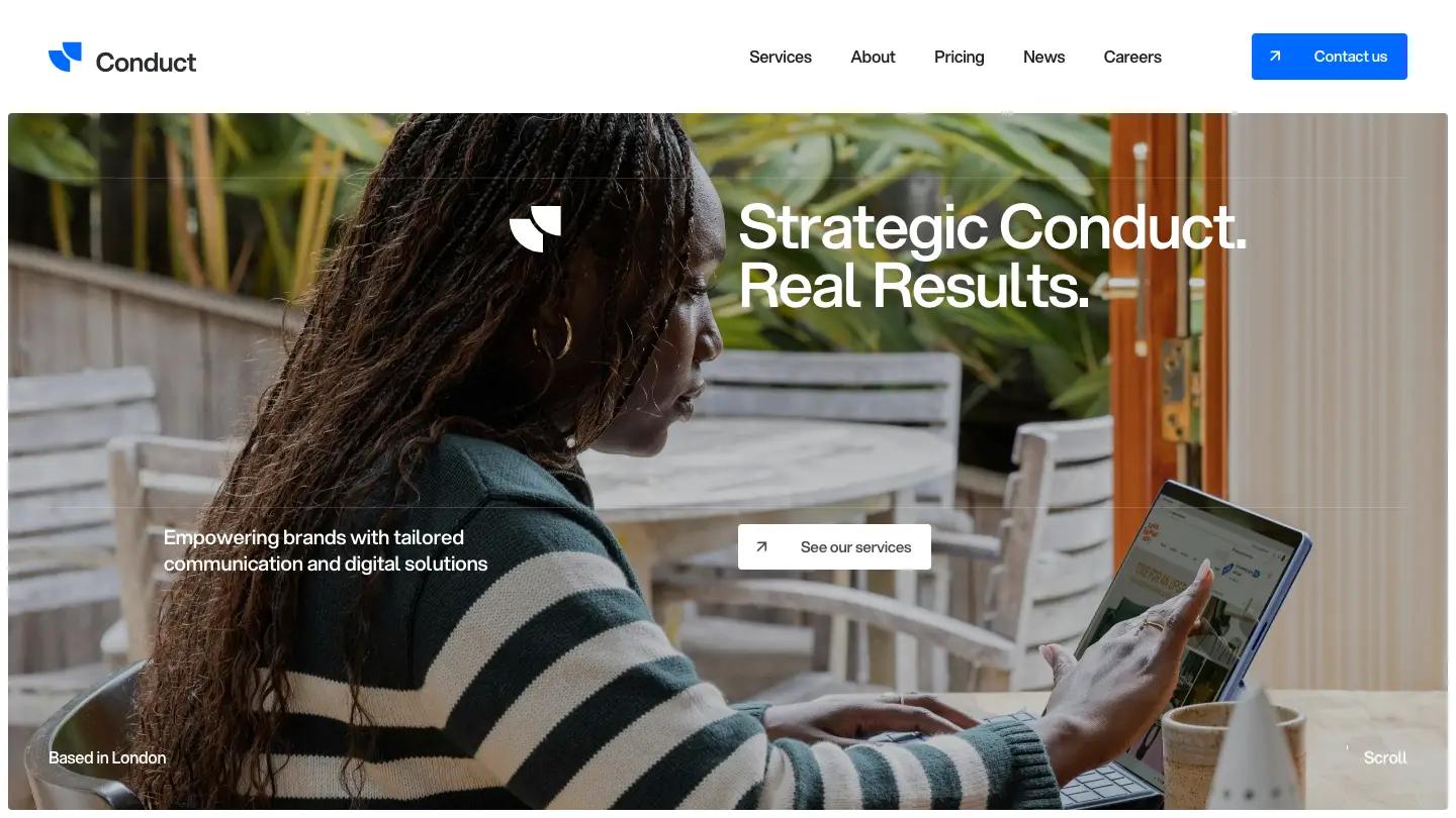
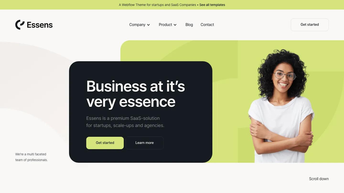
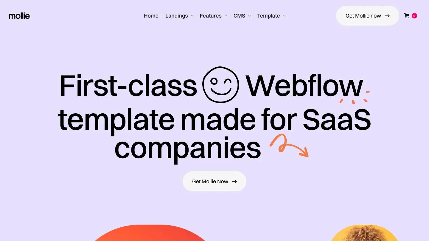
Catalis is a high-quality Webflow template for Technology & Software, Professional Services, Business & Startup by Temlis.
Our Review of Catalis
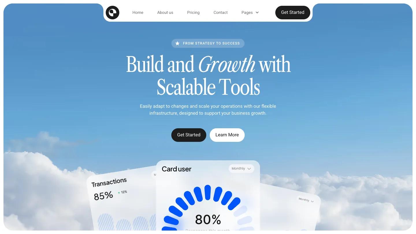
Catalis is a landing site for a fintech or SaaS product, and it wraps the whole thing in sky. The hero sits inside a big rounded panel of soft blue with clouds rising from the bottom, and frosted dashboard cards, one with a curved blue gauge, peek up through them. The headline about scalable tools is set in Libre Caslon Condensed with one word in italics, under a small pill label reading From Strategy to Success, and above a dark Get Started button and a white Learn More pill. The navigation is a white tab cut into the top of that panel holding the main links, a Pages dropdown, and another dark button.
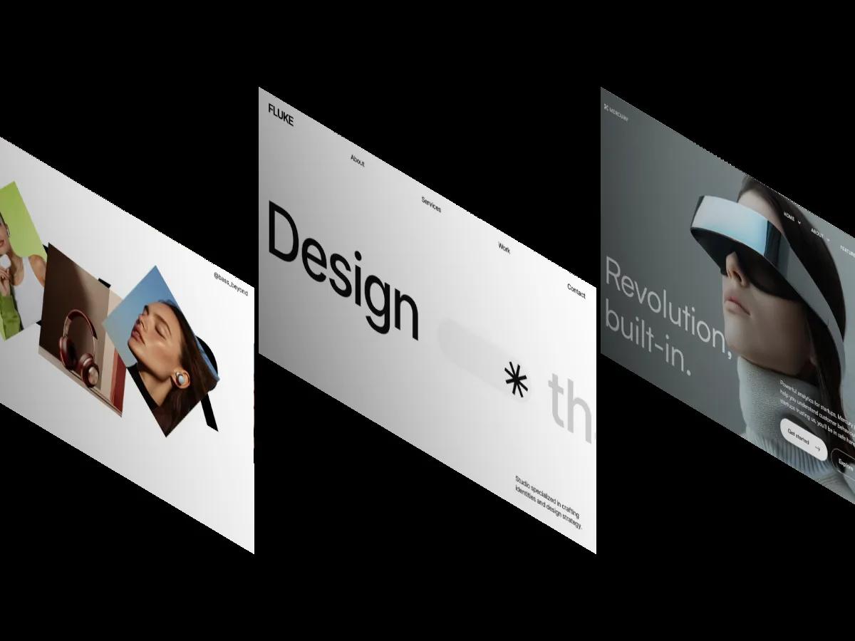
Temlis follows the hero with white service cards on the same sky, each with a small blue icon and a topic like budgeting or market expansion. Next, grey cards pair short titles like Secure transactions with mini interface snippets such as a balance card or a transactions chart. Pricing returns to a deep blue panel, where white plan cards carry checked feature lists. A testimonial strip scrolls sideways with signature-style names, three blog cards carry pill-shaped Read more buttons, and a closing banner sets a floating expenses card over a countryside photo. The Home page we opened is a launch page for the template itself, with a serif title and a sliding row of page previews.
On a phone, the hero text and buttons stack cleanly on the clouds, though a template promo widget covers the dashboard cards.
We'd pick Catalis for early-stage finance, analytics, and B2B software startups that want a calm first page. The hero headline needs a grammar fix before launch. We'd also confirm the floating promo widget on the demo is gone in your copy.
Based on the live demo, viewed on desktop and on a phone. The Design and Dev scores come from separate independent reviews. See how we score templates.
Independently evaluated by our team of 6 designers and 5 developers.











Designers score design, developers score development, and each score is the average of their independent ratings. Read about our review team and how we score templates.