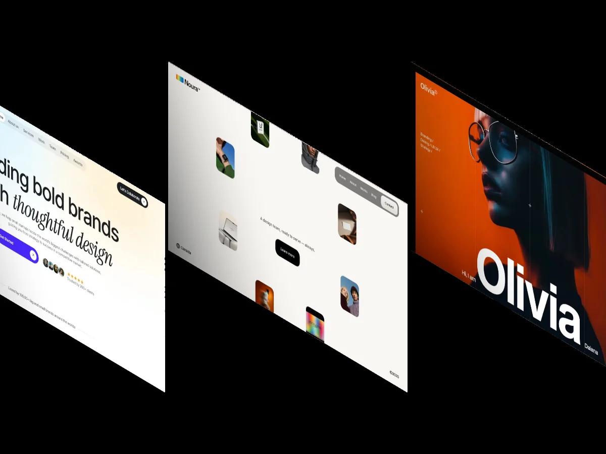
Conicorn is a high-quality Webflow template for Technology & Software, Business & Startup, Professional Services by N!nh Studio.
Our Review of Conicorn
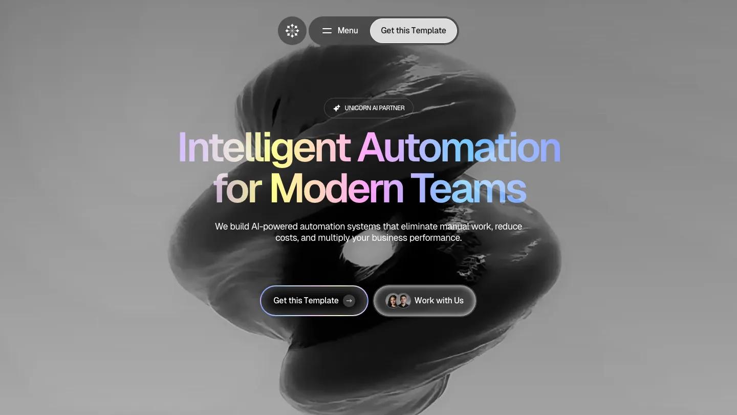
Conicorn is a one-page site for an AI automation agency. The hero sets Intelligent Automation for Modern Teams in large Geist with a pastel gradient running through the letters, lilac to butter yellow to sky blue, over a huge black-and-white twisting ribbon form. Two glossy pill buttons sit below, one with a gradient outline and one with tiny team avatars. Instead of a full menu bar, a small floating pill holds a logo badge, a Menu toggle, and a light call-to-action button, pinned at the top as you scroll.
N!nh Studio alternates soft grey cards with bursts of that pastel gradient. A big mission statement scrolls past a rounded video still and an oversized stat, then the services area becomes a bento grid: a workflow diagram, CRM and marketing automation cards with small UI vignettes, a gradient card inviting you to book a strategy session, and a row of chunky metallic icons for encryption, access control, and data handling. Numbered pill labels mark each section, from How We Work to What We've Built, where case studies slide through a carousel with a product shot, a short summary, and three result figures. Testimonials run as a masonry wall mixing quote cards with tall black-and-white portrait cards. Pricing plans, a team section, a numbered FAQ accordion, and a dark closing card with a contact form follow.
On a phone, the gradient headline breaks across four lines and the two buttons stretch full width under the floating menu pill.
We'd pick Conicorn for AI consultancies and automation studios that want a polished, product-like pitch. The client logos are placeholders and the testimonials quote very specific percentages, so replace them with real results. The page is long, so cut sections you can't fill.
Based on the live demo, viewed on desktop and on a phone. The Design and Dev scores come from separate independent reviews. See how we score templates.
Independently evaluated by our team of 6 designers and 5 developers.











Designers score design, developers score development, and each score is the average of their independent ratings. Read about our review team and how we score templates.