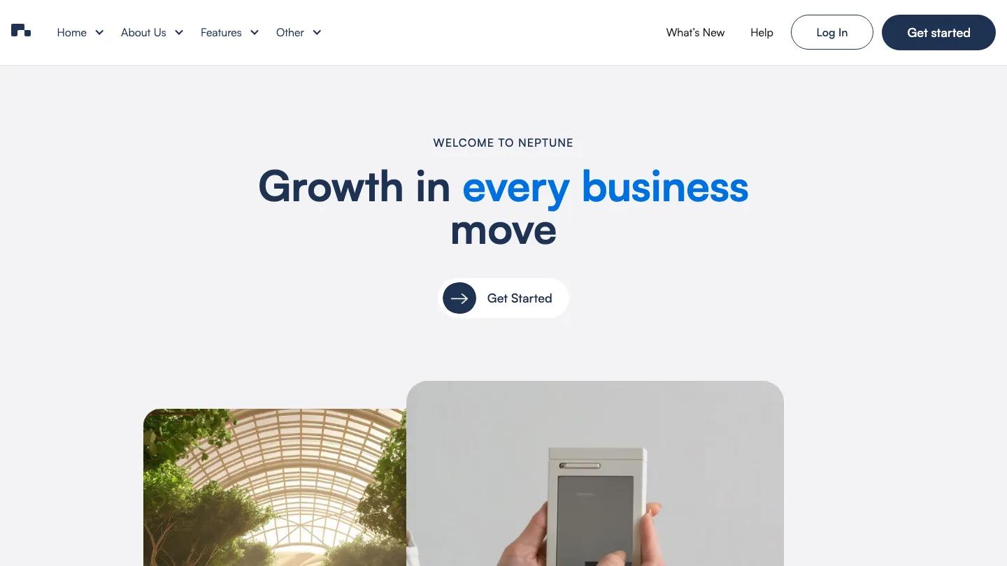
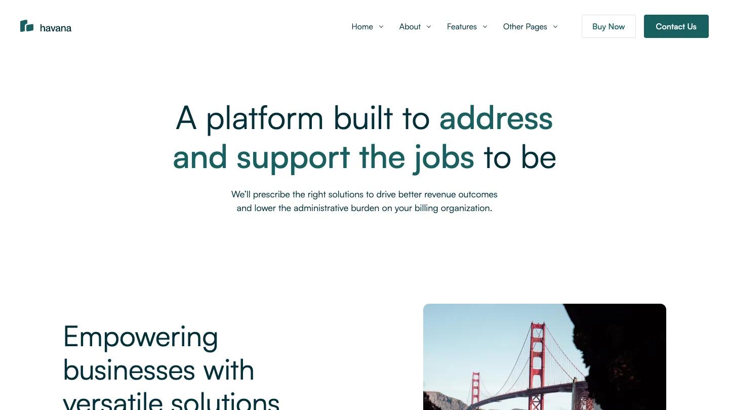
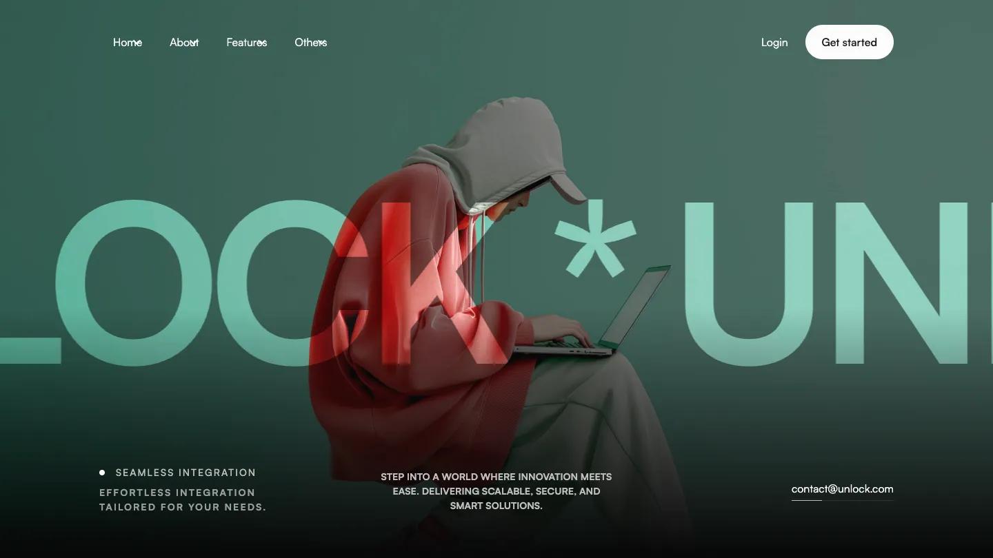
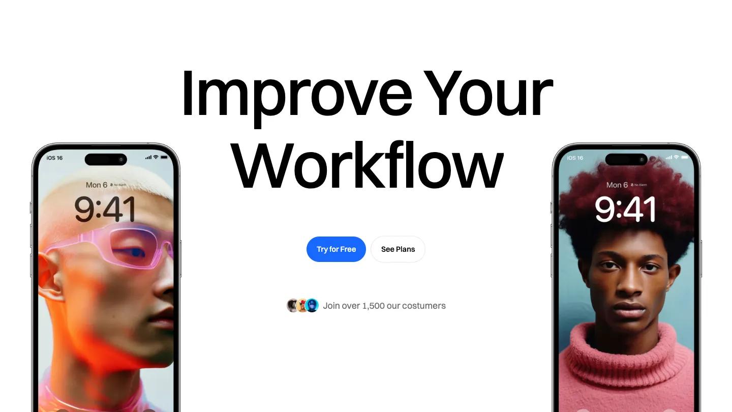
Mercury is a high-quality Webflow template for Technology & Software, Business & Startup, Professional Services by Lucas Gusso.

Our Review of Mercury
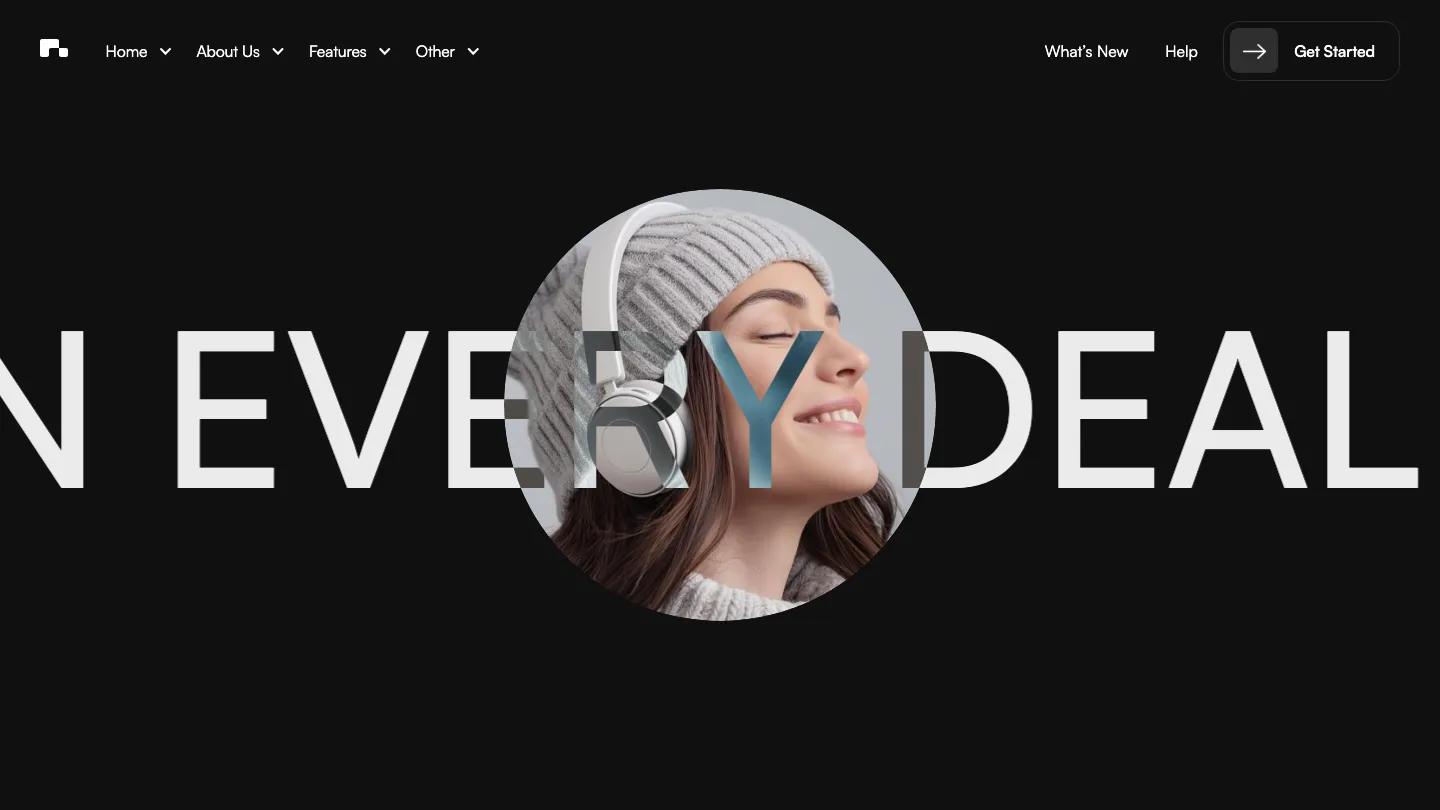
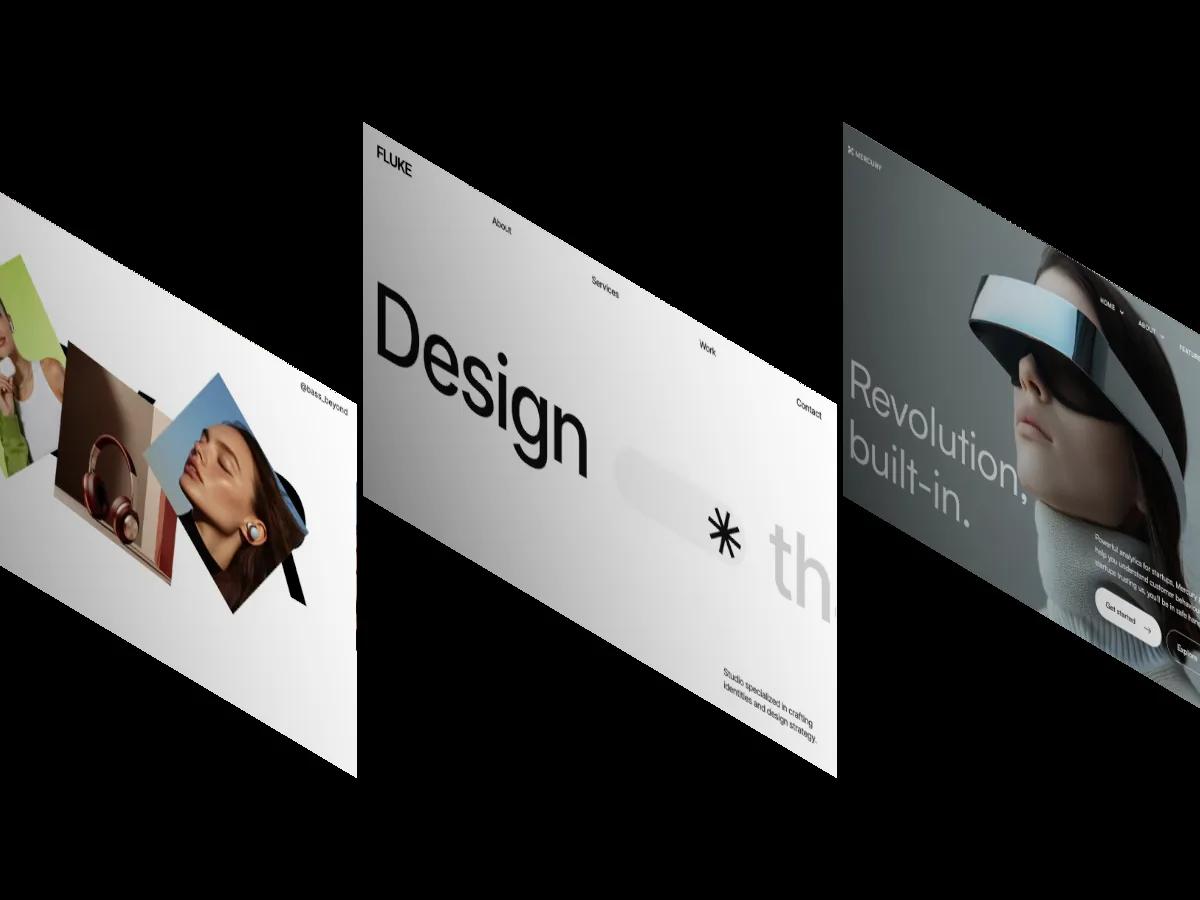
Mercury is a light, monochrome Webflow template for SaaS and analytics startups, with enough extra layouts to stretch into an agency or small shop. Its first home variant opens on a full-screen photo of a woman in a mirrored visor against a cool grey wall, with a short two-line headline in very large, thin white Satoshi at the lower left and a paragraph plus Get started and Explore buttons to the right. The header keeps things orderly: a small Mercury logo, Home, About, Features and Other dropdowns, and an outlined Contact Us pill.
The demo homepage itself is a showroom. Under a large centered heading and a black Buy template button, Lucas Gusso lays out preview cards for each layout: team grids of portraits, contact pages, Pricing, Blog, Help Docs, FAQ, and utility pages such as Style Guide, License, Changelog, a password screen and a 404. Buyers launch from one of the home variants, and the first one carries the real design. "Analytics that feels like it's from the future" sits over photo cards for marketing automation, CRM and reporting, then a wide image pairs with a numbered list of benefits. A row of overlapping circular photos, white helmets, an astronaut, an orange gadget, leads into a footer with office addresses and a strip of client logos.
On a phone, the visor photo stays behind the text, the headline fills the width over two lines, and both buttons stretch edge to edge.
We'd pick Mercury for software startups and product teams that want a calm, editorial look built around product photography. The demo copy includes made-up stats about thousands of startups, so replace those with real numbers or cut them. The silver and orange imagery sets the whole mood, and you'll need product shots in that same restrained style.
Based on the live demo, viewed on desktop and on a phone. The Design and Dev scores come from separate independent reviews. See how we score templates.
Independently evaluated by our team of 6 designers and 5 developers.











Designers score design, developers score development, and each score is the average of their independent ratings. Read about our review team and how we score templates.