WorkDesk is a high-quality Framer template for Portfolio & Agency, Professional Services, Business & Startup, Art & Design, Personal by Nick404.
Our Review of WorkDesk
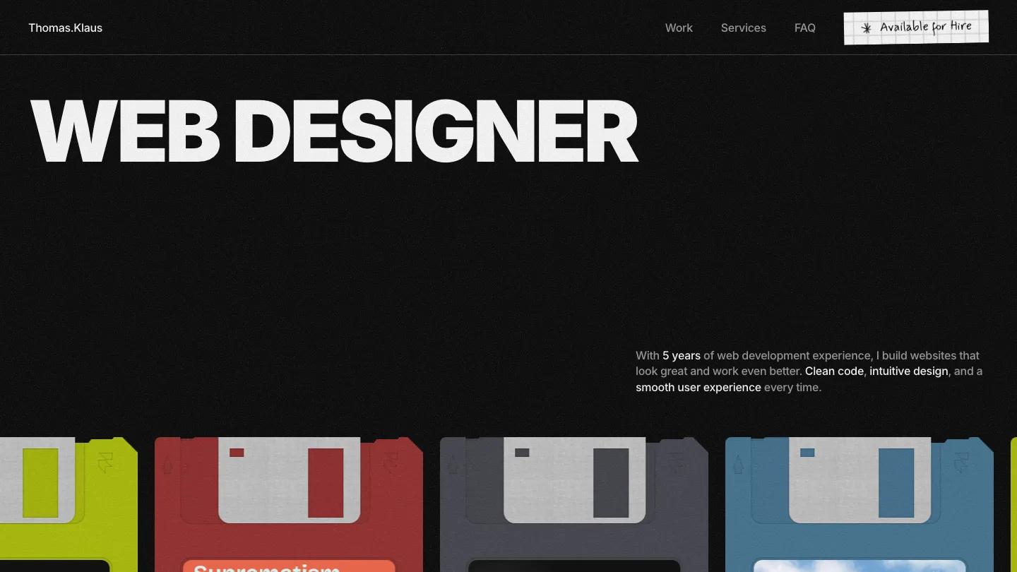
WorkDesk is a dark portfolio for a freelance web designer, and it leans hard on a retro office theme. The hero starts plain, with "Web Designer" in heavy white Inter across a near-black, grainy page and a short intro set low on the right. Then a row of colorful floppy disks runs beneath it, each with a project screenshot on its label and a handwritten title. The header keeps a name on the left, Work, Services and FAQ on the right, and an Available for Hire button styled as a scrap of graph paper.
Nick404 carries the stationery idea through every section. A row of big stats follows the disks, then UI Design, Web Development and SEO Optimization each get a yellow sticky note with a handwritten starting price. About Me pins a Polaroid portrait captioned "Yep, that's me" between short columns on hobbies and tools. What Clients Say clips client photos onto grid paper, My Workflow walks from discovery to website building, and the FAQ is a stack of torn notebook pages with plus toggles. The footer ends on a pager-style screen showing the email over a giant Contact Me. The Work page pairs an oversized heading with a vertical stack of floppy disks.
On a phone, the headline breaks onto two lines, the menu folds into a hamburger icon, and the disk row stays intact under the intro, cropped at both edges.
We'd pick WorkDesk for freelance web designers who sell a short list of services and want a portfolio with real personality. The handwritten font covers prices, testimonials and FAQ answers, so check that it stays readable with your own, longer copy. Every project also needs a label image that works at floppy disk size, and the placeholder name, email and client photos all need replacing.
Based on the live demo, viewed on desktop and on a phone. The Design and Dev scores come from separate independent reviews. See how we score templates.
Independently evaluated by our team of 6 designers and 5 developers.











Designers score design, developers score development, and each score is the average of their independent ratings. Read about our review team and how we score templates.