Direct is a high-quality Framer template for Portfolio & Agency, Professional Services, Business & Startup, Art & Design, Personal, Blog & Editorial by Framence Studio.
Our Review of Direct
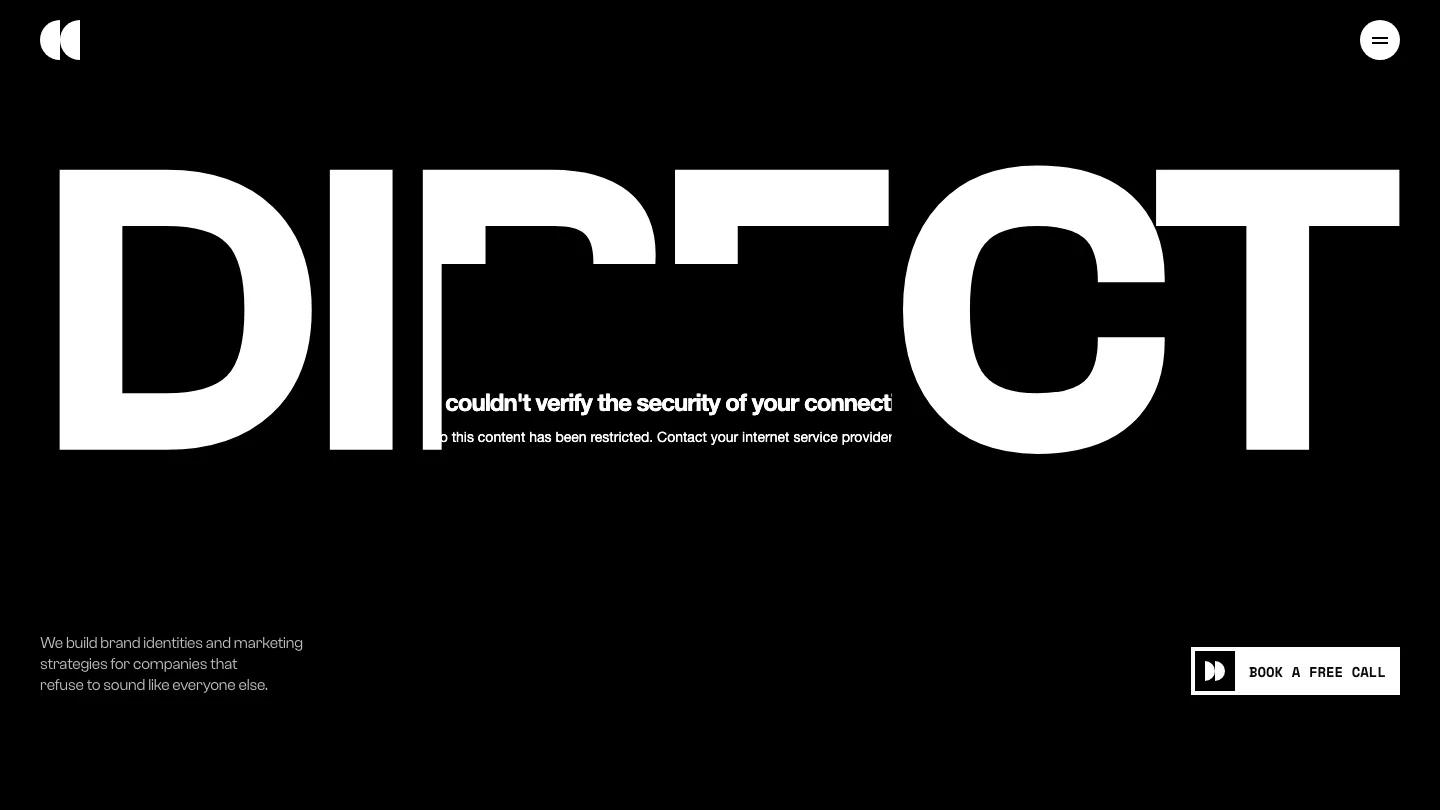
Direct is a dark, punchy Framer site from Framence Studio for brand and marketing studios that want to sound sure of themselves. The hero spells DIRECT across the page in heavy white Clash Grotesk, with a cinematic photo of a lone swordsman and a glowing orange blade dropped into the middle of the word. A short pitch about building brand identities sits bottom left, and a boxed Book a Free Call button sits bottom right. Navigation hides behind a round white menu button, with only the split-circle logo opposite.
The homepage is black throughout, with small monospace labels like Services //02 marking each section. Project cards sit at staggered sizes and heights, each captioned with a number and project name. Services run as a numbered list, with Brand Strategy and Campaign Development in big caps and a small square thumbnail on the right. An about block introduces the founders with moody portraits, followed by a scrolling client logo strip and a stats row. Client quotes float as dark cards on either side of a centered Straight From Clients heading, then come plan cards with plus-marked lists of what's included, an articles row, and a monospace FAQ accordion. The contact page splits the screen: Let's Talk and a clean underlined form on the left, and a motion-streaked photo of a group in orange light on the right.
On a phone the wordmark fits on one line, the swordsman photo drops below it with a Play label for the video, and the pitch and call button follow in order.
We'd pick Direct for strategy-led studios and freelance brand consultants. All the imagery shares one orange-and-teal glow, so you'll need photos in that mood or a plan to replace the lot. The stats and client logos are placeholders to rewrite, too.
Based on the live demo, viewed on desktop and on a phone. The Design and Dev scores come from separate independent reviews. See how we score templates.
Independently evaluated by our team of 6 designers and 5 developers.











Designers score design, developers score development, and each score is the average of their independent ratings. Read about our review team and how we score templates.
More Like This



How We Score Templates: Our Design and Dev Scoring Methodology

Attention Span Statistics 2026: Where Every Number Comes From
Best Framer Blog Templates 2026
15 Best Framer Templates for SaaS and Software 2026
AI and Writing Statistics 2026: What the Research Actually Says

How Long Should a Blog Post Be? We Measured Google's Top 10 for 400 Searches